At Goonhammer, our passion for games extends well beyond the tabletop. Each week, Jonathan “Crion” Bernhardt reviews video games, even the ones that aren’t Warhammer-related. In today’s review, he’s talking about Warhammer Underworlds Online, the digital adaptation of the card/board game of the same name. Note that, since Jonathan is not an avid wargamer, in addition to his take, we have included some “Second Opinion”-style thoughts on the game from other Goonhammer authors who are already tabletop WHU players. Additionally note that this game is currently in Early Access, though it was first released in January and has received several udpates.
In case you weren’t aware that Warhammer Underworlds Online is a video game adaptation of a board game (I was not, personally), the product makes it very clear, very quickly: this is a board game-ass board game. It takes place on an 11×8 hex board, it involves very detail and rules oriented turn-based game play which is mostly proprietary to this specific game rather than being shared with other products, and in perhaps the most board game attribute it could possibly have, it requires about a half-hour of tutorialized learning before you’re ready to get your feet wet in a real match.
For fans of the board game — who presumably do not need those tutorials — these are all good things. I can’t speak to how faithful the systems are to the real life product, but generally Games Workshop puts a lot of effort into these things and the regimented turn order, wealth of rules governing unit interactions that are then either circumvented or ignored by occasional special unit properties (“rolling more Block dice than your opponent rolls Hit dice means you successfully block your opponent’s attack, unless your opponent rolls a Critical die and you do not, or your opponent’s attack has the Cleave property,” for instance), and specific focus on positioning all lead to a crunchy, specific tactical experience that certainly feels like one of their products.
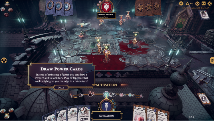
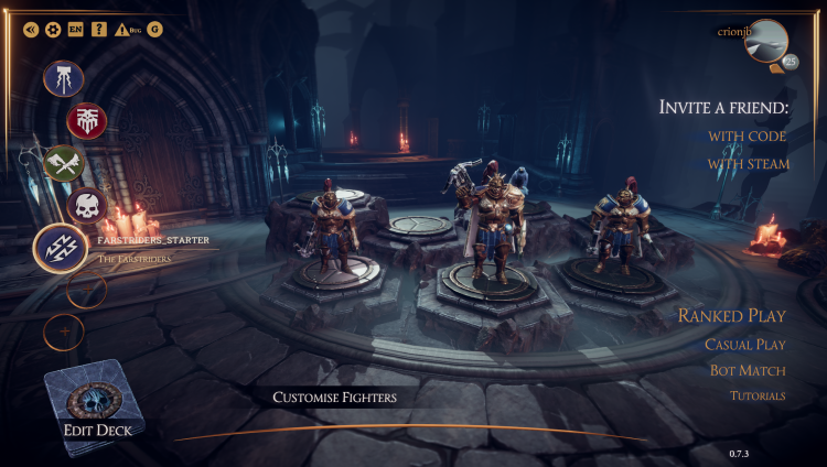
This is somewhat distinct from being a video game in the usual sense, however — it is a virtual rendering of a tabletop product, and in that specific use case it will be of great value to that product’s fans; one assumes it will help build interest in the physical product itself, and it’s certainly very helpful to players who don’t have other gamers who are into the Underworlds products at their local gaming store. Still, I found myself wanting more. There are a few things that the video game format gives the developers license to do beyond create an online environment to play the tabletop game; compared to say, Blood Bowl 2 (future piece coming on that game), I felt like many of the animations for attacks and blocks were canned or anemic. The stumble animation used for forced movement following a successfully landed attack is particularly goofy, especially when coming from one of the Sigmarite sorts whose whole shtick is over-the-top seriousness. The lighting effects are quite good but the character models can be a bit rough; I’m thinking here specifically of the models for the Farstrider deck that was just added to the game. And while effects like the blood slick on the hexes below certainly communicate the visual data they need to — there is a battlefield effect on those tiles which will impair your units in X, Y, and Z way — they rarely impress; there’s a strange pulsing fade on the effect that doesn’t come through in a still shot that, combined with the pristineness of some of the rubble, gives the impression of a clipping error rather than bits of shattered rock sticking out of ankle-deep blood. Still, the game is in Early Access, and it’s worthwhile to get as much game in there as possible (and get it working well) before going back and making graphical or detail tweaks.

The game itself is fun; it replaces the collectible miniature aspect of playing Games Workshop’s tabletop games with unit cards and deck-building, while hewing to many of the aspects of the tabletop experience players will expect — there are objective markers to take and hold, and variable win conditions to earn the glory points that determine who actually wins the game. A game of Underworlds generally seems to take less time to play than a game of some of the more involved products like 40K would, though any veteran of those products probably knows that a game that last “three rounds” can take a deceptively long time to actually pan out. Despite the laundry list of new rules to learn, the UI is quite helpful in reminding what bits do what to which bobs whenever you mouse over.

In the end, it’s not a product I see myself spending a lot of time on solo — especially since the only solo content in the game right now is practice matches against basic enemy AI — but if a friend wants to play Warhammer Underworlds with you and you can’t get together in person (which right now, you absolutely cannot), this is a product that lets you do that in a faithful and bug-free way. If that’s your thing, you can buy it for $30 on Steam in Early Access and support its future development.
A Second Opinion from James “One_Wing” Grover
I’m coming at this game from a very different angle to Bernhardt, which is that I have played and like Underworlds (come on, it’s a very crunchy tactical combat game with lots of depth, this is obviously for me) but have no scene for it locally, so have never been able to dive into the physical game to the extent I might have liked. The rate at which you’d need to purchase card packs to keep up with the actual game mean that it doesn’t feel “worth it” unless you’ve got people to play with competitively on the regular, so I’ve basically ended up staring wistfully at a game I know I could theoretically enjoy, but have no real way of getting into.
With that in mind, I am basically the exact target market for Underworlds Online, and putting an opinion into this review has given me an excuse to finally buy it and have a go. My impressions from doing so are mixed:
The Good
- It’s a faithful adaptation of the game. That is 100% what I wanted from it, so no complaints there. There is one caveat to this in the bad section, but it does meet the key goal of accurately letting you play Underworlds online especially because…
- The interface is very clever and well thought through. One of my concerns going into this was that Underworlds has a lot of moving parts and complex systems going on, and that building a user interface that encapsulated that would be challenging. I work in software myself, and it’s very clear that some talented UX designers took a long hard look at all the different things that needed to happen, and properly considered how to present everything players need to see to them without it being overwhelming. This extends to the deckbuilding interface, which I also liked.
- Thanks to this, it plays fast, and that’s enhanced further by some good visual decisions in how attacks get resolved – your fighter basically starts winding up a big swing, the attack and defence dice roll in an overlay, and then the target either gets whacked or goes into a block animation as needed.
All of this convinces me that there is a good game that meets my needs waiting here, and I am pretty hyped for that. Sadly, it’s currently held back by a few big problems.
The Bad
- The game is currently a long way behind the actual card sets, not having any of the Nightvault or Beastgrave warbands or mechanics. From the point of view of this being a substitute for playing the actual game, that’s a “must fix”. Deckbuilding and metagame strategy is a huge part of playing this competitively, so if none of the current content that’s out there is relevant to the online version thanks to it being multiple years behind, then that’ll probably kill my interest. My understanding is that the intent is to get the other stuff included, so hopefully there’s a plan to do a big upgrade to include the current sets when it leaves early access.
- I love the UX, but the UI needs work on two major fronts. First off, I don’t like how “busy” everything is, in particular the effort put into rendering scenery outside the board area. The fact that there’s no real distinction in colour palettes between the board and everything else can make it honestly challenging to work out where edge hexes end and random scenery begins. I’d be honestly happy just to have everything fade to black outside the board area, because for me the high quality game this is implementing should be front and centre, but currently it feels like the developers were afraid that if they didn’t make it look enough like a “proper” video game people wouldn’t like it. The other big UI problem I have is how rules text is handled – this currently seems to largely be being rendered in-engine, which can make it hard to read if you’re playing with the settings down. I was playing this on my Goonhammer writing laptop, which is by no means a gaming machine but I feel like it should be possible to implement a version of this that plays better on low settings if you put more focus on the game and rules and less on pretty backgrounds and cards dramatically exploding when they’re played.
- The responsiveness and stability aren’t there yet. This is the thing I’m most willing to write off as “it’s early access” but it’s not fantastic. You often have to click on a unit twice before the game will properly calculate whether any of their attacks are in range, and that extended to the tutorials – it would tell me “click on this unit and select this attack” but the first time I did so just wouldn’t light it up as selectable. Speaking of tutorials, for the last one (a practice match) it appeared that I was supposed to be playing as Steelheart’s Champions – but I’d recently opened my Gurzag’s Mob decklist to look at the interface, and so the match launched with them, but kept referring to the Stormcast Warband name. The last thing in this area, and this is the most urgent to sort out, is that there’s no reconnect function if an online game dies. I was playing a ranked game with the Mob against Farstriders, and just as we were going into Round 3 neck-a-neck on 3 glory apiece the game just flashed up a “lost connection to the server” and that was it. Given that every time control is handed to a player the game is in a static state, to my mind there’s no excuse for this not being serialised and stored for recovery in the case of a disconnect.
That’s…a long section and that’s maybe not entirely fair – it’s just easier to write more detailed critiques of things that aren’t working. The network disconnect thing is the only one here that might outright kill the game for me if it keeps happening. I do, slightly, have my software architect’s senses tingling about how my UI concerns overlap with the responsiveness issue, and I guess my other worry is if there’s some technical debt lurking below the bonnet, will they ever get to the pace of implementation needed to keep up with the physical game? However, on that front I’m definitely happy to give them time to show they can handle it.
Overall
While I do have my concerns, there are strong signs that this has the potential to be the online version of Underworlds I want, and the design work that’s been put into the interface in particular convinces me that there is some proper love for the game going into this. We’ve got a few people with the game bouncing around within our community, and I’m certainly keen enough on it that I’ll be challenging some of them to games over the next few weeks. In summary – lots of potential held back by a few must-fix issues.


