My friends! Good evening, and welcome to another entry in our paint review series. It’s me, keewa, your avatar of acrylics, your alpha of artistry, your archon of alliteration. Today I’m going to be looking at the ProAcryl range in toto; I’ll go through the nuts and bolts, I’ll talk about every single paint that ProAcryl currently sells, colour by colour, and tell you about them. Then I’ll pick my favourites and those I think are the most useful additions to any painters toolbox.
This is the ProAcryl review, in full.
Just How “Pro” Is This Acryl, Anyway?
ProAcryl from Monument Hobbies down in Arizona are some of the most cherished miniature paints by painters across the spectrum. We’ve already talked about why we like them so much so I shall sidestep that part and link you instead to our Base Set review. Since the lads at MH kindly gave me their full whack I’ve scarcely touched any of the other paints in my drawers: they flow beautifully, they airbrush with minimal thinning, they go on as smooth as butter, the finish is a lovely matt, and they’re by and large very opaque and pigment dense; the full package really. They are, perhaps, a bit more expensive than most of the other brands (save Duncan Paints and Citadel) but we’ll get to that.
Pros:
- Sensible paint naming. As Monument Hobbies puts it, there’s no “Wizard Butt” in their line.
- Very strong, highly pigmented colours with very finely ground pigments throughout.
- Smooth flow, can even be used directly out of the bottle without thinning and airbrush nicely with only a little thinner.
- Because the paints are so pigment dense, by-and-large they have exceptionally opaque coverage.
- Because the pigments are so fine they mix very well and evenly.
- Preinstalled (glass! No rust here!) agitators
- Paints arrive with a freshness seal on the bottle, which is a bit of a pain to remove but really does prevent them spilling or drying up in transit, and include a foam gasket that prevents them drying out *too* much if you don’t twist the lid all the way down by mistake.
- Transparent paints (inks, basically) have a lot of utility for saturation boosting and hue-unifying processes.
- The Artist signature series are nice inclusions, and it’s great that Monument kicks back some of the profit to the featured artists themselves, more of this please!
Cons:
- Twist tops prevent clogs but don’t prevent mess, I dread to think how much paint gets wasted this way, these can be replaced with normal droppers or the flip caps you see on larger bottles, but the more invested you are in ProAcryl the more those lid replacements will cost you, and since I’ve got the full whack it’d cost like 50 euro to swap all the lids, no can do!
- ProAcryl paints are undoubtedly expensive, but the bottles do contain 22ml, which is 10ml more than a citadel pot, which is almost double the volume.
- ProAcryl doesn’t use a beginner-friendly triad system like AP, Duncan, and Citadel. For experienced painters this won’t be a problem, but might create a higher learning curve for new painters.
- Very limited selection of washes (only 3, black, brown, and flesh), however with the Glaze + Wash medium you can turn any of the PA paints into pretty decent washes, so it’s not any kind of fatal flaw in the system.
Neutral:
- Variety is not at all “limited”, but is absolutely not as vast as most other brands with 126 colours in total. Monument’s focus appears to be on producing very good distinct colours, rather than a million colours with tons that are “almost” the same as others.
- Unlike brands like Vallejo, Mig, AK there’s no “real world military colours” so if you’re looking for the exact right shade of 1935 Feldgrau or whatever then this isn’t the range for you.
Alright, no more faffing around, let’s go colour-by-colour, shall we?
Reds
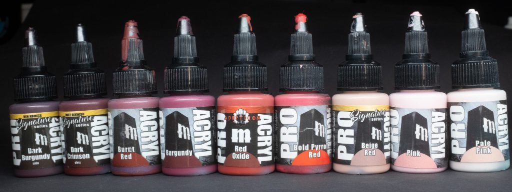
Burnt Red – A classic and one of my favourites, nice and dark plus a little bit muted, this one is great as both a base layer for brighter reds, for shading brighter reds, or just generally being an excellent dark bloody red.
Bold Pyrrole Red – Of all the ProAcryl reds this is probably the most renowned and popular. The name isn’t a lie; BPR is a searingly bright and saturated scarlet, like Citadel Evil Sunz Scarlet on steroids. Although red is notoriously quite a difficult colour to work with, Bold Pyrrole Red makes it super easy to get bright vivid reds. Every miniature painter ought to do themselves a favour and have this one in their paintbox.
Burgundy – For when you don’t need the bright vivid saturation of BPR, Burgundy is a great choice. It’s slightly more purple-y than Burnt Red on the spectrum which slots in nicely as a “cool red”, ideal as a colour for Chaos-y things in 40k, or if you’re painting uniforms that are claret-coloured.
Dark Burgundy – A dark wine-coloured variation of ordinary Burgundy, ideal for shading its sibling or as a colour-contrast shade for warm reds. This particular paint is from the Ben Komets signature series, and as such it has a satin rather than flat matt finish, I’m not entirely sure why it should have a satin finish, but it does.
Dark Crimson – A blood coloured paint, rendered in a very wet-looking glossy format, presumably to let you more easily represent gore on your miniatures. This paint is from the Matt Cexwish signature series. Although it’s glossy, it doesn’t have the same gel sort of consistency as Blood for the Blood God; whether that’s a plus or minus depends entirely on how you plan to use it. I don’t know why Monument Hobbies didn’t make more clear that its a blood effect paint, because that’s what it is.
Red Oxide – As you can probably guess from the name this ruddy-orange paint is a pretty good approximation of the red iron-oxide pigment classically used in paints called variously “Deep Indian Red” or Chestnut. For our purposes it’s good for darker rust colours, parts of either aged metal, Martian-related stuff, etc.
Beige Red – This paint from the Vince Venturella signature series is a reddish tone that’s paler and more desaturated than the others, presumably from mixing beige with red. Honestly I’d hesitate to lump this paint with the other reds when it’s clearly more of a skin-tone, but it does have red in the name so what can I do, my hands are tied. This paint is great to highlight more ruddy skin without losing that elemental redness. In classical painting terms, I think this paint is closest to Old Rose.
Pink – A very bright (but not saturated) orangey-pink, almost Salmon-esque. Very useful for highlighting ruddy skin and painting parts of models where a more subtle pink is required; animal noses or the hair of classic witch elves, for example.
Pale Pink – An even brighter almost cherry blossom version of its sibling, this paint is almost white with the tiniest blush of pink, similar to the web colour Lavender Blush, useful for very very bright highlights on pinkish flesh.
Oranges
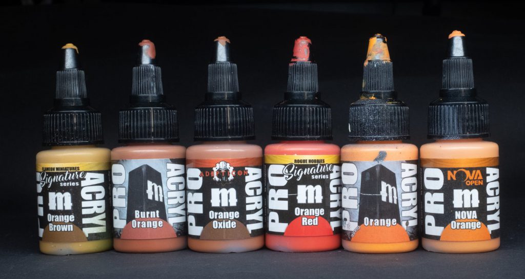
Orange Brown – As the name suggests, a very deep orange sitting more towards the yellow-green end of the spectrum, similar to the colour Tiger’s Eye. Quite a rich paint, useful for shading other oranges without losing too much saturation.
Burnt Orange – A dark, brownish orange that’s more towards the red end of the orange spectrum compared to Orange Brown, because it covers better than lighter oranges, this paint is a great choice to use as a base upon which to build the rest of your oranges, or as a fine highlight for darker browns like Mahogany.
Orange Red – As the name suggests, this bright, super saturated paint from Louise Sugden’s signature series leans heavily towards the red end of the spectrum – this paint can’t decide whether it’s orange or red. Citadel Wild Rider Red on steroids is a good comparison, this paint is an excellent choice for highlighting bright reds with tons of punch.
Orange – The standard straightforward orange, in more specific terms I’d say this paint is a close approximation of Safety Orange/Troll Slayer Orange. Unusually for ProAcryl paints this one covers really really poorly (it is a pure orange, after all), use it with an airbrush and go slowly, paint over white, or layer it over a more robust and opaque orange like Burnt Orange.
Nova Orange – A special sort-of signature paint for the NOVA convention, this orange is like a paler twin to the regular orange, presumably with a bit of warm white mixed in, similar to a Coral colour. Very useful for highlighting the other oranges in a way that isn’t overpowering.
Orange Oxide – A wonderful representation of the absolutely classic rust colour, this one is perfect for weathering rusty patches on metal, or if you’re a Blanchitsu kind of person, for adding those ubiquitous rusty-orange tones we all know and love.
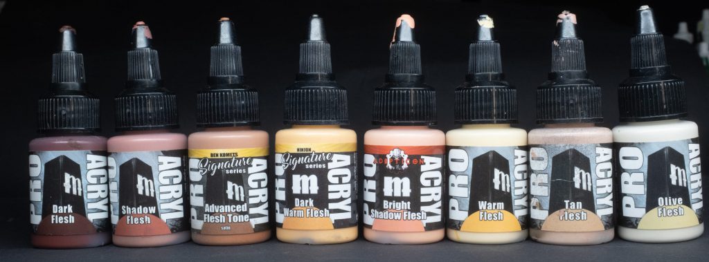
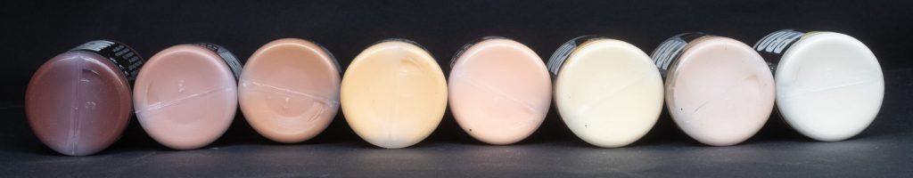
Skin Tones
Dark Flesh – As the name implies, a skin tone on the darker end of the spectrum. It’s rather saturated, quite orange, and lacking the more purple-y note of the darkest skin tones displayed by real human skin.
Shadow Flesh – Not as dark as Dark Flesh (obviously), Shadow Flesh occupies the same sort of niche in the skin-tone section as Bugman’s Glow does in the Citadel range, it’s got a reddish tint but is still quite muted, perfect as a base for any caucasian skin. Apparently this kind of colour is called “Au Chico”
Advanced Flesh Tone – Another paint from the Ben Komets signature set, this one has a pretty confusing name. Why is it advanced? What does that even mean?? Anyway, confusing nomenclature aside, this is a nice, warm, mid-toned skin colour that’s slightly darker than the old faithful Cadian Fleshtone. It mixes nicely with white and burgundy, so you can quite easily shift it to different skin colours through judicious mixing. Maybe that’s why it’s advanced? For some reason the finish is also satin, don’t ask me why, I dunno. Mr Komets, why are all your signature paints satin?
Dark Warm Flesh – DWF comes from the Ninjon signature set, and although it’s called Dark Warm Flesh, it’s not actually that dark, being lighter than the other flesh tones mentioned thus far – perhaps the name is mostly intended as a conjoining reference to the other ProAcryl paint called Warm Flesh. Anyway, it’s a pretty midtone for warm skin with an orange-y yellow undertone. Think Bestigor Flesh.
Bright Shadow Flesh – From the Adepticon set comes another pretty unwieldy name (Bright shadow? huh?) that’s presumably meant to tie this shade to the original shadow flesh. Bright Shadow Flesh is a decent paler pink-ish highlight that mixes well with, and compliments a base of Shadow Flesh to create an easy Caucasian skin-tone.
Warm Flesh – A somewhat orange-y yellow light colour that serves as either a great final highlight for dark skin tones or as a mid-tone for warmer skin tones that are a bit more Eurasian. Ungor Flesh is a pretty good comparison.
Tan Flesh – The skintone that comes with the base set, Tan Flesh is a reddish rosy skin colour that works nicely to establish a highlight for more pinkish skin.
Olive Flesh – The lightest of the explicitly skin toned paints, Olive Flesh is somewhat sandy with a slight touch of green undertone, it works pretty well as a mixer to highlight any of the other skin tones, or straight to highlight skin with a more Eurasian appearance.
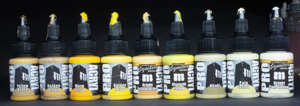
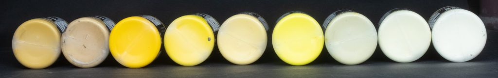
Yellow
All yellows cover badly, this is a hard and fast rule of the universe, so just take it for granted that these paints cover badly unless otherwise stated.
Yellow Ochre – Yellow Ochre is a deep brown yellow colour that’s got a very pleasant earthy hue to it – similar to the paints used to make the first cave paintings in fact! If you want to know how this paint looks, think of the classic Tau paint scheme you won’t be far off. Covers much better than the less earthy yellows.
Golden Brown – Texture like sun? No! As with all ProAcryl paints, as smooth as butter. By name alone you might be confused as to why ProAcryl includes this paint with their yellows instead of their browns, but once you see it you’ll understand. This paint has a very Mustard-y colour to it (English mustard, of course) and retains some of that earthiness that the Yellow Ochre has. Ideal for highlighting all manner of browns, leather in particular. Like the Yellow Ochre, GB also covers better than the less natural yellows in the set.
Warm Yellow – A really pleasant, deep, rich yellow – Warm Yellow occupies a similar sort of niche in the range as Yriel Yellow. I love how saturated and, well, warm it is. For schemes like Craftworld Iyanden or the Imperial FIsts you can’t go wrong with this colour.
Golden Yellow – A brighter, somewhat cooler, equivalent of the warm yellow, golden yellow is essentially your classic middle-of-the-scale Primary Yellow in the ProAcryl range (which is probably why it’s in the base set). Good for something like Greywater Fastness or the classic armour scheme of Ironsunz Orruks.
Bright Yellow Ochre – As the name suggests, this is a lighter version of regular old Yellow Ochre. Not that much to say about it really, in terms of old Citadel paints this would be close to Zamesi Desert, I think.
Bismuth Yellow – As with all of the paints from the Rogue Hobbies signature set, Bismuth Yellow trades in extreme saturation and high-volume punch on the brighter edge of the yellow category. Tonally speaking, Bismuth Yellow is a single-pigment cool lemon yellow that leans towards green. I’ll be honest, in the course of my own painting I haven’t used this colour very much on its own, but it makes a good high-saturation yellow mixer to add to other paints.
Khaki – As the name says, this paint is the colour of the light sandy fabric worn by troops in desert environments, and as such it’s pretty good for that application. This paint is perfect for Cadian Fatigues in particular. In Citadel terms you might say this one is very close to Ushabti Bone.
Pale Yellow – Your classic Ice Yellow colour. This paint is fantastic for highlighting any of the other yellows, but where it truly finds its place is through mixing highlights – rather than mixing white to create a lighter tone, by adding Pale Yellow you can achieve both value and colour contrast, as your highlights are shifted towards a warmer hue than your base tone.
Bright Pale Yellow – Just a brighter version of the aforementioned, presumably with warm white added. Use when you want an even stronger highlight or value change.
Greens
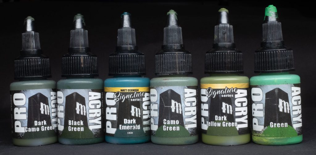
Dark Camo Green – As you might perhaps anticipate from the name, this is a dark desaturated military-style green, absolutely classic as the shadow-tone for all manner of non-desert tanks, planes, artillery, what-have-you. It’s a bit like a better version of Castellan Green, Astra Militarum fans everywhere rejoice! You could even use it as the base for a desaturated ork skin, if you were feeling feisty.
Black Green – Although the name is Black Green, I think this is more of a dark Bottle Green/British Racing Green colour. It’s not as desaturated as the other ProAcryl Black <X> paints, and cooler than the olive tone of Dark Camo Green. Ideal as a base for Dark Angels space marines or any other natural-toned green aspects on Sylvaneth, Wood Elves, etc. A bit like
Dark Emerald – A signature paint from the Matt Cexwish set, Dark Emerald is a very cold blue-green. This coolness makes it an ideal cold shadow for any of the warmer greens – if you wanted to paint an ork skin with high colour contrast, using this as your shadow and something like yellow-green as your midtone would work very nicely. Like the other paints from the Cexwish/Komets boxes, Dark Emerald has a satin finish, no I don’t understand why either. Kinda like Stegadon Scale Green, I guess?
Camo Green – The lighter version of it’s darker cousin, this is your midtone when it comes to all kinds of military equipment, smooth and desaturated. While not exact, it’s a pretty good equivalent to Death World Forest.
Dark Yellow Green – One of the Vince Venturella signature paints, this saturated olive tone is up-and-down a perfect shadow tone for all manner of punchy ork and goblin skin, but is also pretty nice for various military-style applications where you’re willing to sacrifice a little realism for brighter colour.
Green – Helpful name, this one. You might think “aren’t there a million different types of green, why is this one just called “Green”?” and I would agree with you, it’s a nice paint though. More specifically this paint is sort-of like a Dark Spring Green shade, it’s neither warm nor cold, bright or dark, it’s just… Green. 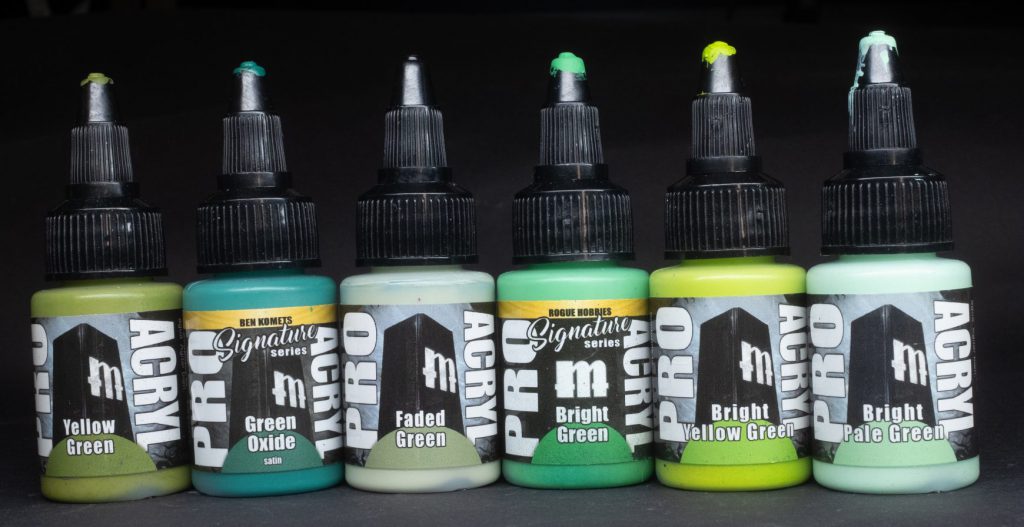
 Yellow Green – As the name suggests, this yellowy warm green could also be called chartreuse; it’s very punchy, fresh, and rich. Similar to Citadel’s Elysian Green I love this one as an ork-skin midtone.
Green Oxide – As the name suggests, Green Oxide is clearly intended to resemble the verdigris patina that covers oxidised bronze. It’s one of the colder greens in the ProAcryl toolbox and makes a pretty great combo when used in sync with Dark Emerald for things like the armour of the Sons of Horus. Used as a thinned down wash with either water or ProAcryl Newsh you can use Green Oxide to get some pretty nice oxidised bronze and copper effects. Again, it’s satin, again I don’t understand why.
Faded Green – This desaturated but very light/pale olive colour makes a nice brightest highlight colour for any of the military camo green applications, edge highlighting the armour of Cadian Shock Troopers and things like that. You could probably call it a Sage colour that fits neatly into all kinds of both natural and ghostly schemes.
Bright Green – Another of the Rogue Hobbies set, the clue is in the name with this one, it’s very bright cousin to the standard “Green”, saturation turned up to 200%. Not particularly warm, not particularly cool, Bright Green occupies the “all-purpose bright green” hole as though, like a mysterious fault in a Japanese cliff, that hole was made for it.
Bright Yellow Green – Close your eyes and imagine what “Acid” looks like in a cartoon. Did you actually close your eyes? Wow, I can’t believe they actually did it, now we can talk about them behind their back, they can’t read it! Haha, did you see that haircut? Wow, what were they thin- Oh, you’re still here huh? We weren’t talking about you, we were talking about Steve who reads this site sometimes. Anyway, if you imagined that cartoon acid you were almost certainly thinking the same tone as Bright Yellow Green, it’s eye-searingly saturated and bright. Use with caution to highlight your orks and goblins, jungle plants, phials of poison, Salamander space marines etc. Be careful, though, the goggles do nothing. Kinda like Moot Green but even more punchy.
Bright Pale Green – This very bright cold green has Spooky Spectres written all over it, wash a basecoat of this with some Green Oxide and you’re like 75% done with any of the gruesome ghosts in your miniature collection.
Blues
Oh wow, like a guitar player in 1930s Mississippi, ProAcryl really does have quite a large selection of blues.
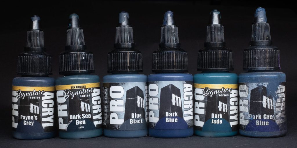
Payne’s Grey – Another paint from Vince Venturella’s signature series, Payne’s Grey is classic fine-art colour made from a mix of blue and black. PG serves as a nice chromatic black that’s less intense than pure black itself, being an ideal shader for both hot and cold base colours.
Dark Sea Ben – One of Ben Komets’ signature paints, and currently the only paint in the ProAcryl range that doesn’t really describe all that well what it is in the name: Dark Sea Ben is a dark, somewhat desaturated marine blue-green. I use this one quite to create an easy blue-green shadow upon which I can build just about anything. It’s also satin, for some reason.
Blue Black – Blue Black is a heavily desaturated greyish dark blue colour, sort of like Citadel’s The Fang, and as with that paint it’s going to be absolutely essential if you want to paint Space Wolves or the box-art scheme of the Death Korps of Krieg.
Dark Blue – Far more saturated than Blue Black, Dark Blue lands squarely in the Navy Blue category, somewhere between Kantor Blue and Night Lords Blue, and like those paints this one is absolutely ideal for Night Lords, Crimson Fists, and the cloth on Hammers of Sigmar Stormcast Eternals.
Dark Jade – One from the Vince Venturella signature series, Dark Jade is a very deep and rich teal, far more green than the turquoises present elsewhere in the range. I used this one for obsidian on the Seraphon I painted recently and I think it works super well for that kind of application, as well as… for various Jade things (no way, really?)
Dark Grey Blue – The darker more emo cousin of Grey Blue, DGB is a nice clean shadow colour that sits neatly between Blue Black and Dark Blue in terms of hue and slightly lighter than either.
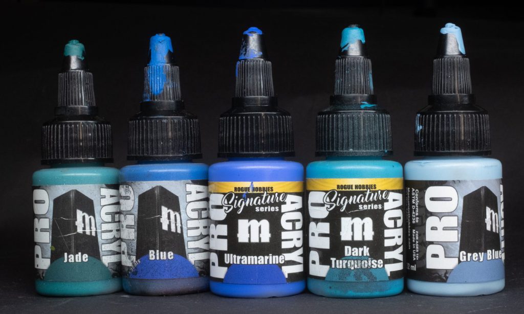
Jade – A very strong mid-value teal colour with tons of punch, it’s far greener than Dark Turquoise and fills that niche very nicely. If you’re painting 30k Sons of Horus or Tomb Kings of Khemri you need this paint, no questions. Unsurprisingly it’s also really good for painting things made of Jade. I know, hard to believe, but it’s true.
Blue – Another paint with an incredibly descriptive name, Blue sits neatly in the middle of the spectrum of, well, blues. It’s saturated and punchy, in citadel terms I’d say this paint is very similar to Teclis Blue in hue and saturation. Ideal for High Elves, the shields of Settler’s Gain Cities of Sigmar troopers, and anything else that needs a very strong blue. Speaking of strong blues…
Ultramarine – Another from Louise Sugden’s Rogue Hobbies signature set, in several livestreams and videos I’ve seen her describe this paint as “the vantablack of blues” and I think she’s right, this paint is so overwhelmingly blue. Like the Bismuth Yellow from the same set, Ultramarine is a single pigment paint – it’s said that single-pigment paints have a higher “mix tolerance;” what this means in practise is that they are better at mixing than paints containing several different pigments. Ultramarine is the fanciest blue pigment and having a single-pigment paint with just that is very very nice. If you’re serious about mixing colours you should definitely give this one a try. Unsurprisingly it’s pretty good for painting bright saturated Ultramarines.
Dark Turquoise – Another of Louise Sugden’s Rogue Hobbies signature set, Dark Turquoise is a perfect high-saturation companion to the regular Turquoise featured in the ProAcryl line. The Dark part is perhaps a misnomer – presumably added because the much brighter paint is called simply Turquoise, it’s not that dark. I’m a big fan of turquoise and use it wherever I can so of course I’m delighted to have such a strong turquoise in my paint drawer. This one is perfect for painting Khemri, Thousand Sons, or Craftworld Iybraesil. In Citadel terms this one is sort of like a mix of Thousand Sons Blue and Ahriman Blue.
Grey Blue – A companion to both Dark Grey Blue and Blue Black, Grey Blue is a nice desaturated mid-light cold grey that looks to my eye like Fenrisian Grey, and as such it’s absolutely perfect for doing the edge highlights on your howlin’ Space Wolves.
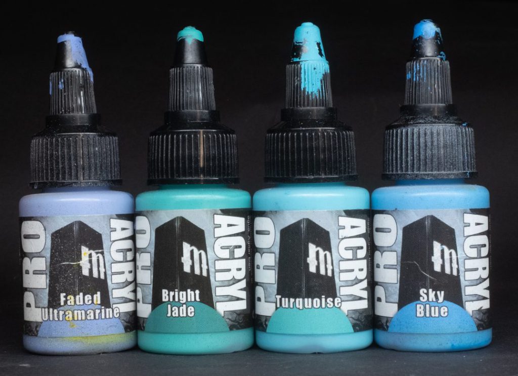
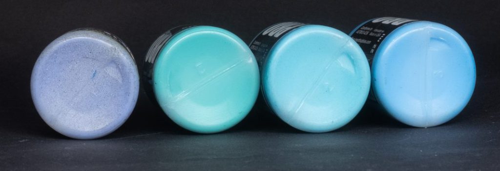
Faded Ultramarine – A faded version of the Ultramarine featured in the Rogue Hobbies set, unlike that paint this one isn’t single pigment, but it still works very nicely as a desaturated bright paint that can easily highlight all kinds of cool blues. It’s like a slightly darker, more saturated version of Russ Grey
Bright Jade – The highlight colour of the Jade pseudo-triad, Bright Jade is powerful. You can really see the lush green in the mix, making it perfect for highlighting teal things like Tomb Kings of Khemri, but also as a verdigris-style wash for your bronze, if you favour a more realistic colour that’s not too blue.
Turquoise – Somewhat confusingly named because this is quite a lot brighter than the standard turquoises you’ll find elsewhere. Light Turquoise might have been a better name for it. Anyway, it’s very nice and punchy, a bit like a mix of Temple Guard Blue and Baharroth Blue. I love Craftworld Iybraesil so it’s no surprise that I use this paint quite a lot.
Sky Blue – The brightest and lightest of the blue family, Sky Blue has quite an apt name. It’s wonderfully saturated while also being quite delicate, I love this colour for painting highlights over the other saturated blues on High Elves, Deathskulls orks, Space Marines, and Stormcast Eternals.
Purples and Magentas
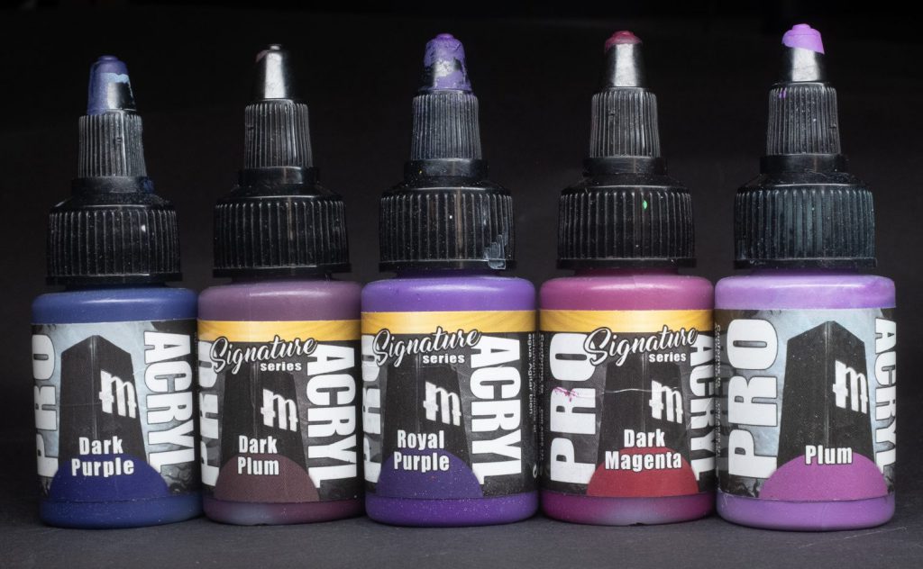
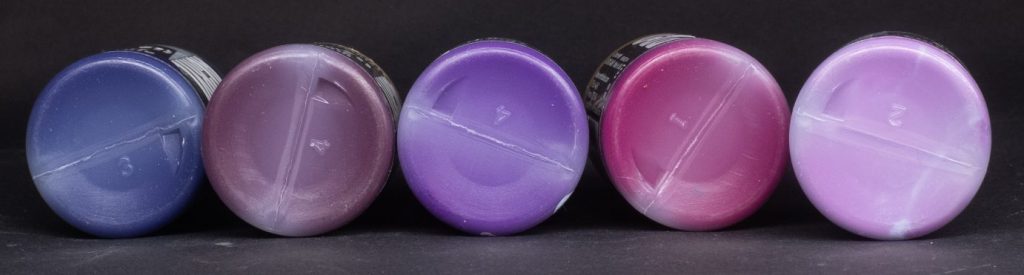
Dark Purple – As the name suggests, this is a nice dark cool purple in the Naggaroth Night mode, ideal as a shadow tone for any of the other purples. When added to white, this paint produces some particularly nice cool violet tones as well, versatile!
Dark Plum – Unlike Dark Purple, Dark Plum sits on the other end of the hue scale as a much warmer almost-reddish purple shadow tone. Hue-wise you might say that it’s a bit like Screamer Pink – perfect as a a shadow for tongues, gums, tentacles, and any other pink gribbly bits you’d care to mention. This paint is part of the Ninjon signature series.
Royal Purple – Rich and regal, as the name suggests Royal Purple draws on the historic connection between purple and royalty, this paint from the Vince Venturella signature series is not really a copy of the Tyrian Purple beloved of Roman emperors and their families but it is very pretty, and great as a midtone for all manner of cloaks, banners, alien skins, and heresy Emperor’s Children Space Marines!
Dark Magenta – Another paint from the Ninjon signature series, Dark Magenta is a good approximation of the artist standard Quinacridone Magenta tone – deep, rich, and intensely saturated, ideal for shading various kinds of pinks and reds while maintaining a strong and vibrant appearance.
Plum – Not only a fruit or Professor implicated in a mansion-based murder, Plum is typically a warm, almost brownish purple colour – ProAcryl’s Plum isn’t really like that (that’s Dark Plum, to you) but is more of a rather vibrant purple-fuschia colour. I used it on the feathers of my Baharroth and the plume of my Lhykis, it’s a great colour for a kind of otherworldly mega-punch.
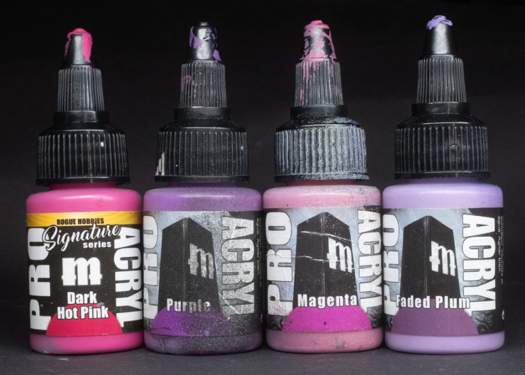
Dark Hot Pink – Another of the Rogue Hobbies signature series, Dark Hot Pink stands alone as the Dark version of a paint that currently doesn’t feature in the ProAcryl range. As you might expect from the Rogue Hobbies association, this paint is extremely punchy, with an 18-wheeler full of saturation jackknifing on the motorway.
Purple – One of those paints (alongside Blue and Green) with simple incredibly non-specific nomenclature; it doesn’t tell you what kind of purple it is, only that it’s purple. Ah well, this paint is a kind of boosted lavender colour, and as with all the paints in this family it’s very vibrant and saturated.
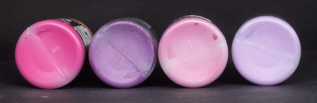
Magenta – One of the most important tones in any painter’s toolbox, it’s also one of my all-time favs, Magenta rules, I love it. However, perhaps there’s a problem with the bottle I got years ago but this Magenta doesn’t really read as magenta to me, but more of a standard pink colour. The colour swatch on the label is absolutely magenta, but as you can see from my photograph the paint inside the bottle doesn’t match it. Shame. Nevertheless, this paint is a good strong pink in the Pink Horror kind of area.
Faded Plum – The brightened-with-white version of the regular Plum colour, which transforms it into a sort of pastel heather or lilac colour. Of all the colours in the ProAcryl set this is definitely the most Slaanesh-demon one, if a Keeper of Secrets features in your future you could definitely do worse than picking up a bottle of Faded Plum.
Browns
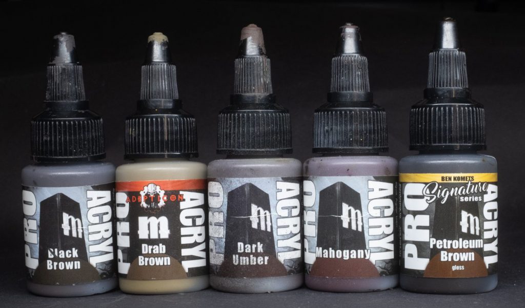
Black Brown – Similar to the artist colour Van Dyk Brown, Black Brown is a very very dark somewhat desaturated earthy brown. Great as a strong shadow tone for just about anything muted or dark, if you’re painting anything grimdark you need this paint.
Drab Brown – The kind of greenish sandy brown that often appears in military fatigues, especially in the 41st millennium, combine with a Khaki highlight to get a perfect Cadian cloth scheme. Also good for things like bandages and parchment in your grimdark sci-fi or fantasy setting.
Dark Umber – As the name suggests, Dark Umber is a shadowy earthen dark brown, although it is not as dark as Black Brown. Dark Umber is perfect for shading just about anything brown, when I go to shade leather I often reach for it.
Mahogany – A very rich ruddy brown which is actually a pretty good approximation for the colour of Mahogany wood. If you’re painting things made of nice wood, like a fancy carriage, the handle of a fine axe, or a piece of wooden furniture, this is definitely the paint of choice for you.
Petroleum Brown – A glossy oleaginous brown from the Ben Komets signature series, Petroleum Brown functions very handily as both a way to add greasy oil stains to your grimdark sci-fi vehicles and also as a way to shade gold metallics without reducing their shininess. A niche paint, but a useful one.
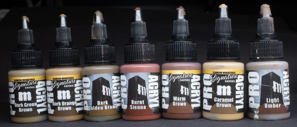
Dark Green Brown – From the Flameon signature series set, Dark Green Brown, similar to Drab Brown, has (no surprises here) a greenish undertone that’s ideal for both natural and camo applications. As the Flameon signature set takes its inspiration from his notable gold NMM, this paint is certainly designed with that in mind too, representing the greeny shadow tones that gold can have.
Dark Orange Brown – Another of the Flameon signature series, Dark Orange Brown is (I hope you’re sitting down for this) a dark orange brown. No way! Really?! Yes! Good for painting the shadows of red hair, leather, and various orange things, this paint presumably represents the shadows of a bronze NMM scale.
Dark Golden Brown – Strange paint, this one. Not because of the colour, it’s a darker version of the Golden Brown found in the “Yellows” section of this article, no, it’s strange because my bottle splits constantly. Unlike any of the other ProAcryl paints, the moment I look elsewhere the paint in the bottle neatly divides itself between two neat strata of a ruddy orange and a warm green. Getting them to recombine takes a hell of a lot of shaking, perhaps I received a faulty bottle or perhaps this is just normal for Dark Golden Brown, but it’s strange enough that it warranted a mention.
The colour? Oh, right! Yes, the colour is a dark yellow-y ochre-y colour, if you’re shading a tan leather this is definitely the way to go.
Burnt Sienna – I’m a sucker for an artist pigment and here’s a classic, Burnt Sienna is a tasty red-brown that neatly fills that Doombull Brown shaped hole in my heart. I love this one for a rich ruddy leather, brown furs, as well as a shadow colour for flaming red hair.
Warm Brown – From the Ninjon signature series, Warm Brown is as you might expect in a Mournfang Brown kind of mould, less intense than Burnt Sienna but with slightly more yellow as a compromise. It’s great for lea- [is he really just going to say that every brown paint is good for leather? Does this guy have no imagination at all?]
Caramel Brown – Yet another Flameon signature series brown, the guy sure loves his browns, this paint is really well named, it reminds me of the caramel in a Millionaire’s Shortbread (google it, you’ll see what I mean!). Caramel Brown is clearly intended as the midtone of the Flameon NMM Gold scale, it’s also great for light brown hair, as a very warm skin tone, and also as…. The natural material they make belts and shoes from.
Light Umber – The lightest of the ProAcryl browns, Light Umber is somewhat cool and desaturated compared to its siblings, the colour of dried mud and desert camo, Baneblade Brown is a pretty good comparison. Apart from the aforementioned dried mud and desert camo, Light Umber could also be used to highlight [don’t say it] all kinds of [don’t you dare say it] leather. [God damnit.]
Blacks and Greys
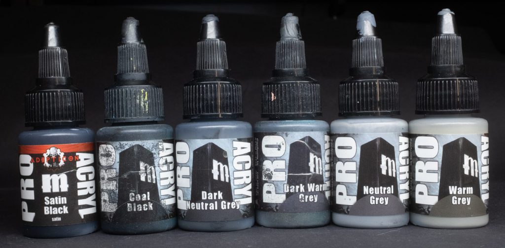
Satin Black – Maybe I’m just too square to get it, or my working method including a varnish has made me immune to it, but I’m a little stumped by Satin Black. It’s black…but it’s satin. If you want your black to be a bit more shiny than the other paints I guess this is one for you, but I’d definitely rather have –
Coal Black – A cool black, perfectly matt and flatter than a dutch bike path, it’s a little lighter than Satin Black by virtue of the matting, but it’s smoother and airbrushes much better.
Dark Neutral Grey – The ProAcryl greys consist of two “families” and a couple of outliers, this paint is the darkest member of the neutral grey triad – neither cool nor warm, Dark Neutral Grey is perfect for things like Black Templars, Raven Guard, or Ravenwing space marines, Adepta Sororitas armour, and all manner of death themed fantasy things – Lethis, Nighthaunt, Soulblight Gravelords, what have you.
Dark Warm Grey – Unlike DNG, Dark Warm Grey has a beige tone, that warmth pushing it closer to a dark old bone or ivory tone, obviously it’s also great for death themed things (this will be something of a theme when it comes to greys) and as a shade for feathers on white angel wings, for example.
Neutral Grey – The middle sibling of the Neutral Grey family, Neutral Grey is a great… neutral colour, for all sorts of battleship situations, the coats and fatigues of particularly grim Imperial Guard regiments, stonework, fur.. There are quite a lot of applications for a nice solid grey tone, you might call it Administratum Grey.
Warm Grey – A warm middle beige colour, like an slightly nicotine aged version of regular neutral grey. Does that make sense? I think it makes sense, let’s go with it.
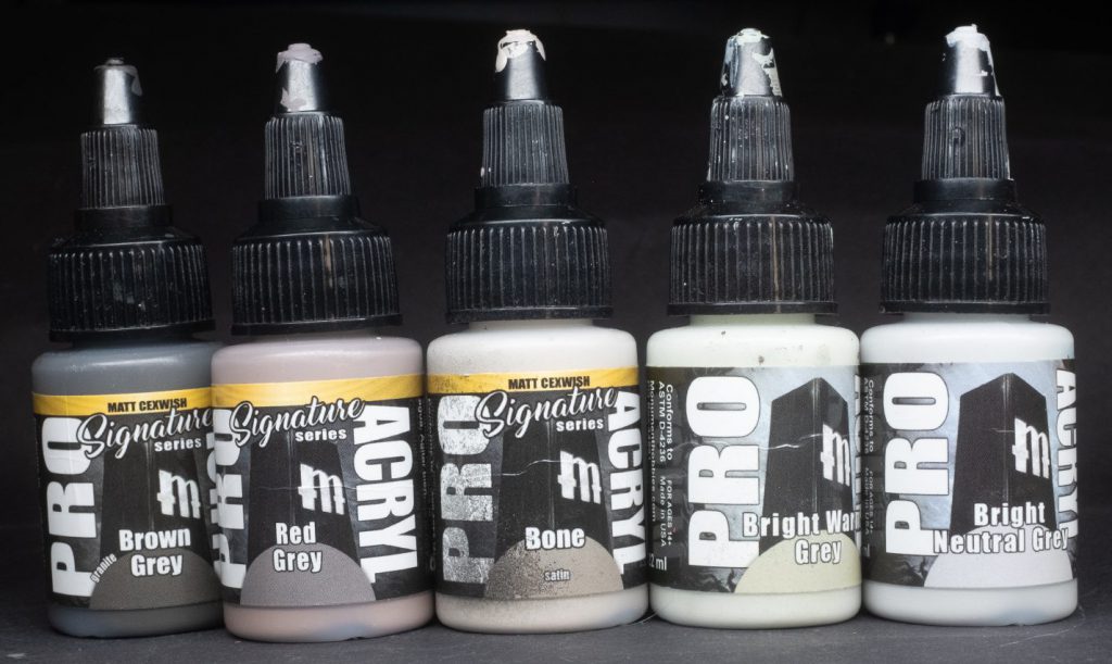
Brown Grey – The little text next to the colour name on this paint says Granite, and I think that’s pretty appropriate, they probably should have just called it Granite to be honest, It’s got a great earthen rock-y feel to it. Since it’s a grey it’s not saturated which I think compliments the selection of saturated browns in the Brown section of the ProAcryl catalogue, I really like this one and I don’t know that Citadel has anything that looks quite like it.
Red Grey – A Ninjon paint, Red Grey Is almost like an extremely desaturated red tone (see my article on colour mixing for what that means!) which is really really good for dead flesh, raw leather, zombies, anything that looks a bit like skin but with the colour drained out of it. You might think you don’t really need a paint like that, but you’d be surprised just how useful it really is.
Bone – This paint from the Matt Cexwish signature series very much does what it says on the tin, it’s a bone colour. In fact, it’s a great bone colour, eschewing the more yellowed ivory tones of the Citadel bone colours, Bone is more of a dark beige with a tiny hint of red, something like Rakarth Flesh (also one of my favourite paints, btw) you could definitely use this as a flesh tone for pallid people as well. But…. it’s satin! Whyyyy is it satin? Why do you do this to me, ProAcryl? Oh well, at least it’s not very satin, I can live with it.
Bright Warm Grey – A bright grey that’s also like a dark off-white, a bit like an old fridge, or any bit of old white plastic I used this instead of Deepkin Flesh for the off-white parts of the armour of my Votann lads and lasses, it’s a pretty close comparison.
Bright Neutral Grey – The brightest of the Neutral Grey family, not surprisingly, this colour is pretty useful for easily brightening and desaturating colours to make tones as well as for doing edge highlights on things that are, well, black. Adepta Sororitas armour, Black Templars, Raven Guard, Black Legion, all of these factions will love Bright Neutral Grey.

Whites
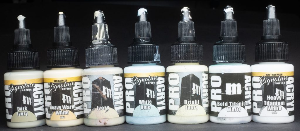
Dark Ivory – The darkest member of the Ivory triad, this paint is part of the Ninjon signature series, as you can imagine from the name, it’s a good base shadow tone for bones, tusks, claws, and all manner of warm white applications.
Heavy Warm White – Part of the Ben Komets signature series, and one of two heavy body paints in the current ProAcryl roster, HWW is a thicker, goopier consistency than the rest of the ProAcryl line. Some small subtext saying “Loaded Brush” next to the paint name lets you know the apparently intended use case for this paint, though I’ve found it pretty good both for mixing and for just doing very precise white highlights on all kinds of things.
Ivory – As you might expect, this paint is ivory coloured, a nice pale-ish beige. The use cases are pretty much the same as Dark Ivory; it works nicely as a mid-tone for bones, parchment, tusks, claws etc – also works well as a pale highlight for various kinds of brown.
White Blue – Part of the Vince Venturella signature series, presumably following on from his excellent video about the use of chromatic whites. White Blue is an icy white that works very well as a final brightest highlight for blues and as a cool mixer to highlight blues without losing too much saturation, and as a highlight and hue-shift for any other colour.
Bright Ivory – The lightest of the ivory triad, the uses are very much the same as the others.
Bold Titanium White – Perhaps ProAcryl’s most famous paint, at least among the people I know. Bold Titanium White is an extremely bright, very strong, and unusually opaque white paint – white paint usually covers like complete ass, but not so with this little wonder, it’s absolutely magic. I dunno how the wizards at Monument Hobbies managed it, but they might have made the best white miniature paint on the market.
Heavy Titanium White – A heavy body version of the Bold Titanium White and part of the Matt Cexwish signature series, it appears this paint is also intended for a loaded brush application, but it’s also really great for sharp, defined white highlights.
Metallics
Note: All of these paints need a lot of really hard shaking to mix the glitter/mica flakes into the paint properly, if you don’t you’ll probably find that they’ve separated in the bottle, be warned!
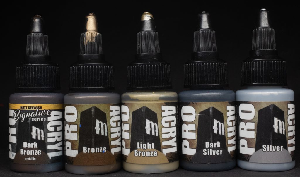
Dark Bronze – Part of the Matt Cexwish signature series, Dark Bronze is a very rich dark brown metallic colour that’s very similar to the renowned Scalecolor Decayed Metal and Citadel Warplock Bronze. Perfect as a base for all kinds of bronzes and brasses – Skaven stuff, chaos space marine trim, Khorne, you name it.
Bronze – Unlike the overly saturated orange/coppery “Bronze” colours of other manufacturers, ProAcryl Bronze does actually look like the beautiful bronze of an old statue, not too shiny, not too saturated, just perfect. Love this one.
Light Bronze – An ideal counterpart for the other ProAcryl bronzes, I love this one drybrushed over a coat of plain Bronze to give that lovely scratchy old scuffed metal look.
Dark Silver – Perhaps a slight misnomer, because while this paint is certainly a Dark Silver, I think it would mostly be used as a representation of iron or dark steel rather than silver. Quibbling aside, this paint works nicely as a shadow for swords, armour, wrought iron, all sorts of things.
Silver – Yep. It’s silver alright, no denying that. Very useful to edge highlight all sorts of metallic paints and as a mixer to brighten any of the other metallic paints.
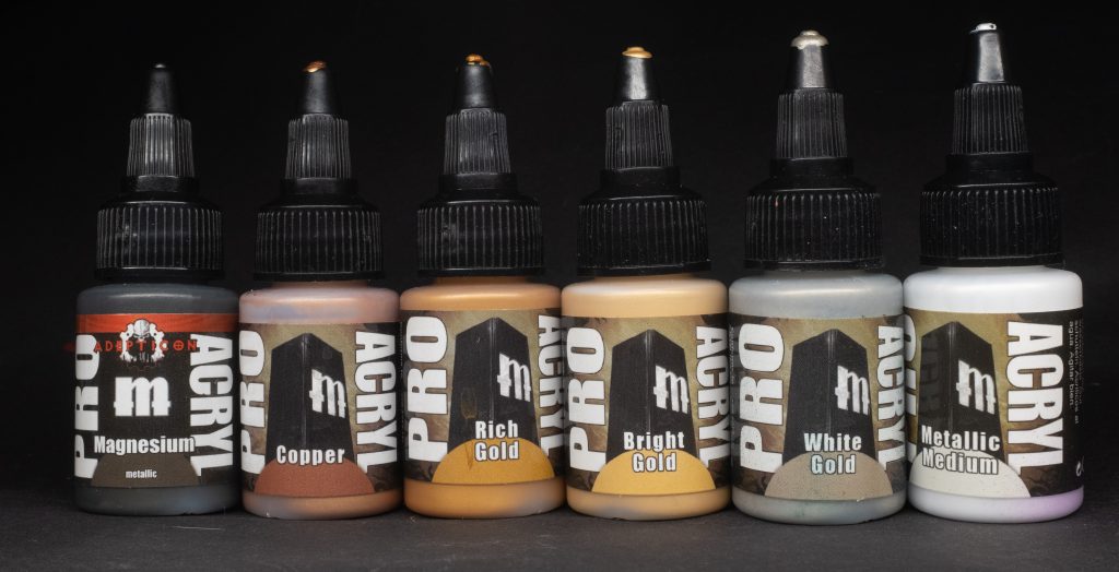
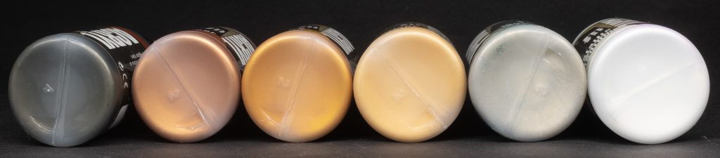
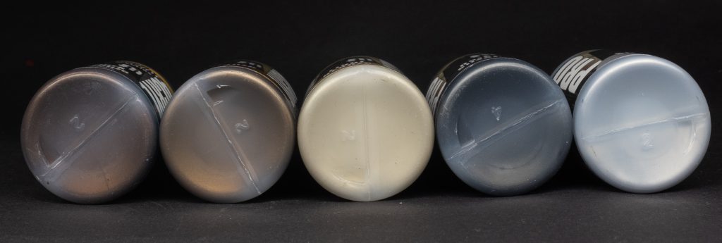
Magnesium – Part of the Adepticon set, Magnesium is a weird sort of brownish silver. I have to admit I have no idea what actual magnesium looks like so I can’t tell you whether this paint looks like it or not. Good for adding a little colour variation for breaking up the silverness of things like pipes, exhausts et cetera.
Copper – A perfect imitation of its metallic namesake, copper is bright and saturated with a deep reddy-orange tint. If Bronze isn’t saturated enough for you, use a bit of this for some incredible pop. You can’t beat it (geddit?)
Rich Gold – The darkest of the three ProAcryl golds, Rich Gold is a bit like Citadel Retributor Armour in both its orangey-yellow hue and bold saturation, it certainly packs a real punch. Ideal for the armour of Hammers of Sigmar Stormcast Eternals, the trim of Chaos Space Marines and all manner of jewellery and adornment.
Bright Gold – Lighter and more yellow than Rich Gold, Bright Gold is clearly intended to be the mid-tone over a Rich Gold base and for that I can’t fault it.
White Gold – Silver with the tiniest little hint of gold which makes it ideal for doing the final brightest highlights on any of the non-grey metallics in this list.
Metallic Medium – A fun paint that seems to have been unfairly overlooked by the internet in general, ProAcryl Metallic Medium is a colourless version of a metallic paint, into which you can mix any of the other colours to make a bespoke metallic shade. Need a turquoise metal for some Alpha Legionnaires? Just add some of your Dark Turquoise to some Metallic Medium and give it a really good mix. Unlike adding a transparent/contrast paint over a metallic base, mixing a paint into the medium keeps it as glittery and shiny as possible without any dulling of the metallic sheen. You might not think much of it, but very handy to have in your toolbox.
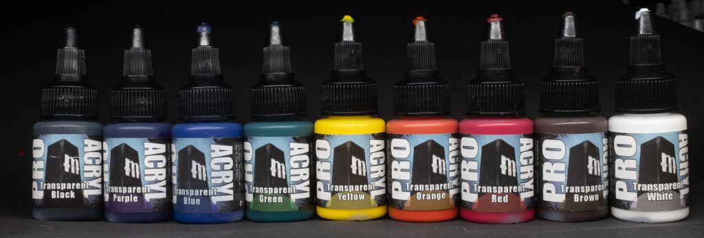
Transparents
Although these paints aren’t explicitly labeled as “inks”, they behave similarly to other ink products, both as a hue shifter and a saturation booster, plus when diluted with water or wash medium they work really well as shades as well. All of the transparents behave the same way, with the only real difference between them being their hue. Mix Trans Brown and Trans Black for a really punchy Agrax-but-more-saturated shade. Go over leather or wood with Trans Brown to really punch the saturation and unify your highlights. Trans Yellow is great for a sort of candle-light OSL. These things have a ton of versatility and certainly have a place in your toolbox.
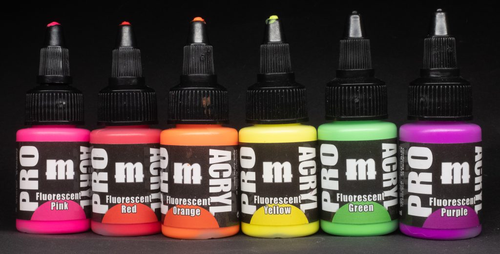
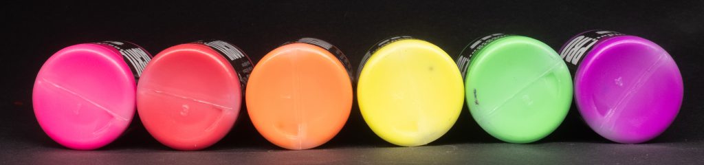
Fluorescents
NB: All fluorescent paints cover like absolute arse, so please mentally add “covers like arse” to the end of each of these descriptions. You’ll notice that there is no Blue in this category, according to the source this is because it’s very difficult to make a good fluorescent blue paint.
I’m a bit iffy on fluorescents honestly, but I tried them anyway, here are my impressions:
Fluorescent Red – A very punchy scarlet colour, great for glowing red lenses.
Fluorescent Green – Good for the old fashioned monochrome computer screens that adorn the 41st millennium.
Fluorescent Yellow – Eye-searingly bright, like if you ground up a high-vis jacket and made it into a paint.
Fluorescent Orange – Ideal for things that are either on fire or extremely hot, as you would expect, drag the paint around a bit to create a fun easy OSL.
Fluorescent Purple – A bit cyberpunk, this bright almost neon/argon colour is very futuristic.
Fluorescent Pink – I used this one for both the blade and eyes of my Lhykis model, it pops so much and looks so alien and weird.
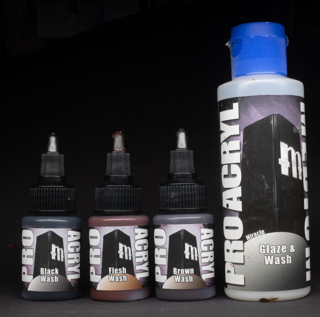
Washes and Medium
The three washes (Flesh, Brown, and Black) all behave the same way, flowing into recesses effortlessly with minimal staining of flat surfaces, which is nuts to me. These are acrylic washes but some how their capillary action is more like an oil or enamel, it’s very impressive.
Glaze & Wash Medium – Honestly I could probably write a whole article about this one just by itself, what an incredible tool for any painter. The label says “miracle” as a subscript by the main name and honestly, you know what? Fair play to you ProAcryl. If you want to thin colours to an incredibly thin glaze consistency (4 parts medium to 1 part paint) without them either splitting or becoming too fluid, this stuff is going to have you dancing in the street. Glaze blending with this stuff is so easy it almost feels like cheating. As a wash medium it’s also great, simply add roughly 4 parts medium and water to 1 part of any colour paint and watch in delight as it becomes a smooth recess finding monster. Incredible product, and best of all, it comes in a big old 120ml bottle.
Keewa’s Essential Picks
If you asked me to choose a set of my favourite 12 ProAcryl paints here’s what I’d go for:
- Ultramarine
- Bold Titanium White
- Bone
- Bold Pyrrole Red
- Burnt Red
- Dark Turquoise
- Golden Yellow
- Dark Bronze
- Transparent Brown
- Shadow Flesh
- Bronze
- Dark Flesh
Have any questions or feedback? Drop us a note in the comments below or email us at contact@goonhammer.com. Want articles like this linked in your inbox every Monday morning? Sign up for our newsletter. And don’t forget that you can support us on Patreon for backer rewards like early video content, Administratum access, an ad-free experience on our website and more.