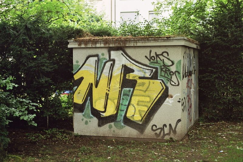
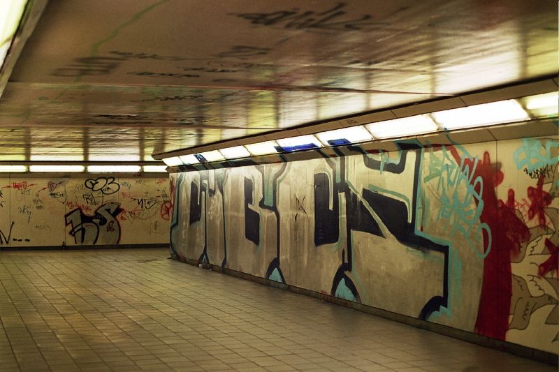
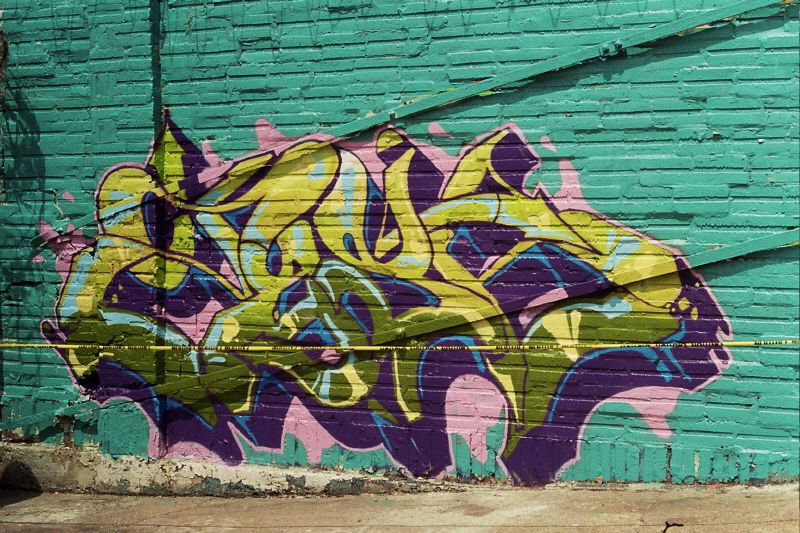
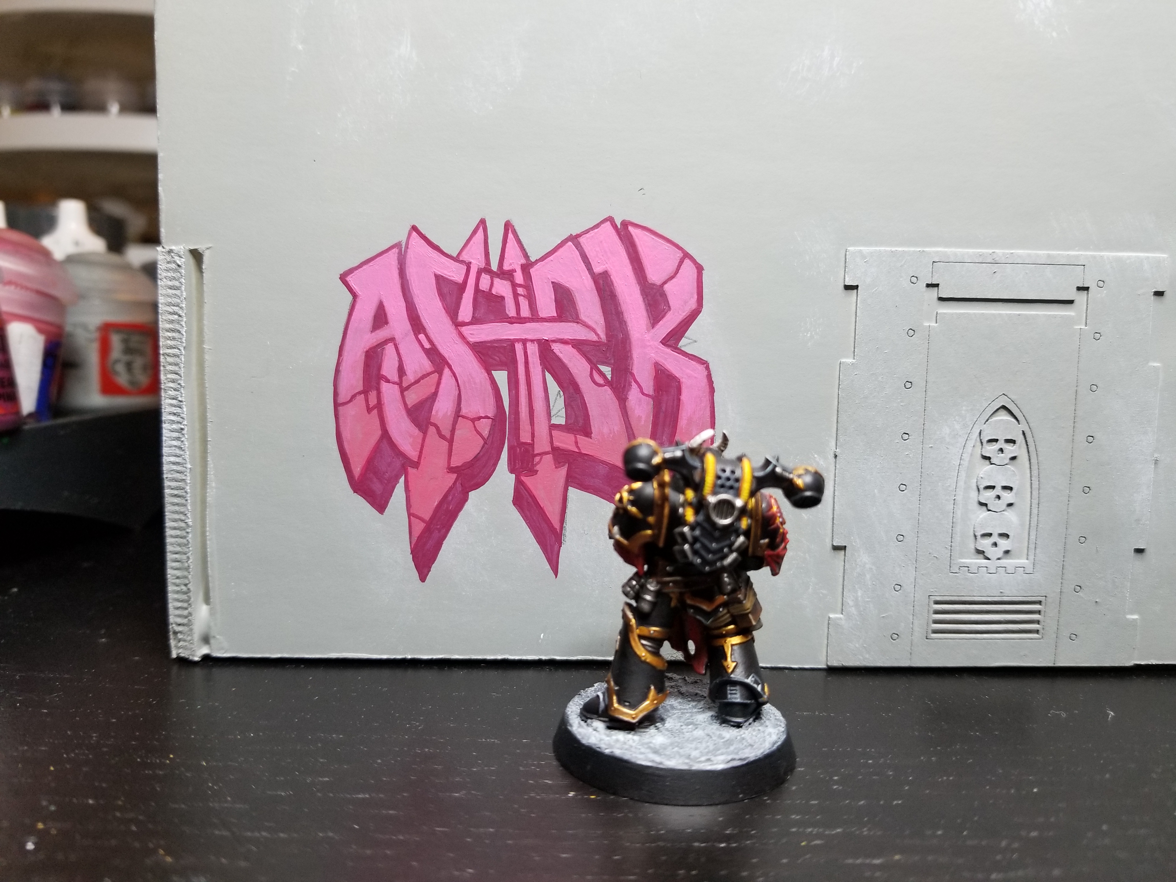
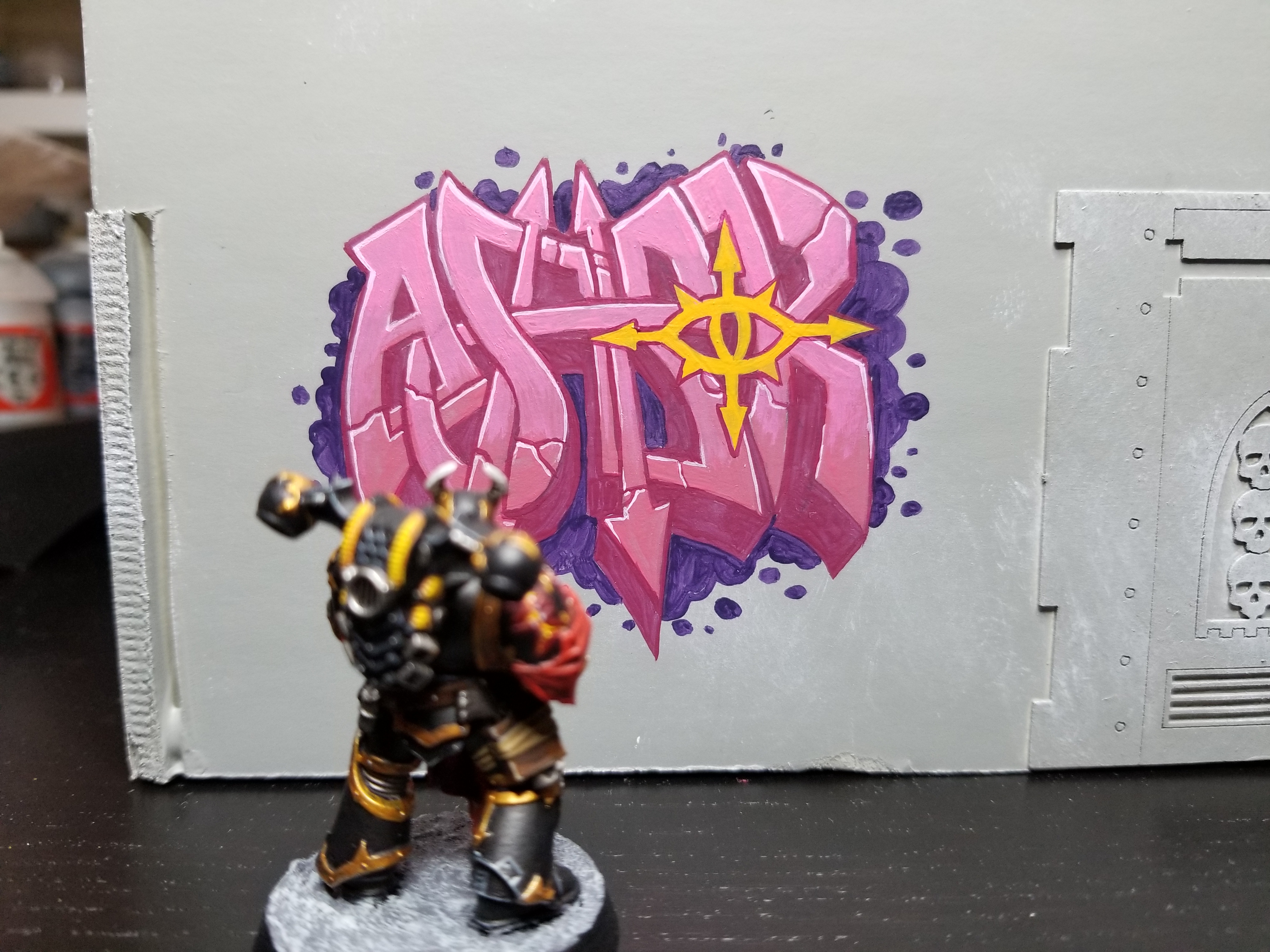
In Goonhammer’s How to Paint Everything series, we take a look at how to paint, well… everything. This week, Robert “TheChirurgeon” Jones is talking about graffiti — its history, how to paint it, and how you can add realism and color to your terrain by covering it in the spray-painted defiant messages of local gangs.
Graffiti – or street/wall art – is as old as human civilization. Or at least, as old as the part where we started building and living between walls. While you could point to cave paintings as examples of graffiti, that always felt like a stretch to me. Instead, I think we’d be better-served looking at ancient Greek and Roman examples as something more evocative of the modern concept.
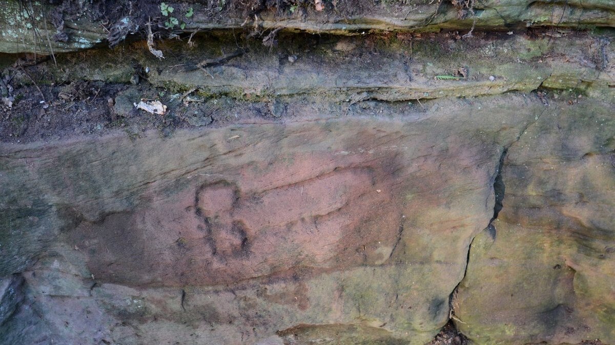
I don’t know about you, but I find it comforting to know that nearly two thousand years ago, the ancient Romans were scrawling genitalia on the walls in protest, much as I did in college that one time we went to the bar that had whiteboards and markers out for guests to use. If you think about it, I was just unfortunate enough to be born about 1,800 years late and the bouncer who threw us out was actually the one who was wrong.
Note: OK maybe not protest — phalluses were considered a symbol of good luck by the Romans, so maybe this wasn’t carved in protest. Who can say, really.
Modern graffiti as we know it seems to have originated in Philadelphia in the early 1960s (when you have time, search for Darryl “Cornbread” McCray) and then made its way to New York. In New York, the movement made subway cars its most prominent canvasses, and its most prolific artist, Taki 183, was featured in a New York Times story that brought graffiti into the mainstream and led to the city becoming the central hotbed of activity for the movement. Over the decade that followed, what started as acts of vandalism and simple tagging grew into an art form, albeit one that led to an out-and-out war between its artists and the municipalities they made their canvases. If you’re interested in learning more about this period, I’d highly recommend checking out the documentary Style Wars, which details the period and the graffiti culture, with a lot of additional focus on the overlapping breakdancing and rap cultures.
Crude drawings aside, I’ve always been fascinated by graffiti. As an illustrator and painter, I love the aesthetic and the work that goes into making art that’s ultimately so temporary, publically visible, and illegal. And it is — graffiti is art, but as an act of vandalism, it’s also a crime. Goonhammer doesn’t condone or endorse the cool, cool crime of tagging up a bunch of buildings and cars.
While my career as a graffiti artist growing up was sadly, not particularly long or fruitful — I lived in a rural area in high school and didn’t have a lot of opportunities to practice my shitty craft — creating the grimdark battlefields of the 41st millennium has given me the ability to kill two birds with one stone. Making urban battlefields gives me an opportunity to scratch the same itch, albeit in miniature.
Graffiti and Warhammer
In last week’s Narrative Forge, I talked about display tables and briefly mentioned some graffiti work I did on a statue, which led to a bunch of requests about how I painted it and graffiti art in 40k. If you want to add realism and character to your cityscape terrain, you need to add some street art in there. The more remote and dangerous a location you’re in, the more likely someone came in and tagged the joint. So let’s talk about adding graffiti to your terrain.
Types of Graffiti
Broadly speaking, there are nine types of graffiti:
Tags
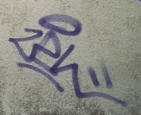
Tagging is the most basic type of graffiti. A tag is usually one color and the artist’s name/handle. In the graffiti community, it is considered rude as hell to tag over someone else’s tag or work. Note that this doesn’t mean it doesn’t happen — in fact, it happens all the time because people are shitheads.
Throw-Ups
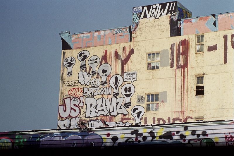
A throw-up is basically a more complicated tag. It’ll have 2+ colors, and usually involve filled-in block/bubble letters. Like tags, it’s something an artist will typically do over and over, and they’ll perfect the process so they can do it quickly.
Blockbusters
A blockbuster is a huge throw-up, basically. It’ll also be in block/bubble letters. Blockbusters are used to cover a big area (like a city block) in a short amount of time, and they’ll typically be designed to be painted with rollers.
WIldstyles
A Wildstyle is a stylized, elaborate version of a throw-up that typically does the same thing, but is really hard to read if you aren’t familiar with the way they’re written. They’ll include a lot of extra curves, angles, and arrows usually. If you’re painting graffiti on your 40k terrain, these will generally look the most like what people think of as graffiti, so doing one or two of these will go a long way toward establishing a particular look. I’ve got a tutorial on designing and painting one of these below.
Heavens
A Heaven is basically a Tag or Throw-up that’s in a really hard place to get to, usually high-up. The harder it is to get to the spot, the more respectable the work is.
Stencils
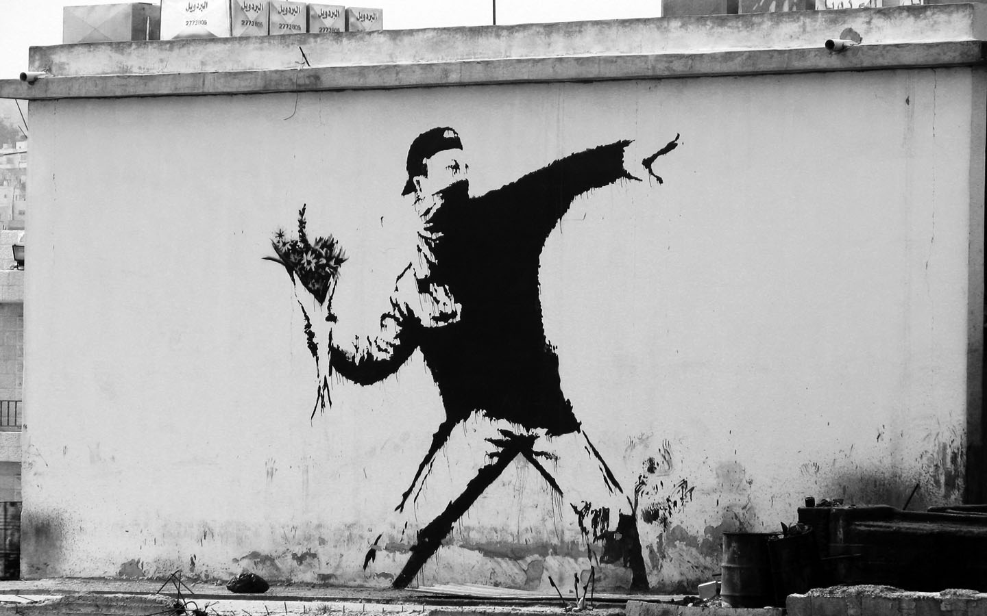
Stencils are just like they sound. You make a custom stencil, then spray it onto a surface. These are easily repeated and can be more detailed than a tag you’d do by hand, with sharper lines. Bansky uses a lot of custom stencils in his work. You can either make your own tiny stencils (a lot of work, but useful if you want to do the same thing over and over in your graffiti art), or you can replicate the general look of these by using a single color and avoiding closed loop shapes that might be impossible to achieve with a stencil.
Paste-Ups (Posters)
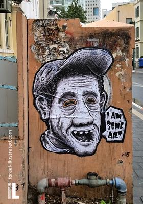
You make a poster at home, then put it up somewhere. Also repeatable, depending on your print situation. Faster to put up too, if you need to get something up and don’t have a lot of time. Faster to tear down too, though. Banksy’s done a lot of paste-ups in his work. You can make these in 40k by making the images on your computer, then printing them out on a piece of paper, cutting them, and gluing them to whatever model surface. Then paint them over with varnish and weathering effects for a more realistic finish.
Slaps (Stickers)

You make some custom stickers or doodle on a sticker surface, then slap it somewhere, like a tiny poster. A lot of these are done on postage stickers, because you can just steal a fistful of these for free from your local post office. If you’ve seen Into the Spider-Verse, Miles does a lot of these on “HELLO my name is _____” name tag stickers, which are also commonly used for slaps.
Pieces
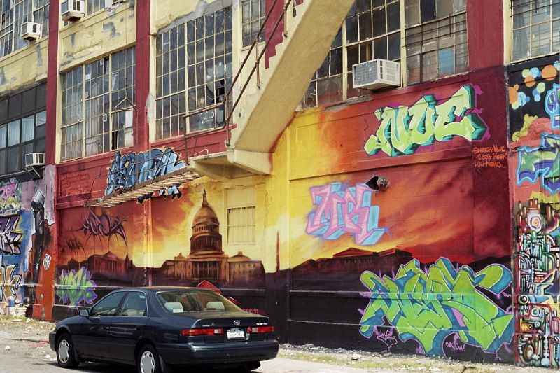
Short for “masterpiece.” Basically a large, standalone piece of art painted freehand. They usually go hard on these and they take a long time. For these, painting something very elaborate in a public place can be really hard because of the time it takes to do that without getting arrested. So a good, complex piece in a public space will earn you mad respect. In 40k, you see these a lot on vehicles already, where someone paints a crazy mural on the side of a tank. Doing these on terrain can be cool, but it can also just look like you painted a painting on the side of your terrain, which can make it challenging to create something that actually reads as graffiti visually. If you’re going to attempt this, there are a few things you can do to give it a more graffiti-esque look. The first is to use a visual style that reads more crudely as graffiti, and the second is to tag over it and use layering or weathering effects to make it obvious that it’s street art and not a mural someone painted that’s supposed to be there.
Making “Realistic” Graffiti For Your Faction
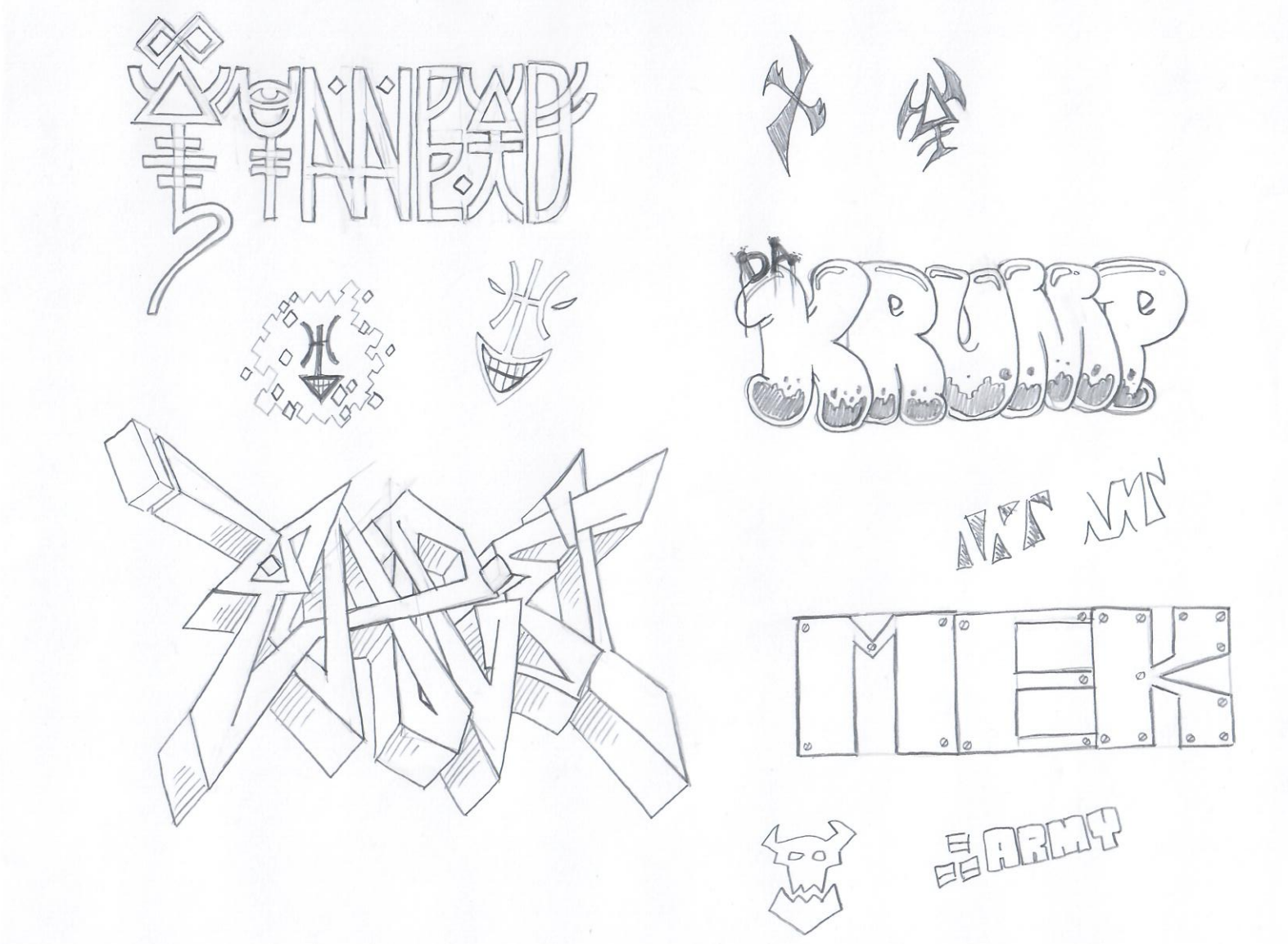
Making realistic graffiti starts with knowing your stuff. Understanding the types of graffiti above will help you figure out what type of look you’re going for, but the next step is doing your research. This is the fun part – you get to spend time looking up photos of rad graffiti online or, if you’re particularly enterprising, go out and explore your city for interesting examples and photograph them yourself.
Once you’ve done your research, you can start thinking about the kinds of graffiti you want to do and what you’re trying to communicate visually. Like everything we talk about in the Narrative Forge, this means telling a story. Graffiti is historically an act of rebellion and social disobedience. The messages and sentiment expressed will often reflect this, just as they’ll reflect the artists creating it. As you create your own graffiti, think about these questions and use that to inform your art. On that note, here are some ideas I’ve been noodling over here on each faction’s graffiti and what it might look like:
- Imperial Graffiti will come in all shapes and sizes, but I suspect most of it will be done by Necromunda-style gangs. That means lots of gang tags and territory markings, lots of anti-establishment messaging. There may also be lots of Imperial Cult messages as well. Astra Militarum graffiti is likely to be stencils and posters and look like recruitment ads. Because what are the Imperial Guard if not the galaxy’s largest gang of jackbooted thugs?
- Chaos Graffiti from cultists will incorporate a lot of religious and anti-Imperial messaging. I suspect cults do most of this type of marking, and do so on behalf of their Chaos Marine masters, but I like to imagine that the Alpha Legion post lots of subversive messaging and markings for their fronts, while the Emperor’s Children use lots of garish colors and appreciate the art. Chaos graffiti should incorporate a lot of chaos imagery, either the icons of the gods or the pointed stars (or both).
- Genestealer Cults will put up a lot of messages about worker solidarity and fighting an unfair system. For Genestealer Cults, graffiti would serve as a tool for spreading dissent, driving people to their cause, and Communist graffiti is going to be a good source of inspiration for these.
- Eldar appreciate a good art, especially Dark Eldar, who specialize in Heavens and also being rude as shit and tagging over other artists’ works. I envision Eldar graffiti as incorporating Eldar runes and a lot of thin lines and organic shapes. For Eldar, messages would likely revolve around the Ynnari, either for or against their cause. Or it might promote a particular aspect. For Dark Eldar, the messaging will probably promote or denigrate a particular Archon.
- Harlequins’ graffiti uses a lot of diamond/harlequin patterns, smiling imagery, and elaborate fades. It promotes the laughing god’s agenda, and is done with more flair and style than any other faction’s graffiti. Harlequin graffiti is gonna be like all pieces and wildstyles.
- Ork graffiti is brutal and quick. They aren’t artists per se, but they do love disrespecting things. Orks do a lot of territorial and clan/kultur markings, using a mix of ork glyphs and large, blocky letters with broad shapes and 90-degree angles. Orks would probably do a lot of tags and Throw-ups, maybe some stencils. Since Orks are all about doing whatever the hell they want when they aren’t rebelling, it’d be interesting to see stencils that call for conformity or following the rules. Or maybe something inspired by Shepard Fairey’s iconic “OBEY” design.
- Tau graffiti will be messaging that emphasizes the individual’s freedom over the greater good, probably speaking out against the Ethereals, or for the suffrage of enslaved species. Because disobedience may relatively new to them, I imagine their graffiti will be mostly tags and messages of disobedience rather than more elaborate art.
Let’s Tag Something
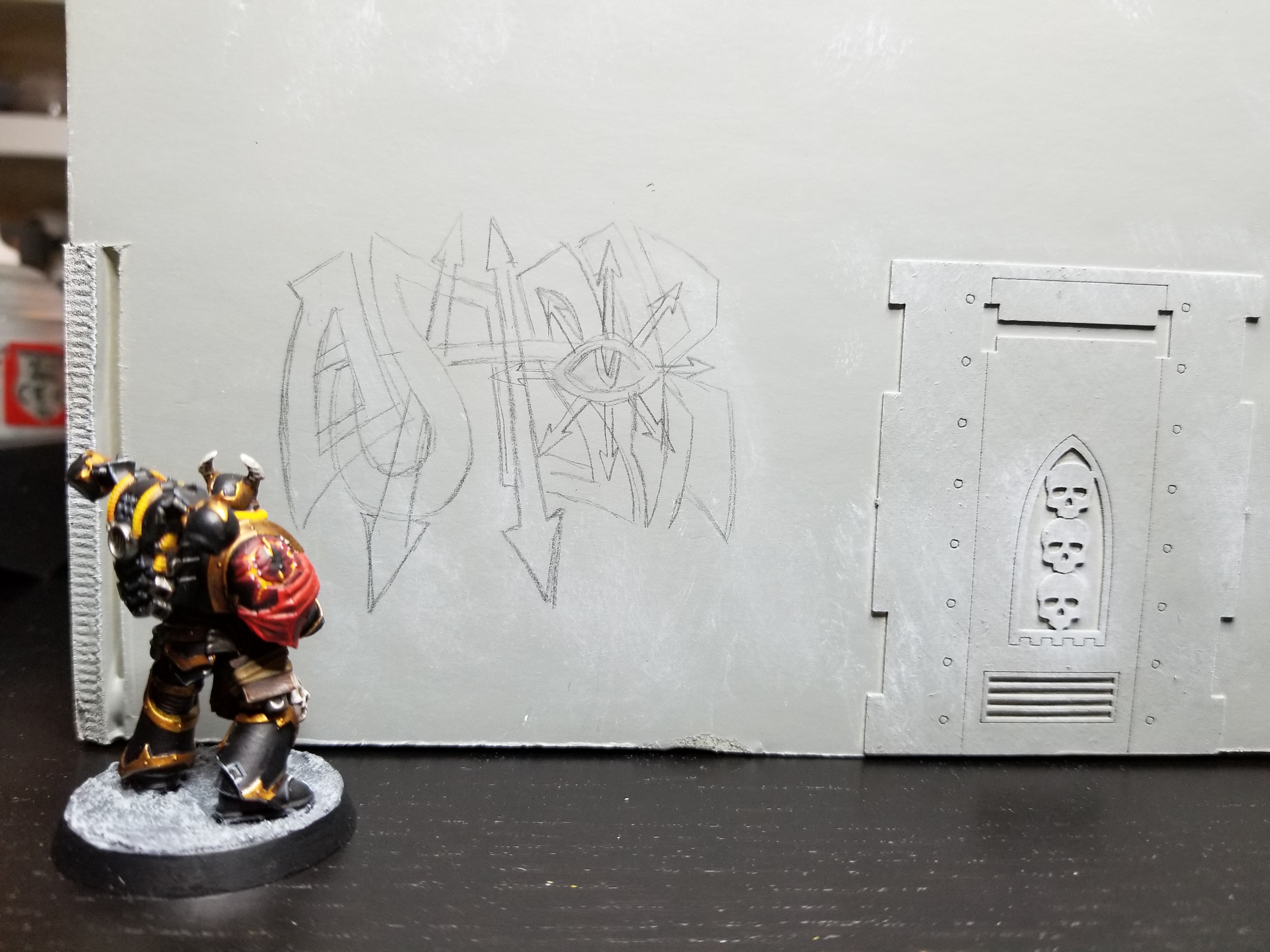
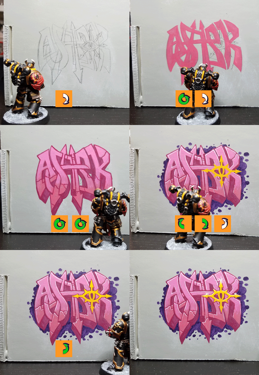
Alright, we’ve gone through the basics of graffiti and some ideas on how to create it for various factions. The first thing you gotta do is sketch up a plan. You won’t have to do this if you’re just doing a tag or throw-up and you know what you wanna do, but for more complex works, you want to have a more detailed plan of what you want. So start by sketching some things out, playing around with shapes and geometry. Do some line work and test things out.
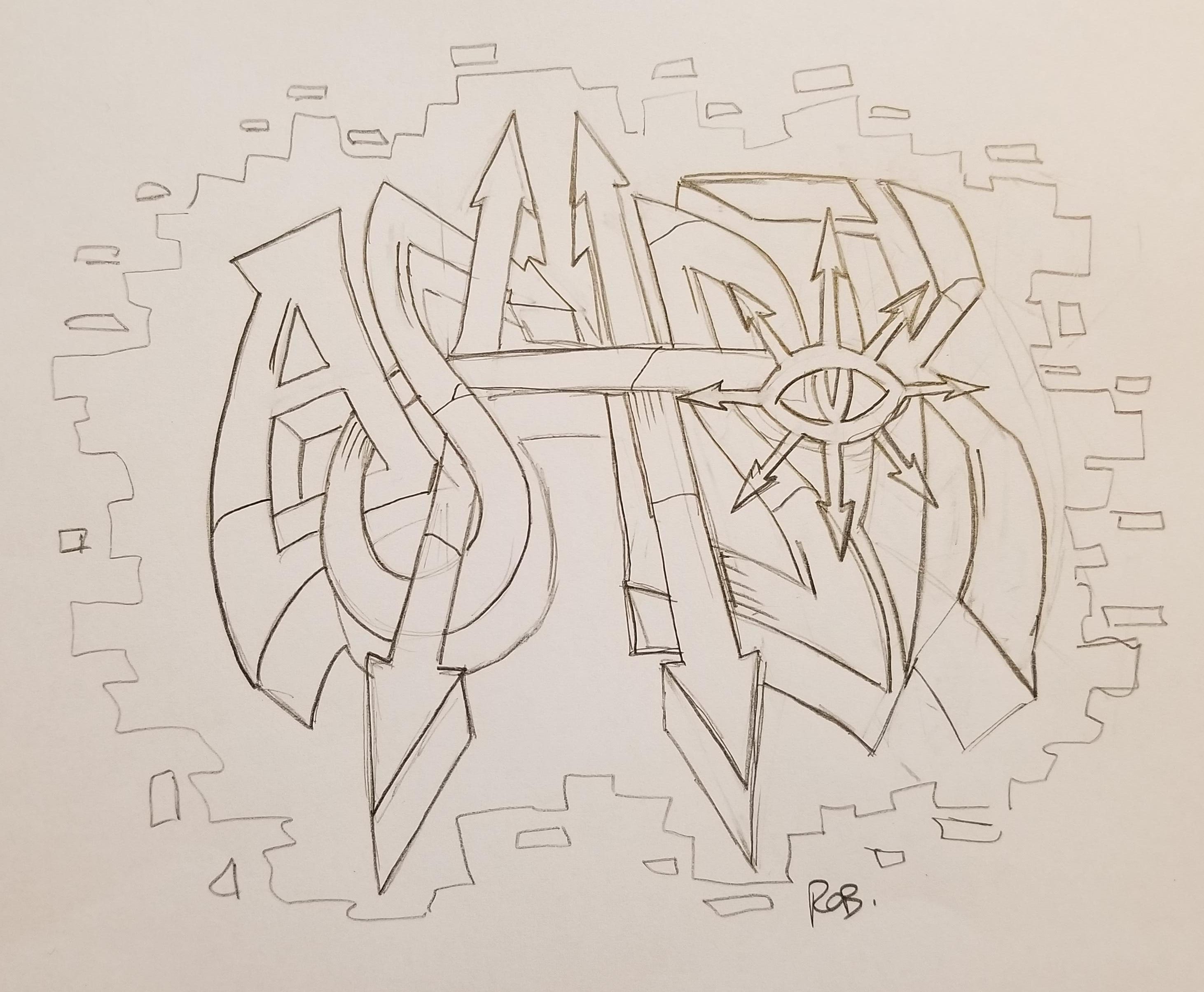
Then, sketch out what you want. Again, this all starts with a story. Who’s doing the tagging, and what are they trying to say? I wanted to do some chaos graffiti, and so I figured out I was going to do a Wildstyle, but I needed a name. Fortunately, Goonhammer created a name generator for Kill Teams some time ago. I fired that up and created a Black Legionnaire — Ashrok Korda. He’s a former member of the Emperor’s Children and a devotee of Slaanesh, so he’s an appreciator of art and wants to do works that he thinks will please Slaanesh. Also, he uses a lot of pinks and purples — old habits die hard. Here’s the sketch I came up with based on that. The idea here is to incorporate lots of pointed arrows and use the Eye of Horus as the “O”, to show his dedication to the Black Legion and rep Abaddon’s forces.
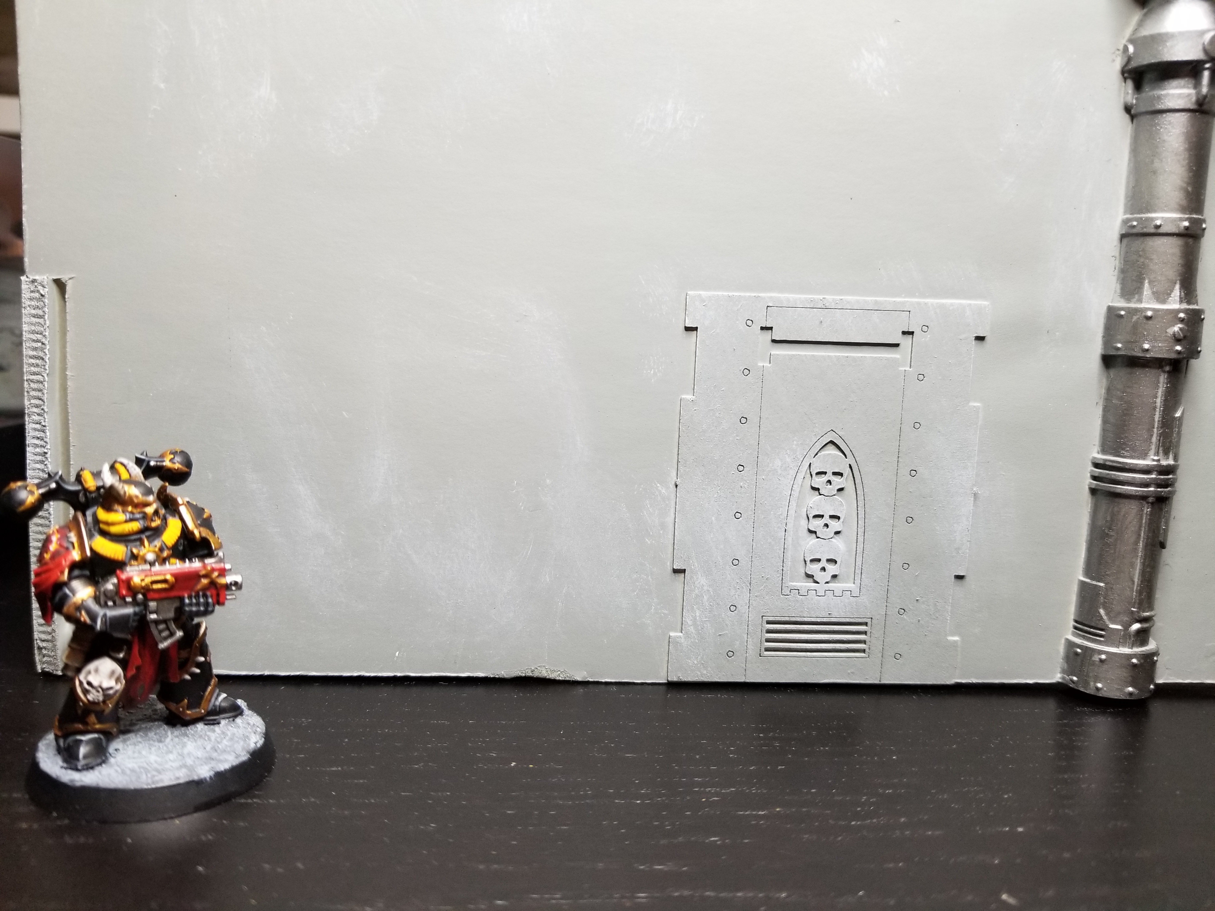
Next you need to find a suitable surface. Ideally this is a big open area of wall that’s largely flat, allowing you to lay out your design without having to worry about corners, weird crevasses, or odd geometry. The bigger your design, the more large, flat area you’re going to need. For this piece, I happened to have a large warehouse structure I built a while ago for an Astradus campaign game. That gave me a lot of room to work with. It’s not as visible as Ashrok would like, being on the back wall of an old hangar, but it’s a good space and he won’t have to worry about the local fuzz finding him while he works.
I start by sketching up the design on the wall. You can also start by laying down a base color if you like, then sketching over that. That’s especially helpful if you are trying to make it look like the artist primed their space before painting. In this case, I’m gonna add that “Under” layer later on, and the gray wall is fine to work with.
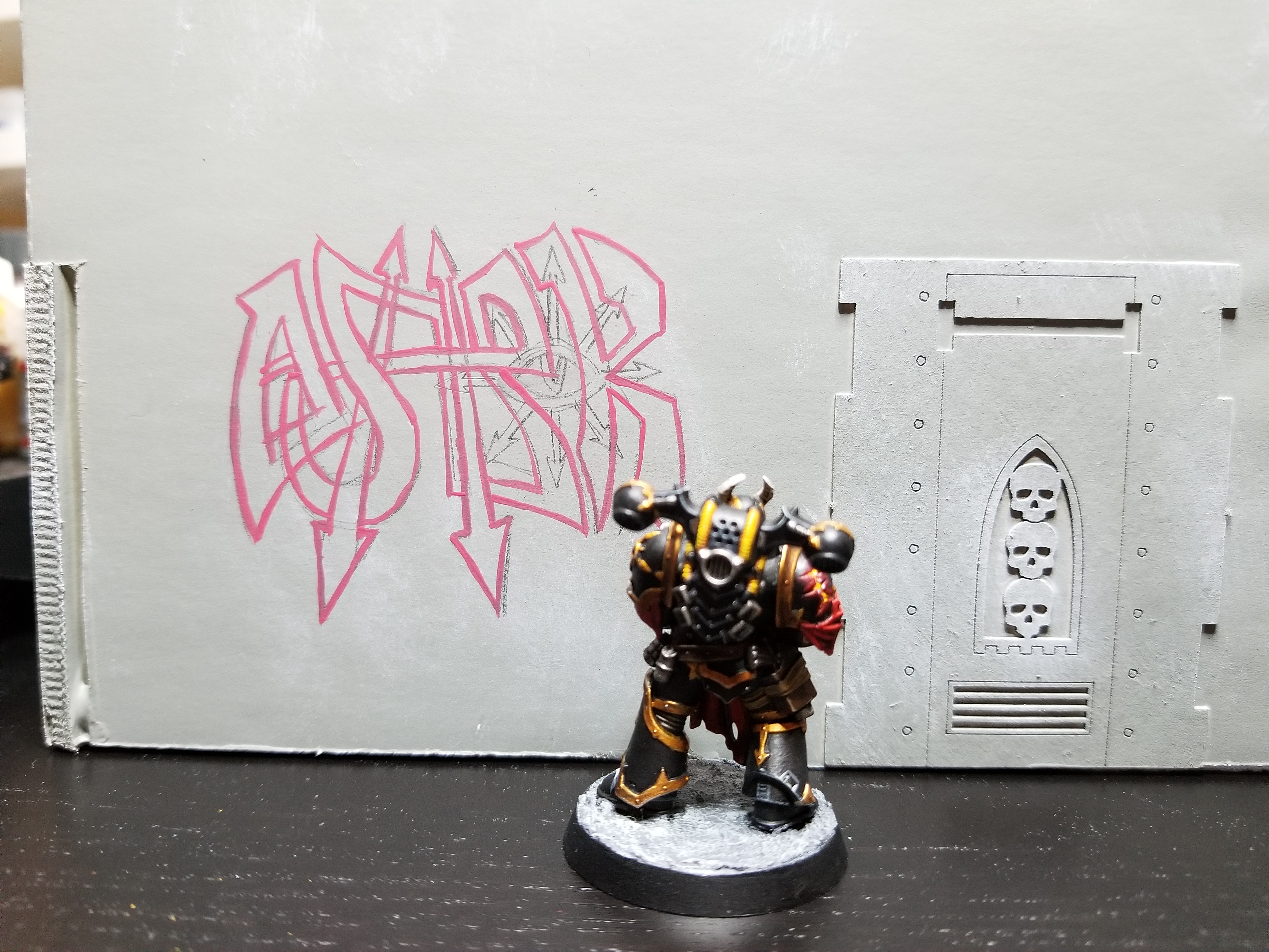
Once you’ve sketched things up and you’re happy with that, pick some colors. Trace the piece using your primary base color. In this case I’m using Pink Horror. I picked it because I own four shades of pink and it’s the third darkest. It also fit what I wanted to do with pinks on this. One of the upsides to painting graffiti on your terrain is that if you’re going for realism otherwise, you’re gonna end up with a lot of grays and browns and metallics and dingy scenery. Painting graffiti allows you to use bright colors that really stand out that you otherwise wouldn’t be able to get away with.
Then fill those sections in with the base color.
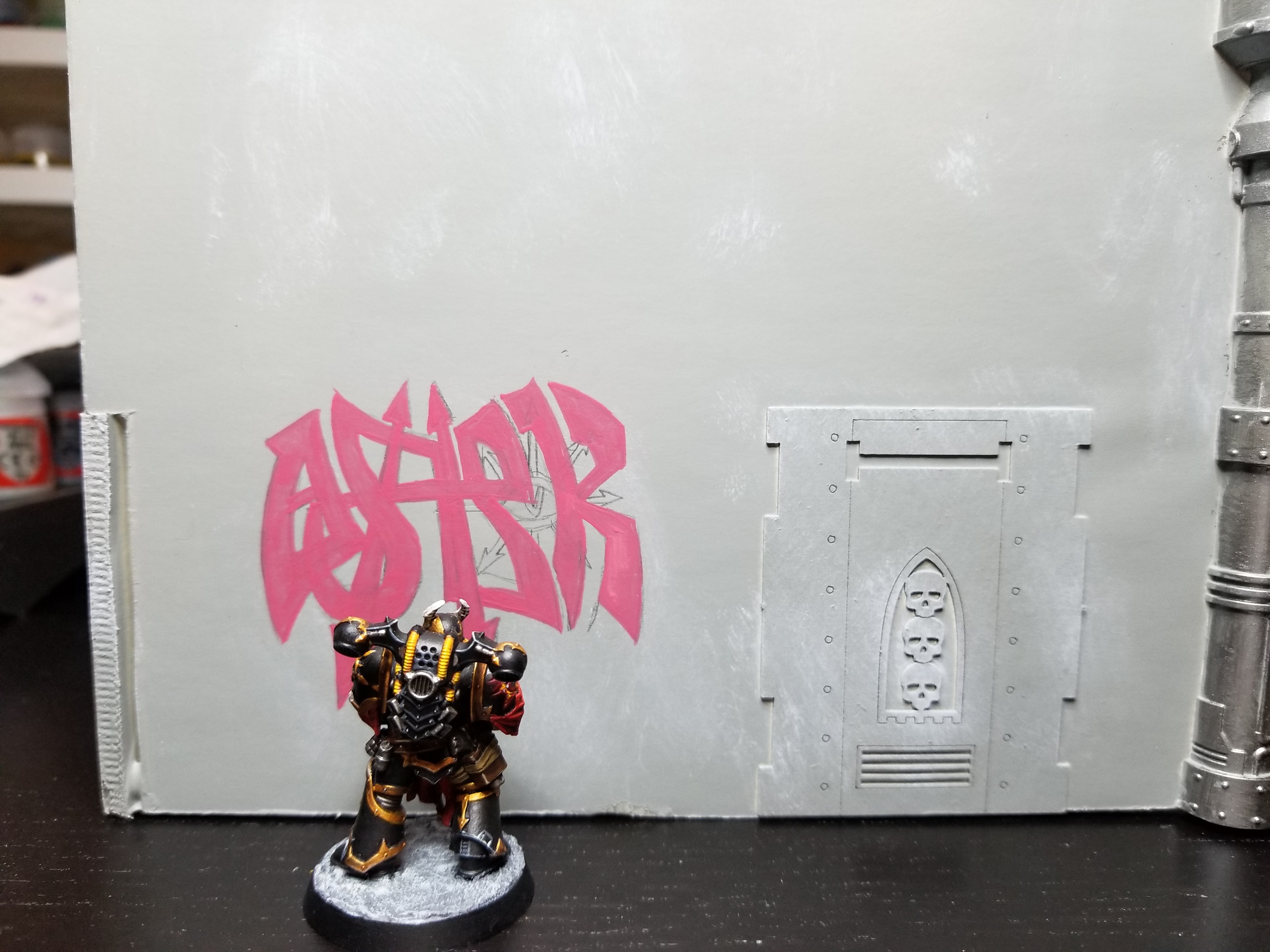
Next, outline the text with your dark gel and block out the 3D parts. When you do your 3D parts, make sure they’re either all going the same direction, or going in a way that makes sense from a perspective standpoint. If you aren’t familiar with perspective lines, start by just making all the lines go the same direction. If the lines aren’t going in a direction that makes sense visually, it’ll make your whole piece look off, and everyone will know you’re a poseur. The darker pink I used here for the outlines (sometimes called “outer gels”) is Screamer Pink.
Next, lay down your second color and work in the fades you’re looking for. At this step I added the cracks and other details I wanted in there. For the fades I basically just ran the brush until it was out of paint along the surface, going for a kind of drybrush fade. The lighter color being used here is Emperor’s Children pink. I also added in some cracks here with Screamer Pink.
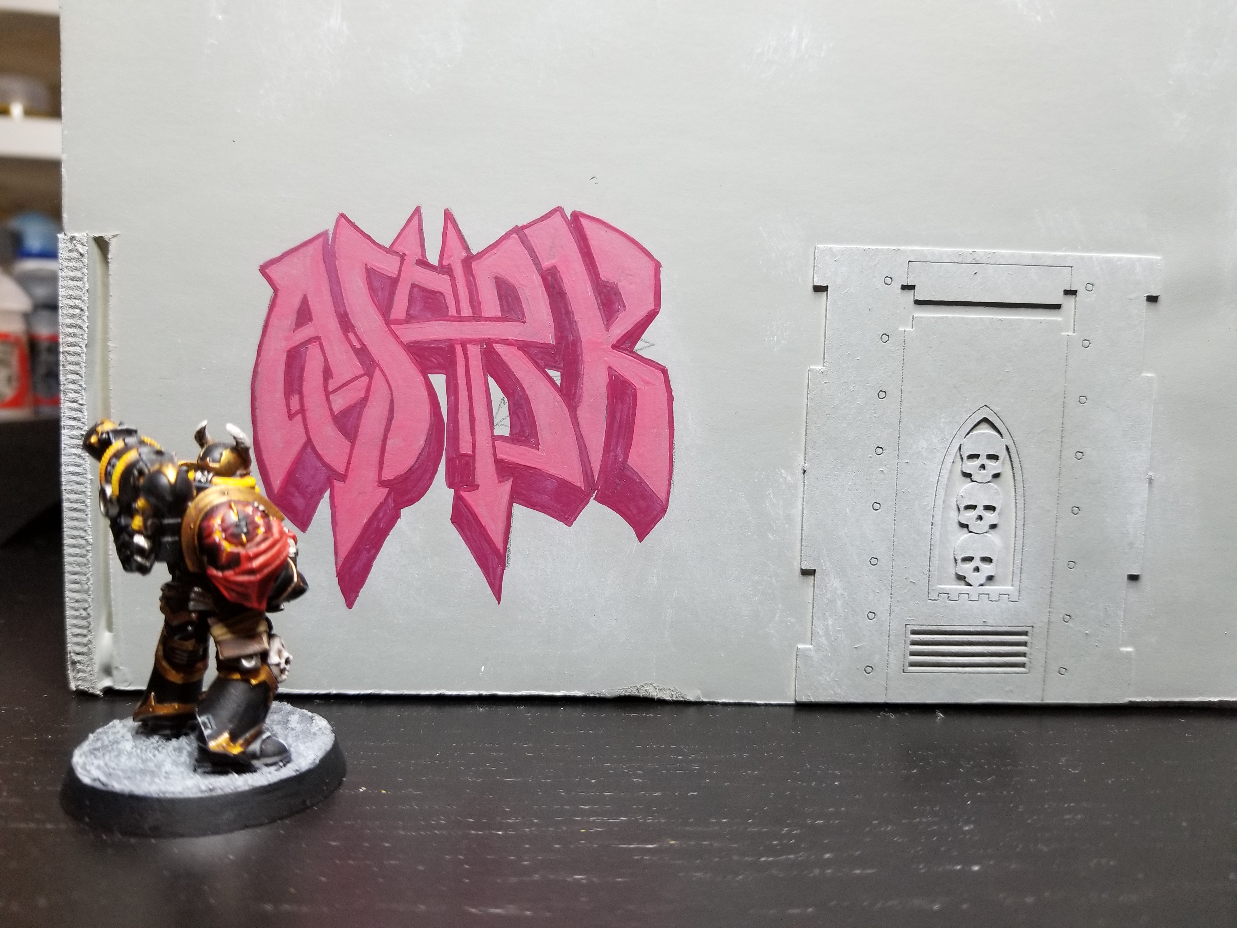
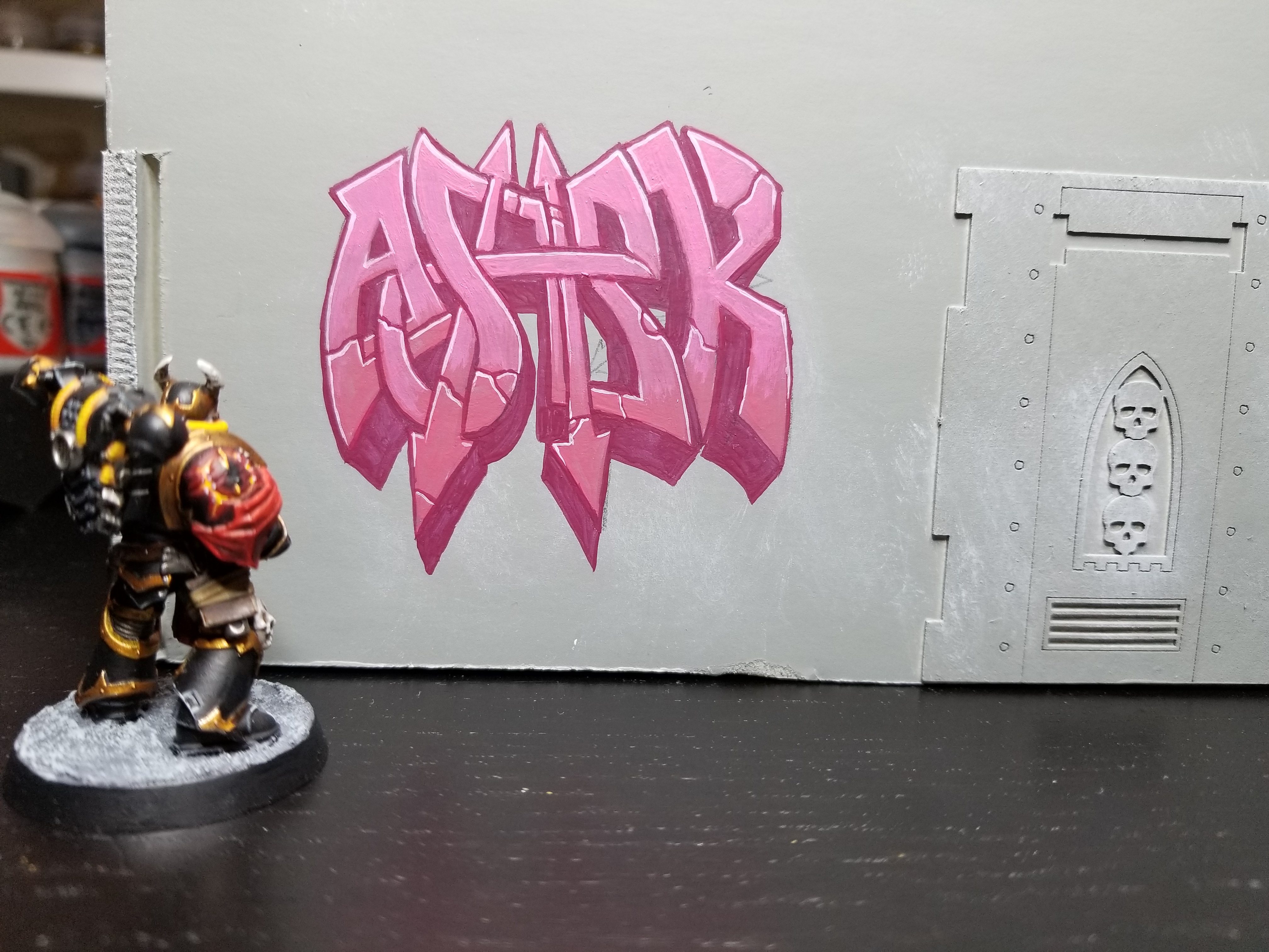
Drop in your light gel/highlight color. In this case, very light pink. I used Fulgrim Pink for this edging highlight color. Afterward, do some touch-up work with your dark gel, fixing outlines and re-lining cracks.
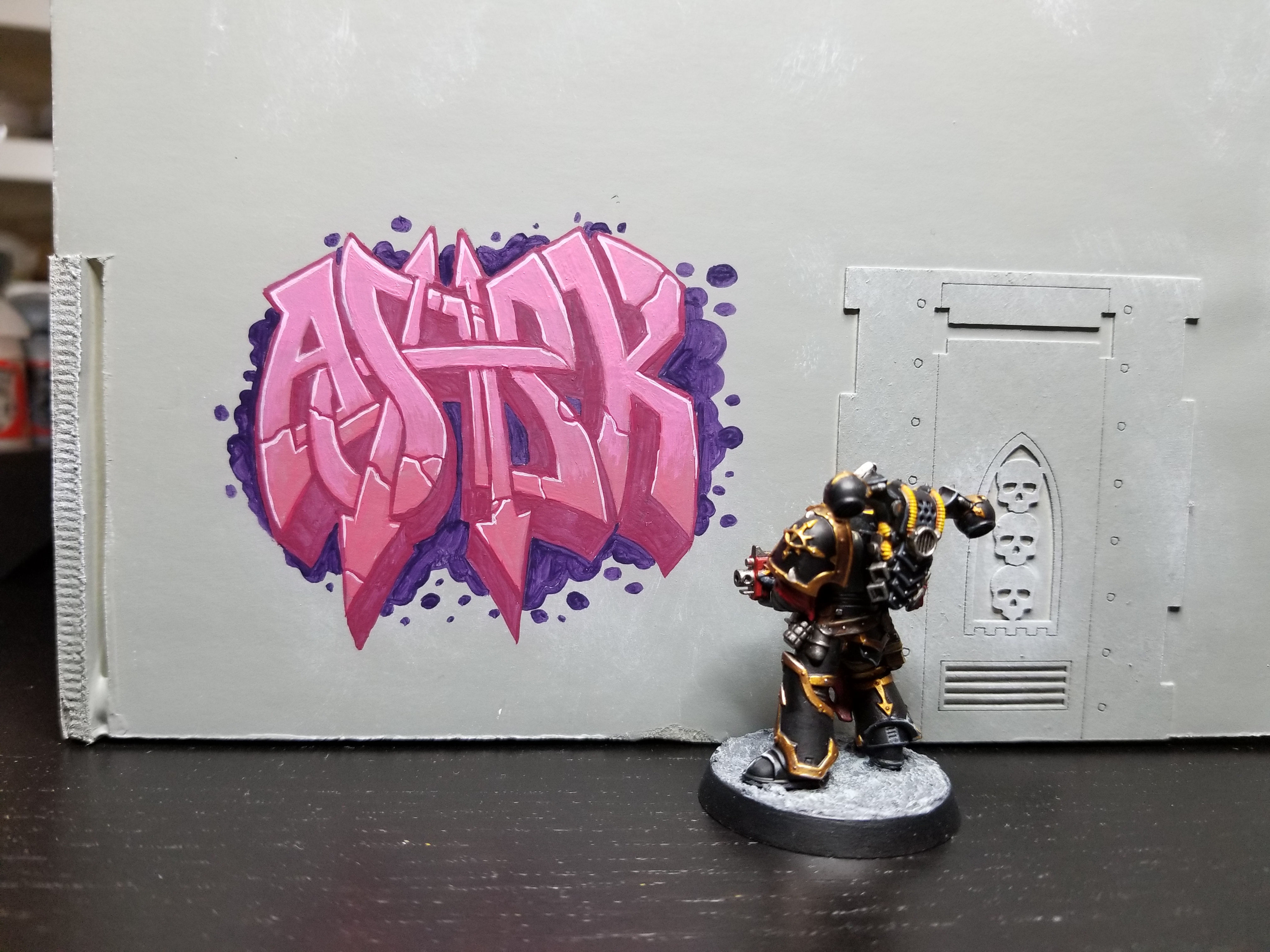
Now let’s add in the background. The reason I don’t start with this is because it makes it harder/impossible to follow the sketch lines if I cover them up with paint first. In this case I used Naggaroth Night to fill in the background parts and add an additional layer around my Wildstyle.
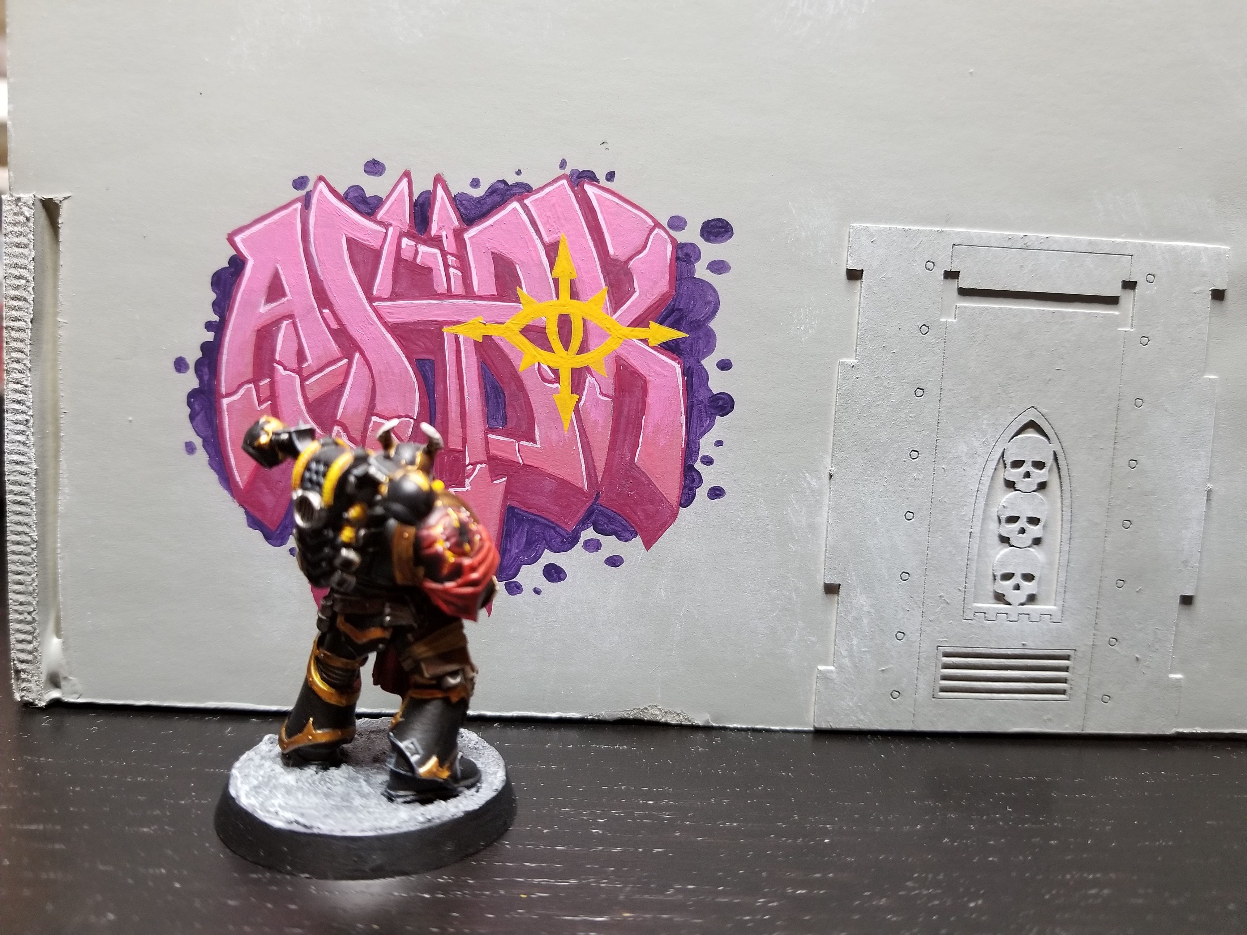
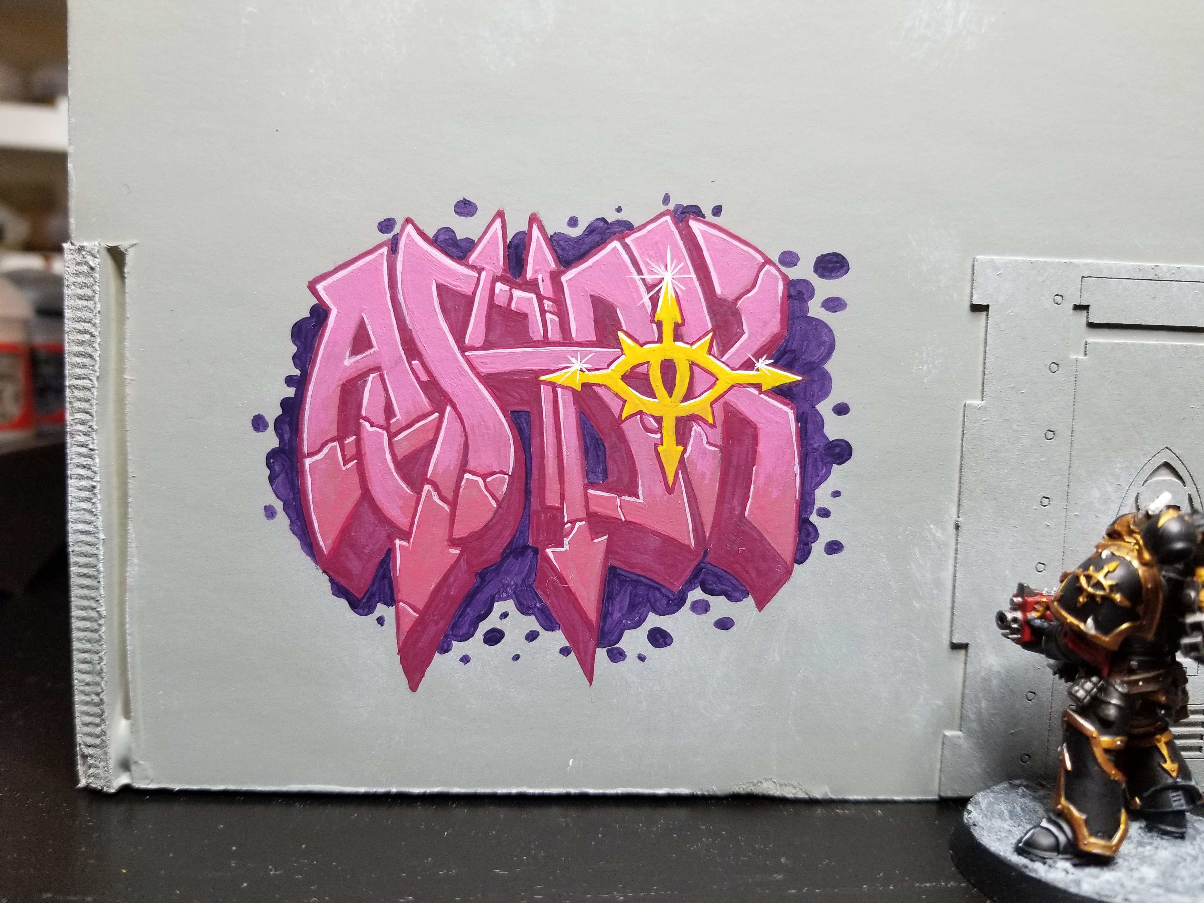
Alright, looking good. Time to do the Eye of Horus detail. Same process. I block out the basic shape with Averland Sunset, then fill that in. I’ve kind of thoroughly painted over my original design so at this point it’s either freehand it (which I do), or re-pencil it in over top of your paint.
The next step is to outline it with the basic outline color – Screamer Pink. This will tie it into the piece visually and gives it more clear definition.
Now I’m gonna fill that in with some Flash Gitz Yellow and fade it a bit.
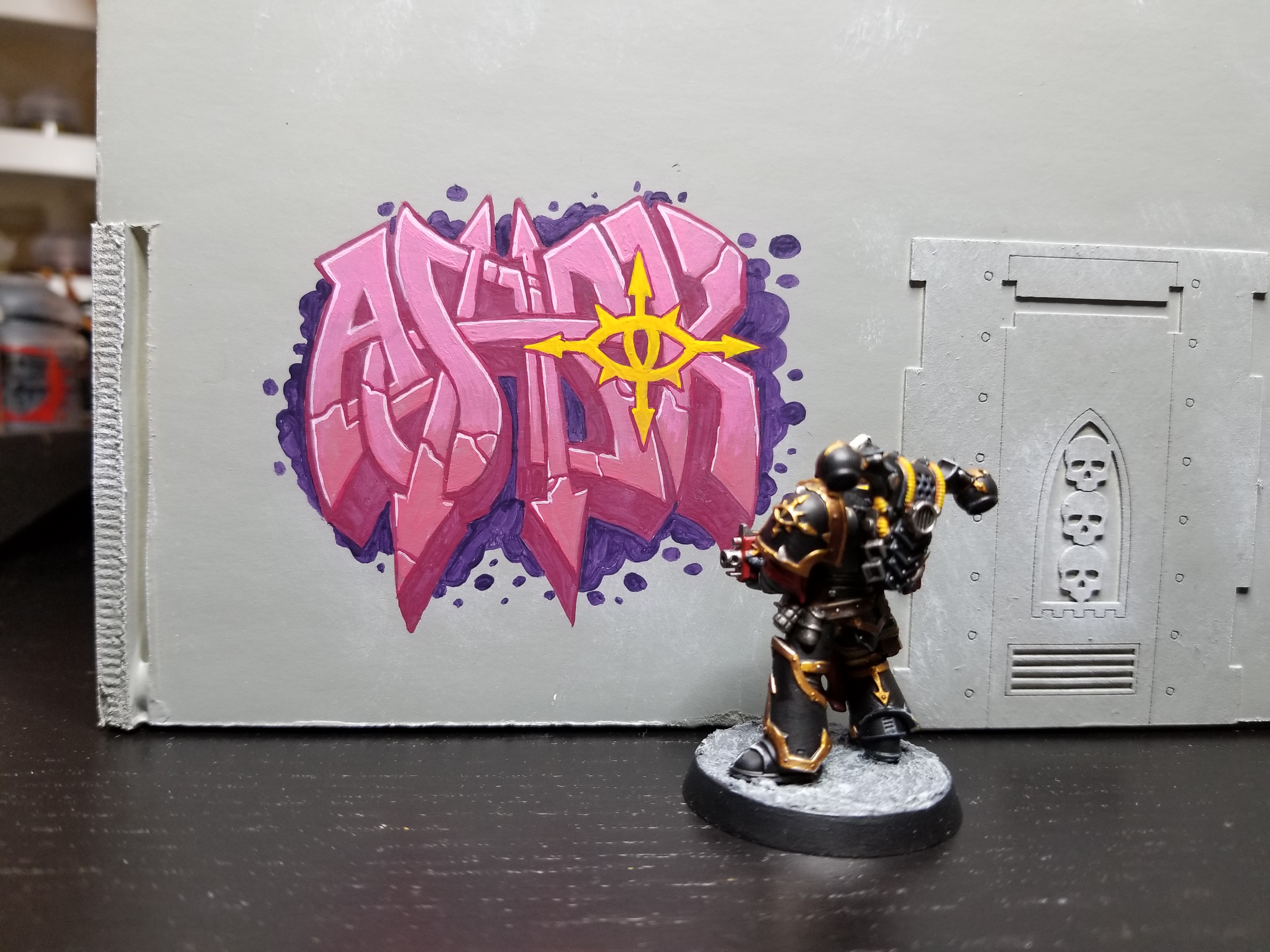
To finish the piece off, I’m going to do some edge highlights with white on the Eye of Horus to make it pop and give it a gold feel. Then I add some gaudy sparkle effects to the point edges to give it some additional flair. I don’t love these as a designer myself, but they’re exactly the kind of flourish I’d expect to see on a real piece, and so I’ve included them here to give the piece more realism. Ashrok stands back and admires his work.
Adding More Graffiti
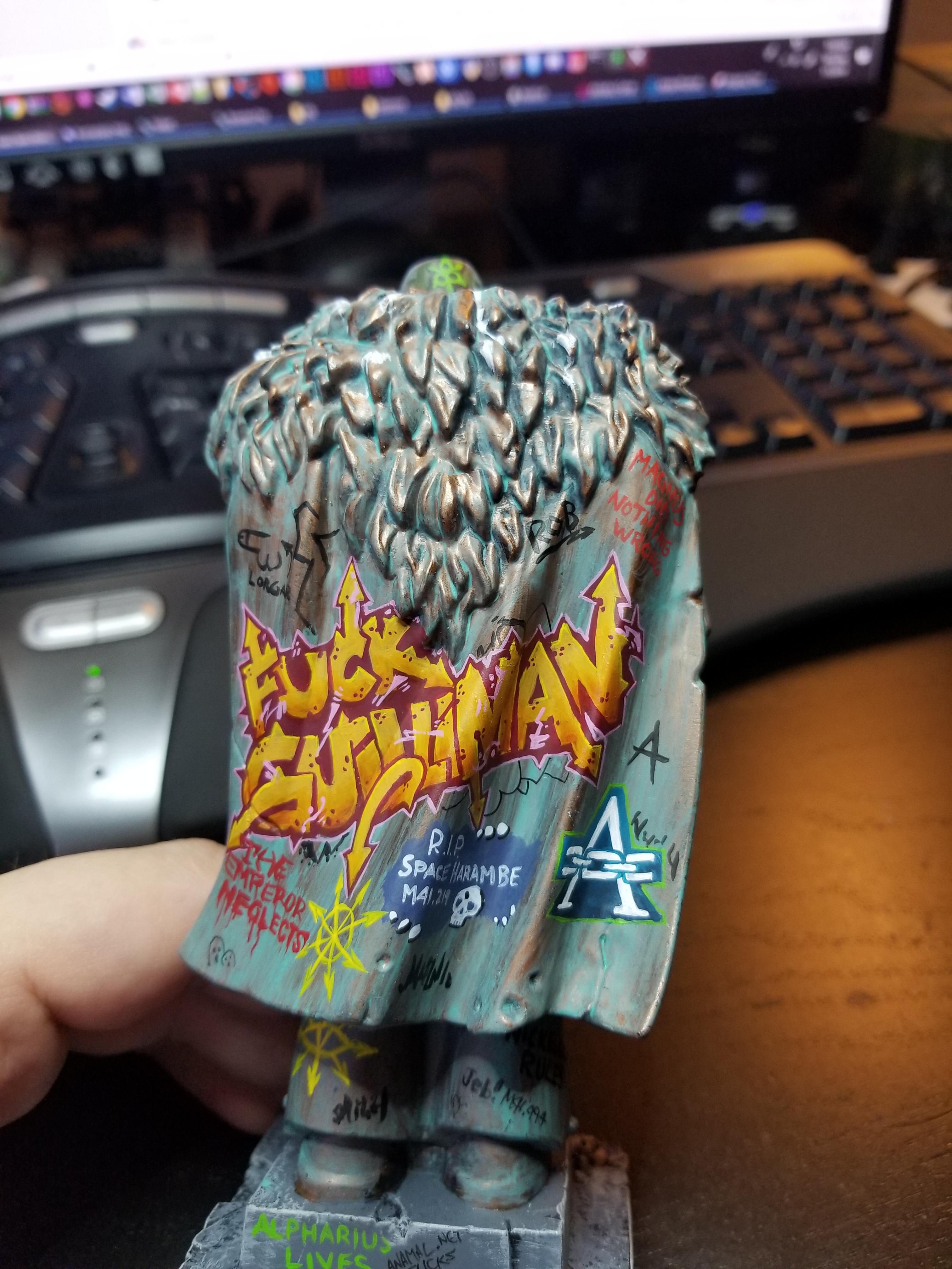
If you want to give your terrain a really neglected, graffiti’d look, then you’ll need to cover it in a variety of tags and throw-ups. Don’t be afraid to paint over parts of your work with other tags and pieces. The key here is to layer multiple works, which in turn will give the impression that so long has passed that the building or statue (or whatever) has been painted, then painted over again, and painted over again after that. Remember, you’re using your terrain to tell a story, and so the terrain itself should reflect the story you want to tell. On the statue I did for JD Reynolds’ display board, I did a bunch of smaller tags around the larger throw-up/wildstyle, and tried to do some layering and under-painting to give the impression that there was more there which had been written over. In retrospect I should have covered up at least parts of the big piece, but I really wanted that “Fuck Guilliman” message to come through.
Additional Research
The best way to drum up additional inspiration for making your own graffiti is to do some research! I mentioned going out and taking photographs of graffiti on your own in the sections above, but if you’re looking for additional inspiration, I thought I’d include some additional sources you can browse through here:
- Manchester Genestealer Cult graffiti
by thehammo
This piece got some press a while back since it showed up shortly after the Kelermorph model was released. It’s a great piece on the northern end of Manchester and shows some 40k art in a real context. Something like this is neat because it could serve as propaganda for Genestealer Cults, portraying the Kelermorph as a cute, friendly, hero. - Eldar Graffiti
by Mac_Orion
A really cool Eldar piece that would work for either Craftworld Eldar or Drukhari, based on the colors and shapes used. I really like the use of organic shapes and purple and green for Eldar work. - iStock Graffiti Gallery
iStock
Google Image Search will get you almost anything you need, especially if you add one of the graffiti types from my list above to your search query. But after GIS, there are also some good stock image galleries out there. And tons you can find on Pinterest and Instgram. We’re spoiled for image resources these days.
Start Tagging
Hopefully this has given you everything you need to start making your own graffiti-marked urban landscapes. As always, we’d love to hear from you–if you have any questions or comments, drop them in the comments section below or hit us up on social media. Or, if you’ve done some sweet graffiti work of your own you’d like us to see and maybe feature, shoot us an email at contact@goonhammer.com.
I leave you with this time-lapse footage of Ahsrok at work.
