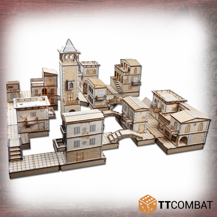
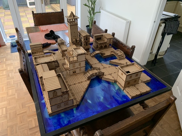
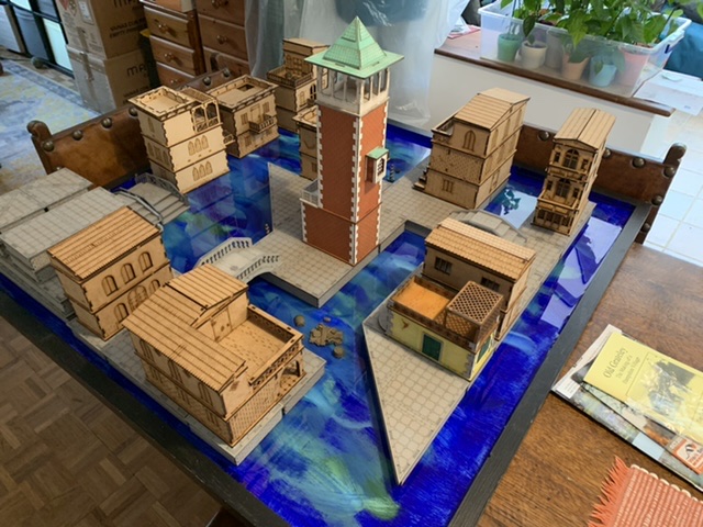
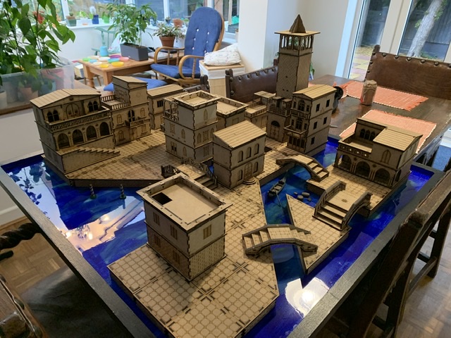
In this review, Mike takes a look at the Venetian Quarter, created by TTCombat as he continues his journey under the Rent in the Sky.
This isn’t the first time we’ve visited the strange Venice created by the designers at TTCombat and if you want to know more about Carnevale, you should check out our article on the starter set. The Venetian Quarter was provided by TTCombat free of charge for review purposes and can be purchased from their store for £150.
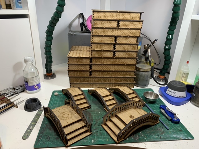
In my first article I laid the foundations, or in this case canals, for our journey around Venice and with the resin cured I began work on the Streets of Venice. This was a lot of cutting, I really can’t overstate how much cutting was involved here. The MDF bridges that join the streets to the rest of the sheet were fairly thick and to prevent damaging the pieces I cut each one individually, sacrificing a couple of box cutter blade tips in the process. Now this was my first time working with any significant amount of MDF and I was assured this was pretty normal, so I think a lot of my shock was down to my own stupidity of cutting out almost every street piece over the course of two sittings. I also earned a sizable blister in the process.
With everything neatly piled into their respectives sizes I set to work gluing everything together. The brick work joins in to the flagstones were pretty snug fits and I found it easiest to actually flip the piece when I was ready to press them in place and carefully apply pressure from the top, so that everything goes in with a satisfying thunk. I don’t feel like there’s a huge amount more to say about this process – you’re given a huge number of streets, enough to comfortably cover a 3’ x 3’ board, and once you’re in the groove of assembly it all goes pretty quick.
-

Streets of Venice. Credit: Mike Bettle-Shaffer
My excitement to see it all on the table quickly carried me through to the bridges, and again you get a generous number for linking the various pieces of your board together. I really liked the variety here, with three basic bridges and two much fancier ones and as I put the kits together my mind began whirring with possible paint jobs to elevate them from my planned basic coating of light grey ink. It’s worth raising here that as the bridges are slightly more complex kits taking the time to dry fit certainly doesn’t hurt and in the process I realised there was a step missing. Just compare the pieces you have to the store image and you’ll be fine. The Ringhiera Bridge feels like a much more modern kit, with far finer MDF bridges joining it to the wider sheet which made removing the pieces much easier. When you come to the Stretto Bridge you’re going to need to trim it down, or at least I did. The pieces that sit under the steps were too long, causing everything to sit out of alignment so with a box cutter in hand and my safety glasses on, I resized everything. Seriously wear some safety glasses, I almost caught a piece of MDF in the eye and that’s what prompted me to put mine on.
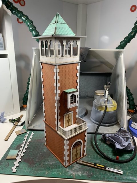
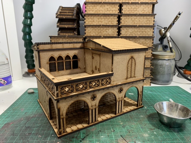
Assembling all those streets and bridges felt like eating my vegetables first, you have to don’t have to do it but it makes getting to the meat of the meal more fun. I decided to dive in with the Plazzo Lucia and was delighted by how much easier the pieces were to remove and clean, they’ve definitely updated their design process as time has progressed. It was at this point I started using super glue here and there. It’s clutch for getting slightly awkward joins stuck fast, removing the need for clamping or rubber banding to make sure you get a good join. You could go even faster and use zip spray or a mitre gluing kit but I didn’t really feel the need here. In terms of assembly the buildings were much the same, some pieces here and there still needed cutting out with the box cutter but for the most part it was an easier process than the streets. I want to call out the Palazzo Magdelena here as I was really taken with the sheet lay out, there’s some clever tricks here and there to help increase the overall density or pieces on the sheet.
The buildings of Venice lend themselves well to being represented in MDF and with the addition of some greyboard pieces the majority of joins can be easily covered and buildings elevated that little bit more. Each building comes with it’s own sheet to add embellishments here and there, though if you’re planning on painting I’d advise leaving them off until you’re done painting the main structure as you’re unlikely to want the greyboard the same colour as your building. On the subject of embellishments, it’s worth mentioning the extra etched details on the floor of each building, with wooden planks and geometric patterns being common throughout. I do plan on eventually painting the insides of the buildings, but for the time being I’ll be focusing on the externals.
Overall the kit offers fantastic value for money and comfortably covers an entire table, with some basic tricks and patience you can elevate the whole board to another level. I’m excited to be getting on with painting it now, so join me in my next article where I’ll be discussing various approaches and showcasing some of the painted pieces. If you’d like your own little slice of Italy, you can find the full range here.
Have any questions or feedback? Shoot us an email at contact@goonhammer.com.
