2022 was a year of escalation. The previous years marked my journey through the pandemic under the familiar banner of my Master’s degree. I’d grown horribly accustomed to the loneliness and shades of grey that permeated society, and three years of Master’s in Psychology was getting terribly mundane.
This year changed things dramatically. This was the year that South Africa began clawing back the normal degree of suffering and turmoil that we’re accustomed to. I began the year with a full-ride scholarship to start a PhD, and was crushed after missing a wonderful job opportunity. My relationship reached new heights of warmth and growth, and I nearly crashed and burned out of my PhD before its sixth month. I faced my anxious and depressive symptoms head-on and took the unprecedented step of getting medicated.
Ups and downs.
I e-mailed Goonhammer on a whim, which launched a vibrant and joyful writing side gig in freelance writing. I’ve wept in despair and loss, and anchored myself to the beauty in my life. 2022 was a year of escalation after three years of slow-burning. I’m not sure I was ready for it, but godammit I showed up.

In my hobby life, I worked on individual projects and allowed my scatterbrain to run free. The part of miniature painting that brings me joy is exploration and experimentation. I get little out of coercing myself into painting strike forces, and I seldom have the time for army projects. My engagement with the hobby is enjoyed in bite-sized pieces as part of a challenging life. I work on my PhD. I write. I spend time with my partner. I eat. I build and paint. I squeeze a few games in. I GM a TTRPG group (Dark Heresy Genesys is incredible. Track me down on Discord and I’ll tell you all about it.). I’m a heavy gamer (100 hours on Darktide in the pre-release beta). My life is filled with things that bring joy, and hobbying is one bright aspect of that. I’m the kind of person who keeps many plates spinning. At best, I address the logistics of multiple responsibilities in an organised fashion. At worst, I’m scatterbrained and stressed out.
Preamble aside, I’m proud to discuss some of my favourite projects for 2022. For a lot of these, I’ve outlined how I accomplished them, rather than just… giving you a drawn owl and telling you that I drew it. Please enjoy.
Stark Greys
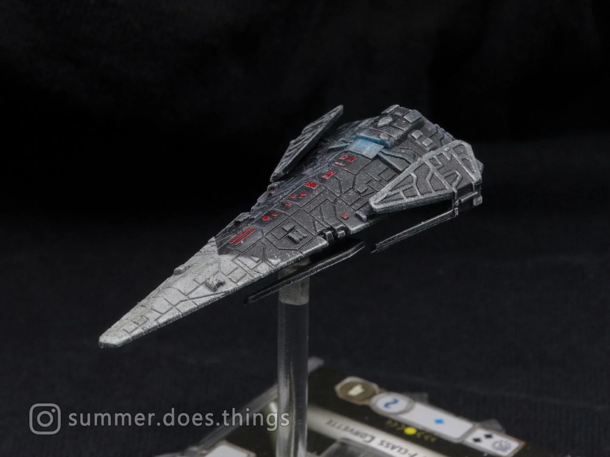
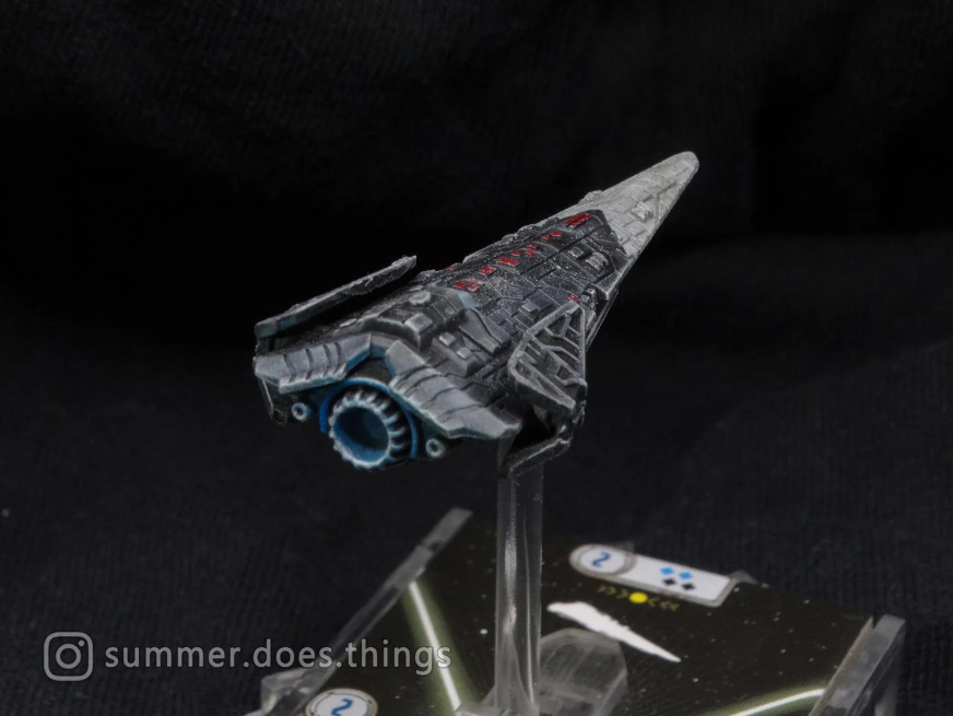
I’ve loved the Raider-class corvette since its introduction in X-Wing and my first proper sight of it in Battlefront II. The aggressive lines and dagger silhouette speak to a relentless pedigree of Imperial subjugation. I thought to honour its depiction in Battlefront II by making mine an understated special forces flagship. Enough customisation to differentiate it from the drab Imperial Navy, but not so much to be ostentatious. A warship meant for cold professionals who are aware of their elevated status.
My default Imperial colour scheme for Star Wars: Armada differentiates itself from the monochrome on-screen scheme by leaning on stenciled patterns. I retain some of the light grey, but make heavy use of dark grey for visual interest. Masking tape and airbrush allow me to define colour schemes that are fittingly sharp and orderly for the Empire, while making things colourful.
I default to Tamiya Flat White and Tamiya Flat Black, both acrylic and shot out of an airbrush. I find that the lighter grey sprays less evenly due to the high pigment concentration of white, so I always lay that down first. Then, I use ordinary masking tape to define the lines of the scheme. For this Raider, I’ve maintained the aggressive, dagger-like aspect with a forward-facing triangular design. Once thoroughly masked, a mix of mostly Flat Black with some Flat White handles the dark grey rear. Be mindful of where you place the lighter colour, as the eye will be drawn to it. This can be used intentionally to draw the eye to the model’s business end, but can also divert the eye poorly.
A recess wash with Tamiya Panel Line Accent Colour Dark Grey mutes the light grey down for a used appearance, and ties the two colours together. I accented the model in red (any luscious, deep red will do) for detailing, and layered on a drybrush of Pallid Wych Flesh (or any off-white) to highlight the raised portions. A gentle sponging of Pallid Wych Flesh completes the scheme with a basic paint chipping effect. The result is an aggressive, custom-painted Raider that remains understated and well-worn.
Basics Never Die
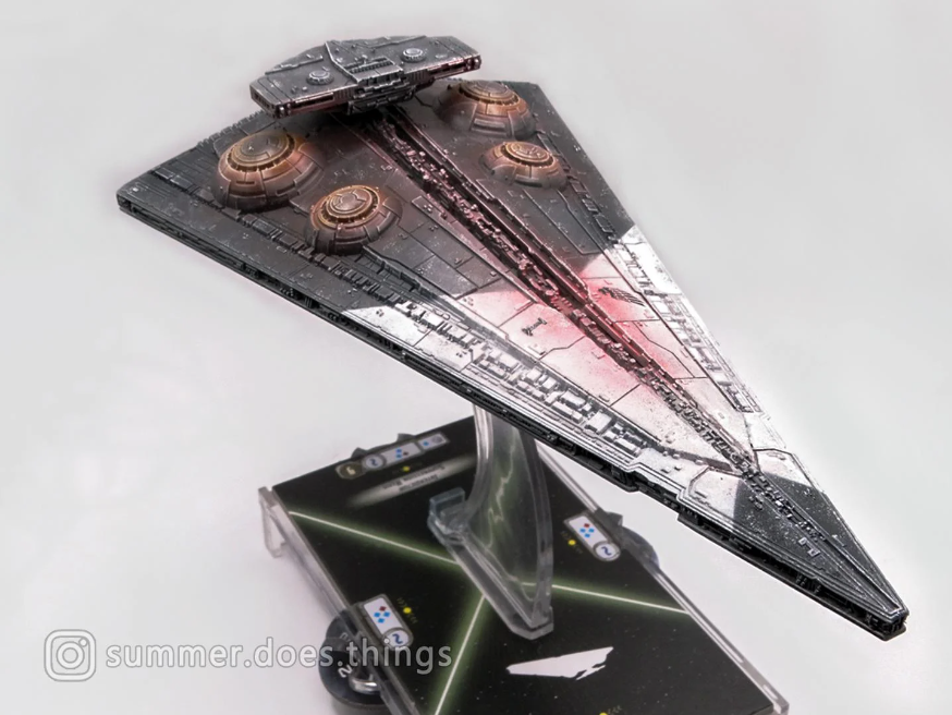
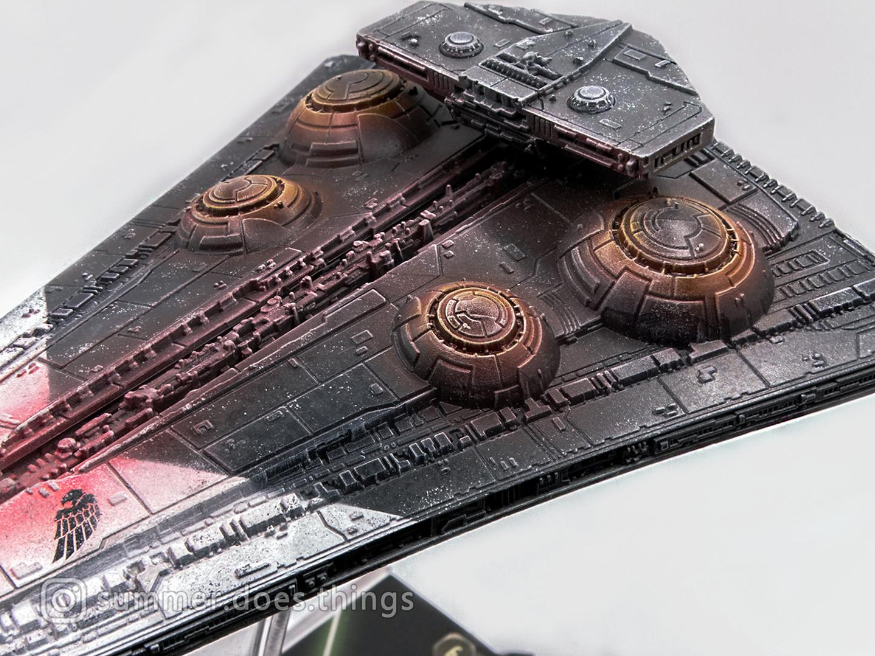
Basic techniques like basecoating, drybrushing, and recess washing have never left me. They’ve just… transformed and crystallised. My Interdictor’s base colour scheme followed the same principles as the Raider, and was its predecessor. The larger ship warranted more time, and I was happy to give time to such an interesting piece of Star Wars lore. Firstly, a dark grey and off-white base using Tamiya Flat White and Flat Black airbrushed as in the Raider above. This was followed by a simple drybrush highlight and recess wash to lay a foundation for… enhancements.
Large models rendered at small scale like warships don’t need to be closely detailed. From the perspective they’re viewed at, individual scratches are functionally invisible and wouldn’t even appear. Indeed, detail elements like rivets and nuts on scale model tanks and warships are often exaggerated in size so that they can show up to the naked eye at all – a compromise between flawless reproduction and functional modelmaking. Weathering an Armada ship follows the same trend. The ships are enormous, and even a single paint flake visible to the naked eye would be metres wide in ‘reality’. A delicate round of sponging with contrasting colours (metallic on dark grey, dark grey on white) develops the appearance of accumulated chips and wear. The origin of this wear is indiscernible. Stray micrometeorite strikes, time spent in ultra-dense gas volumes, atmospheric flight, or stray laser fire are all candidates. The point is to weather the ship for a used appearance without drawing the eye too far from focal points like the contrasting colour scheme and gravity well projectors.
The gravity well projectors of the Interdictor are its focal point. They’re the source of the interdiction, after all. For glow effects, I always get drybrushing involved. Back to basics. Maybe my mental bandwidth is low at the end of the day, or I just intuitively understand that it’ll work. The smoother, diffused part of the glow is a Tamiya Orange with a bit of extra thinner. I airbrush it gently and smoothly in a couple of thin layers to build up a glow without overwhelming the base colour. Then, it’s a drybrush of Pallid Wych Flesh (or your equivalent off-white) onto the edges. Enough for a hard, thin, uneven highlight – a source of light. Sometimes I drybrush some orange there for extra unevenness. There isn’t a strict method here. As much as I appreciate step-by-step painting tutorials, they’re not the heart of painting to me. I learned to paint through errors and being purposefully aimless.
If you’re cold, they’re cold.
I picked up some Star Wars: Legion this year. We’ll see where that takes me. My first order of business was to deviate from the standard stormtrooper colour schemes and go with something camouflaged. Grounded and ‘real’. The terror of your Imperial presence is all well and good, but it pays to not be shot.
This was my first earnest attempt at camouflage and I went for a horizontally streaked grey and blue arctic camo. My headcanon is that the Galactic Empire constituted a committee to design a universal cold-weather camouflage pattern. And the design-by-committee approach came up with something that they convincingly claimed would be suitable for all cold-weather scenarios. Tundras? Of course. Ice sheets? Easily. Urban warfare? That’s what the grey is for. Forests? The little streaks surely look like leaves, no? As with any performance-focused authoritarian state, lies and false results are signed into fact, performance figures are exaggerated, and dissenters are hushed. By the time the design reaches the top, the corps is assured of an affordable camo pattern for stormtroopers that renders them nigh-invisible to the naked eye in any frozen environment.
Anyway, the first time this armour sees action, a platoon is ambushed and destroyed (not a reflection of my first Legion game. Don’t know why you’d think that). The Empire’s Universal Cold-Weather Infantry Concealment System is a wash in every single environment it’s deployed in. Too conspicuous for hard snow. Stands out like a sore thumb in urban debris. There are no trees in the galaxy that look like these men. Blame gets passed around, nobody is ever held accountable and hundreds of stormtroopers are killed as a result of this blunder. The committee that orchestrated this disastrous design? Promoted or retired with full benefits.
Anyway.
The scheme is just an airbrushed grey with brush-painted streaks of grey and light blue. Off-white drybrushing allows for a matte highlight that maintains the blandness of camouflage while illustrating depth. I used Tamiya Clear Red for the lenses, because that colour dries incredibly glossy and is my go-to for lenses and simple glassy effects. The irony of painting camouflage is the need for balancing detail with blandness and obscurity. My first attempt at it taught me a lot, and I can’t wait to apply it to other projects.
Cheapskates
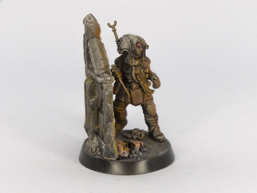
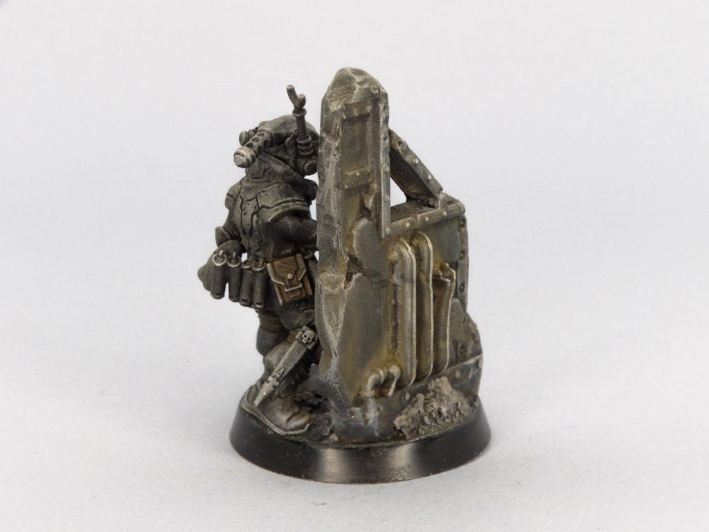
One of the honoured motivations for kitbashing is to save money. Especially when it comes to unique characters who would otherwise be prohibitively expensive to buy normally. Take that time I wanted to complete my group of Officio Assassinorum operatives with a Culexus Assassin. The assassin model is expensive, but I was coming off the high of a couple of Necromunda boxes and had a lot of bits and pieces lying around. A jaunt into my bits box liberated a Delaque torso and arms, Palanite Enforcer legs and the head of a spindle drone from Blackstone Fortress. Accessorise generously. One thing led to another, and I was left with a very convincing assassin, complete with animus speculum.
In my usual spirit of experimentation, I used the opportunity to fiddle with colour schemes. Assassins don’t conform to an army-wide colour scheme – many of them wear active camouflage or disguises. This is an opportunity wherein I am not constrained to a typical colour scheme or uniform. I decided on an experiment involving light. I painted the model as though it was skulking through some ruins at night, and was lit from the front by firelight. This began with a zenithal highlight and shading job from my airbrush, followed by a buildup of Tamiya orange from the direction of the off-screen flames. Detailing was accomplished through a mixture of washes, drybrushing and some light edge highlights.
Tough guys
I grew up on Ghost Recon, Call of Duty and 40K. That means I have an insufferable interest in elite units and special forces, and a willingness to tell people all about it. I, for one, strongly believe that tacticool is sorely missing in 40K. I’ll say it. When Primaris marines showed up with foregrips and comically rendered 28mm heroic scale Picatinny rails, I was overjoyed. The only way things could get better is if I applied my fondness for Call of Duty-esque aesthetics to my precious Imperial Guard.
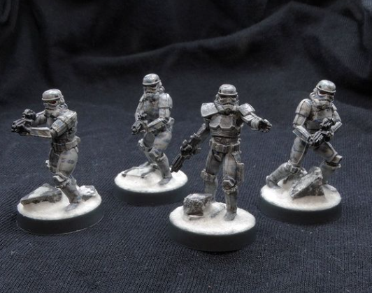
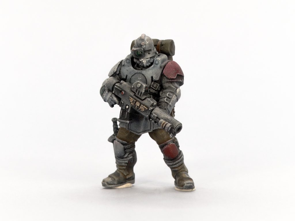
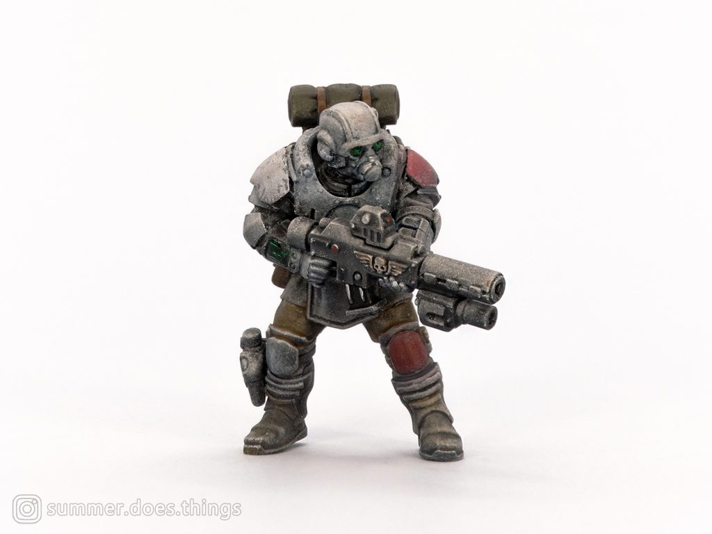
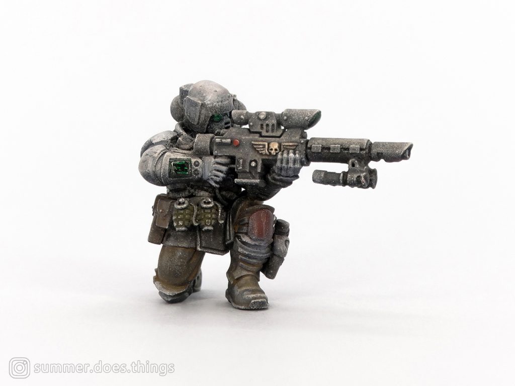
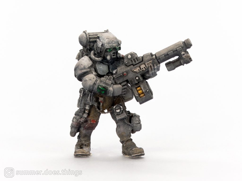
Enter my conversion project for a squad of cold-weather stormtroopers. It started with me fuming over the wonky limb proportions on my Tempestus Scions kit. They weren’t a worthy replacement to Kasrkins, in my mind. Stubby, baroque-armoured troops caught in an era of changing scales. Too short to meet the new standard, and not dynamic enough in posing either. The Palanite Enforcers kit had just dropped and I picked some up in search of good, armoured humans. Palanite Enforcer legs also went well with Forge World’s now-defunct hostile environment Cadian torsos. A well-proportioned baseline.
Weaponry was provided by my Tempestus Scions kit. Remember, if you use enough knife or putty, you can resolve any conversion problem. Truly. The Scion arms fit nicely on Enforcer bodies and I accessorised generously. Real world armour is replete with extra nonsense that is vital and ruinously heavy. One of the main limitations on infantry performance is the piddly human who carries the rifle. The supply of gadgets, equipment, and consumables is endless, unlike the load-bearing capacity of an infantryman’s knees. That’s why I stuck equipment onto this team until it looked like they could barely walk. It was as much a nod to real world sensibilities and the absurdity of 28mm heroic scale in representing small details.
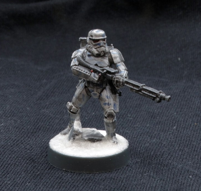
Their weapons were a joyful jaunt into tacticool aesthetics. I wanted my stormtroopers to reflect modular real-world arms organised into distinct specialisations. These people have the run of the armoury, after all. I settled on a solid projectile weapon by slicing off the hellguns’ (hot-shot lasguns for the amateurs) cabling and slipping boltgun magazines into the space. For most of the team, I also snipped down the over-long Scion optic and it conveniently left the shape of a holographic optic with no extra effort. I had before me the interstellar equivalent of the HK416C: a flexible carbine platform that could be modified to suit any role. The first photo in this section depicts my assault configuration, with a flashlight and small bayonet lug. The second photo depicts a grenadier configuration, with a launcher poached from the Primaris Intercessor kit. My third soldier has a designated marksman variant with a long optic, bipod, and straight magazine. The machinegunner below gets a generous box magazine and bipod. If he survives (he won’t), he’s going to learn all about how bad veteran’s healthcare is in the Imperium.
I painted them in grey, with a cold-weather theme (you may be noticing a trend.). I purposefully kept the scheme simple and low-res, using heavy drybrushing and non-specific mixes of grey, brown, and blue tones. An oil wash ties the colours together and gives these models a sufficiently grimy and worn appearance. I think they look fantastic. My unhealthy fixation on firearm Youtube channels, a hobby knife, and a bits box can birth the most unholy things.
They’d look a lot better if I actually completed the project they were part of, though. Maybe in 2023.
The rest
I don’t have the energy to write in such detail about every enjoyable project I did in 2022. I suspect that you don’t have the time to read them, either. It’s unfortunate – I was enjoying your company. I’ll outline some of my other fun projects this year below. Expect more of my favourite colours: black, grey, and white.
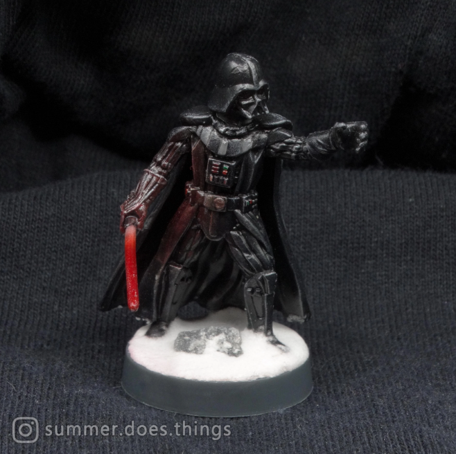
Darth Vader from the Star Wars: Legion Core Set was a fun exercise in textures. Vader is clad in black, but has reflective and matte components on his suit, which offer a special challenge. As a rule, I opted for a glossier varnish painted by hand onto shiny components, and a matte coat on dull components. A subtle OSL effect on the lightsaber completes the look.
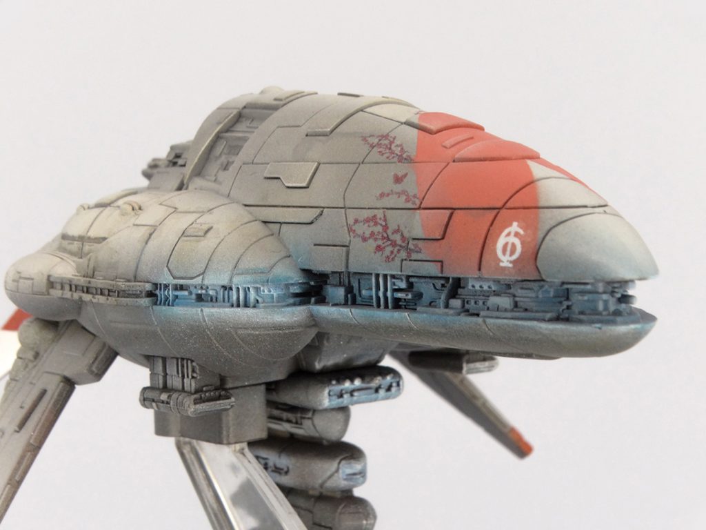
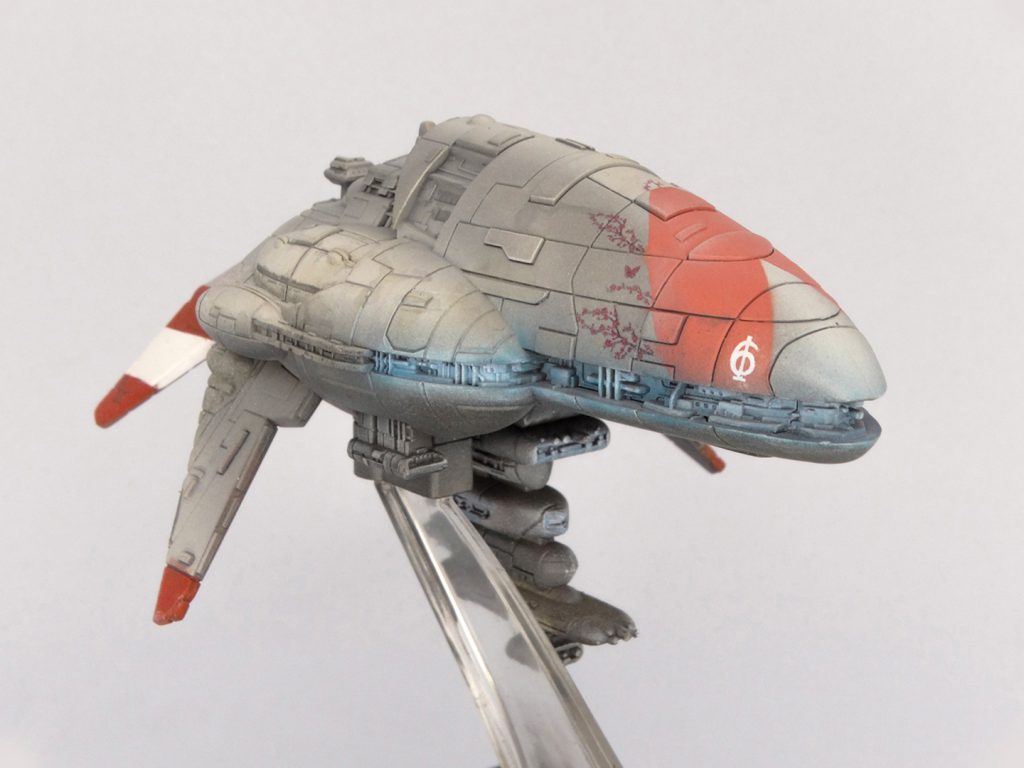
One of my earliest projects for Star Wars: Armada was repainting my Assault Frigate Mk. II. I wanted something more organic and cohesive than the motley default scheme of the Rebel Alliance. I dipped into my collection of nail art waterslide decals and chose some delightful cherry blossom decals. After basing the model in a warm grey with some airbrush highlights, I settled on a salmon coloured chevron as the central design (a way to tie the cherry blossom branches to the colour scheme) and set to work applying decals.
The end result is something thoroughly unique and respectful of the scale of Armada’s warships. You shouldn’t be able to perceive fine detail at this scale, but that cherry blossom motif must be tens of metres long. I polished the model off with OSL lighting, and finished the tail in the red and white striping of the WWII-era Regia Marina. A nod to real-world naval history.
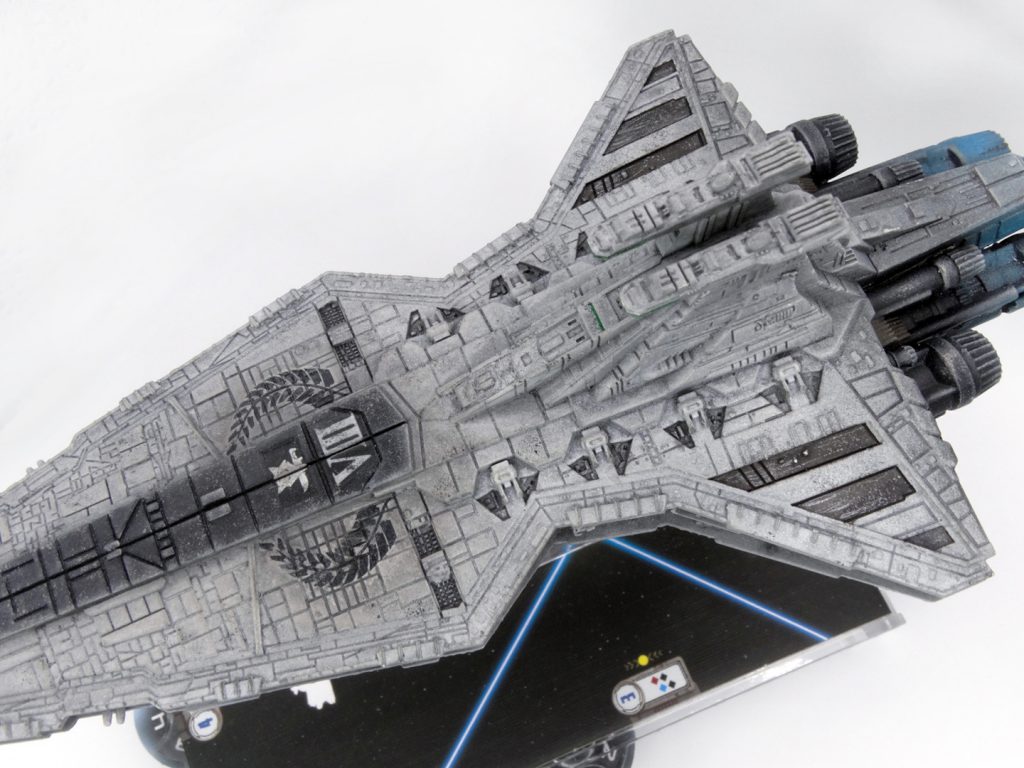
My Venator-class Star Destroyer was just an exercise in taking a coloured-in ship and making it grey. I just wanted to play around. I used black on areas that are striped forward to create a sense of aggressive directionality. Various, uneven greys signify wear-and-tear on an aging warship. Everything from chipped paint to weathered decals speaks to a long service life for this ship. A proud service life cut short by the rise of the Galactic Empire.
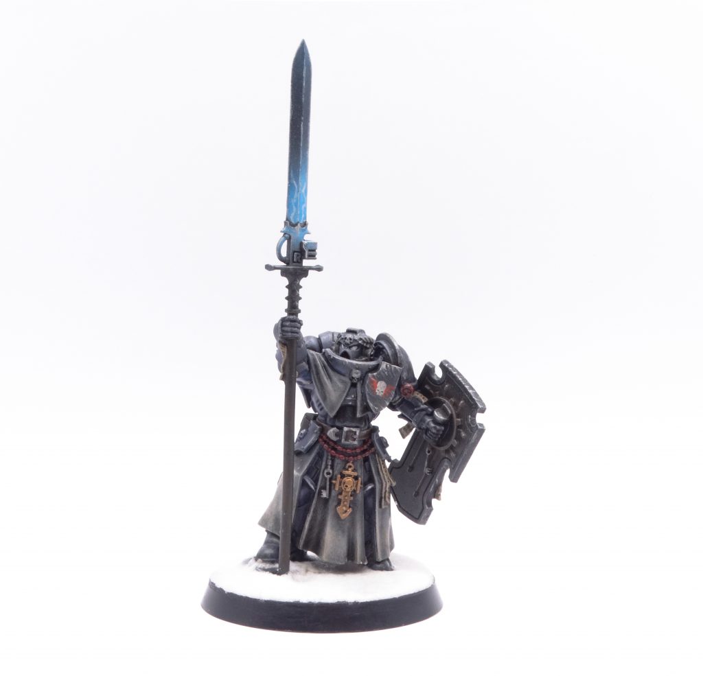
When the Indomitus box released, I found the more… regal and baroque space marine aesthetic uninteresting. I know that after five years of tacticool Primaris, people wanted a return to the roots of the Astartes, but I’m not fond of that look. I sought more grounded, grungy Astartes. One victim of that pursuit was the Bladeguard Ancient, who was tabbed to become my Chapter Champion. I had no interest in having a banner-carrier or dedicated close-combat troops. He went under the knife and came out with a storm shield and power glaive (courtesy of a Grey Knight Terminator sword). I set myself the challenge of doing grungy and worn, but keeping to a knightly theme.
I’m quite proud of the resulting Champion. The spot of light on the power weapon adds some contrasting brightness to an otherwise dark colour scheme, and the unique weapon befits a chapter’s greatest melee fighter. He could use a pressure washer and some soap, though.
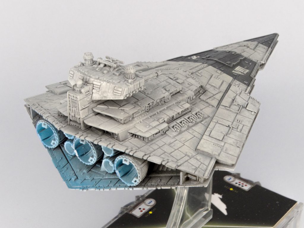
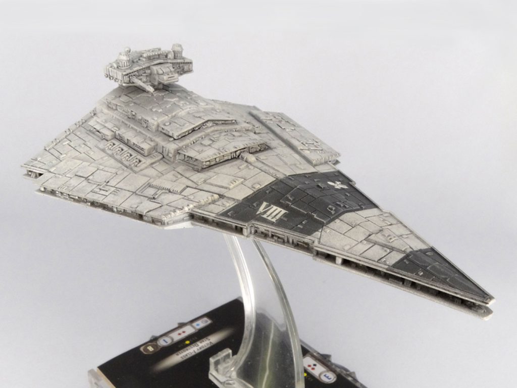
My Victory-class Star Destroyer was an effort to gravitate from triangular stripes to straight stripes. Very risky stuff. I compromised on the quality of the striping for this project because it was actually an experiment in panel line washing. Imperial warships are so filled with greebly, recessed panel lines that are just begging for a wash. Panel line washing is a keystone skill from scale military modelmaking and I sought to bring it here.
My favourite companion for panel line washing (and a lot of my regular washing) is Tamiya’s Panel Line Accent Colour range. They are a very loose enamel wash intended for thin panels. They apply well, and are an excellent way to roughly shade models. For the Victory, I painstakingly washed the panel lines before going over with light airbrushed white and heavy drybrushing to clear up errors and raise the original light grey colour. My verdict? If you’re gonna wash a model with this many panel lines, just use an oil wash. It’s much easier.
Not a hobby project per se, but I do think the real joy of 2022 was the friends we made along the way. 2022 was my first year of in-person wargaming since the dreaded panini hit us. I took to Star Wars: Armada with a gusto at my gaming club. We had lots of new faces and I quickly cemented my reputation as the weirdo who takes up four tables away from everyone else and pushes around plastic toys. There’s no reputation I’d rather have.
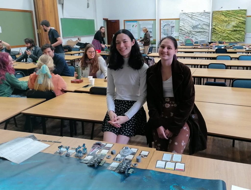
Armada is a delightful game to introduce to new wargamers, because it plays intuitively and ties into the beloved Star Wars setting. Fans of Star Wars (there are many in my vicinity.) love seeing the excitement of onscreen battles translate into a tabletop game with lovingly detailed miniatures. I’m only too happy to oblige. So this one goes out to the dear people I taught Armada to. Please don’t leave me. I promise I’m nice.
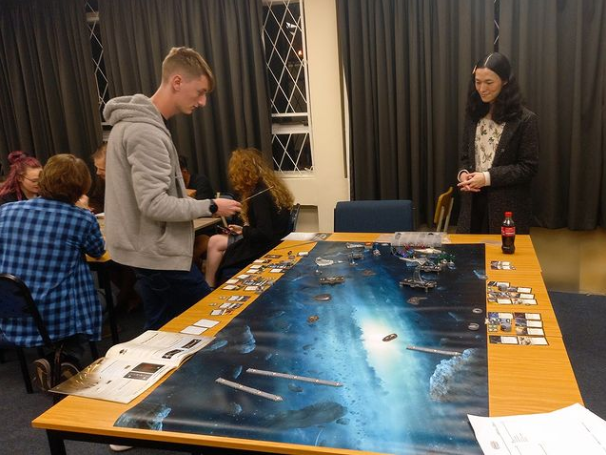
I’m looking forward to 2023. I’m hoping for more Star Wars: Armada and to branch further into my newfound interest in Legion. I might even dip into X-Wing because I have poor impulse control. My dear readers will even find me in the darkness of the 41st Millennium with a few conversion projects. Here’s a hint: I fucking love tanks. Catch me on the ‘gram if you want to see that as it happens.
I’m an acquired taste, but quite charming once you get to know me.
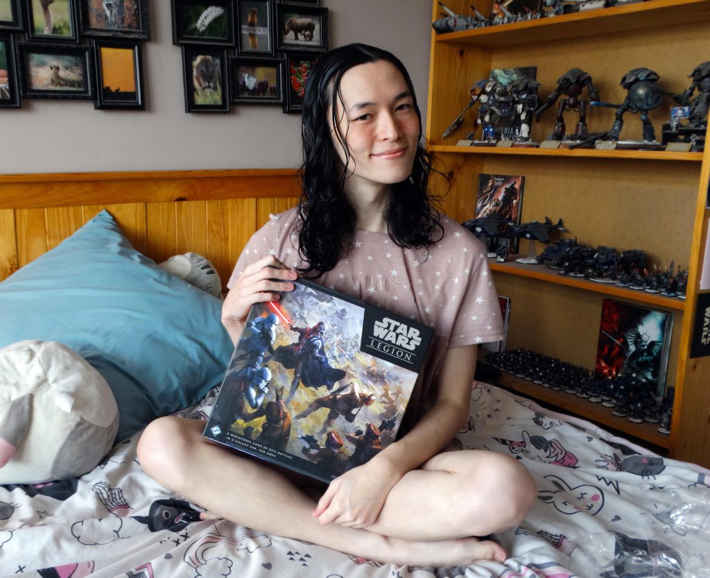
I think I’ve dragged this protracted exercise in self-pleasure out to its limit. That’s what Year in Review posts are about, anyway. So you know what? Thanks to all of you. Thank you Goonhammer for giving me a meaningful opportunity and community of weirdos. Thank you dear readers for being there to read my nonsense. Thank you Lucy, for being the girlfriend who feeds me and tells me I’m pretty. May 2023 be everyone’s finest year. Because it surely can’t get worse.
Right?
Have any questions or feedback? Drop us a note in the comments below or email us at contact@goonhammer.com.
