This past Father’s Day, like at least one other dad you might have heard about on the news, I took my kid to go look at a big historical boat. The trip went better for me, in that nobody got crushed into spaghetti sauce, but I did hit my head on armored bulkheads a few times. It also reminded me of another story, an instagram where constant Irish Racist and occasional punchman Conor McGregor was looking at a big boat and decided that actually, he wasn’t going to hang up his gloves, he was going to get back in the ring and get his ass beat wholesale a few more times. This is the power that Big Boats have. They can compel us to do things, to obliterate ourselves in different cool ways. As I stood there in the shadow of the battleship New Jersey, I thought that it was time to get back in my cave and update 40kstats for the new edition. So I did.
The biggest changes between this version of 40kstats and the old one are due to the game structure allowing for a ton more variation, and we wanted to account for all that. Missions are now a random combination of 5 deployment maps and 9 primary objectives, and so we have a full 45 to pick from, rather than 9 in the old GT packets. There’s a lot of fun wrinkles in the data – I don’t want to go too deep into drawing conclusions here, since we’re still in the early days of the edition and thus sample sizes are small and players are inexperienced, but it can be entertaining. For example: which deployment map on which you are Deploying Servo Skulls can impact your final score by as much as ten full points. Also, this page is extremely boring right now because the Codexes aren’t out yet, but the new detachment report cracks me up because it turns out that almost every Space Marine chapter is just better off using the Gladius Task Force instead of their own bespoke detachment. Now that’s game design.
You should go click around and learn a thing or two, but first: What, you may be wondering, are the titular 4 OK stats? Reader, I am here to help.

One is simply games by faction, a rough measure of how popular a faction is in the global meta.

The second is win rate – the percentage of games that a faction wins. This is important to most of you – not me, because I’m built different and my win rate is resolutely 0% – and we can slice it by date or faction, and dice it by opponent or mission.

The third is points by secondary objective, both fixed and tactical. Knowing which secondaries tend to score better for your army can help you choose which to select in fixed mode, or which to discard when operating in tactical mode. Flip mode remains the greatest.

Finally, we have TiWP – Tournaments in Winning Position – and TiWP Ratio, which are the type of sabermetrics-looking thing you’d see in Baseball Prospectus. This is a more complex statistic, and describes how many times a given faction was in position to win a GT or larger event. Think of these as your 4-1 or 5-0 players: they might not win the event overall, but going into the final round they hadn’t been mathematically eliminated yet. TiWP itself is fine, but it’s the combination of TiWP and games by faction that produces the fourth OK stat, TiWP ratio. This is the ratio of how widely represented an army is in the meta to how often they come up in TiWP. If a faction shows up in 10% of TiWPs despite only being only 5% of the field, the TiWP Ratio would be 2.0, and that army is probably a little too good. It also probably means the models are sold out and you’re about to see a lot of proxies or 3D-printed versions of them on the table, because they’re very good.
We’ve made each of these numbers available for the entire game, and also collected everything relevant to a particular faction (along with some links to articles on this very website), on the faction pages. This is your one-click bundle of all the data we have, filtered to the faction of your choice.

None of this would be possible without a robust feed of data from our various sources – without anything to aggregate, we’d have to resort to just making up stuff and declaring it to be true, which is more of a Reddit thing than a Goonhammer thing. The pipe of anonymized battle data coming in has been a massive help, and is in fact the only way a thing like this could work at all. We’re committed to keeping the data automatically updated, and we’ll be adding new reports and visualizations as we think of new ones that might be useful to readers. The biggest gap now is that we don’t have good data on Gambits yet, but expect some analysis on those when enough games filter in to allow us to draw conclusions.
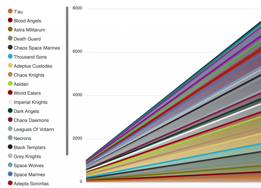
These statistics, and many more, including at least one hideous stacked line graph, are available for you to peruse at your leisure over on 40kstats.goonhammer.com.


