After assaulting your eyes and artistic sensibilities with Lorcana’s ugliest cards last week, let’s turn our gaze toward the best-looking cards released so far, shall we? Now, once again, I must remind you reader that all art is subjective and this is simply my take on what the most beautiful, compelling, and successful illustrations are in the game. I actually had a harder time making this list than the ugly card one because there are so many great images on these cards. Ravensburger has done a remarkable job of employing diverse artists capable of not only illustrating the Disney characters we know and love as we know and love them, but also in all new visages, scenarios, and concepts.
I have excluded all Enchanteds from this list. Not only because my family and I have not pulled a single one out of hundreds of packs and we are extremely bitter and hateful, but also because I could easily list ten Enchanteds here and all it a day. Most of them are top tier all the way with just a couple of 8 or 9s among the 10/10s.
Look now upon this gallery of greatness!
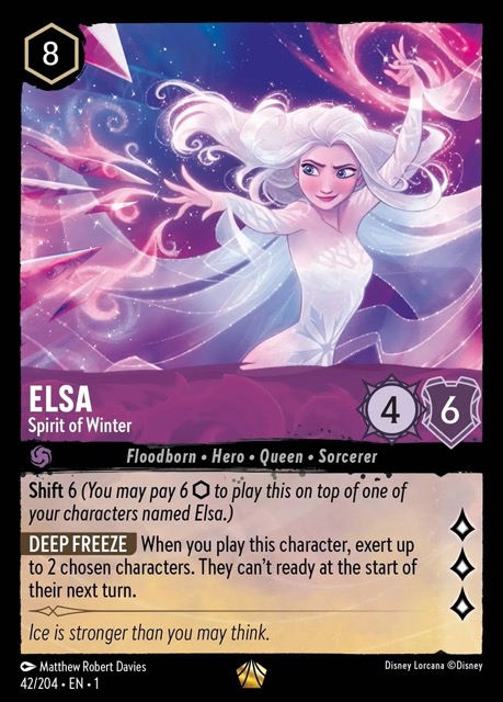
I mean, come on- like this wasn’t gonna be on the list. This Legendary remains the iconic card of the entire game, to the point where folks have called it Lorcana’s Charizard. It’s a stunning illustration full of energy and enchantment that captures the game’s vibe and its possibilities. I bet that many have seen this card and thought “huh, I bet that game is worth checking out” based this illustration alone. It’s a masterpiece of TCG art, and it’s arguably better looking than the Enchanted version.
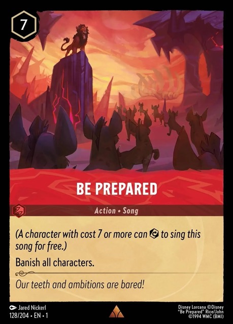
I love the apocalyptic tone of this card- even if you haven’t had this card played on you umptyjillion times, you know you are in deep lion dung when your opponents slaps it down. It’s evocative of the dark turn Lion King story while also expressing the extreme board-wiping effect of the card.
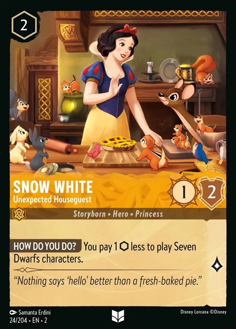
I love vintage storybook illustrations, and especially the kinds of illustrations that were in early Disney storybooks. This card, while a modern illustration using current techniques, captures that feeling in its use of color, pose, and composition.
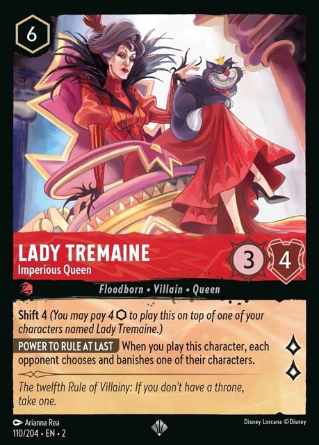
I was actually kind of shocked by this card when I first saw it. For one thing, it’s so overwhelmingly red. For another, there’s a subtle intimation that Lady Tremaine’s Floodborn incarnation is perhaps a vampire. I can totally buy Lady Tremaine as a blood-drinking aristocrat a la Countess Bathory, and the Gothic Horror feel approaches Cinderella’s antagonist with a whole new perspective.
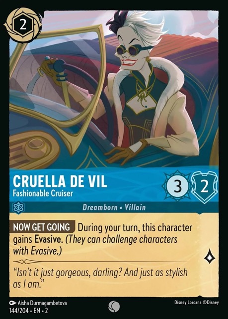
The really neat thing about this card- which totally captures the essence of a Dreamborn Cruella- is that it specifically references the painting Autoportrait (Tamara in a Green Bugatti) by the Polish artist Tamara de Lempicka. It’s a brilliant move, as it picks up on de Lempicka’s themes of Feminist liberation and Deco-era glamour and applies them to an idealization of the Cruella character. Glad to have a foil of this lovely card.
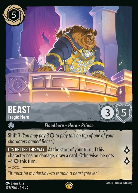
I debated putting this one on the list because it is no doubt a beautiful card, but it also doesn’t go into uncharted territory like many Floodborn cards do. Regardless, it’s a masterfully drawn image of a pensive, regretful Beast with the card effect brilliantly shifting from a giving, loving suitor to a vengeful, raging monster. The artist completely nails the visual style of Beauty and the Beast as well as the romantic aspect of the story in such a perfect way that I really couldn’t deny this card a berth.
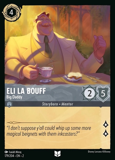
This may be a controversial pick as I’ve heard many think this card is “ugly”. I particularly like its distinctive style- it stands apart from the other illustrations in the game with its oil painting look. And what better way to depict an important man of taste, class and dignity like Big Daddy than a formal portrait of the Great Man sitting down for morning beignets? This is to my mind one of the more inspired illustrations in the game.
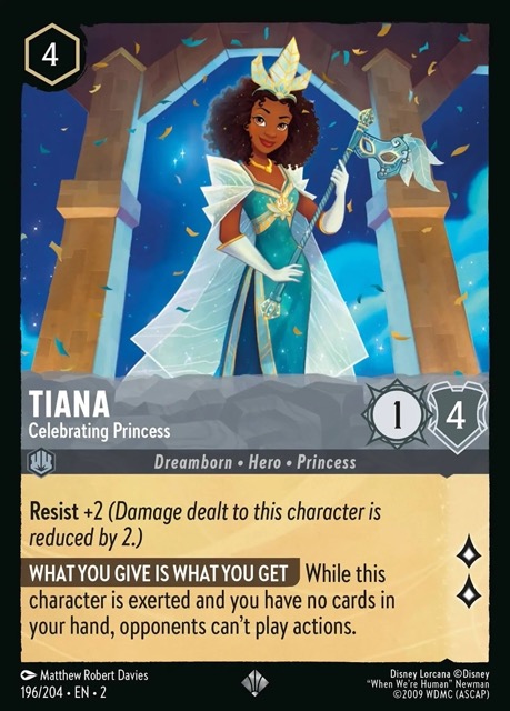
This card is such a delight, offering a vision of Tiana with her hair down and naturally curly- a look she doesn’t usually have in any of her other depictions outside of her brief appearance in Wreck-it Ralph Breaks the Internet. She has a Mardi Gras mask, and confetti falls across a lovely night sky, speaking to her New Orleans traditions. The shoulders of her cape and her crown echo her more common lilypad-inspired fashion. This is such a thoughtfully executed piece, and it is one of the best princess illustrations in the game.
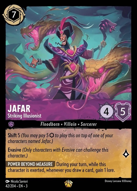
Striking indeed! This is the kind of illustration where when you get to it after flipping through thirteen other ho-hum cards in the pack, you know that you’ve pulled something special. The colors on this card are just stunning- turquoise, purple, and pink jewel tones set off with blacks and golds. It’s also an incredible card, which makes this one of Into the Inklands’ finest Legendaries.
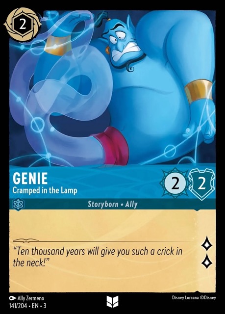
I love that this card uses the format in an ever-so-gently fourth wall breaking way. The card’s frame creates Genie’s “itty bitty living space”, with the artist contorting the beloved character to fit him into this tiny box. There really aren’t any other cards in Lorcana that are as playful as this one, and I’d love to see more.
