Lorcana is a TCG filled to bursting with beautiful illustrations. Unlike so many other licensed games that have cheaped out on the art like those Legendary deckbuilding games that had some of the most atrocious illustrations I’ve ever seen in any game, Ravensburger commissioned excellent artists who no doubt were thrilled to add their personal touch to the Disney look. As the kind of person that knows the names of the folks who did things like color design and background illustrations in the films (such as the great Mary Blair and Evyind Earle), I’ve really appreciated the attention to detail, quality, and imagination that these cards have evidenced. It’s not only a great game, but also a great collection of Disney artwork.
But it’s not all good.
Now, let’s be clear; art is subjective and as they say “there’s no accounting for taste”. I’m certainly not aiming to insult or devalue the contribution of the artists of the cards I’m about to rip into (in jest!), but there are a few pieces of Lorcana art where I don’t think the high standard was quite met. This is not surprising in a game that has hundreds of cards and more on the way. This is intended in good fun, and no doubt I’ve somehow selected someone’s favorite piece in the whole game so I apologize in advance. As they say again, “there’s no accounting for taste.”
Now, without further adieu, I present you the ugliest cards in the game. And no, Eli La Bouff isn’t on here because I think the oil painting style portrait is an awesome way to depict ol’ Big Daddy.
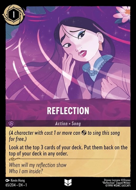
It’s a boring card that has a boring illustration. As much as I love Mulan and all the often-incredible Mulan imagery throughout the game, this one lands as something of a dud. I do like that it maintains that purple is the primary color (you have noticed that throughout all the cards, haven’t you?) and compositionally it’s fine, but the image just makes me sleepy when I see it. Which is almost never, because no one seems to play this card.
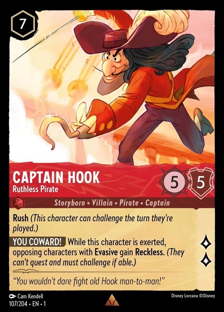
Now this is one is closer to my heart and eyes, because I play this card in my current Poppin’ Off Pirates deck and he shows up at the absolute worst times- like in the post-mulligan draw. I debated putting it in my deck not only because it kind of sucks at 7 uninkable and I’m not sure I’ve ever had a game that got that far along where I absolutely had to get rid of an evasive character to win, but also because it’s a rather unflattering depiction of Hook. As a man with an unusually large face, it seems even bigger here, and it’s almost as if he is stumbling forward from the massive weight of his visage. The background fade on the action side bugs me, but there again- art is subjective!
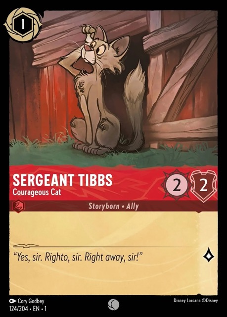
One of the “and who might you be” cards in the game for many players, this 101 Dalmatians supporting character is hardly one of Disney’s Most Beloved as it is, but this kind of weirdly rustic illustration isn’t likely to win many fans, especially as a 1/2/2/1 vanilla card that most folks will never play. 101 Dalmatians has one of my most favorite art direction styles in all of Disney, but this piece doesn’t quite hit the mark.
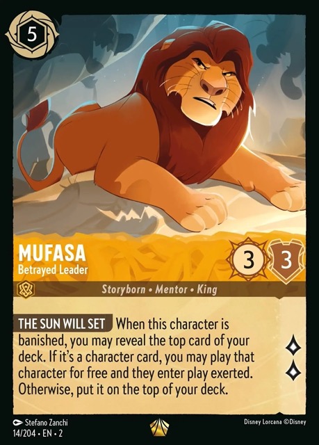
A staple card in the Mufasa High Roller net deck many have copied, this is undeniably a great card and it depicts a great character in his last moments of life before his terrible demise. I l love the Hyena shadows, but I don’t love how Mufasa looks. Something about him makes me think of Liam Neeson here (reminder- art is subjective), and he looks more like he’s about to get on a phone call to tell Scar that he’s comin’ to get him than he is about to fall to his death. There’s also a lack of dimension that bugs me. Maybe it’s the hair.
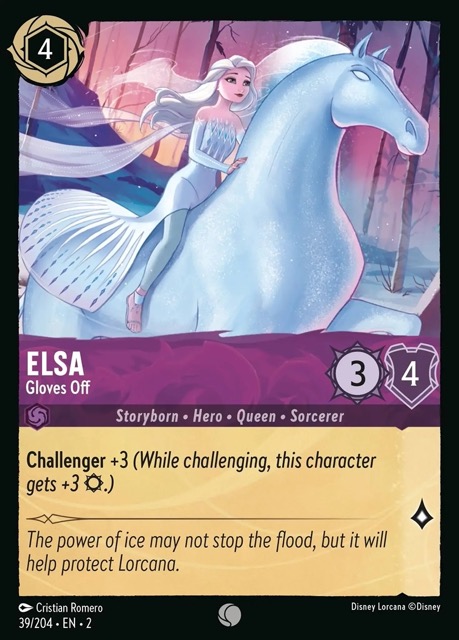
Ok, now this misfire is a case where I don’t think the card match up with the art. “Elsa, Gloves Off” should look like…I dunno, Spirit of Winter maybe? We should be seeing Elsa at the fullest expression of her powers so that you nod affirmatively when you see “Challenger +3” on the card. She should be shooting ice out all over the place and putting the deep freeze on those Weselton creeps once and for all. But we get a princess on a pony.
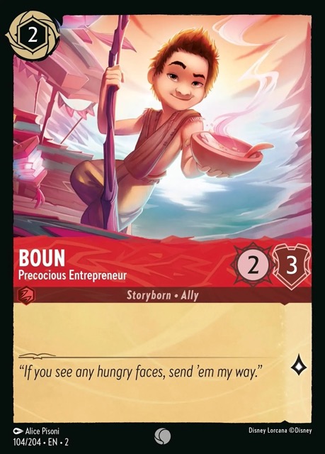
Blobby background art, lots of digital airbrushing (I think), and he’s shoving food in your face. And, well, he’s not really a great character to begin with. Boun was a groaner card throughout Rise of the Floodborn, meaning that you’d open a pack, see Boun, and groan. Sorry Boun fans.
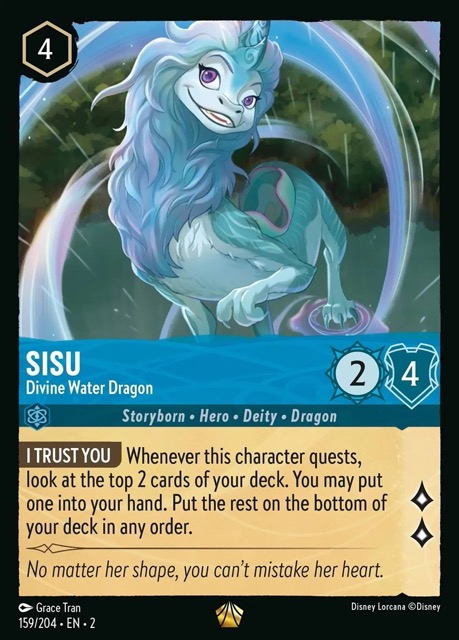
This card bugs me because it’s pretty decent overall but Sisu’s face is almost in a different art style. The heavy black lines of her features don’t really match up with the rest of the illustration and it gives it a kind of rushed feeling that it doesn’t deserve. Contrast this with the Enchanted Sisu by the same artist, which is one of the best illustrations in the game.
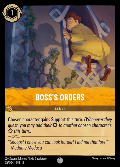
I was going to slot Mr. Snoops, Inept Businessman here but then I saw this card on the list and there’s Mr. Snoops’ ass shoved in our faces. I hate The Rescuers. Possibly more than I hate Cars. But at least Miss Bianca and Bernard are cute. Mr. Snoops and his Cruella wannabe boss Madame Medusa practically smell like Michelob and Marlboros just by looking at them, and the whole vibe of their film is mired in this depressing, 1970s murkiness. I don’t like any of the Rescuers cards to begin with (and I won’t play with the kind of good Sardine Can out of principle), but this is the ugliest of the lot.
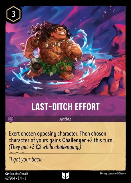
I’m really not sure what is happening in this psychedelic freakout but it looks like a sentient meatball about to take flight through a Jack Kirby panel to battle Silver Surfer. Maui looks compressed and squishy- I mean, moreso than usual- and the whole space tornado thing is a strange look for this nautical hero. It’s a really jarring look quite different than most of the other cards.
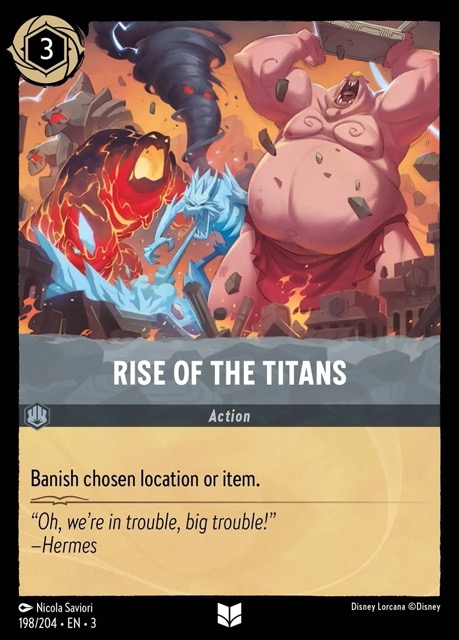
Back in the 90s, there were a couple of occasions where Disney artists were accused of putting sexual messages and images in some of the artwork on videocassette boxes or in the films themselves. For example, one of the towers on King Triton’s castle on The Little Mermaid box looked suspiciously like a popular sex toy. Turns out, the artist really did draw exactly that as a joke. Now, with all that in mind, I present you with Rise of the Titans. Reminder- all art is subjective.
Next time- let’s redeem this column and look at the best art in Lorcana!
