John Blanche, artist, visionary, driving force behind the weirdest and most wonderful corners of our hobby, retired last month and – in lieu of a retirement party – we at Goonhammer wanted to take the time to mark his immense influence and unfathomable inspiration that John and his work have given to us over the years.
John illustrated innumerable fantasy worlds, but his association with Games Workshop started right at the beginning with White Dwarf issue 4 (Jan 1977) and since then John’s work hasn’t just been important to GW, it’s defined the look and feel of their worlds. His illustrations opened up what 40k and Fantasy look like, inspired a million conversions and, in more recent years, have spun off an entire miniature art movement based on his distinctive, evocative painting style.
The best way we can think to say thanks and happy retirement to John is to show off his art and the miniatures we’ve made that he’s inspired, so here come a tide of Goonhammer writers to tell you all about what they love about this creative titan.
Lenoon
This article was my idea, so I’m going to kick off. This isn’t just the first bit of John Blanche art I ever saw, it’s the first bit of GW art that I came across full stop. I first knew it as the weird cover of an amazingly exciting magazine, but you might know it as the cover imahge for 1997’s Epic 40,000.
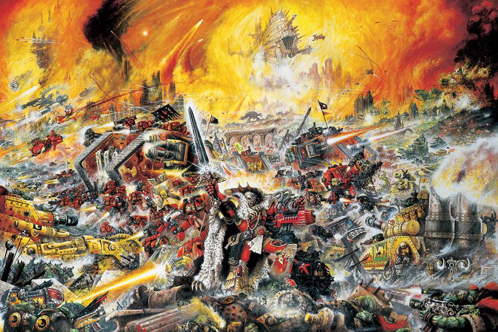
This is, was, and always will be IT for me. This is what 40k is – monstrous, maddening, bizarre, messy, detail to drive the sanest hobbyist mad, monsters fighting monsters for inexplicable ends at ridiculously short ranges, scale-destroying ships and titans and tanks and missiles, explosions, red, yellow and orange fighting over black, grey and gold. Every time I look at it – 25 years on for god’s sake! – there’s another detail that I spot in there (I’ve never noticed the imperator titan before) – and another conversion idea to put together, another crumb of genius to extract from it. I will never not love this image, and it not only got me to stop and buy the magazine, it got me to stop and spend the rest of my life and far far too much money on this hobby. What a gift from a master!
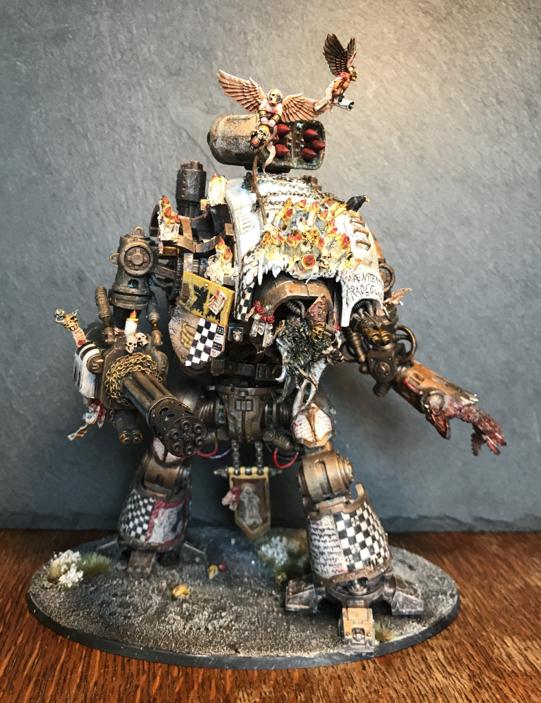
For my Blanche inspired miniature, I don’t think I have to say much about it. I watched, read, studied images and then went into a fugue state while reading the Canterbury Tales. Out the other end of it all came this, which I hope goes some way to showing the immense influence of John over my hobby time.
King_Ghidra
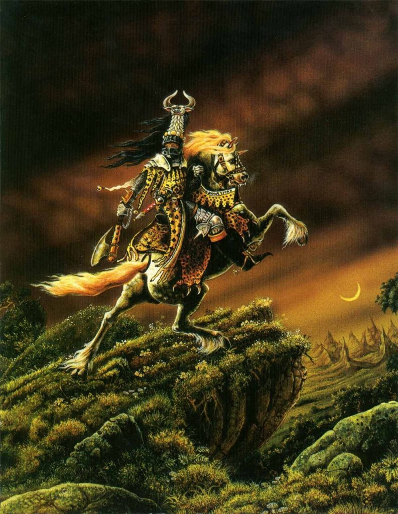
This piece was the cover to the very first White Dwarf I bought, #84, way back in 1986. It is pretty grounded by the standards of most of John’s work, but aside from being a beautiful piece, it still exudes medieval fantasy. Later in life I discovered it was based on a painting by Théodore Géricault, called The Charging Chasseur, which is a very Blanche thing and made me love it even more. The art in those early White Dwarfs was so influential on my idea of the possibilities of what fantasy could be, and the world of Warhammer would have been so much the poorer without John’s radical vision and influence.
Keewa

This is the first piece of John Blanche artwork I’d ever seen, although I didn’t know who painted it back then. I was maybe 8 or 9 years old, thumbing through David Day’s “A Tolkien Bestiary” when it hit me, a bolt from the blue. This incredible sweeping vista of the famous battle from the end of The Hobbit, so bursting with detail and life that I pored over it for ages, looking at every last bit like the world’s most gruesome Where’s Wally page. The colours are muted but the sense of place is absolutely stunning. The shape of that cloud of bats is seared into my mind, when I was looking through the catalogue for a favourite piece, for this tribute, it could only be this one. Thank you for defining fantasy art for the past half century. Salute to one of the greats, enjoy your retirement.
Summer
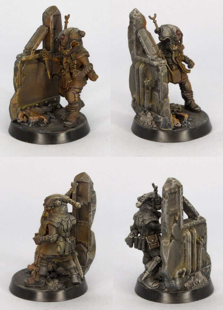
In my opinion, a standout facet of John Blanche’s style is its monochrome nature. The visual art of his era reflected this via a lack of strong contrasts. Today, a clash between different sides is always marked by strongly contrasting colour schemes. The red and black of Chaos versus blue of Astartes. The white of T’au, or purple Tyranids. Contemporary 40K art is a clash of colours that represents factions and tones. The cover of the Indomitus Core Book depicting Abaddon and Guilliman is a hallmark of this newer style. Blanchian work (like the dark mechanicum techpriest pictured) is brown and dirty. In appearance, a character could be a ‘good’ or ‘bad’ guy. But that doesn’t matter. What matters is that it is disconcerting and grim in nature. Blanchian work, AKA Blanchitsu deviates from contemporary 40K art by using a very narrow colour palette. It leans on dirty, grimy browns and reds. It bears the characteristic scratchiness and messiness of old, hand-painted 40K art.
A few years ago, I painted an experimental model in this style. I decided on a Culexus Assassin. Blanchitsu modelmaking strongly encourages conversions and experimentation, so I started with a commitment to not use a single part of an actual assassin kit. I ended up with a very interesting model that I painted with a twist. I used browns and oranges layered over a textured grey base to depict a Culexus Assassin skulking near firelight. I think it adequately captured the ruddy, monochrome, and sinister aesthetic of Blanche’s style in a tabletop format.
Musterkrux
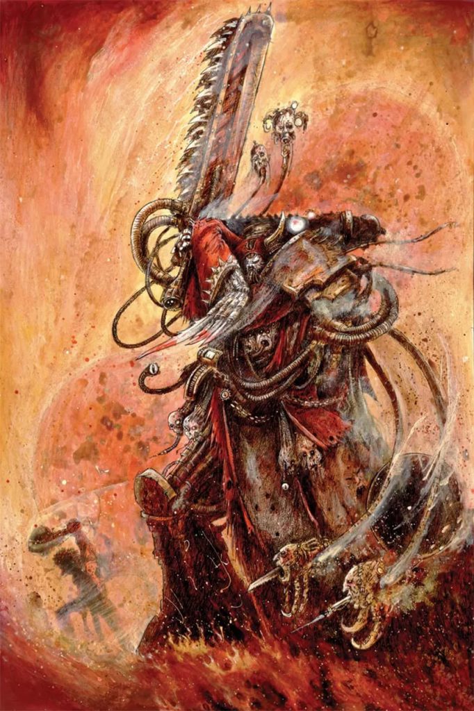
John Blanche’s picture of Ezekiel, Chief Librarian of the Dark Angels, is peak 40k for me. Powered Armour? Check. Hood and Robes for Maximum Mystery? Check. Honking great magical weapon? Check. Obscene amount of PPE and a Bionic Eye, hiding what little vestiges of humanity remain? Double Check. So cool.
I picked this image because it inspired me to want to buy Ezekiel as a young, maybe 11-12 year old, proto-nerdling. I was an Ultramarines player at the time but the 2nd Edition sculpt for Tigurius was kind of boring. So, I wanted Ezekiel, who was a mysterious, hooded bad-ass with a bionic-eye and a sword. A Games Workshop Red-Shirt all but forced me into buying Tigurius the day I came in to buy Ezekiel and that interaction formed a core memory for me that endures even now. Jokes on you, random Red Shirt from 25+ years ago, I bought Ezekiel another time I visited the store…
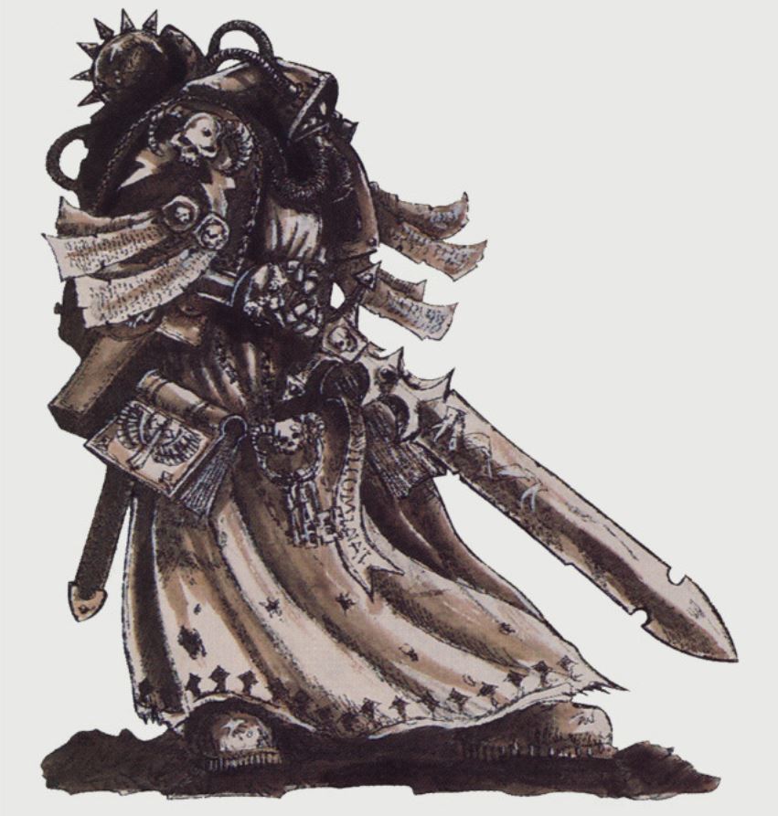
This art, along with so many other pieces captured my imagination as a young boy and represents the foundation upon which an entire galaxy of fantastic characters and concepts was built. A galaxy I hope to share with my son when he’s a bit older. Thank you, John.
Skails
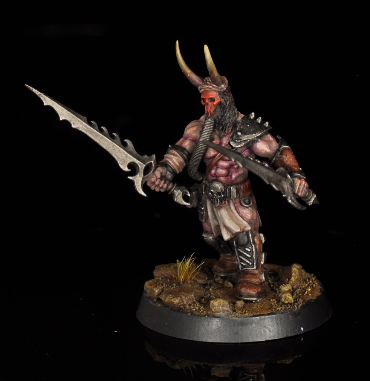
I really became aware of John Blanche and Blanchitsu style in 2018 or so, despite an early warhammer stint from 1997 to 2002ish. His work was unmistakeable even at that time though. His loose, sketchy style is so expressive and imaginative. He did a lot to build the visual weirdness that made Warhammer and Warhammer 40,000 such novel universes.
what I want to share here are two models that were a personal turning point for me into more serious kitbashing and directly inspired by a couple of John Blanche illustrations. These kitbashes were for a contest with the idea of taking two infantry kits and combining them to make a blanchitsu style warband. I used Kairic Acolytes and Orlock gangers (plus citadel skulls, greenstuff, and piano wire) to make these wasteland scavengers/chaos weirdos.
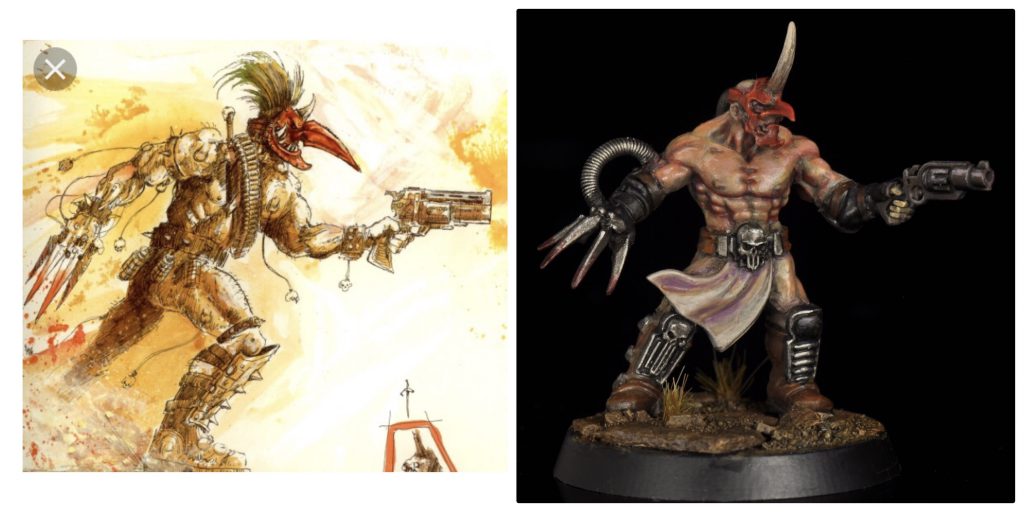
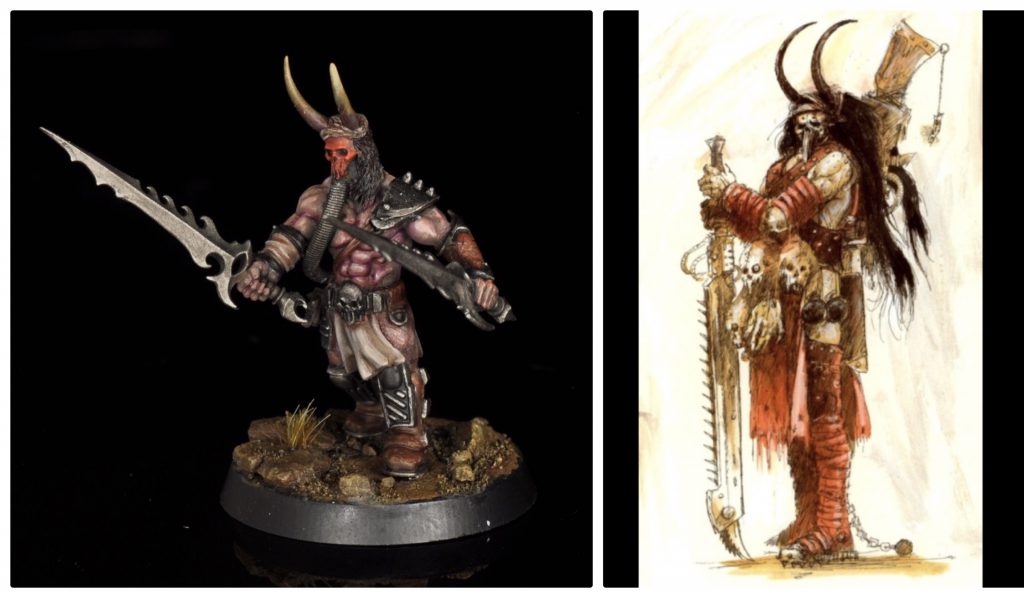 These two were made as close as possible to the artwork with the pieces I had available. You can check out the rest of the warband/cult here: Skails’ Blanchitsu Helot Cult
Perigrin
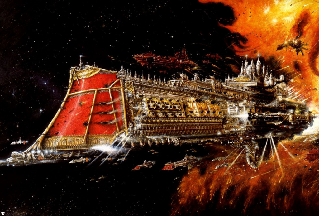
I have been a fan of Blanche for nearly the entire time I have been in this hobby, though I didn’t know his name until the Blanchitsu trend took off a few years ago. In my mind his art defines Warhammer in a way that no other artist’s does, the limited color pallet and general sickly, warm vibe of his art doing a better job of evoking a feeling in me than any other piece of 40k art.
This above piece of art, which I do not know the name of, first appearing I don’t know where but first being seen by me online, (Lenoon edit: it’s the battlefleet gothic cover art) oozes 40k in a way nothing else I have ever seen. The image of a cathedral flying out of hell firing a lot of guns is rad as hell. I am not as well versed in art as some of the people here at Goonhammer, so I don’t really know what to say other than that it just evokes the grand scale of the setting in a really great way.
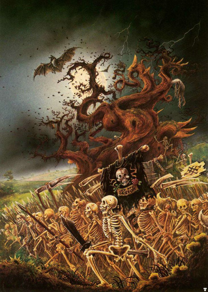
It was too hard to pick just one piece of art, so here is one for the other of Warhammer’s two settings. The cover of the Skeleton Horde box has an ominous, sickly vibe that I think more people associate with Blanche than his more epic 40k art, and I am personally such a massive fan of the twisty, branching tree in this piece of art that I want to sculpt one. Fantasy was always my preferred gameline, and I blame seeing this art as a kid on an old box my dad had sitting in the basement from eons ago for giving me a lifelong fascination with it. I still need to get around to doing an Undead army though. By the time I was buying models for this game they had switched over to more armored skeletons, which just didn’t hit the same vibe as this art piece, which is what I would want to emulate. I hope Blanche enjoys retirement, because his art really defines both settings to me.
Josh:
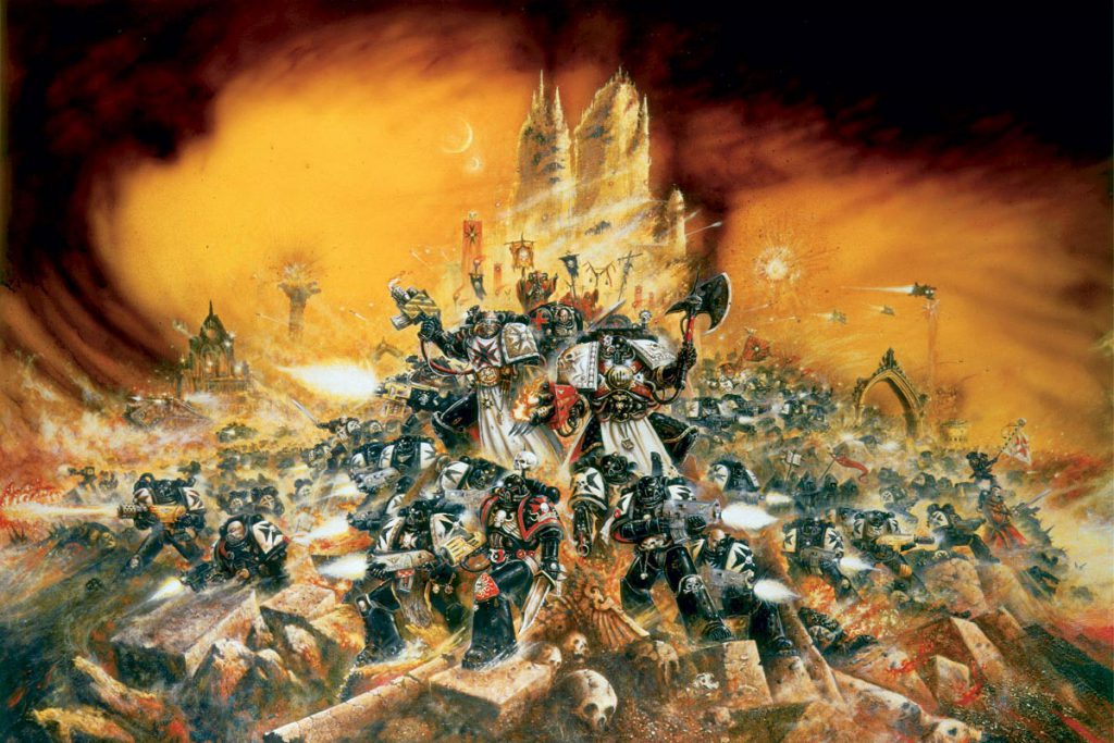
It’s a real struggle to narrow down which piece I want to celebrate when it comes to Blanche’s artwork. There’s such a range to them that it makes me feel like picking one is leaving out the brilliance of the others. Ultimately, I chose the absolutely iconic Third Edition cover, the image that for me is synonymous with the idea of Space Marines as these grim, fanatical, barely-human behemoths.
I love this image so much I spent two-hundred odd quid for an official artprint to put it up on my wall. It’s packed with detail as soon as you drag your eyes from the forefront. A sweeping, wartorn landscape, packed with the equally disturbed human retinue of the Space Marine, who all just don’t look quite right in their own way, under the sickly yellow light that gives the impression of the apocalypse, all capped off with hive city that looks like’s burning.
I want to describe every detail in this piece, because there’s so many, but I’ll be here all day.
Blanche inspired me to pursue the Space Marines in a way no other Warhammer art has ever gotten me too. His colour palette is synonymous with Warhammer, in my mind, and it communicates this vibe of post-armageddon that I’ve always found strangely appealing and calming. Thank you. John Blanche. Your art rocks, and it made me wanna’ make art that rocks too.
Thanks for it all John! Enjoy retirement from everyone you’ve inspired here at Goonhammer!
Comments, thoughts, suggestions, cool blanchitsu conversions to show off? contact@goonhammer.com, comment below or join our patreon
