You’ve just painted your miniature, you feel proud of your work (or proud enough anyway) and want to share it with the entirety of the online community – on social media, in your hobby group chats, etc. You snap a pic on your phone and….it looks nothing like it does in person, and instead much much worse. Today we’ll be discussing what you can do to up your photography game and show off your hobby.
General Tips
Regardless of your set up there’s a few truths that will help you get better pics quickly:
- Have a darker background than your model. In most cases this will help draw the viewer’s eye to the model, and makes colors pop better. If you need to take photos on white for some reason I’ll add some points at the end of the article.
- Keep the backdrop as far away as possible. There are a couple reasons for this – if your backdrop has any texture to it (typically from being fabric or mousepad material) it can cause some visual noise from having that high frequency texture near your model. Moving the backdrop further away drops it out of focus and mitigates this. It also lets you light the background separately from your models, so you can make sure both parts do what you want.
- Avoid harsh light on the models. The closer in apparent size your light source is to your model, the harder the shadows will be. You can see this going outside, despite the sun being very very large, its so far away that it appears small, and on a clear day shadows will have very hard edges. On a cloudy day, despite the sun being in the same place, because the clouds are diffusing the light it appears to come from a larger area, wrapping around and softening shadows. With your model photography you can solve this fairly easily with tracing paper, parchment paper, sheer curtains (IKEA sells some very cheap), or any other fairly thin and translucent thing.
- Keep your lights a little further away from your model than you think. Light falls off very quickly, with every doubling of distance being a quarter as bright, so by backing the lights off you reduce the difference between each side of your model. On single models this isn’t usually too big a deal, especially if you have 2 lights, but can be pretty noticeable on larger groups. This does mean you need to make sure you’re adding diffusion to the lights, as by moving them further away you’re also decreasing their apparent size.
- Stabilize your camera. By diffusing our lights and moving them further away we’ve reduced the total amount of light hitting our scene, so we need a longer exposure to compensate. Most people’s hands shake quite a bit, especially as phones aren’t designed for stability, which turns your model into a blur. A cheap phone tripod is a must for this.
- Control as much of the photo as you can. If possible, download an advanced camera app that gives you manual control. You’ll want to set ISO as low as possible (generally 50-100), aperture as large as possible (it’s denoted by f/number), and adjust shutter speed to get a good exposure. If you can’t get a separate app, try tapping on the model to tell your phone it’s the subject. You may want to turn off any room lighting, as that gives you complete control over what your lighting is doing.
On the Cheap
This is the easiest and simplest way to take better pics of your minis. Using largely what you have already and getting something small and new like a lightbox or a new desk light is basically all you need at this point.
Bair’s Setup
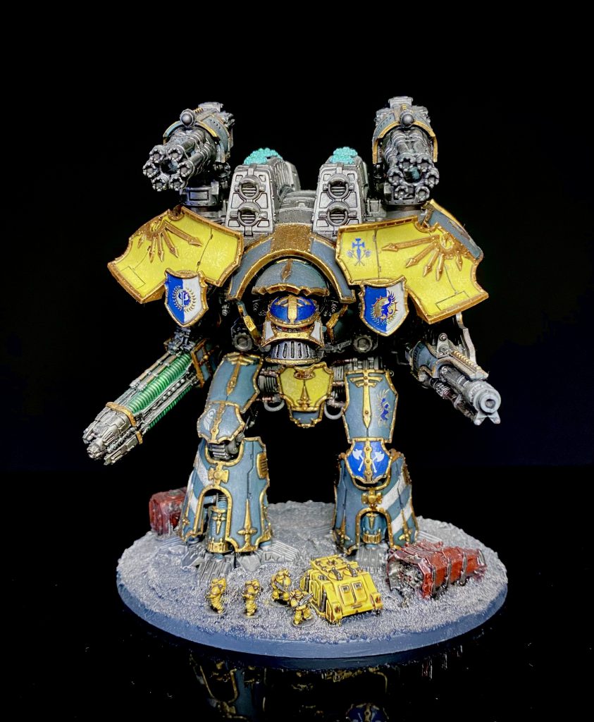
I live in a 1 bedroom flat on the outskirts of London, with my wife, so space is an absolute premium. I’m not able to dedicate any amount of space for…almost anything really. My desk is where I work from home, do all of my hobby and where I take pics of finished miniatures. I’m also not a photographer by any means and have only started messing with editing pictures very recently so is very simplistic. What I use is:
- Desk light (an LED bar lamp)
- iPhone camera and photos app for editing
- Horus Heresy Age of Darkness set box lid
- A3 sheet of black gloss acrylic sheet
- Musou black acrylic paint
That’s it. I took inspiration from Soggy by using the inside of a large box as a back drop; the new Horus Heresy box set works great since it’s already black on the inside but really any large box works since I painted the inside as well. I wanted to try and make the backdrop darker so painted it with Musou black (the blackest black paint) to absorb more light. I painted two coats of this on the inside of the box and it definitely helps to make the background darker by default – if it’s actually worth the cost at £50 per 100ml (I picked it up for £40) however is up for debate, and this step isn’t strictly necessary. Thankfully I needed one pot, and used maybe 4/5 of it, so still have some left for…something I guess. The lamp I have is off-camera in these pics but it’s a long bar of LED’s that I also use for painting. You don’t want the light directly on the model so I raise it up and away when taking pictures so it doesn’t create any weird shadows.
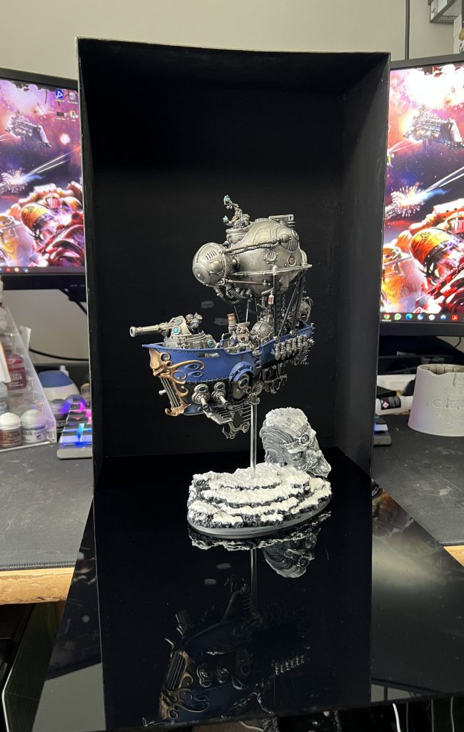
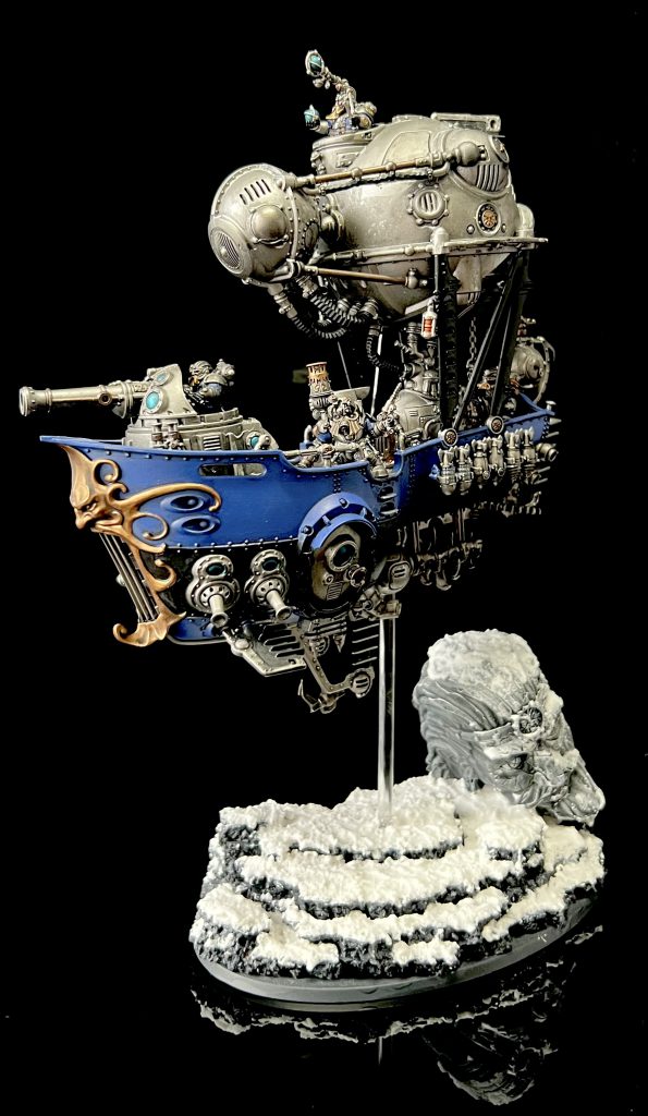
I simply place the box on my desk standing up on the side, with the acrylic sheet down in front of it, models as far forward on the acrylic sheet as possible to keep the background further away and take a few pictures with my iPhone. If the model is particularly tall I’ll just use the other side of the box instead and follow the same steps. After I have a picture I’m happy with I just follow a few simple steps:
- In the iPhone photo app click Edit
- Crop the photo so that the mini takes up most of it and is centred
- Turn the Black Point until the background is entirely black, but not further than necessary
- If this has darkened the model too much turn up Brightness and/or Exposure a little
- Similarly change the Contrast if these have changed the colours too much
The set up and before and after a quick edit:
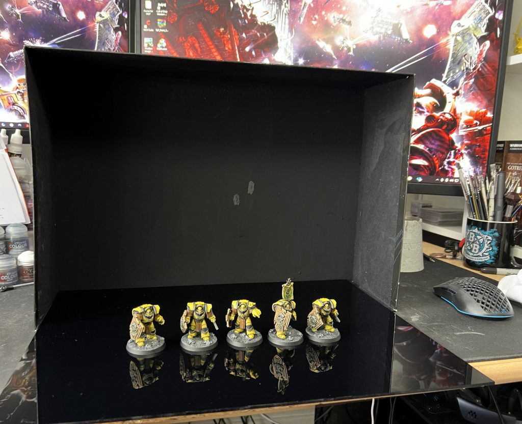
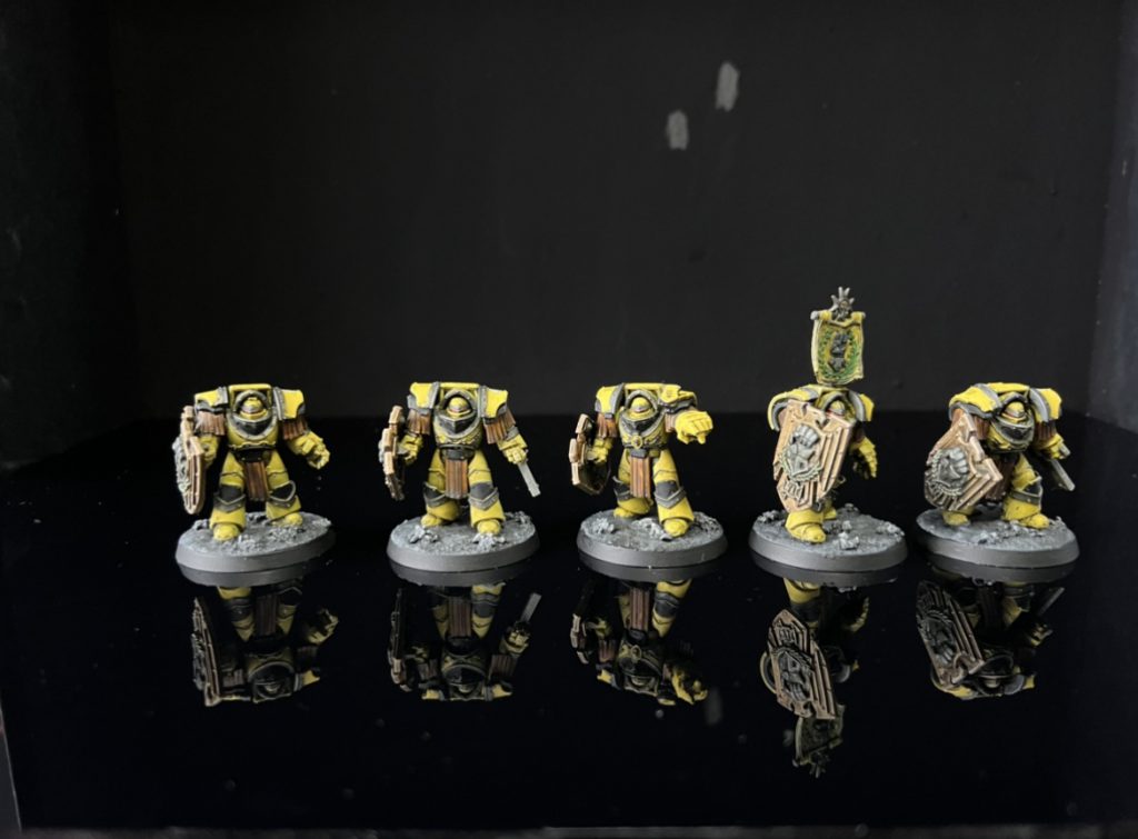
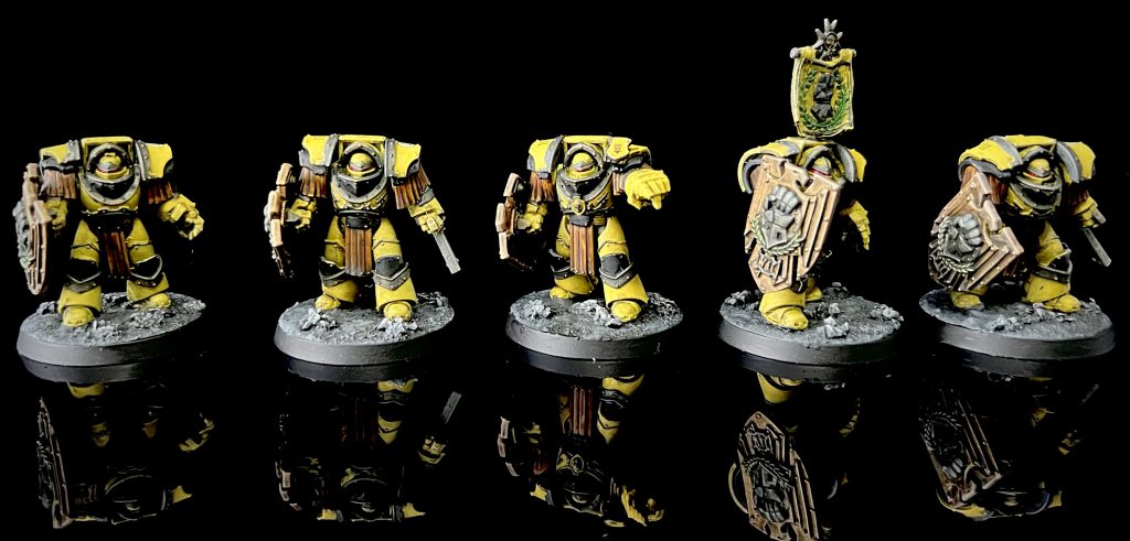
That’s all that I do for my photos. It’ll take some practice with the lights you have to hand and what will look good for the space you’re in.
DYLON
As I’ve shown in previous articles going over my Hobby and Gaming Spaces, I’m blessed with a great space for my hobby. The space allows me to keep a Photo Booth set up all the time. This reduces the effort it takes to get photos of my stuff, as I’m able to finish something and walk right over and shoot it, before it goes a lives in a display cabinet.
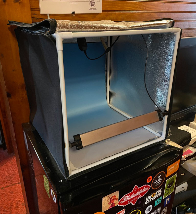
Living on top of my beer fridge, I have a Travor Photo Box that can be found on Amazon for less than $60 USD. I use my iPhone 12 Pro to take pictures and do minimal editing within Instagram before I post. The photo box has 2 LED light bars, that I have set to above-and-slightly-forward and one directly in from-of the minis. The reflective side material helps to bounce the light to the sides of the minis to reduce weird shadows or glare.
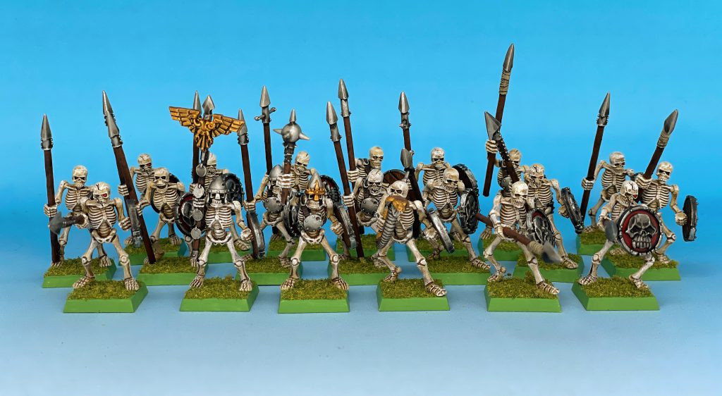
I have a Macromat blue-to-white fade mat that I use as the background for a bunch of my stuff. I use it as if when I’m shooting classic minis or with terrain for AoS or 40k stuff.
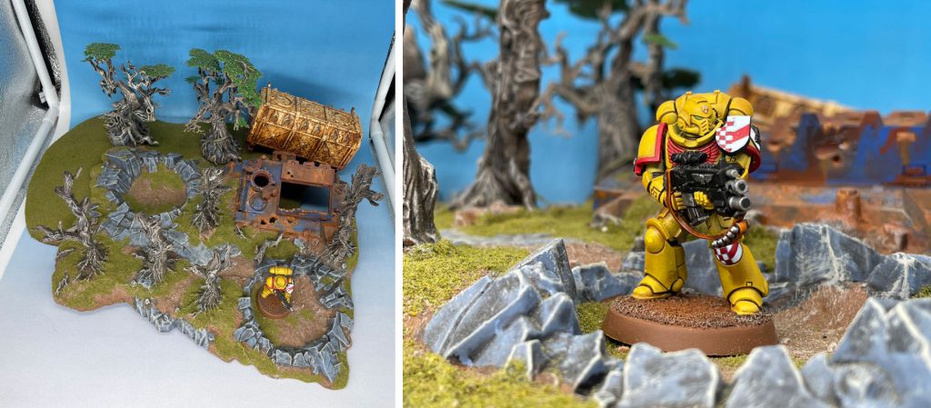
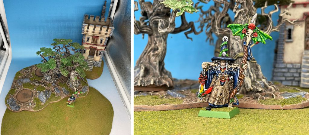
When shooting 40k stuff, I’ll grab some quickly-identifiably 40k terrain, battle scape, containers, etc and place them in to build some depth and create a setting. Age of Sigmar is the same idea, building a setting with universe-correct terrain grounds your mini.
Necromunda is the only difference here, where I have a store room that I built that looks super cool, but isn’t the best to play with, which ends up living in the Photo Booth.
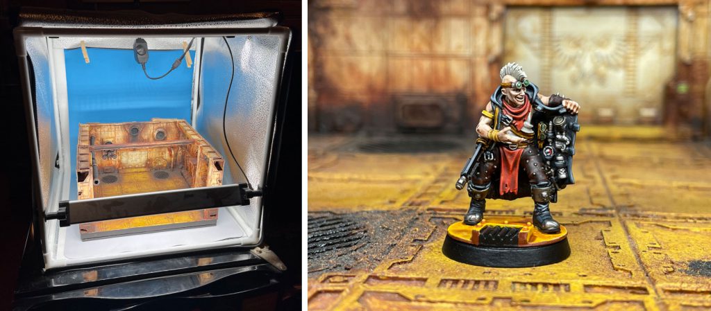
The only thing I do in the iPhone photo app is to use the 2x optical zoom, which has less distortion so your mini will look more natural. it also allows you to get the mini larger in your image without having your phone crammed an inch away from it. And then, in Instagram, I’ll crop as needed or do very mini color correction, but I’ve found that the combo of the light box and the terrain give me pretty good white balance, tonal range, and exposure. Not always, but pretty consistently.
Fowler
Let me show you a brief succession of Fowler’s lightbox setups. I am a heathen and shoot on a light background, and don’t really want to invest time in dialing much in. I shoot with a Samsung Z Flip 3 – the foldy phone – which is actually amazing for (lazy) mini photography. The fold lets you get your phone at mini level pretty quickly, and the camera is pretty solid. I edit pictures with Snapseed, which I use to adjust brightness / levels (and edit out dirt specs). Even if you don’t really know what you are doing, just go to tools > Curves, and nudge it around until your picture looks better.
Guess what? If you have an airbrush booth, you have a photo booth!
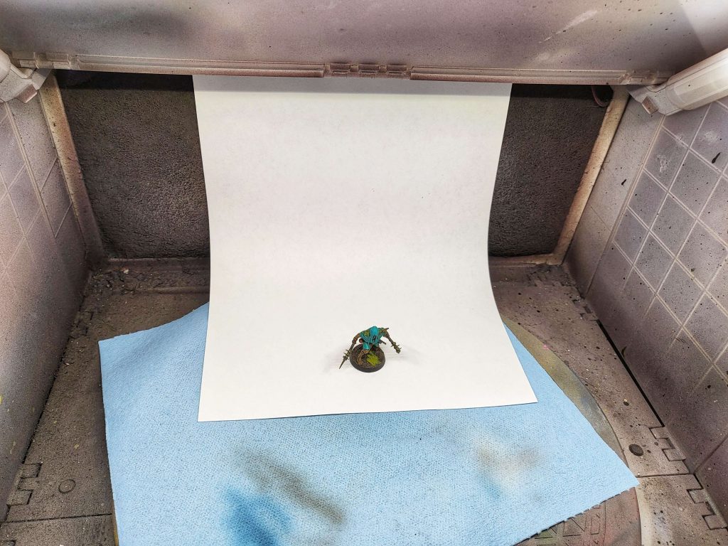
The lights inside the standard booth are alright, but if you can aim a lamp in there as well, you might be surprised by the results you can get out of it. Especially if you want to get a nice quick shot of something in progress / just finished, your booth can look great.
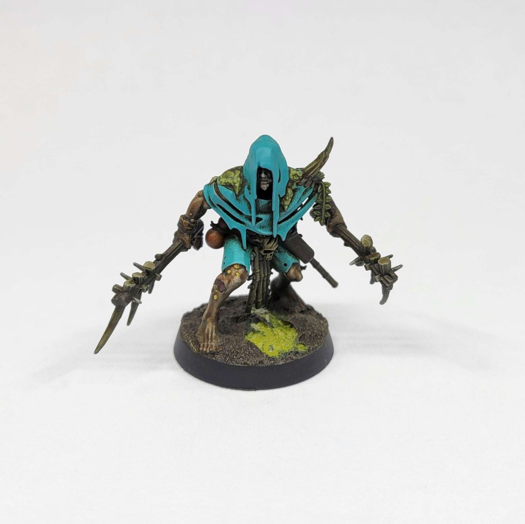
Next up is the first lightbox I bought. This was around ten bucks on Amazon, and is powered via USB.
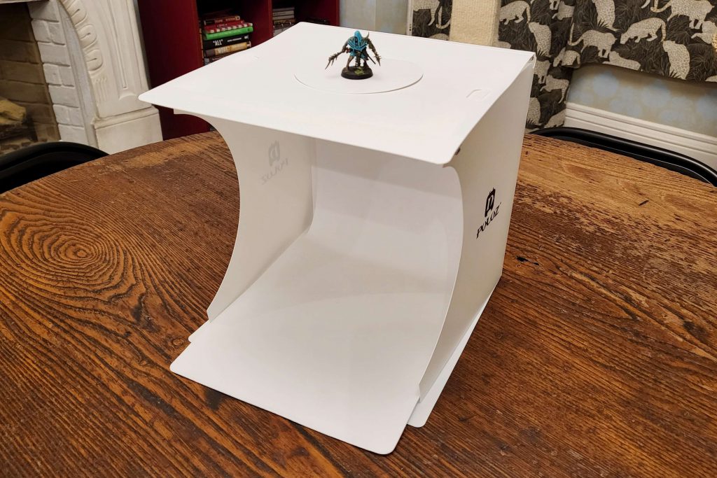
One of the tough things about shooting on white is dust. Especially if you leave your lightbox permanently up, you will inevitably find tiny dust bunnies. I keep a hand vacuum around for that, but wiping the background down every time you shoot helps as well.
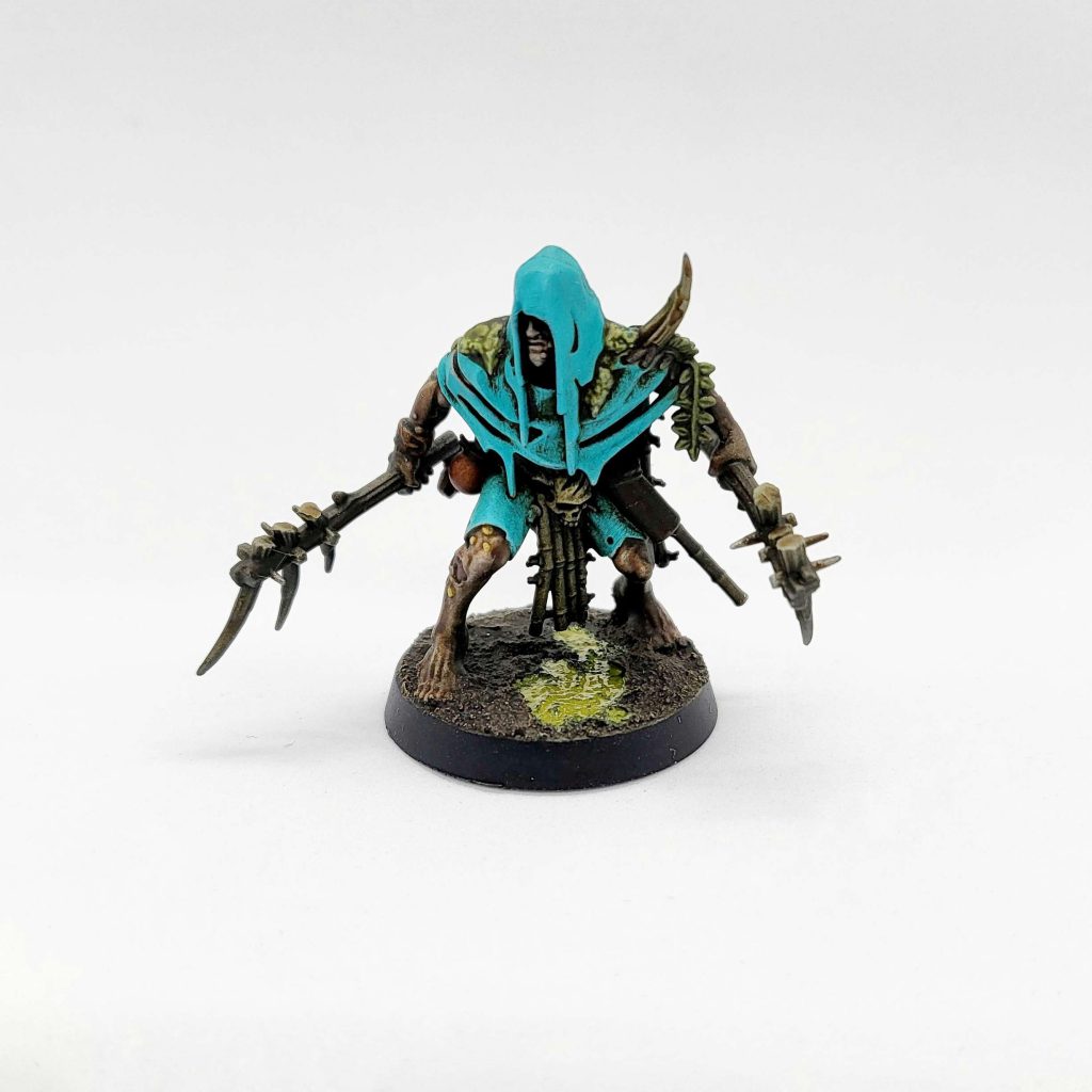
Nowadays, I have a 18″x18″ folding lightbox that has a permanent home. it’s worth the space and the effort if you can spare it – especially if you can set it up close to where you finish painting miniatures. While I can’t find this specific OEM for sale any more, it was a flash deal on Amazon for about $40. The box Dylon posted is very similar.
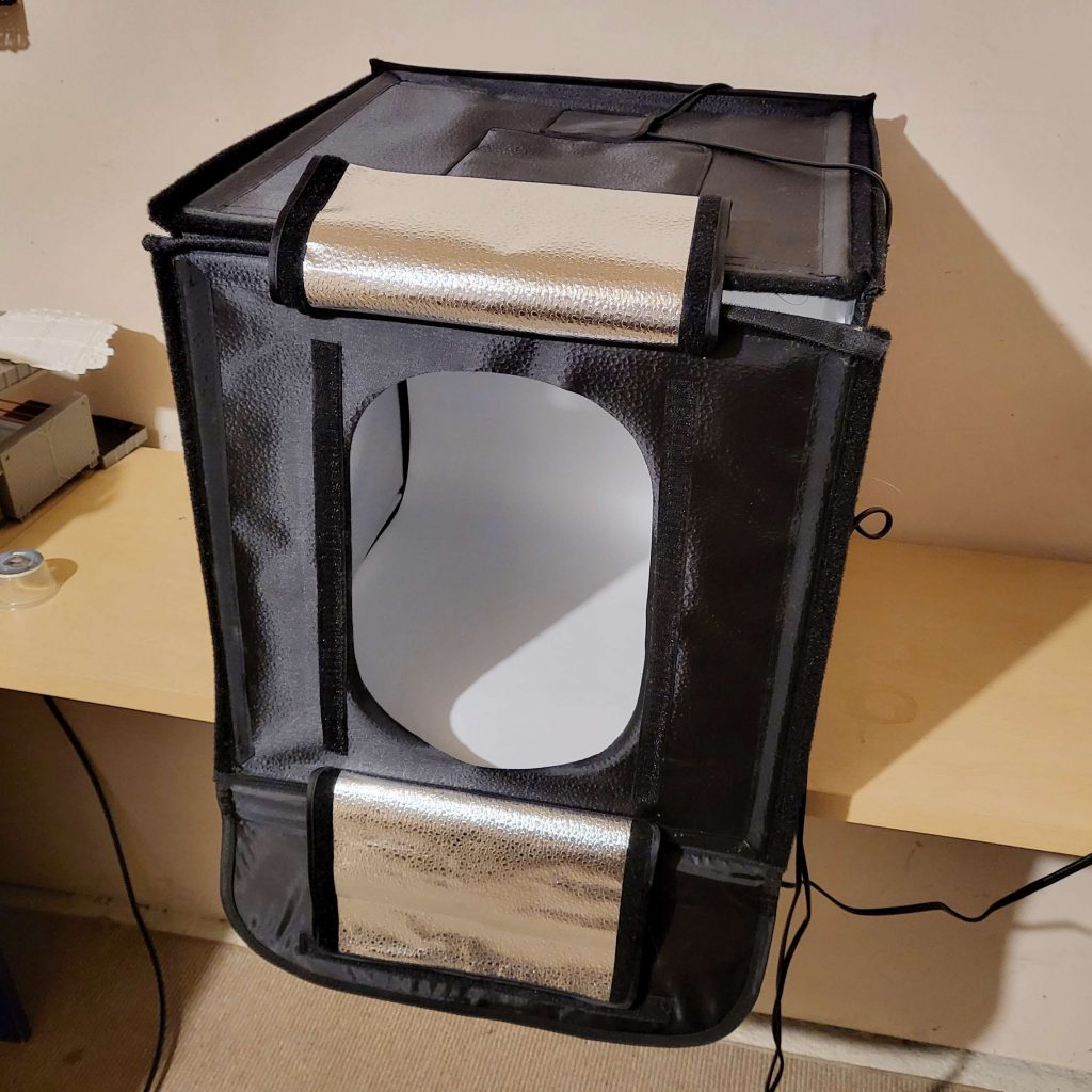
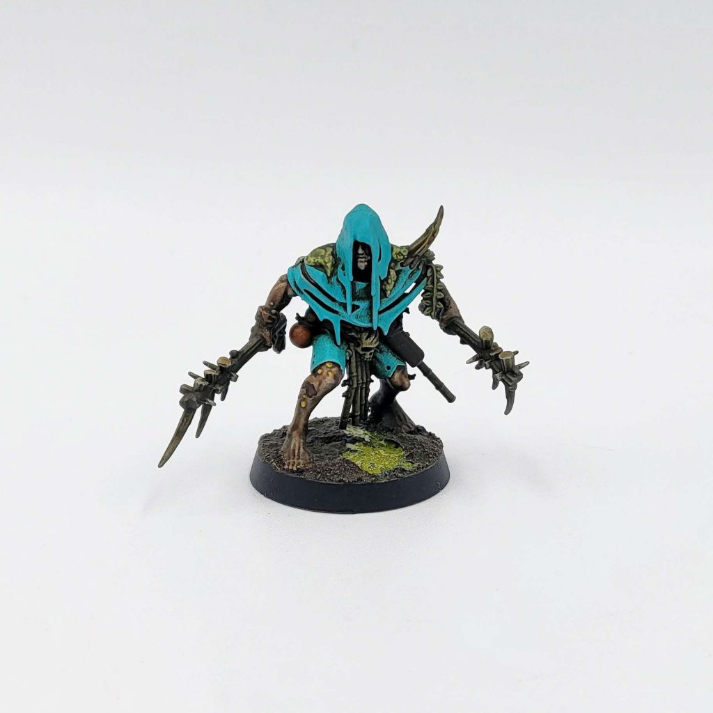
All of the stuff above is more than sufficient if your main posting outlet is Instagram or the occasional glamour shots in an article.
Pendulin
Glossy black acrylic, sheets of foamcore, a tripod – you’ve heard it all before. But we’re now going to kick our photos up a notch with some dedicated lighting, a mirrorless camera, and a little razzle dazzle in Photoshop.
Also note that this section may as well be named “Jack’s Photo Setup on a quote Budget unquote“, as every piece of my setup was put together following his recommendations. If you want to break the bank and get the best photos possible, check his section below. That being said my own setup costs costs a pretty penny, totaling up to shy of $2,000, with the bulk of the expense being the camera and lens. But even if you use the camera on your phone, you can still improve the quality of your photos with some of the cheaper parts of this setup like proper lighting and a tripod.
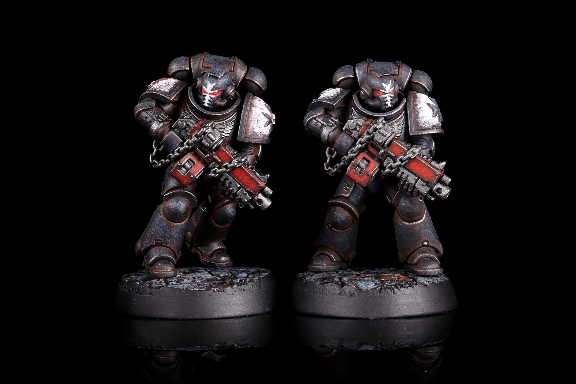
If you recall my article from last year, Getting Started With Photogrammetry – Part 1 – Taking Photos, you’ll already be familiar with my photography setup. I’m going to take an image from there, cause plagiarism isn’t a crime if you’re stealing from yourself.
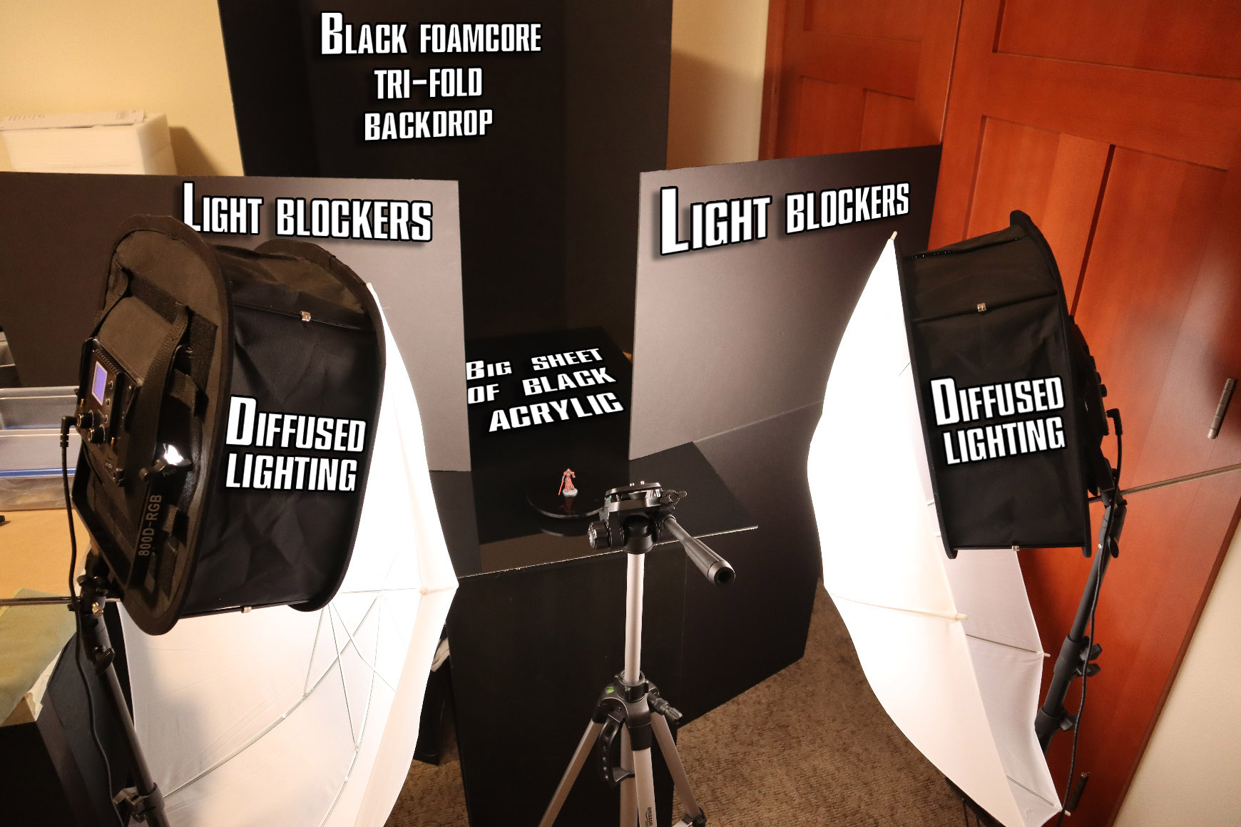
This might look big and elaborate, but it’s really not. Let’s go over each one of the elements of this setup and see what they’re all about. Note that this photo has the model on a small lazy susan. It was there only because I was shooting photos for photogrammetry, and I don’t typically use it.
- Big Sheet of Black Acrylic
You know it, you love it, and if you browse Goonhammer for any length of time, you’ve seen countless photos using it. This is a 2’x3′ sheet of glossy black acrylic that I got cut at a local acrylic store – I don’t recall the price, but I know it was under $100. It lets the reflection of the model show up if your camera is at a shallow enough angle, while keeping other reflections to a minimum. I - Black Foamcore Tri-fold Backdrop
Available for cheap from any hobby store, or for free from an elementary school science fair if you’ve got low morals and fast fingers. It does exactly what you think, give a photo a nice black background. - Diffused Lighting
An absolute slam dunk of a purchase is some LED lights and diffusers. I’m using a pair of relatively cheap LED lights, diffusion boxes, and umbrellas for that sweet double-diffusion. The lights I use even came with their own tripod, which is kind of crummy, but also it’s absolutely good enough for me. Total cost for these was around $200. - Light Blockers
“But Pendulin,” I hear you say, “I just spent all that money on lights and now you want me to block them?” Yes, yes I do. You want the lights to hit the model, but not the backdrop. To that end, I close the blinds, turn the overhead lights in the room off, and set up light blockers between my diffused lighting and the backdrop. My light blockers are big sheets of black foamcore, costing around $8 per sheet. I’ve got 6 of them kicking around, but I’m only using 4 in that picture. - Tripod
It’s not labelled in the picture, but it’s essential to my photo setup. Get those shaky hands outta here. I’m using a cheap, Amazon-brand tripod for $30 and it does everything I need it to do: be a three-legged stick that holds my camera in place.
- Camera and Lens
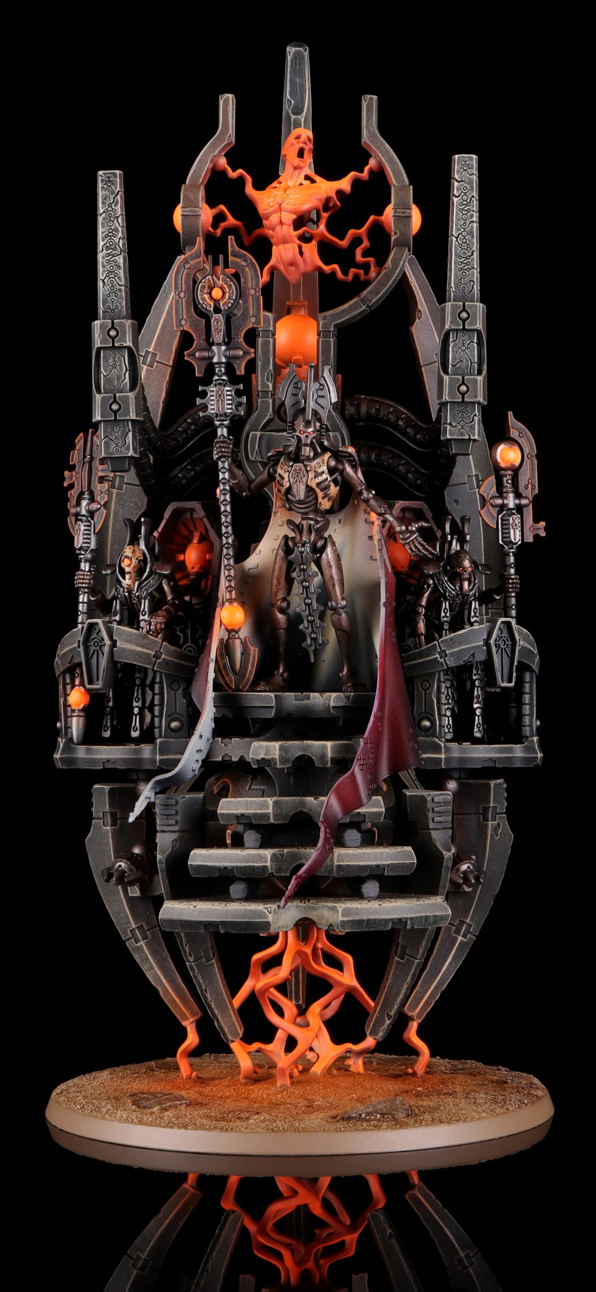
Elephant in the room – the camera itself. I’m using a Canon EOS M6 Mark II camera with either a EF-M 28mm Macro lens or an EF-M 15-45mm lens, depending on what I’m shooting. Not gonna lie, this is hefty investment. For the camera and either of these lenses, expect to drop around $1,200. It’s a doozy of a price tag, but sometimes you gotta spend money to make moneyshots. - Photoshop
The gold standard in paying for features you’ll never use, I get my money’s worth with a subscription to Adobe’s Photography plan. I got the absolute cheapest subscription available, which was $10/month when I signed up. Though a glance at Adobe’s site shows their current cheapest plan at double that, so I might be grandfathered in – shop around. The primary use for Photoshop is “focus stacking” – merging multiple photos together at different focal points to create a single picture where everything is in focus. But I also use this software to crush the background to pure black and clean up stray dust.
With all the “what” out of the way, let’s dig into the “how” of taking pictures.
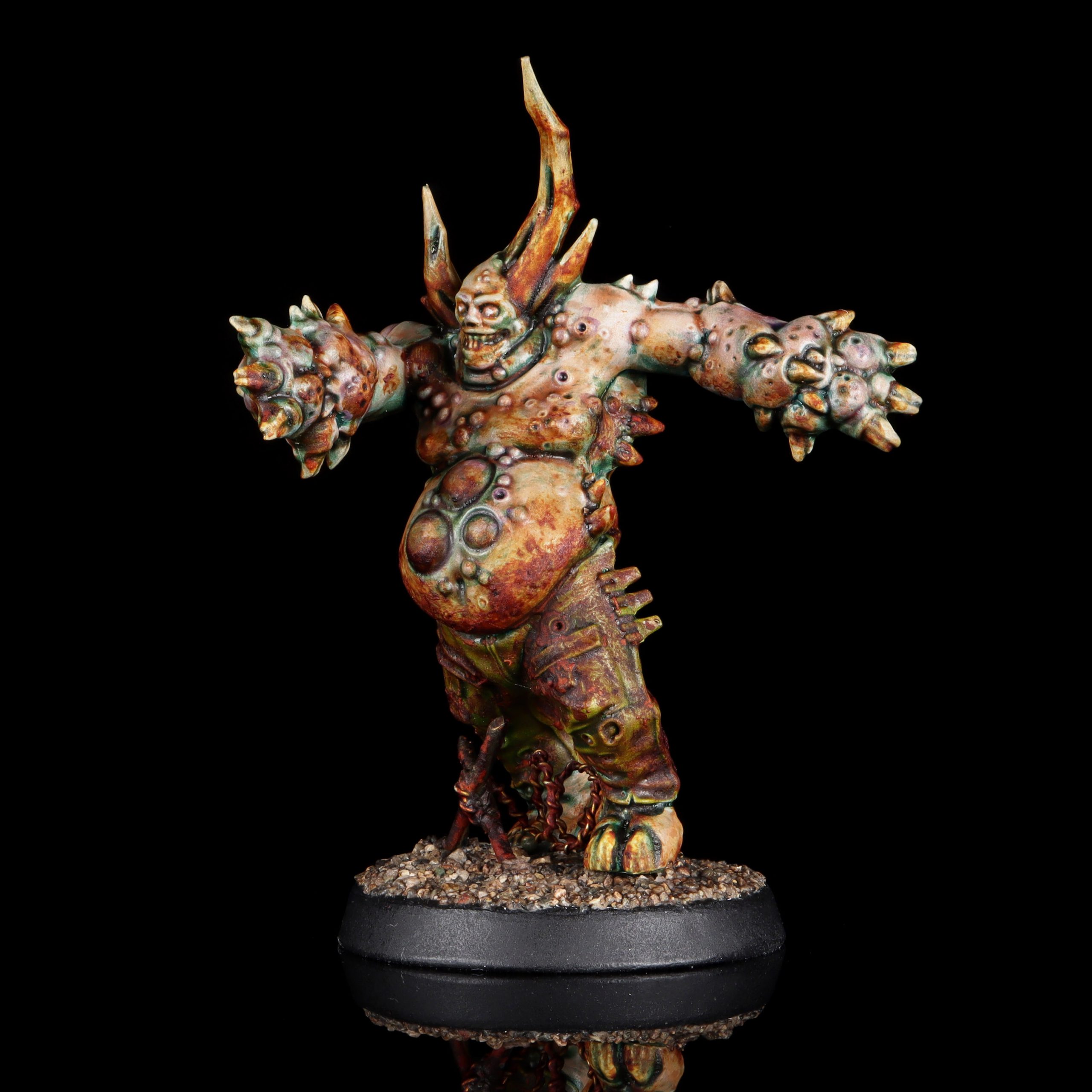
For these photos, I shoot at F11, ISO 100, and then an exposure time around 0.5 to 1.5 seconds. I’m camera dumb, so those numbers don’t mean a lot to me on an intuitive level but, like a good Admech player, I religiously follow tech instructions I don’t understand in order to appease my camera’s machine spirit.
If you are holding the camera with your hands, the first upgrade you want is to get a tripod. Leaving the aperture on a camera open for a full second will create a blurry image, no matter how steady you think your hands are. Even at 1/10 of a second or shorter, your pictures will turn out more crisp and consistent if your camera is affixed to a solid mount. If you’re still having issues with wobbly pictures, look into a remote shutter or take the pictures with a timer. Ideally you aren’t touching the camera at all when it’s aperture is open.
If I’m taking a photo of a single infantry model, then I’ll shoot 5-10 pictures at different focal points, making sure that every part of the model is in focus in at least one of those pictures. For larger models, it just means more pictures to merge. For larger set-piece photos, I might take a couple dozen pictures.
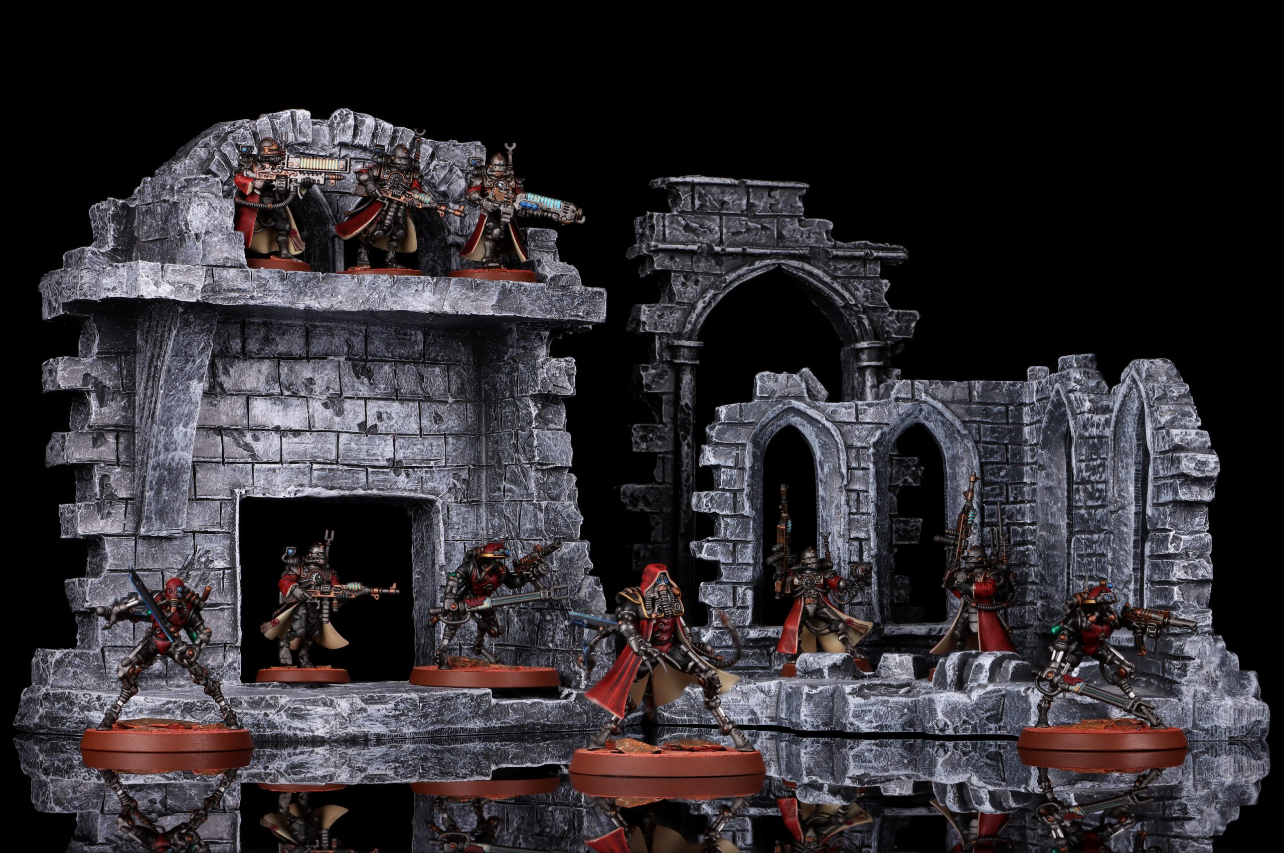
Photos in hand, it’s off to Photoshop. I covered cleaning photos briefly in Getting Started with Photogrammetry – Part 2 – Cleaning Photos, but it’s good to briefly mention the steps. I’m not going to cover every ol’ thing I do in Photoshop, as that’s an entire article on it’s own, but here are the basics.
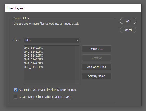
First thing is to focus stack the images – merging them into a single crystal clear photo. Go to File > Scripts > Load Files into Stack and select your photos, checking “Attempt to Automatically Align Source Images” and hitting OK.
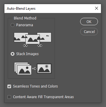
This might take a minute, but when it’s ready make sure all layers are selected and then go to Edit > Auto-Blend Layers. Check “Stack Images” and make sure “Seamless Tones and Colors” is also selected.
This may also take a minute or two, depending on your computer’s specs. But the result will (hopefully) be a crystal clear image! The final cleanup steps I go through you can read about in my photogrammetry, adjusting the photos levels to crush the background, using a layer mask to isolate the image, and using the Spot Healing Brush to remove dust. Crop the image to your liking, and you’re good to go!
Jack: If you want to spend just a little bit more money and save an absurd amount of time, instead of focus stacking in photoshop go pick up a copy of Helicon Focus. Not the cheapest software out there, but it’ll make a focus stack take only a handful of seconds and do a better job than photoshop does.
Jack – on the not-cheap
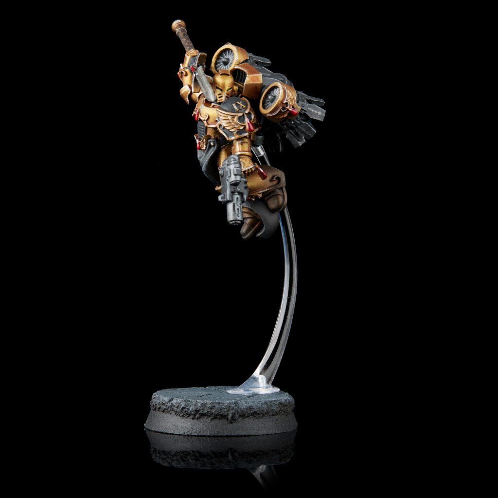
My setup has ended up more or less defining the Goonhammer “house style”, though unless you’re also a professional photographer you probably can’t quite copy it. Regardless, just like some of the setups above, you can get the same effect at a fraction of the effort.
I start with putting a sheet of black acrylic/plexiglass under my model. This is going to be frustrating because you have to dust it constantly, but because it’s very shiny it won’t pick up any glow from your lights – it’s purely reflecting something off in the background that isn’t lit.
I light the model with two large lights. In my case, they’re strobes, but you can get by with just about anything. At one point I tested in the past with a work light from the hardware store and as long as I kept it diffused it worked perfectly. The diffusion on them is about 24″ x 32″ – bigger than you necessarily need for this, but you still want to end up with an apparent light size 2-3x larger than your model. Just move whatever you’re using for diffusion closer to the model and further from the light to increase the size.
The left light is twice as bright as the right one, which gives me some directionality to my image. As we read english left to right, having light flow in that same direction gives a very natural feeling to the image. If you’re just using light fixtures from home you can move the right one a bit further away to dim it, put a lower wattage bulb in, or double up on the diffusion (though if you’re using something more opaque like printer paper this may be far too much).
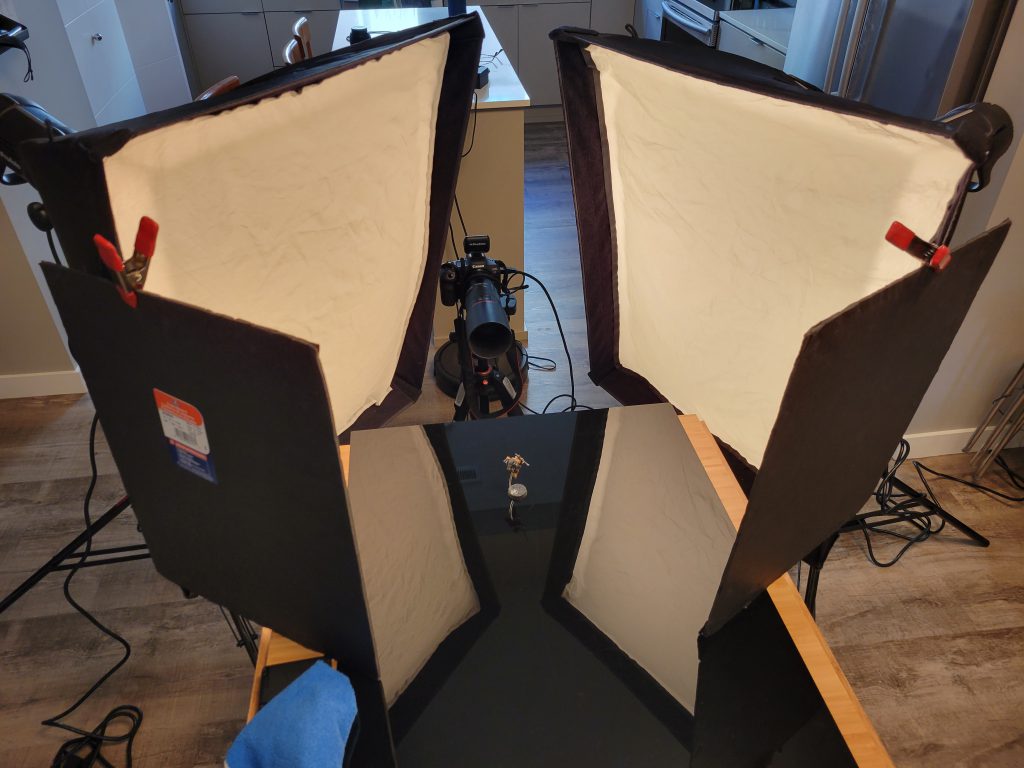
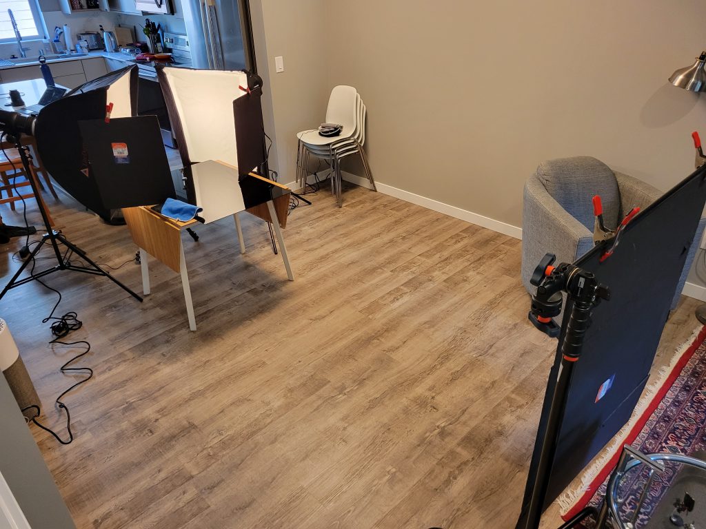
You can see the microfiber cloth I use to wipe dust off the acrylic sheet right there. It’s hidden behind two more foamcore cards, both which are attached to the lights and block them off my backdrop. By cutting the light like that I can bring my lights a little more around the front of the model without lighting my backdrop, which again helps reduce harsh shadows.
The background itself is a black foamcore trifold like you might’ve used for presentations in school. It’s hanging about 8 feet back from my model, which means that even without those blocker cards nearly no light is reaching it.
Photos on white
For the most part, I think these look worse than a photo against a dark backdrop in almost every situation. If you need to not be against a uniform dark color, putting your model in a scene (that keeps some separation between the subject and background, both in focus and in brightness) is going to be the most interesting way to display it. Sometimes however, we do need to take photos on white.
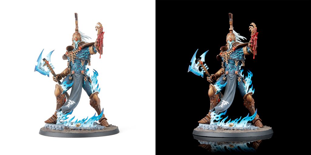
As you can see above, the same model photographed on black is much more vibrant, has better defined shapes, and pops on the page better than the same model on white. I badly wish Warhammer Community would learn this.
Getting off my soapbox, I was able to take that photo on white with mostly the same setup as I used for the photo on black. Instead of black acrylic I used a sheet of white paper that covered my table, and I replaced the backdrop with more white paper. I got rid of the foamcore cards on the lights, as I no longer cared about light hitting my backdrop, and I added a third light to hit the backdrop. This doesn’t need to be diffused or anything, you just want it powerful enough to get the backdrop up to pure white.
I did end up needing to do a bit of photoshop on this, as its almost impossible to get the tabletop surface to pure white without some specialized gear. It was mostly just adjusting the white point to be a spot that turned the table pure white.
Always Be Posting
Following some of the steps above you should be able to get some nice crisp photos of your miniatures in no time at all – just remember the most important rule: always be posting.


