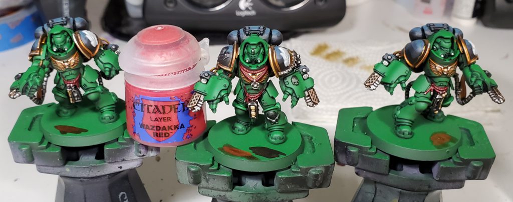
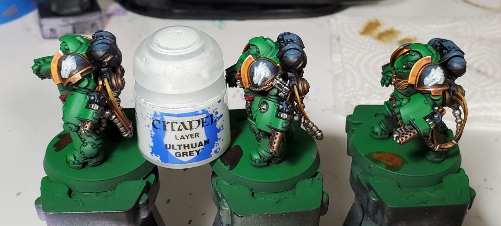
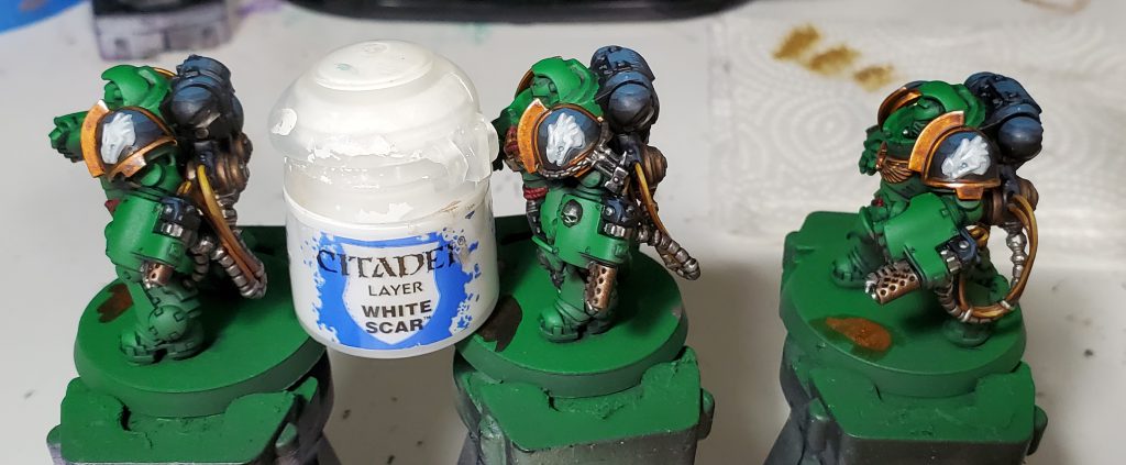
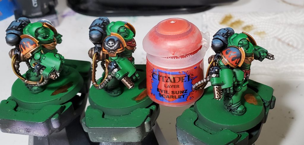
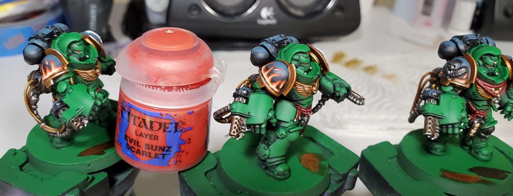
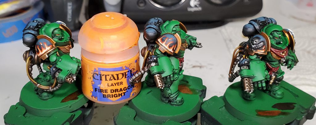
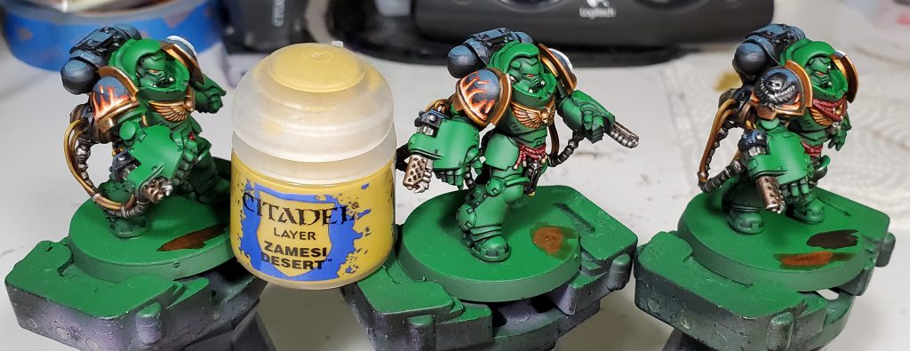
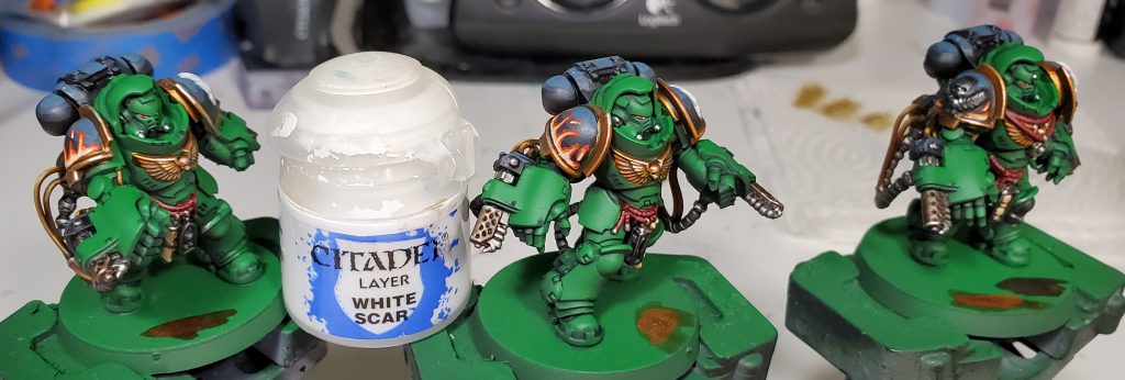
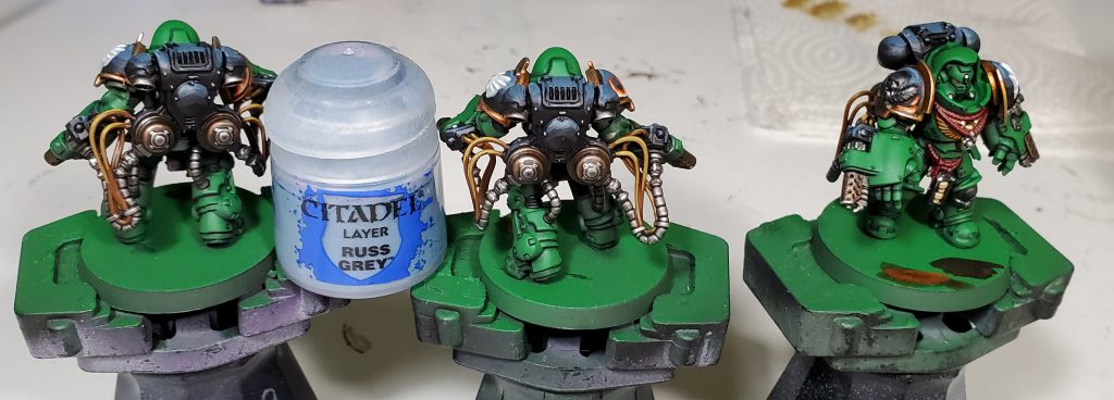
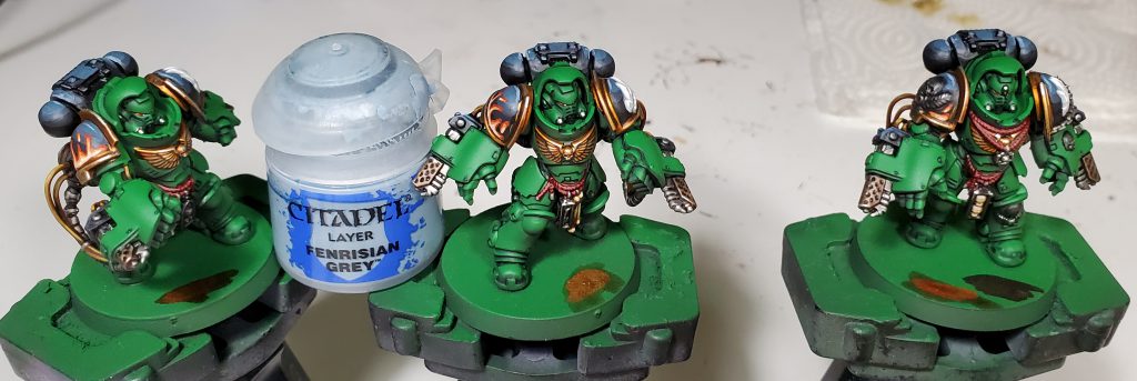
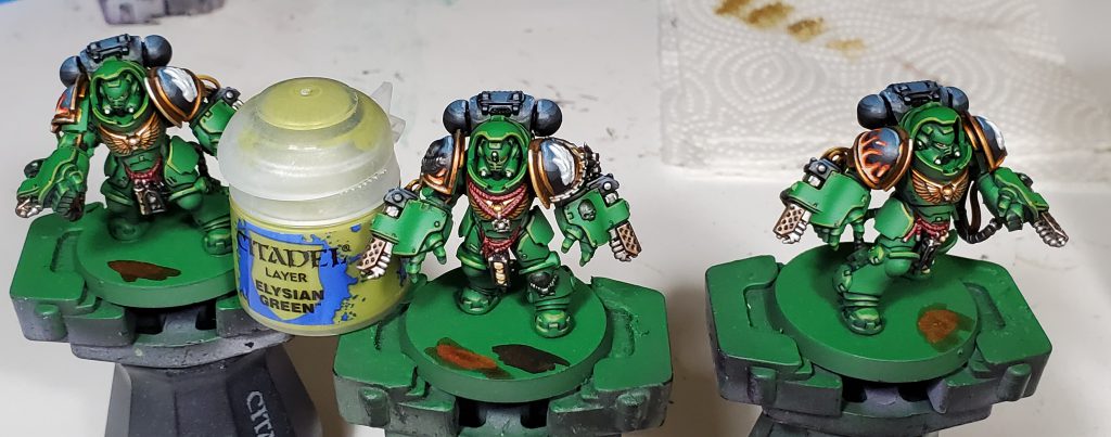
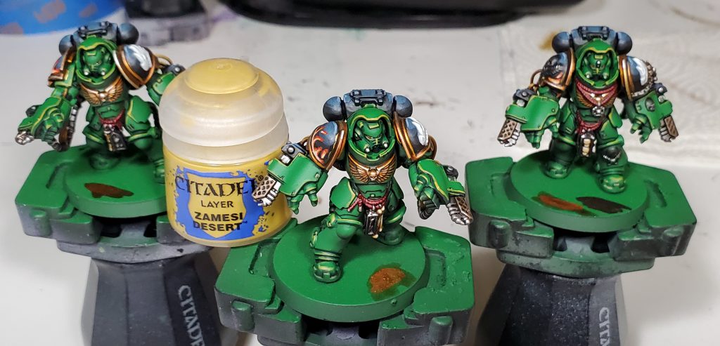
While we’re always going back and adding updates to our older How to Paint Everything series when we have new methods or need to adjust old links or rules talk, sometimes the updates are big enough that they deserve to get their own articles! In this article we revisit the Salamanders for a rework of Rockfish’s scheme. We’ll also be updating our larger How to Paint Everything: Salamanders article with these changes, which also has more takes on our favorite power armoured pyromaniacs.
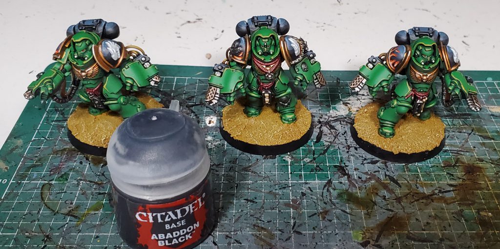
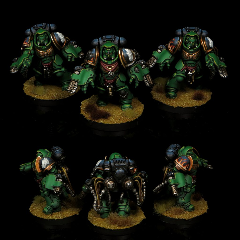
Salamanders are my second largest army after Tyranids and my scheme has gone through quite a number of iterations. This will be the 3rd revision in as many years – mind you I only started collecting this army with Dark Imperium. While the core green, black and gold retain the same base coats, I switched up washes and highlights to really bring the recipe in line with my more recent style. I think I have managed to make this new generation of Marines striking without clashing too hard when combined with the rest of my army.

While in a bit more logical order than my Death Guard scheme, I will apologize in advance for my tendency to bounce between different colours as this guide is in chronological order. In addition, I will mostly not list the specific colours in the accompanying text as that can get pretty repetitive and a bit redundant with the paints being in the pictures themselves, instead I am mostly going to be talking about why I made a colour choice.
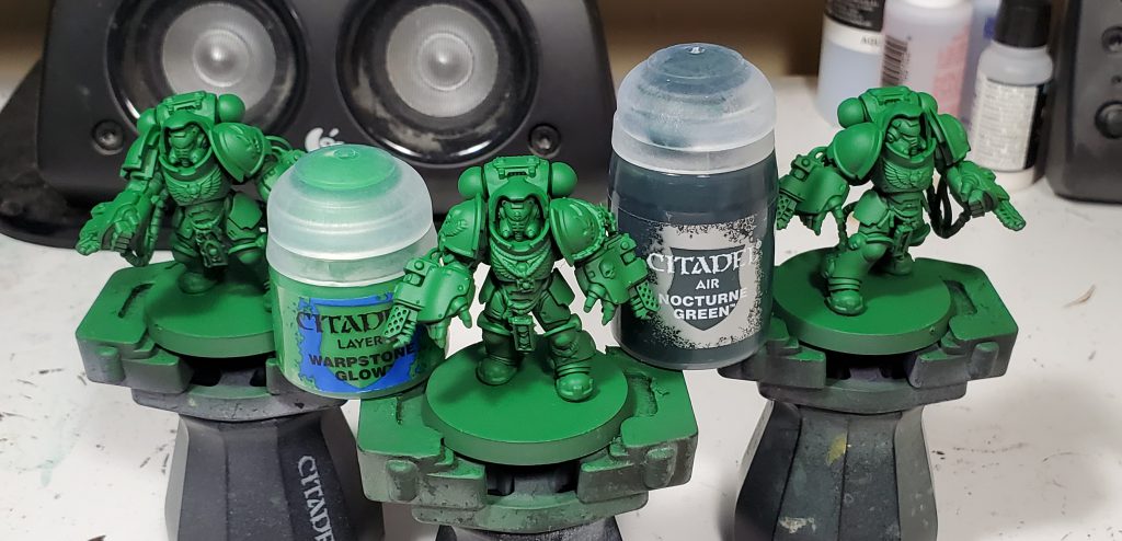
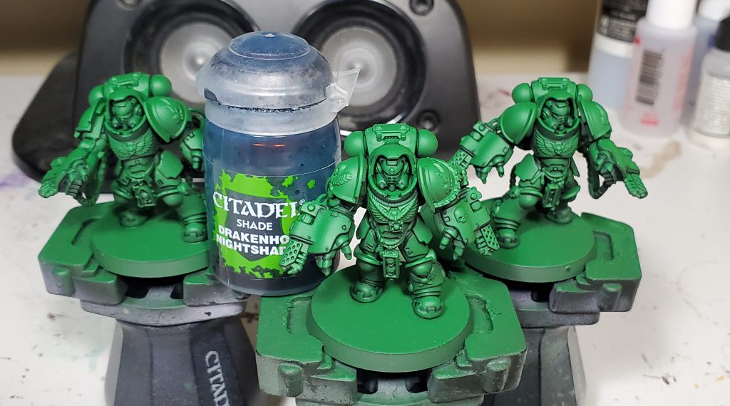
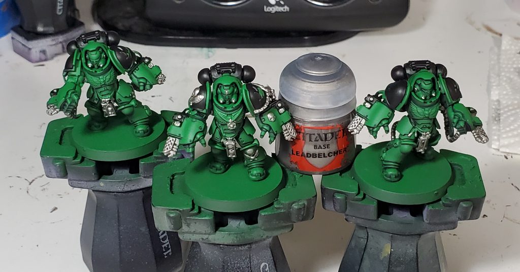
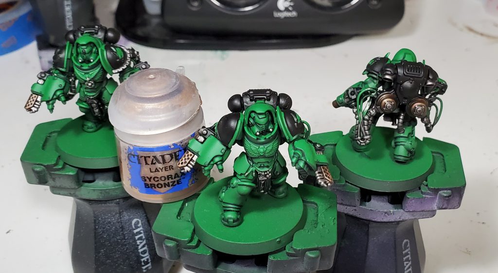
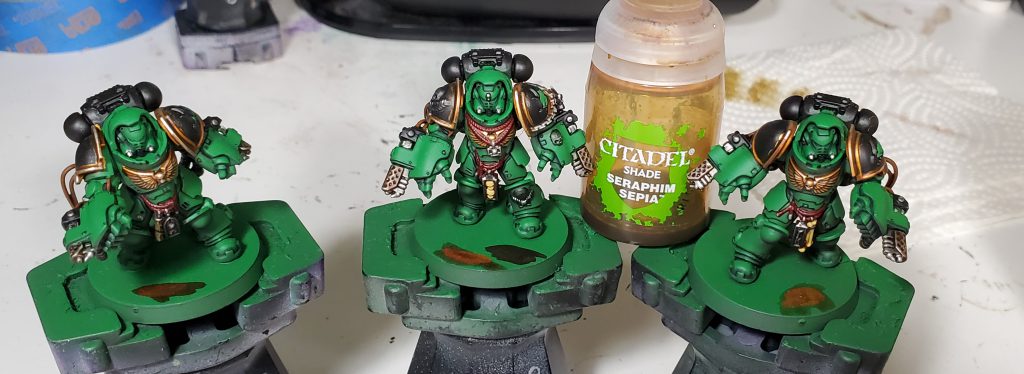
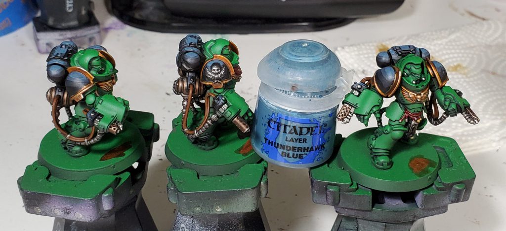
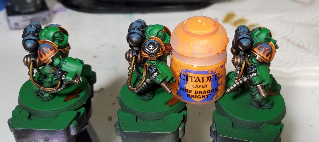
I started with a airbrush base coat of Warpstone over Nocturne, this is roughly a zenithal basecoat since I only focused the Warpstone on upper faces of the model. This is not super visible from most viewing angles, but speeds up the pin wash substantially as the darkest areas are already shaded. For the wash I used blue rather than a black to provide a slightly more natural shade. In proper colour theory, one way you can darken a colour is by mixing toward the “bottom” of the colour wheel with blue in this case. Of course that is just one method, you can also shade by working in a complementary colour for warmer shadows.
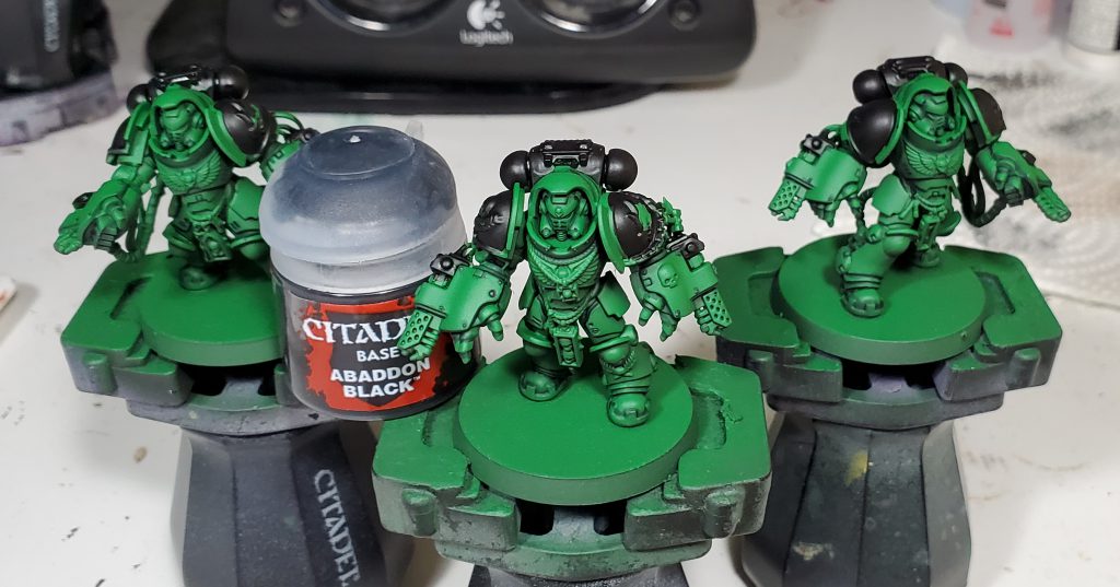
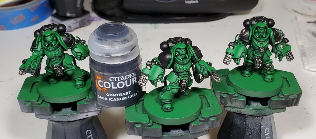
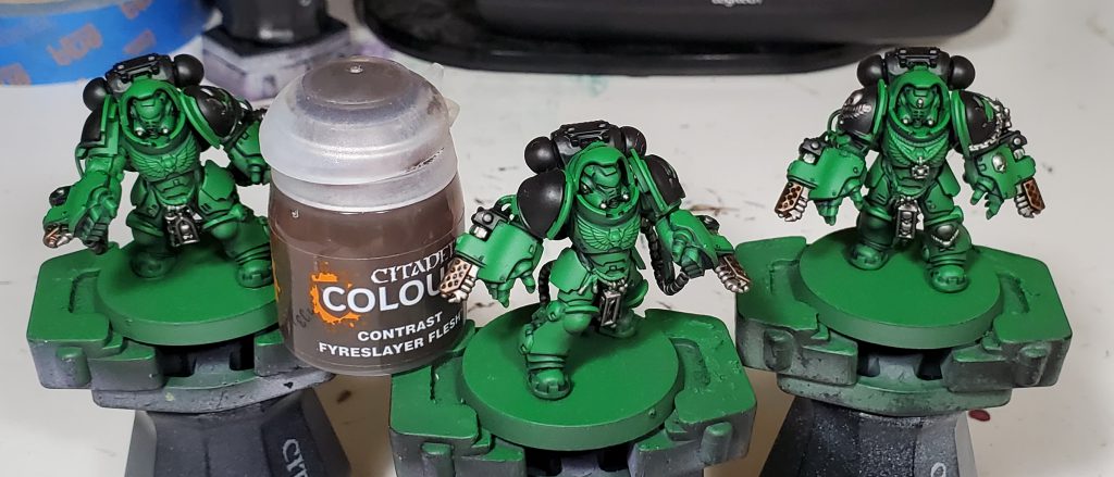
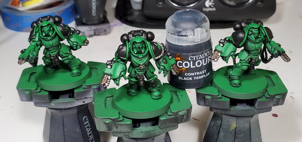
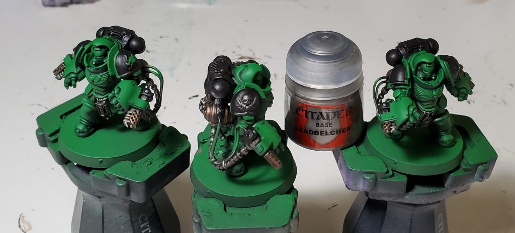
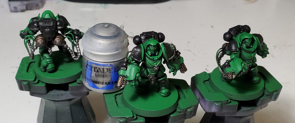
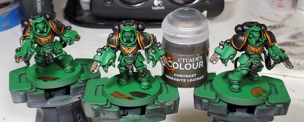
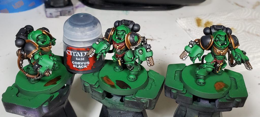
I quite like how Basilicanum Grey is basically super Nuln Oil, achieving the same kind of colour smoother and darker. An additional layer of Fyreslayer makes a delightful copper-ish colour. I nicked the idea for black metal for Salamanders from the Bladeguard that was shown off on Warhammer Community to prevent from having the gold being overbearing as was happening on previous iterations.
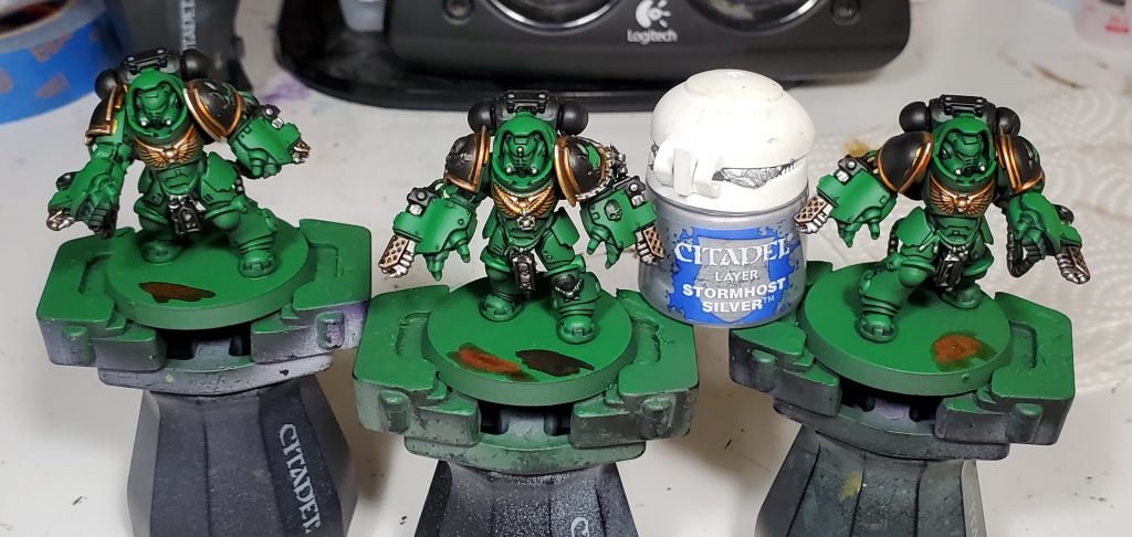
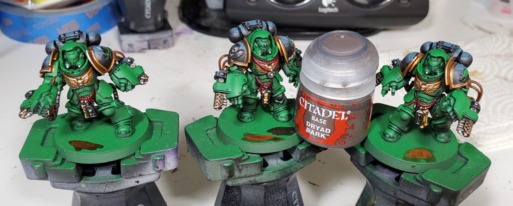
A recent change for me is making use of more drybrushing in stuff like metals instead of intermediate edge highlights, which saves a bunch of time without a substantial loss in quality. I used to be super against drybrushing, but these days the extra effort just not worth it given I can get a greater differentiation of metals vs other textures with less time.
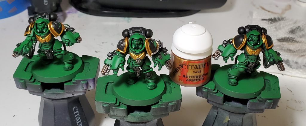
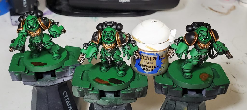
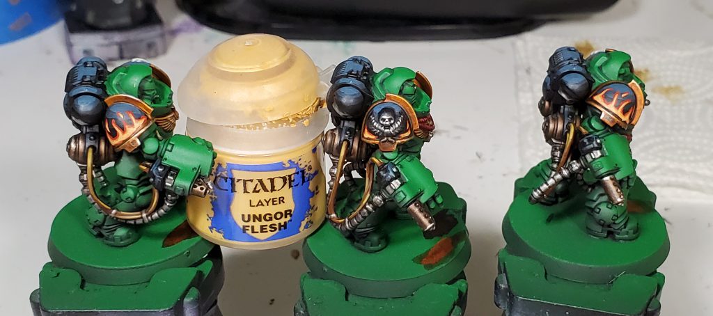
The gold is mostly pretty typical other then the using contrast to get a really rich colour along with a dry brush of Liberator, I quite like how it turned out!
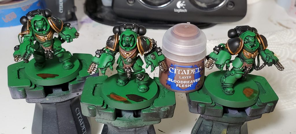
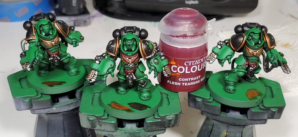
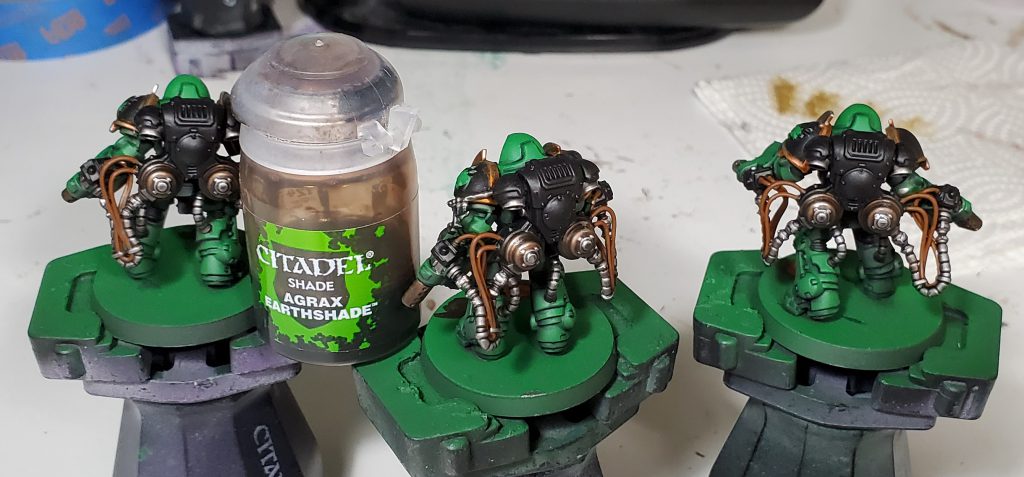
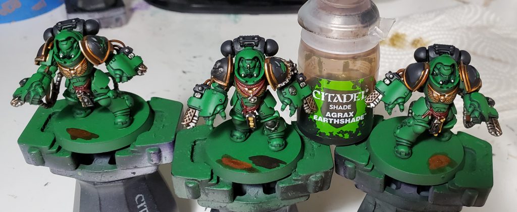
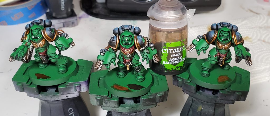
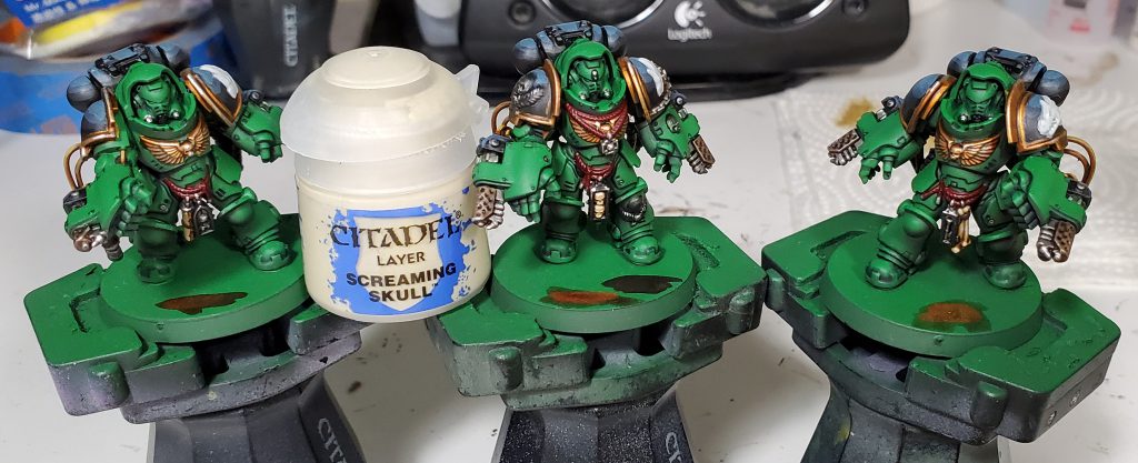
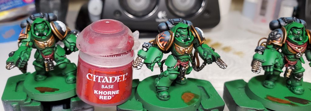
I made use of contrast over a dark-ish base coat to get a rich dark red for the tassels, this is one of the ways you can really get a lot more colours out of contrast paints, don’t lock yourself to Wraithbone and Grey Seer! One thing that might be a touch confusing here is that the Agrax and Sepia was used for the cables and bone/parchment respectively.
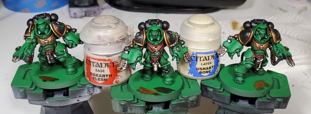
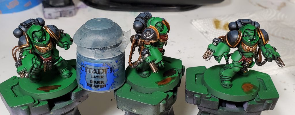
I go with these basic layered zenithal highlights on the black primarily for sanity’s sake, on the table top a lot of stuff like that ends up looking nice and smooth when amongst others and the terrain without having to spend a ton of time on fancy blends. The Agrax was used on the bone to give it a slightly more muted colour along with the dryad bark.
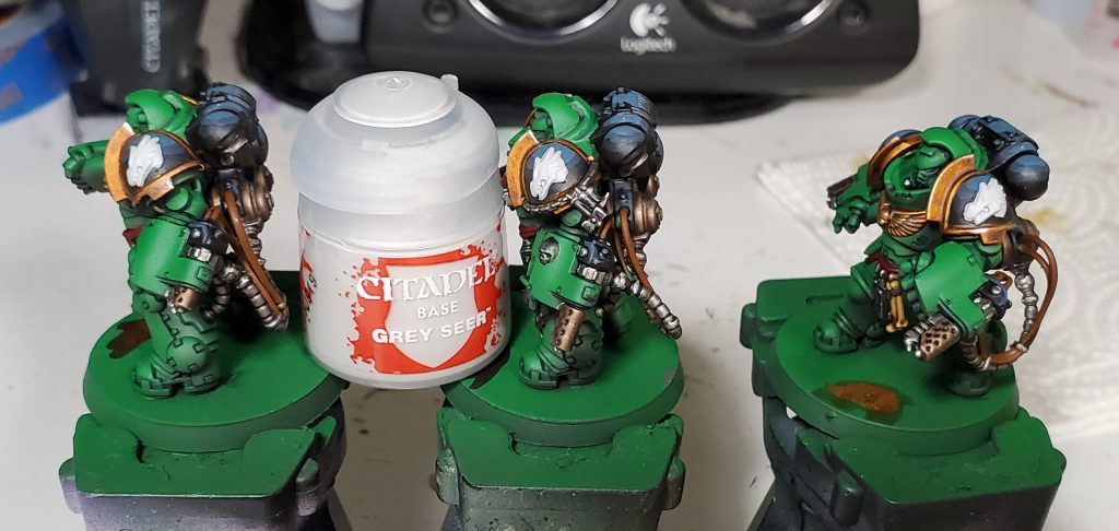
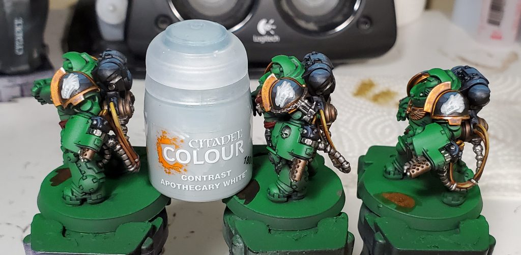
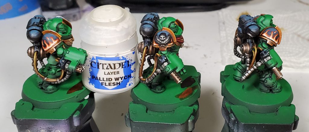
I quite like Apothecary White as it gives a decent neutral color over white but you could use pretty much any wash thinned over white depending on what you want to go for. We will come back to finish the iconography off in a bit once the wash has dried!
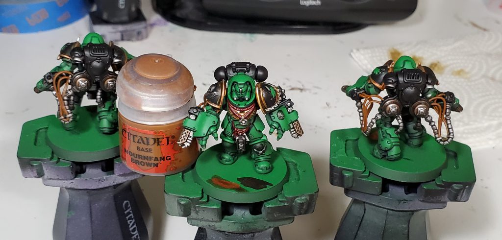
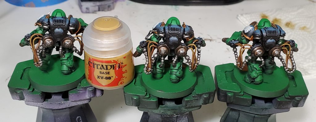
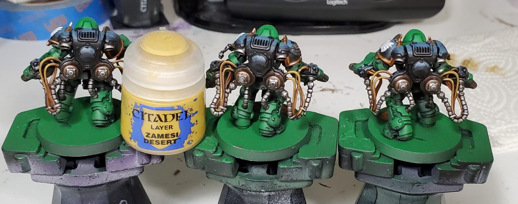
For the yellow cables I started with a brown base coat to provide a really stark contrast against the highlighted sections, otherwise I find cables can look like they have not even been highlighted from a distance.
We return to finish off the iconography! I somewhat violate the my typical behavior of only doing zenithal highlights on these as I want to put a lot of emphasis on the depth of the dragon’s face. For this I put the brightest points on stuff like the jaw, brows, and spines that should be be bold against the rest really to emphasize the key parts of the Salamanders logo.
For the flames I don’t really go for fancy super realistic or very cartoony, I think these end up somewhere in the middle and also being pretty fast. I don’t really go for any shape in particular but I find it is pretty key to have a few floating embers or it looks really lame. I start with a couple of layers for the underlying red, but you can get away with a single coat for the rest as blotchy-ness in lower layers just leads to subtle colour variations in the final design.
For the eye lenses I do a fairly traditional gem effect. For those who have not done gems before, the general idea is to subdivide the lense into smaller crescent shaped areas of successively brighter colours towards one direction before a final point of white on the opposite point. Usually you select a lower or further into an object for the crescents of colours to imply light shining through and reflecting off the inside of the gem/lense.
While optional, I came back to put a few edge highlights on the black to differentiate the smooth curves from hard edges. Then we return to the green after not having touched it since the recess shade, I left the main panels to end as this lets you hide mistakes from other colours under thicc highlights. The yellow in the highlights is also calling back to basic colour theory where we move successively brighter shades of a colour towards the top of the colour wheel, typically the only colour you can highlight with white without losing saturation is yellow.
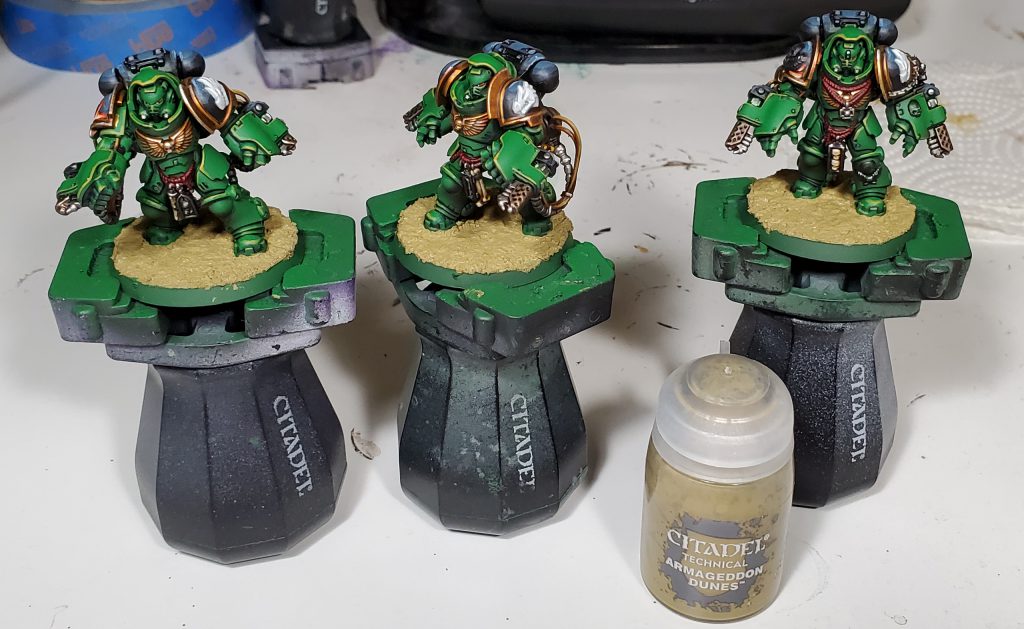
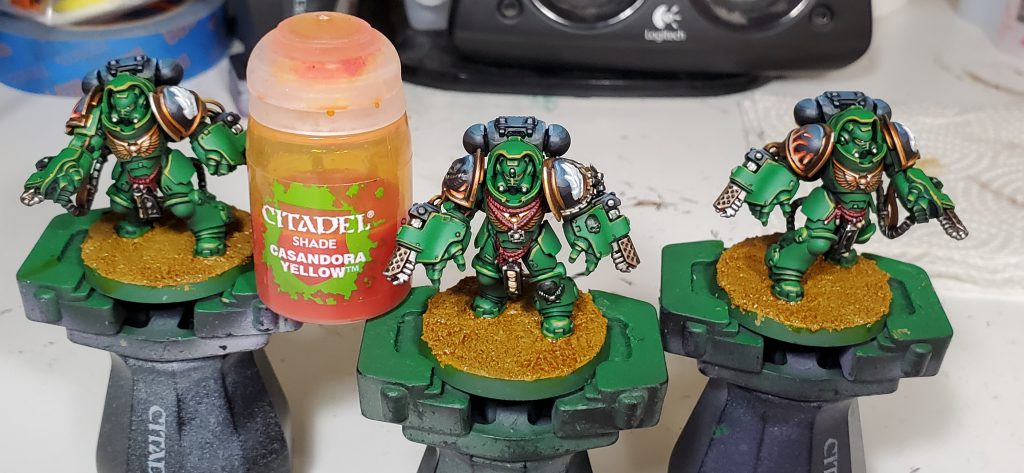
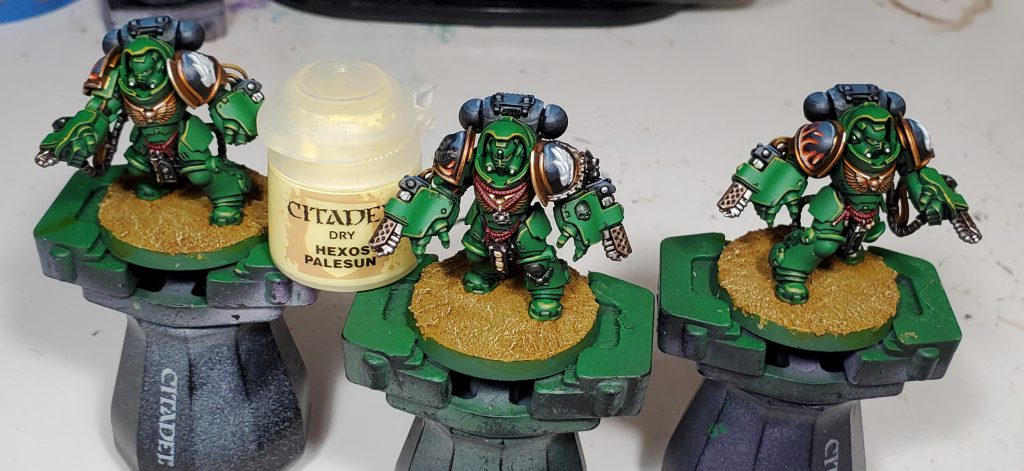
My bases on smaller models is typically fairly basic, just wash and drybrush over a texture paint before cleaning up the rims and throwing on tufts from Gamers’ Grass.
I am still unsure my exact strategy for how I am going to handle the skin tone going forward, when I have figured it out I will probably come back and drop in another section somewhere down here. My current plan is probably doing more conventional human skin tones glazed with a ashen grey or similar.
