In our How to Paint series we look at how to paint well, Everything. This week we’re looking at underpainting and how to achieve different results with different techniques.
Underpainting is a technique where colours are applied to a model to form a base for later paints. The purpose of doing this is to use the underpainting to affect the colour value of later paints, and increase their lightness. Lightness in this context is the perception of luminance by the human eye, and there’s a whole bunch of science behind that because the human perception of light is non-linear compared to the brightness of an object, so something twice as bright is not perceived by the human eye as being twice as bright.
That’s the simple (mostly) explanation, and I’m going to digress a little into art history, because the technique originates in painting ‘flats’ (and boy will some people get bent out of shape if you refer to painting on canvas as painting flats, but life is risk), long before it was applied to miniature painting. If you did A-Level art (the qualifications children complete at 17-18 for those outside the UK), then underpainting is in the syllabus, and some of this article will be pretty familiar.
One important thing I want you to remember is that this is your hobby, and it is for you to enjoy. Be happy in what you do, and if you want to try these techniques do so, but they range from basic to advanced and are a menu to pick and choose from rather than a set of instructions to follow. If you want to go down the rabbit hole there are entire books about this and courses you can go on, and if you want to do Golden Demon/display level painting then it’s going to involve a lot of learning about fine art techniques and applying them. I’m a tabletop standard miniature painter, so I’m doing an introduction so you can understand the basics.
People say that you either have a talent for something or you don’t, but those are people who haven’t thought a lot about what talent is. You wouldn’t expect someone to pick up a musical instrument and immediately play to a concert level standard, that’s literally what practice is for. No one started out painting to a Golden Demon level, it’s about practice and mastering technique and understanding technique, which is something that isn’t done well a lot of the time, because people divorce the doing of something with the why of something. If you refer back to the gifted children problem, a lot of gifted children burn out because they’re smart enough to not need a solid grounding in the fundamentals when in primary or secondary education, and then they burn out hard in tertiary education when faced with a significant increase in the challenge of what they have to do because they’ve never had to master the fundamentals.
A lot of the artists I mention in this article spent literally decades mastering their craft. They apprenticed and practiced. They corresponded, and also had competitive rivalries (with varying levels of friendliness), with other artists, to push themselves to do better. They learnt from the artists that came before them, and passed their knowledge on to the artists that came after.
I am going talk about some things at reasonable length to define terms and techniques that are important to understand, but that’s why there’s a table of contents here to jump to where you want.
The Origins of Underpainting
Underpainting was pioneered by Titian during the High Renaissance (art historians disagree on when it started and ended but 1490/1495/1500 to 1520/25/27/30 is the range, and this is for a bunch of reasons I won’t go into here). You’ll recognise a number of High Renaissance works, with Leonardo Da Vinci’s The Last Supper cited by some as being a definite break from the Early Renaissance and kicking off the High Renaissance. Titian, Leonardo, Raphael and Michelangelo are all figures in the High Renaissance, so that’s 75% of the Ninja Turtles right there.
The High Renaissance is seen by many art historians as the pinnacle of Western painting because of the steps forward in technique in that time. Again, there’s literally doorstop length books written about this, so I’m not going to go into detail here.
Underpainting was one of these techniques. Titian was hugely respected and influential, and with the deaths of some of his contemporaries and his former master Bellini, reigned as the master of the Venetian school for sixty years. So when Titian did things, other painters copied his techniques and composition (Rembrandt copied the composition of Titian’s A Man with a Quilted Sleeve in his own self portraits for example). In modern terms he was an influencer, and all the cool painting kids wanted to be like him and copy his style.
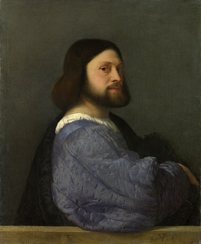
Painting is an art, and like most arts it’s developed over thousands of years of human history, with our oldest paintings dating back over 45,000 years and continuing from there to the art we have today. It’s worth remembering that, and as miniature painters the techniques we use tend to have a rich and long history.
There are a lot of Art and Fine Art graduates working at modern GW in various roles, and this is not a surprise. You can see the influences from various periods in GW art and it’s various styles throughout the history of the various games, and sometimes pieces directly reference an artist in it’s composition or style (this is totally normal, you see it throughout literally all art in all of human history).
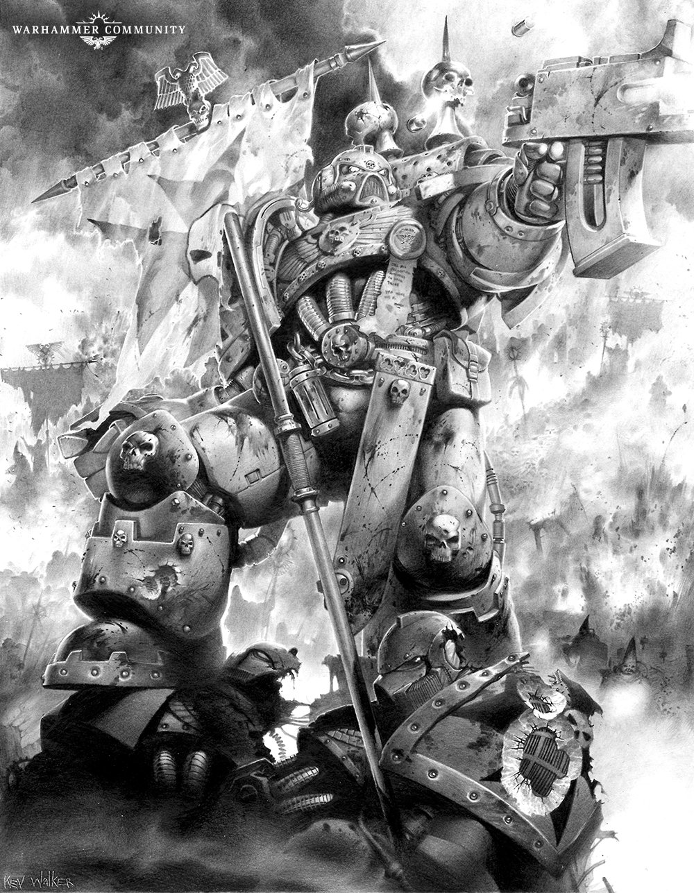
Games Workshop have commissioned a lot of black and white art, and this provides us with lots of examples of art using a single hue, where everything is defined by the value.
Artists tend to thrive when they have a restriction on what they can do, and have to use imagination to overcome the limitations placed on them. There’s a lot of really really good 2nd and 3rd ed black and white art, from a time before GW books went full colour.
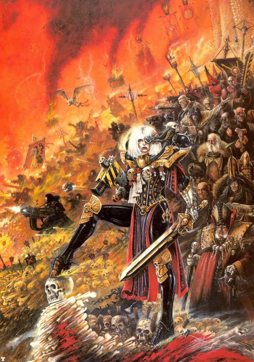
John Blanche frequently uses underpainting and glazes to create the effect of an inner light. Pay particular attention to the sister of battle’s face in the above painting, and as a whole you can see a piece where the underpainting defines the later glaze layer.
So what is underpainting?
Underpainting is where an initial layer of paint applied to the thing being painted (historically a canvas, but we’re talking about miniatures), which serves as a base for subsequent layers of paint. It’s called underpainting because is goes under the overpainting, which is layered (again something miniature painters are familiar with). There’s a whole fascinating rabbit hole to go down regarding overpainting, which is a technique often used by restorers (and undoing the work of ‘restorers’ is another fascinating subject) of varying levels of skill as colours on paintings became faded with time and exposure to the elements (the Renaissance painters lacked ‘Ard Coat unfortunately).
Artists frequently reproduce the works of earlier artists as a means to learn technique, as a source of enjoyment of the work, and to recognise, reference and pay homage to an artist. This also enables a modern audience to see the stages of creating such a work, as for most artists the sketches, underdrawing, underpainting, practice versions and even the finished work itself have been lost in the passages of time.
For example, a number of Sofonisba Anguissola’s works (a contemporary and correspondent of Michealangelo who passed a lot of knowledge on to the painters who followed her later in her life), were lost due to a fire in 1734, but due to the popularity of her paintings and influence as an artist, copies remained, though due to her habit of not signing paintings as she was a noblewoman art historians have had to put on their detective hats to correctly attribute some of her works to her.
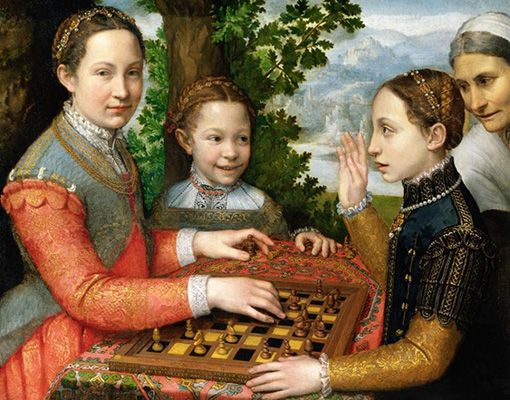
The important thing as a miniatures painter is to think of the painting of the model as a series of layers of paint of varying opacity, where the lower layers (the underpaint) helps the painter get the correct tone. Done correctly it helps the colours become brighter, and duplicates the effects of light in a more subtle way than highlights (particularly the edge highlighting favoured in the ‘Eavy Metal style).
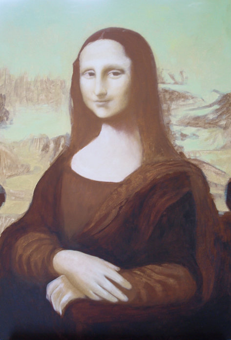
An artist will normally go – Sketch – Underdrawing – Underpainting (possibly more than one layer) – Overpainting (multiple layers). A miniature artist will skip the first two stages as the miniature defines the object being painted for you. The most primitive form of underpainting is the undercoat, and given the opacity of miniature paint, this helps define the value of later layers.
The simplest way to illustrate this in a way you will immediately understand is this.
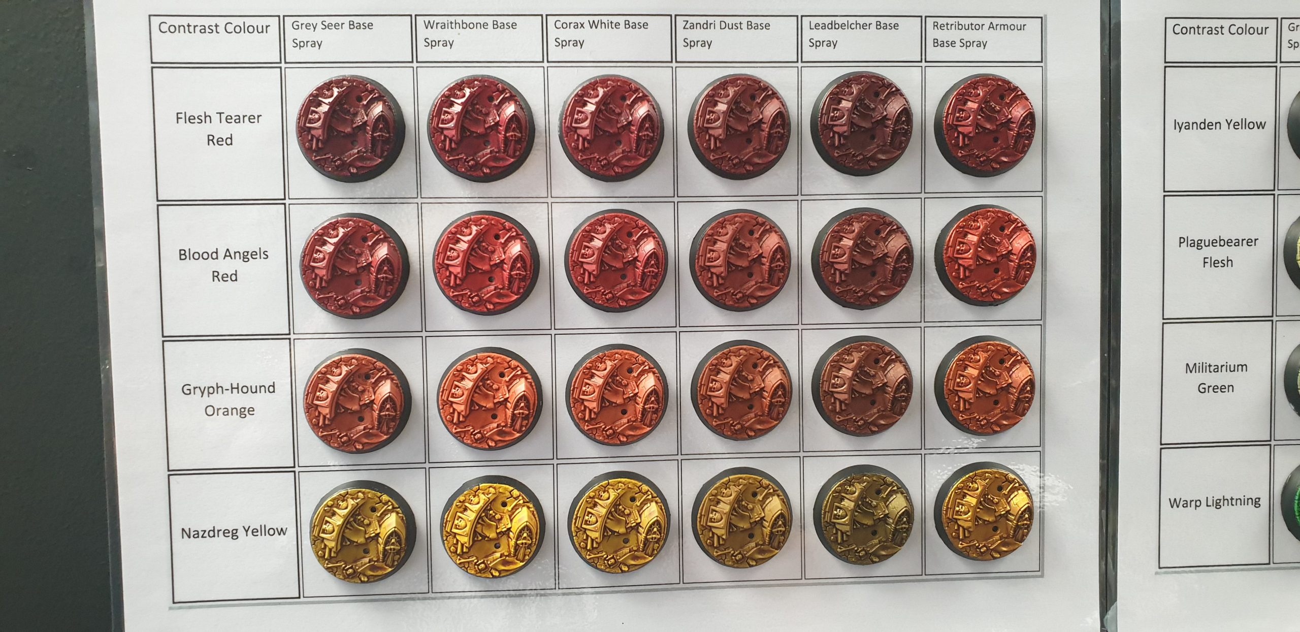
This is a familiar image of different contrast paints over different undercoats and the changes in colour value created by them. The overpainting is exactly the same, but the underpaint is different and so the effect is different. As a miniature painter you will have done something like this, and underpainting is at it’s most basic level this with more thought applied.
This is where we’re moving into personal preference on the effect that you are going for. Edge highlighting looks good, and is a technique encouraged by GW, but there are a whole series of other techniques that are used to create the illusion of light hitting a real surface (including blended highlights and underpainting) to create a more subtle effect. Edge highlighting is easy to teach and a good technique for most painters, but in stretching your craft you need to push yourself out of your comfort zone and try new things.
You can also combine these techniques, and learning when to combine things is a huge part of your development as a painter.
The danger of emphasising the edge highlight Eavy Metal style to beginners is that they are sidestepping building an understanding of the fundamentals to get where they want to go – nicely painted miniatures.
I feel the Contrast range (which are very clearly suited to glaze painting over underpainting to get very good effects) is a move back to a more classical technique by GW, but that is something that hasn’t been communicated to their audience through Warhammer TV or Warhammer+. We can see GW staff doing it on their personal projects, but there has not been a push by the company as an entity to show that technique to their audience for a while (you can find plenty of old White Dwarf articles where it’s clearly been used though), they’ve simply given them every tool necessary to do it (and contrast particularly are absolutely excellent for it) and left it to them to work out it for themselves.
While the Warhammer+ Colour Theory video is good, and explains some of the fundamentals, I feel GW could go a lot further in showing that there’s a whole world of technique out there to master. Maybe Warhammer+ should do a few tutorials that basically duplicate some of the GCSE and A-Level art syllabus, because a lot of their audience either didn’t study those at school, or those lessons are lost to the mists of getting old like I have.
Definitions
Before we get into this it’s time to define some things, as not everyone reading this will have studied art. Also for some reason in miniature painting a lot of classic art techniques are given a different name and there’s no clear reason for this. It’s like if someone is explaining driving to you and they keep talking about the velocitator and then when you do driving lessons you find out it isn’t called that at all.
Opacity
This is the ability of the paint to obliterate the colour difference of a substrate. This is commonly called coverage. The low opacity of acrylics used in model painting is why we have ‘two thin coats’ to get a solid colour. It’s why the most common mistake of beginning painters is to make the paint too thick in order to get sufficient opacity. They can tell by looking at it that it’s wrong, and the most logical thing to do to get better coverage is to make the paint thicker.
You can adjust the opacity of a paint by thinning it, with medium or with water (though medium gives more consistent results). Most ‘pro’ painters will thin to the consistency of skimmed milk and do multiple layers to build colour, and in particular colour transitions, applying a slight change to the colour beneath with each layer. This is very much the approach in the Eavy metal school.
‘Chalkiness’, a word particularly used when talking about white paint, is where the paint has low opacity, and covers the substrate below poorly. It ties you to multiple layers, or adding an additional layer (such as a grey) between the original colour and the layer you are painting. Different paints have different opacity, and you’ll learn the behaviors of each paint as part of your painting journey. One of the big GW paint range changes, the introduction of Foundation paints with more pigment and better coverage, was specifically to deal with this a few years ago in 2008.
Colorimetry
The science and technology used to quantify and describe physically the human color perception. I’m only going to briefly touch on this because basically the human eye does not perfectly perceive colour and light, with brightness being non-linear in human perception.
You can read a bunch more about this somewhere else, and I’m not going to start posting graphs about the wavelengths human eyes can detect.
The Human Eye
Or maybe I am. The human eye is a sensory organ that reacts to visible light and is part of the sensory nervous system. It allows the processing of visual information.
Colour is detected by Cones within the eye, and these detect different wavelengths. It was previously believed that the three types of cones within the eye detected Red, Green and Blue, but further research has shown that this is not correct, and the interpretation of colour is put together in the visual cortex based on the brains interpretation of the information detected.
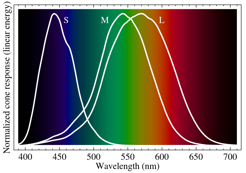
It’s worth noting that perception of colours varies between humans, and that they further vary with animals like bees, who can see parts of the spectrum that we can’t.
So humans perception of colour varies, so how do paint manufacturers create a coherent range of products to paint with?
Munsell Scale
The Munsell scale is a way of organising and replicating a colour based on three properties:
- Hue (the basic colour, such as blue)
- Chroma (the difference from a grey of the same lightness, which is an attribute of perception) – GW call this Saturation in their Colour Theory video, which is actually a good way to explain it, but do say Chroma is used in classical painting.
- Value (the lightness of a colour)
The easiest way to represent this is the following diagram.
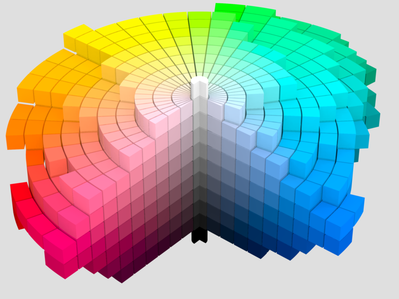
- The Value is the white to black core, measuring lightness.
- The spokes branching from that core are the Chroma.
- The direction the spokes are going in is the Hue, being the colour.
Yes, this is an incredibly fancy colour wheel, but you will notice that you can find a detailed one of these, pick up your paints and place them one by one in the blocks of this diagram.
Colour scales and swatches like this (Munsell has been superseded in many uses by other colour models, but is a really easy way for me to explain Value, Chroma and Hue) are a tool used to help design paints because they give an accurate scientific system for measuring human perception of colour, and thus the means by which paint manufacturers create and maintain consistency in the paints that they manufacture.
Why am I telling you this?
Because to get the best results you’ll work out the Value of your underpainting, and when you overpaint using a colour you will select one using the same Value.
This means an artist doing underpainting will look at the Values of the underpaint colour they’re putting down and then match the values of the overpaint colours to create the best effect.
Thinking about painting in general – then blending is the seamless transition from one of the blocks on this scale to another, either by moving upward, outward or inward on the scale.
Do you have to match values? No. But you’ll likely see ‘pro’ painters and people doing bust painting do it when they’re making display/competition entry pieces. If you want to go down that road then you’ll be doing a lot more than reading this article, and good luck to you on your journey.
Types of Underpainting
Underpainting can be applied in a number of ways:
- Zenithal undercoat applied with spray can or airbrush is the easiest and quickest way of creating an underpainting effect, with an airbrush giving a much more tightly controlled effect.
- Drybrushing with a large and soft brush, like a make up brush. Drybrushing can absolutely beat the crap out of brushes so cheap make up brushes are an ideal tool for this.
- A wash to create a tone across the entire object, but due to the 3D nature of the object this has a different effect to a flat surface like canvas.
- Applying one of the above effects to specific parts of the object. Or multiple effects to different parts.
I’m also going to split these into difficulty levels as techniques, because these range from things a novice painter can try to things I’m put towards the expert end.
It’s also worth making the point that in general, oils go over acrylics, if you are thinking of using oil washes for these techniques I would recommend you don’t unless you are doing the miniature in oils. Miniature painting with oils can be very rewarding, and oils and enamels were the miniature paints of choice prior to the advent of mass market acrylic paints (so when I started painting models it was with enamels).
Imprimatura (also called toning)
A thin wash applied, often of burnt sienna or burnt umber applied on white (so Agrax Earthshade, heavily thinned down brown contrast, etc can be used to duplicate this in miniatures). On a flat this will give a tone that can make it easier to judge value and colour, but on a 3D object like a miniature this will essentially preshade the model in the tone used. You might use blue for a miniature where you want cold colour values, orange or brown for warm, even red, yellow or black. This is a matter entirely of your preference as a painter. On a 3D object this will line the detail (rather like panel lining) and help you pick out the differences between the various textures on a model. Ideally the thin wash is thin enough that it doesn’t leave much on the flat surfaces but hits the detail.
If you read the ‘How to Paint Citadel Miniatures’ book from Games Workshop which came out relatively recently (ok checking that 2003 I’m like that guy out of Indiana Jones) then on page 38 this technique is referred to as a Guide Coat.
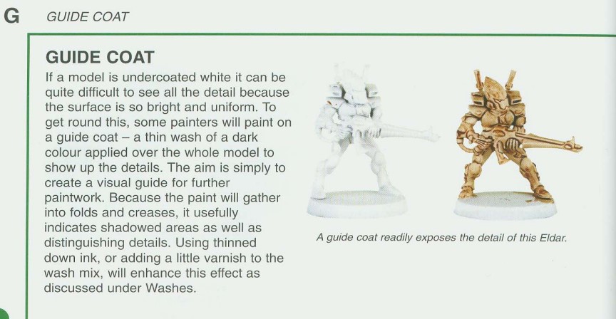
Some inks are glossy, and a small amount of matt varnish or medium added to the mix will deal with this.
Essentially a lot of painters don’t like to paint on a blank white canvas, and miniature painters sidestep this slightly by the 3D nature of their pieces vs ‘flats’. However it’s worth noting the popularity of grey primers, or of painting from a black matt undercoat with a grisaille, or of using a black toning wash over a white undercoat to bring out detail.
My preference would be a black toning wash with a low surface tension. You can try using the Gen2 Contrast Nuln Oil for this, or mix your own wash by taking the wash colour you want and cutting it with a 20:1 mix of water:Future Floor Varnish to reduce the surface tension of the mix.
Grisaille
This technique is from the 14th century and is painted entirely in shades of grey or a neutral greyish colour (in the example I painted I moved from a mid grey to a light grey to a white). This can be the final step if producing a monochromatic model (the monochrome effect sometimes seen when people are painting 1920s gangsters like they’re in a movie for example). Painting monochrome as a way to learn more about creating colour value is used by a lot of teachers.
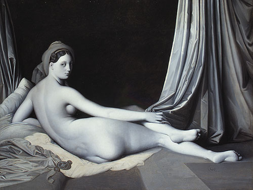
The above painting is commonly used to show the colour value that can be created using a single hue, with the drapes to the right of the painting having been overpainted to show the changes to colour value caused by the underpainting.
This effect can be done in other colours – brown (brunaille) or green (verdaille) for example, but a small colour range is used with shades of one colour and the underpainting is then painted over with glazing layers.
The effect can be done in multiple colours on the same model, and the early Netherlandish painters used a multi-colour grisaille in some works.
Grisaille without overpainting was also popular, being quicker and cheaper than a coloured canvas, and the Chiostro dello Scalzo in Florence has a number of gray and brown grisaille frescos if you’re in the area and want to pop by.
In miniature painting I’ve seen this called ‘pre-shading’, but also bear in mind that you are not tied to grey to white, and for a metallic final colour (for instance Alpha Legion) you can start from a dark metal through to a bright silver (that face when you realise that it’s all just metallic black through metallic grey to metallic white). You can then turn almost any colour into a metallic by overpainting it as a glaze on top of a metallic grisaille.
There are some miniatures that will take particularly well to this, and the various GW ghost models (Lord of the Rings Army of the Dead, Age of Sigmar Nighthaunt) would benefit either from a grisaille or a verdaille depending on which colour you wanted, and you could get an army painted to a basic standard quite quickly doing this. You can see this in this article https://www.goonhammer.com/middle-earth-strategy-battle-game-faction-guide-dead-of-dunharrow/.
Grisaille is also used a lot, in combination with glaze painting (which is essentially what the entire Contrast paint line is made for), to create the colour values on a model and then apply the hue to speed paint. You can tear through models pretty quickly doing this, and they look pretty reasonable for a tabletop standard. You can then highlight, pin wash or do any number of other techniques to create areas of interest or detail on the final model, or use thinned glazes to apply a colour filter and ‘beef up’ the overpainting if it looks a little flat. But after the initial overpainting layer, you’ve got something you can put on a table.
Verdaccio
Verdaccio is the Italian name for a mix of black, white and yellow pigments that give a grayish or yellowish (depending on the proportion of components) soft greenish brown. It’s become integral in fresco painting, and you can clearly see it in the ceiling of the Sistine Chapel on the architectural details.
A similar technique is used to remove the warm tone of primer. In miniature painting I think this falls into a fairly advanced technique, though for the dedicated freehanders working with a large flat surface (or a small curved surface, knight and titan freehanders I’m looking at you) where it is a tool to refine values and give a neutral surface prior to fresco like freehand.
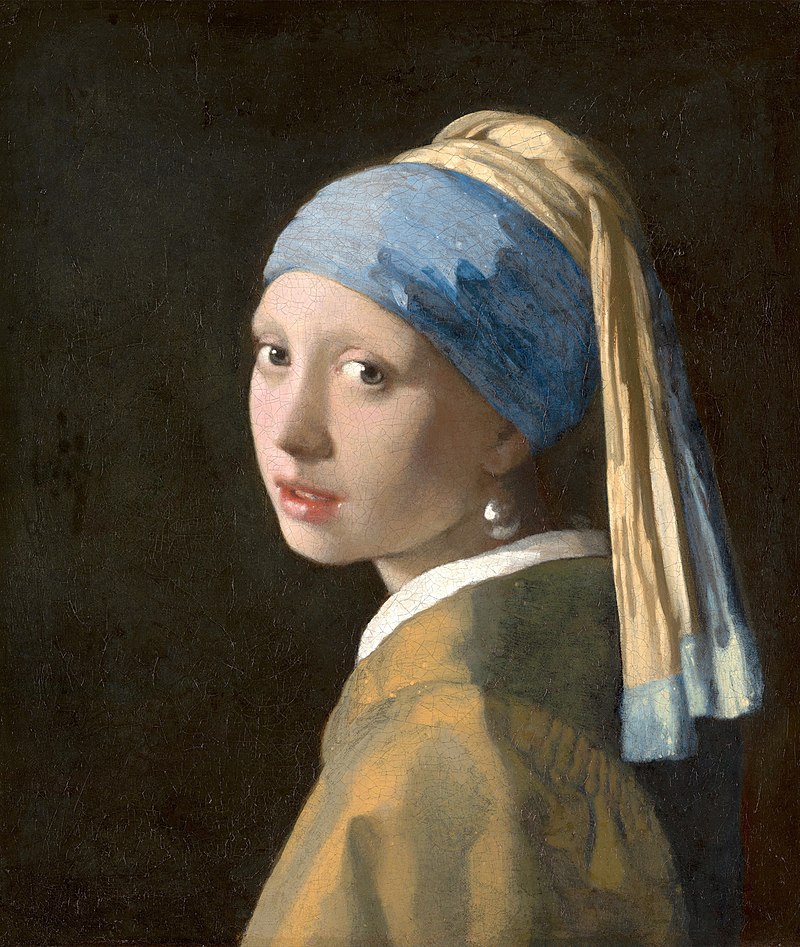
Verdaccio is also used as a way to enhance skin tones to create a more realistic tone, and there are tutorial videos on youtube for you to use this technique on miniatures.
This has been used on busts and miniatures for a while (because let’s face it, going from frescos to busts is a fairly logical step), and the difficulty you will run into is using it on 28mm figures. 54mm figures or giants and monsters is a different kettle of fish because you have a lot more physical area to play with. 28mm faces are, by definition, small. A lot of Warcry figures and some fantasy figures are showing a decent amount of skin, and this is where a dose of Verdaccio would be a good idea.
There are a couple of ways to do this, with the easiest cheating way being to use the Citadel Contrast paint that seems to be specifically made for this, Plaguebearer Flesh, a soft greenish brown that takes well to a little thinning with medium, and happily flows into recesses.
Otherwise you are looking to create a fairly thin mix, and either Deathworld Forest or Elysian Green are good starting points.
Bistre was also used for exactly the same things as Verdaccio, but this is further complicated because Bistre (created by taking beechwood soot and boiling it to make an ink then diluting it with water) was also used for sketching out the underdrawings in paintings. It’s a dark greyish brown, though variations in other browns existed. For miniatures painting, heavily thinning a brown contrast like Snakebite Leather will give a similar effect, or to approximate French Bistre use Garaghak’s Sewer.
Dead Colouring
This is where flat lighter colours are added to a dark substrate to define the value for later layers, giving you the outline of the piece and detail, and simply lacking the colour.
This is used to provide the basis for a painting, and painters would as a normal paint of their process produce these to be completed later, or completed by others, or to show to prospective clients for them to choose to pay for a finished painting based on the canvas shown.
Below is a part of Da Vinci’s Adoration of the Magi.
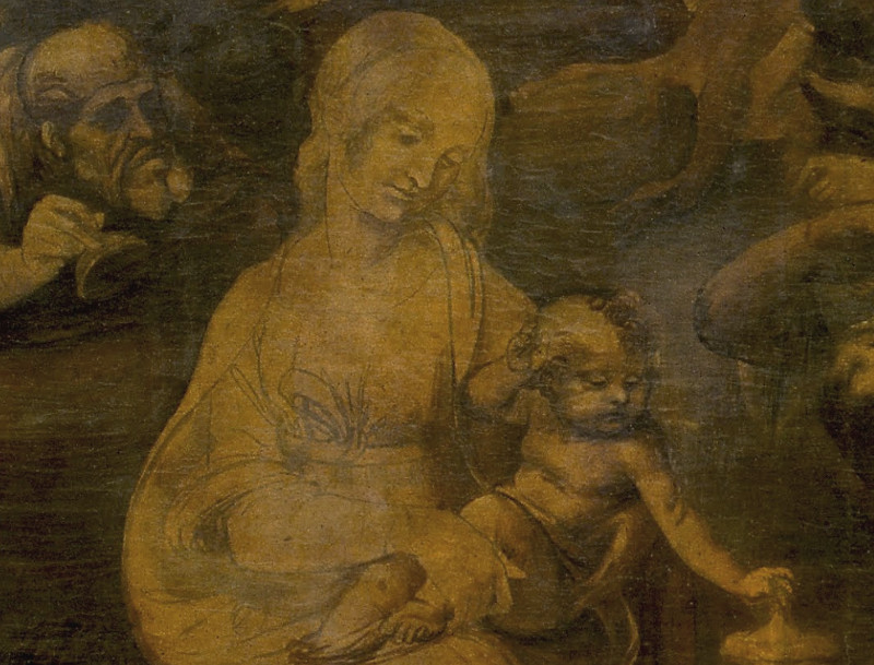
The issue is that grisaille or brudaille are frequently used to do this, and I feel there isn’t a meaningful distinction at a technical level between the two for the purposes of miniature painting. You use underpainting to create the ‘dead layer’ (so called because of it’s monochrome or colourless appearance) but it is not particularly distinctive from the early stage of grisaille, where you have defined the shape of what you will paint and started controlling the colour levels.
Examples
I can’t talk for 3,900 words about underpainting without putting my money where my mouth is and giving some examples.
Imprimatura
For this I’ve taken a model with a lot of surface detail, a Battletech Commando mech. I’ve based this and sprayed it with White Scar primer.
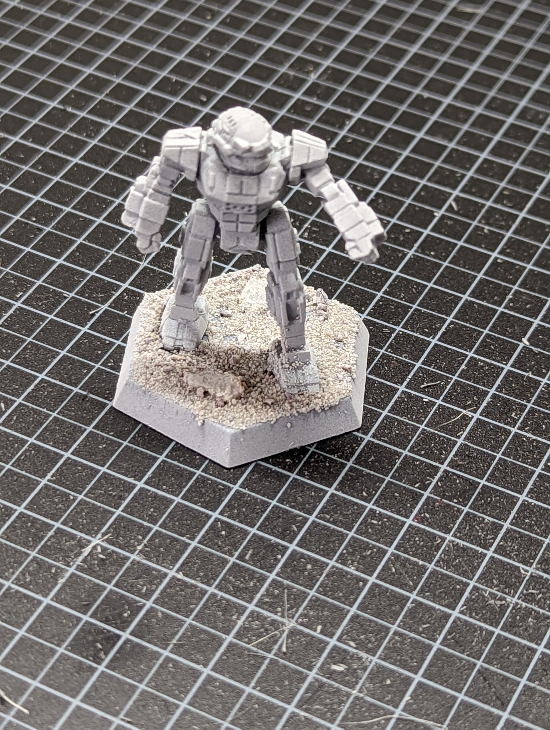
As you can see, it’s very white. This surface is perfect for contrasting, but I want to see the surface detail of the model that I have to make sure gets painted, so I grab the Contrast Nuln Oil and use it straight from the pot.
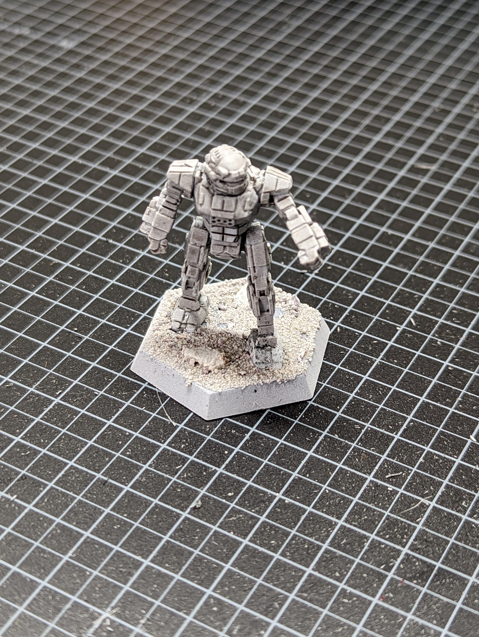
This immediately brings out all the surface detail, even down to grains of sand that have stuck to the leg during basing.
So how does Imprimatura affect the overpainting?
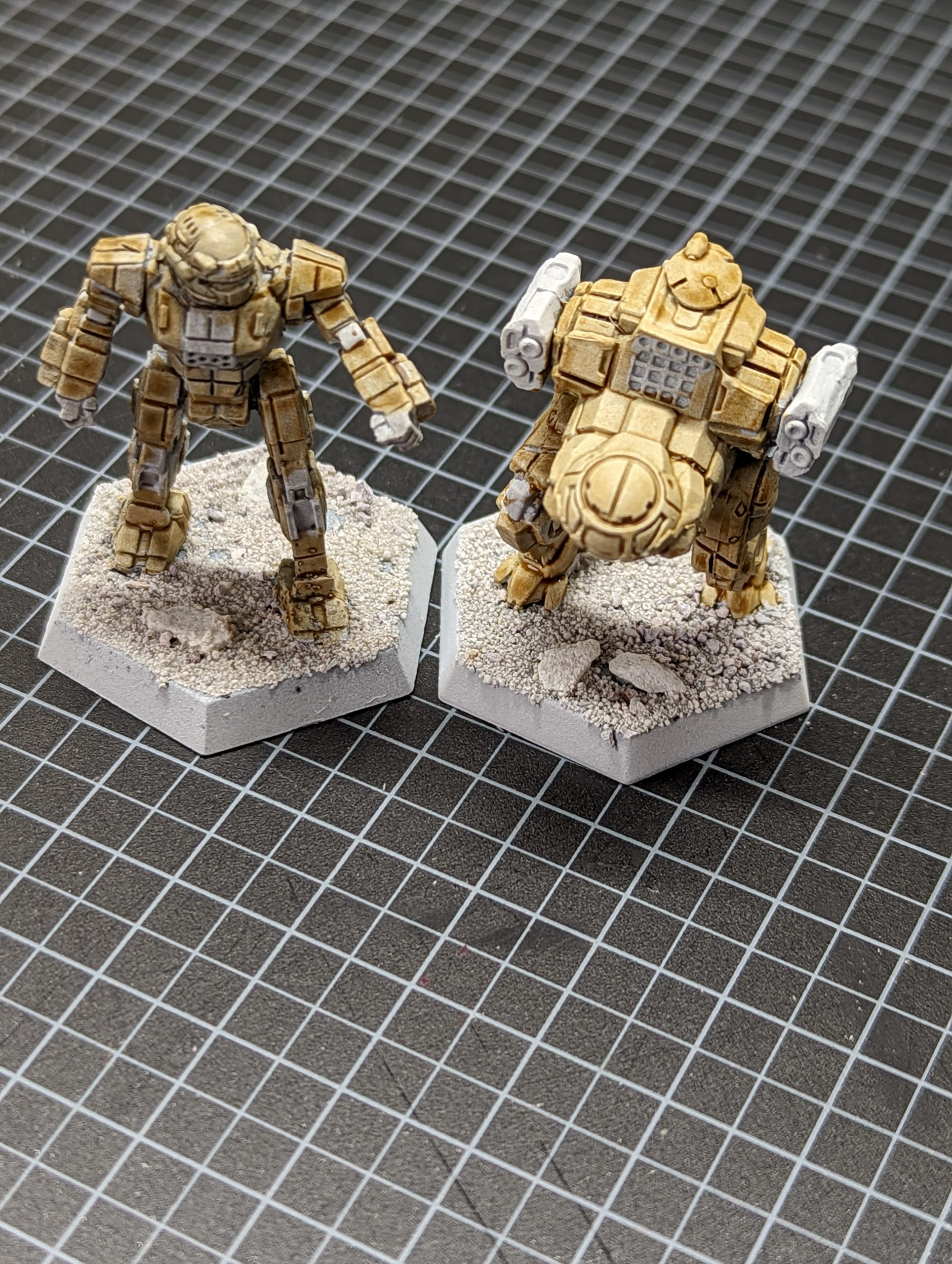
As you can see above the Commando with the Imprimatura has a darker tone, especially in the recess details. In painting both miniatures I found the Commando easier, as the recesses had already been darkened by the Nuln Oil and I could concentrate on the surfaces. The detail was already clear, and I could concentrate on getting the effect on the armour plates with the Skeleton Horde that I wanted. On the Jenner I found myself going over it, pushing Skeleton Horde into the recesses in order to get the lining effect that was already present on the Commando and even then it looks flatter.
Grisaille
I was fortunate enough to get some Kroot from the Into The Dark box, and I wanted to underpaint these with a grey to white grisaille. I assembled all the models (17 in all) to give an almost complete roster, and worked out the necessary sub-assemblies where required. I then based the models and sprayed them black.
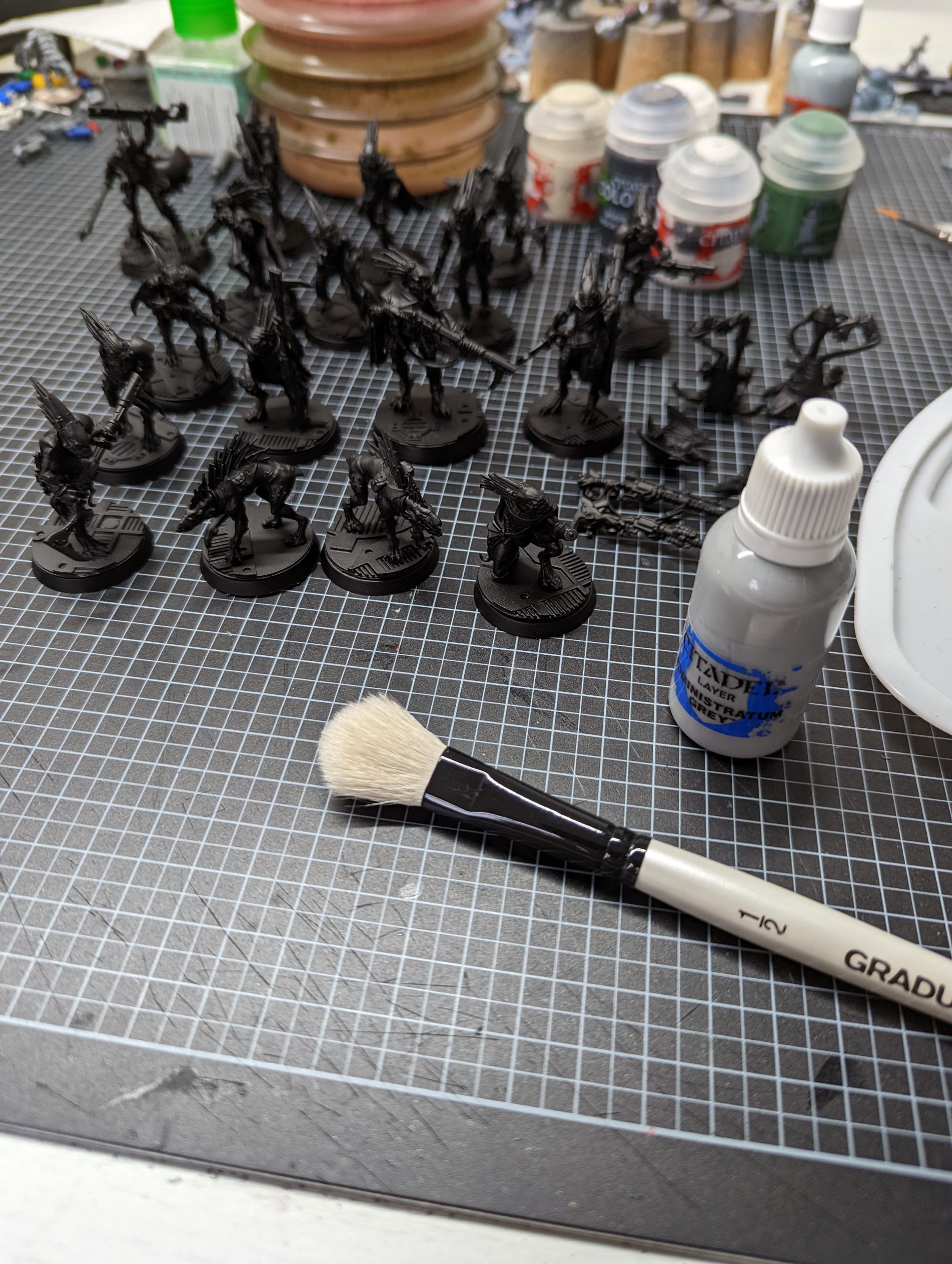
As you can see that’s a lot of little Kroot. I started with Administratum Grey and a large soft drybrush.
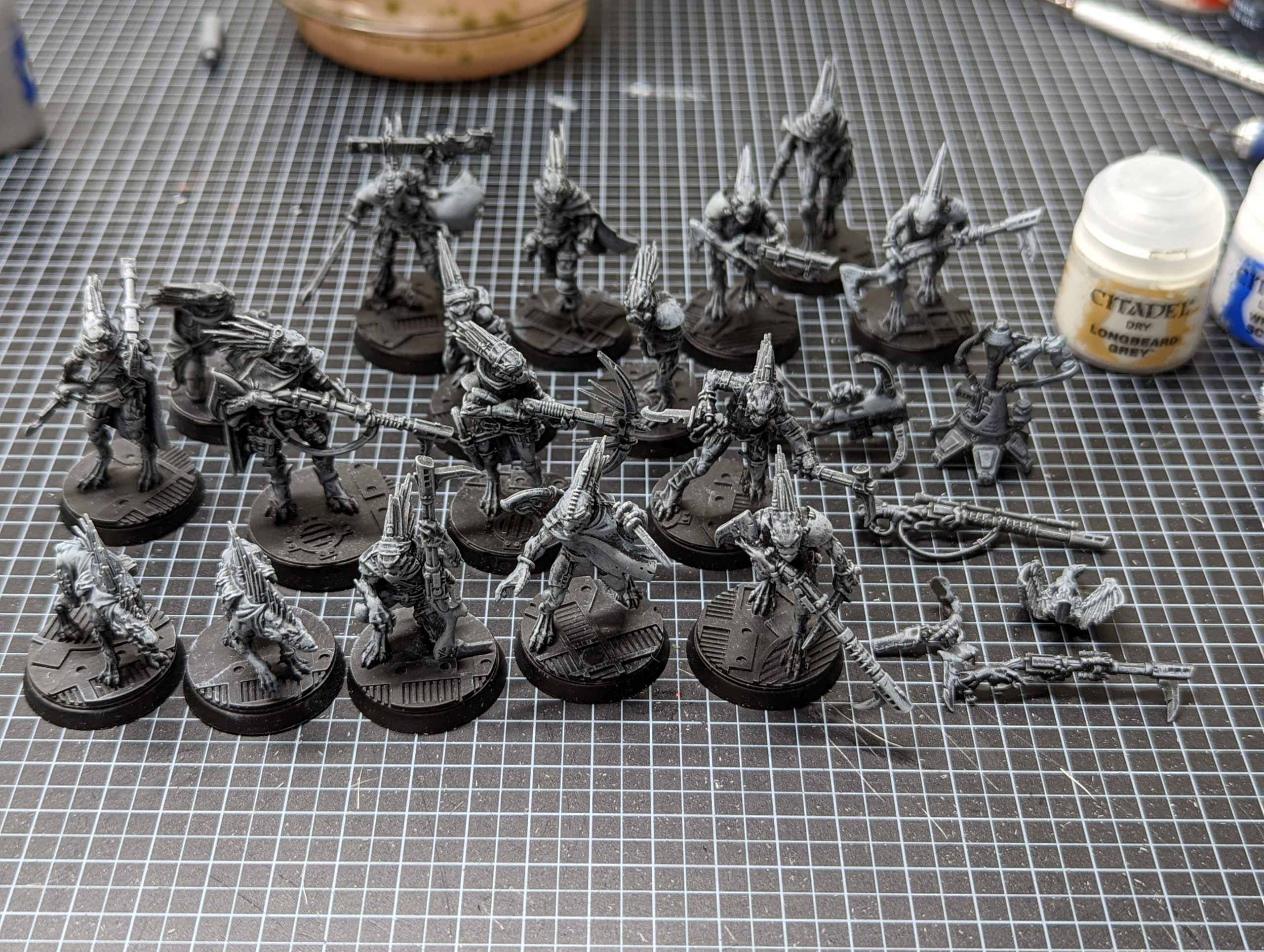
As you can see, I’ve set the light source as coming from above, drybrushing down to build up texture and value, and define the highlights and shadows. The next step was a lighter drybrush with Citadel Longbeard Grey Dry paint, again moving from the top down (but lighter and not as far as the Administratum Grey layer).
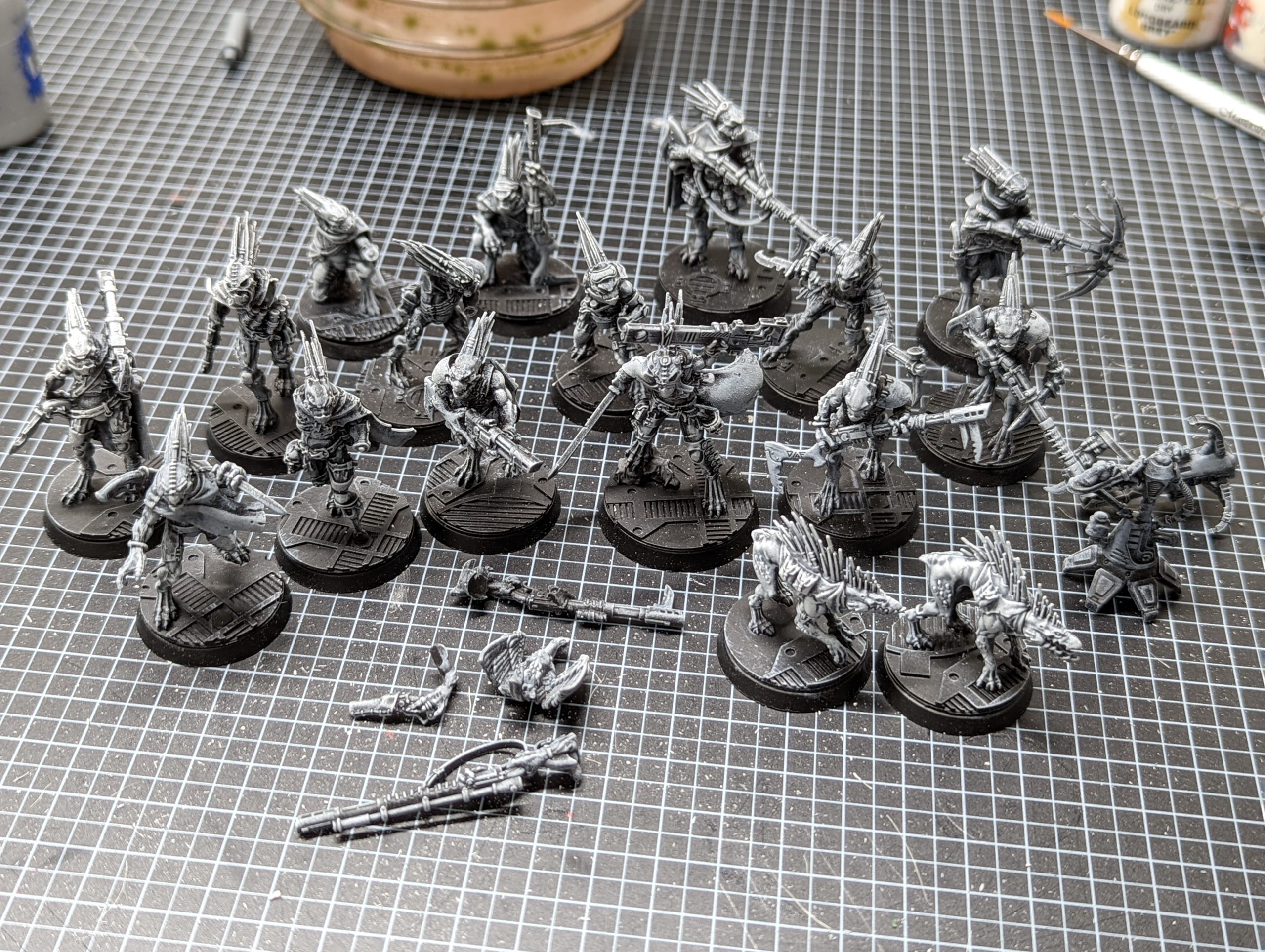
As you can see the Longbeard Grey has increased the value where the light would hit the models. You could stop here, but I went further.
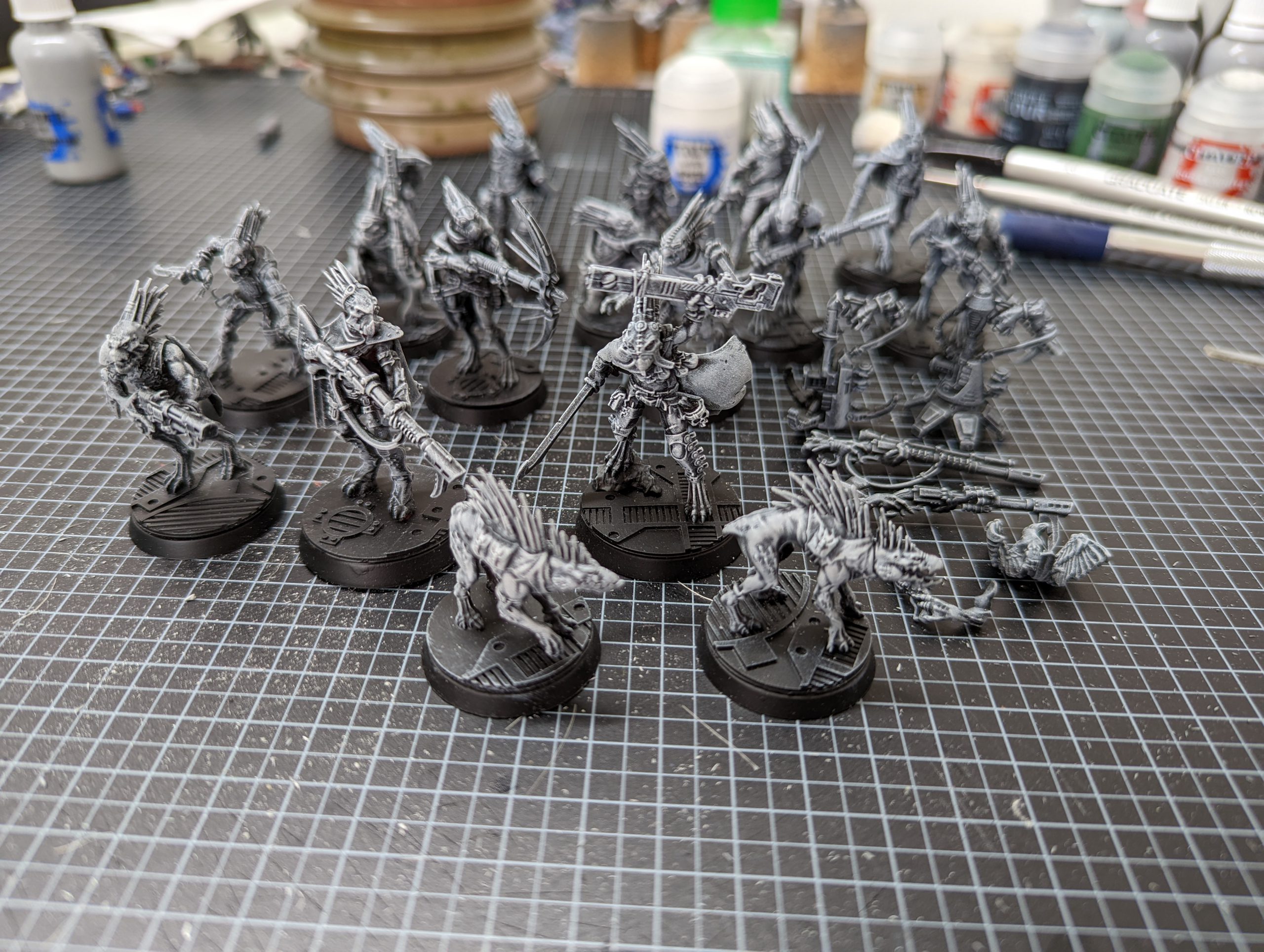
A final layer of very light White Scar drybrushed on the areas I want to have the most value, and then breaking out a 3/0 brush and handling any areas where I want a line highlight.
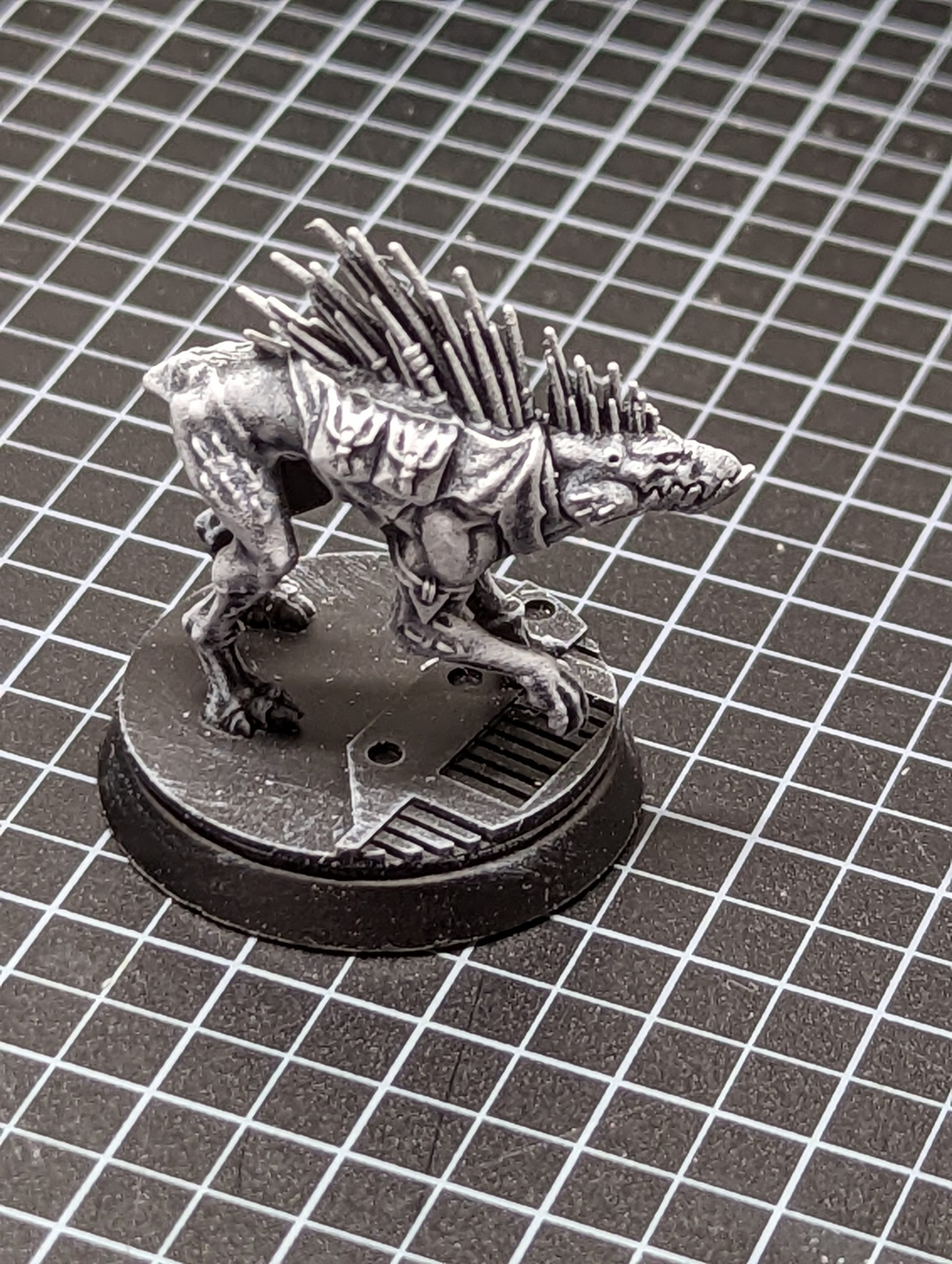
You can see the completed Grisaille above, where the values have been built up using the different layers, and if you wanted to go with a very stylised black and white Interrogator style kill team, then you can stop here.
So lets see a first layer of overpainting.
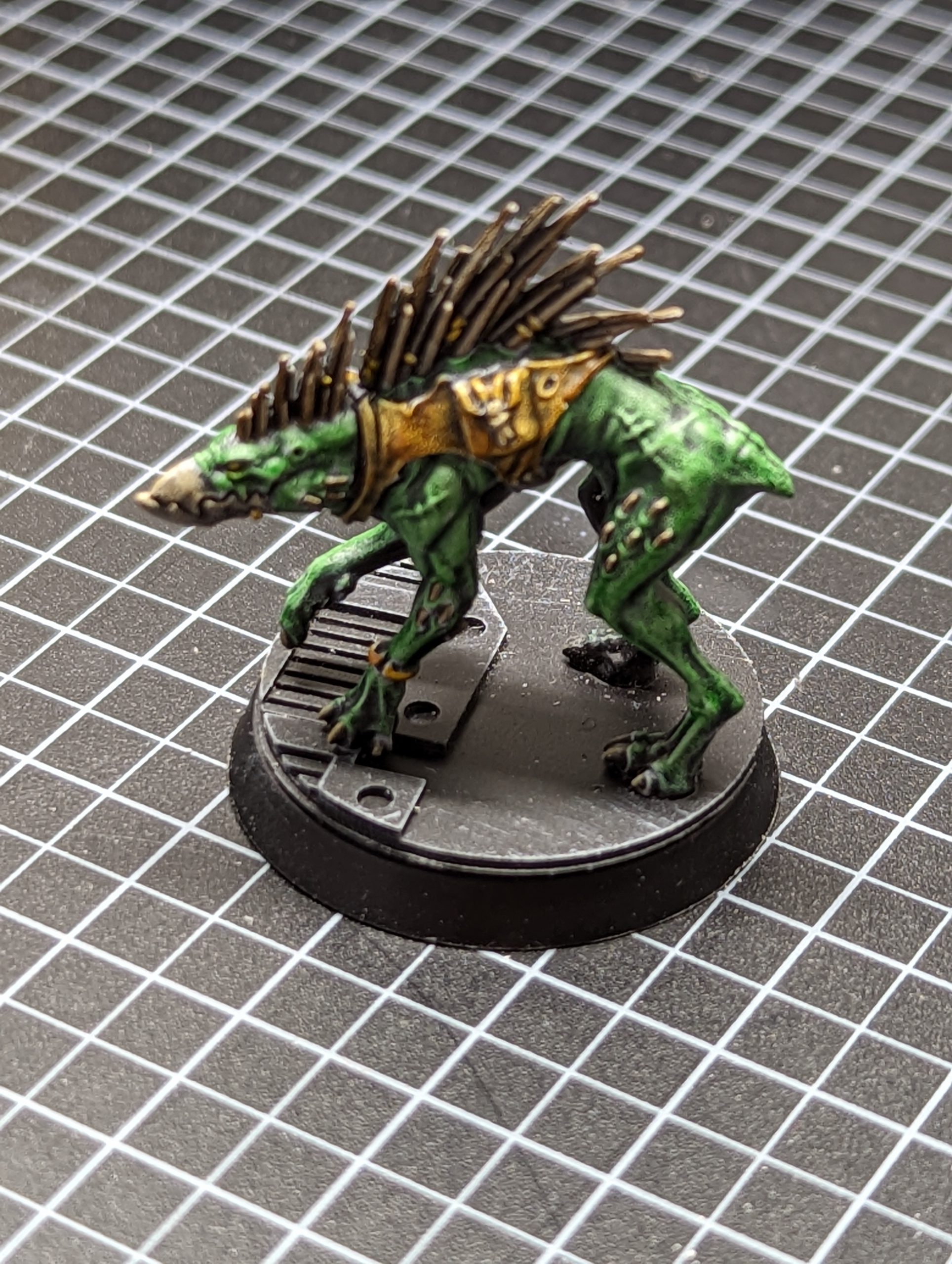
The paints used were:
Skin – Contrast Ork Flesh/Contrast Medium 50:50
Leather – Snakebite Leather/Contrast Medium 50:50
Quills – Garaghak’s Sewer/Contrast Medium 50:50
Beak & Claws & String – Skeleton Horde
Eyes – Imperial Fist
Gold – Silver and then Nazdreg Yellow
As you can see this is now a tabletop standard model and the only thing needed before popping it on a table is the base being done. I’ll go back for a few details to punch up the model a little, but in a couple of sessions (doing the grisaille on the whole kill team and coming back and spending ten minutes on a Kroot hound) I now have a serviceable model, which is what I wanted.
But what if you wanted to go a little more detailed? It’s Squat time.
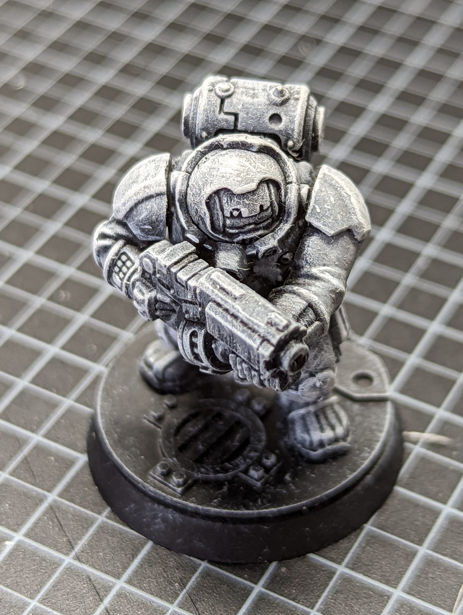
With a grisaille, you build the highlights in, and you can take a fairly small brush and your pot of White Scar, and look at what you want to detail. Particularly good things to try is wear on leather, spots/stains on clothing, and scratches/wear on armour.
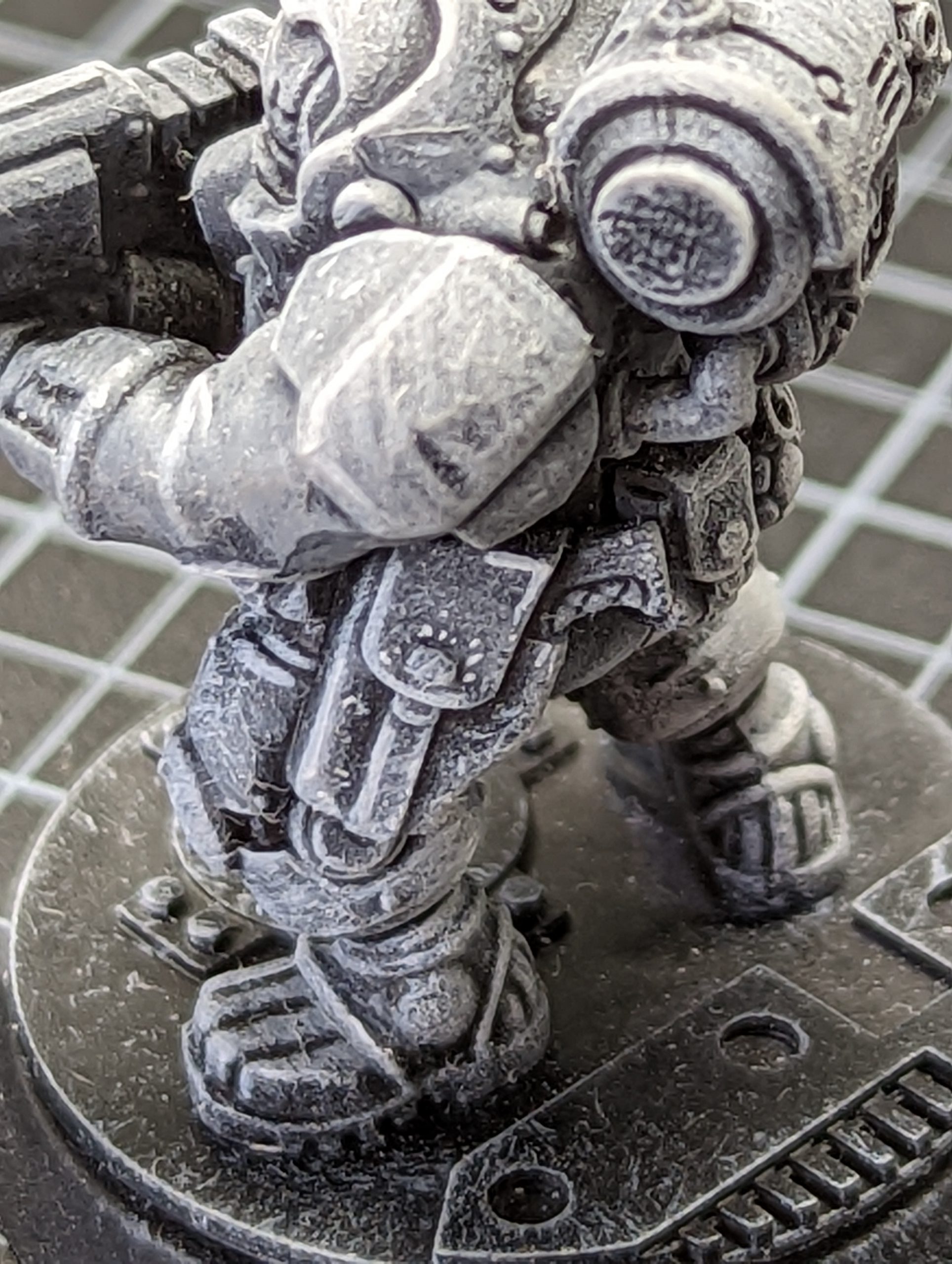
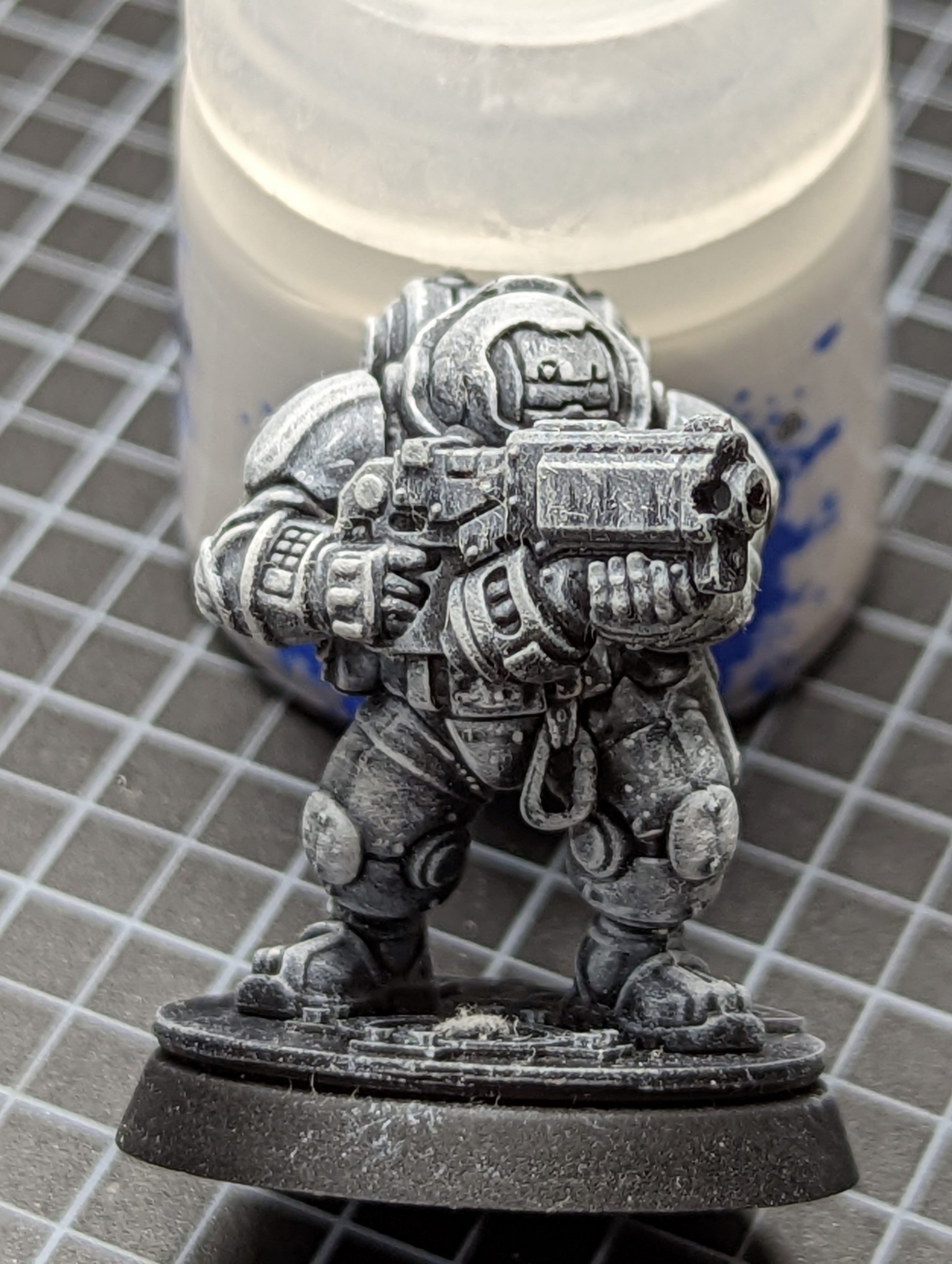
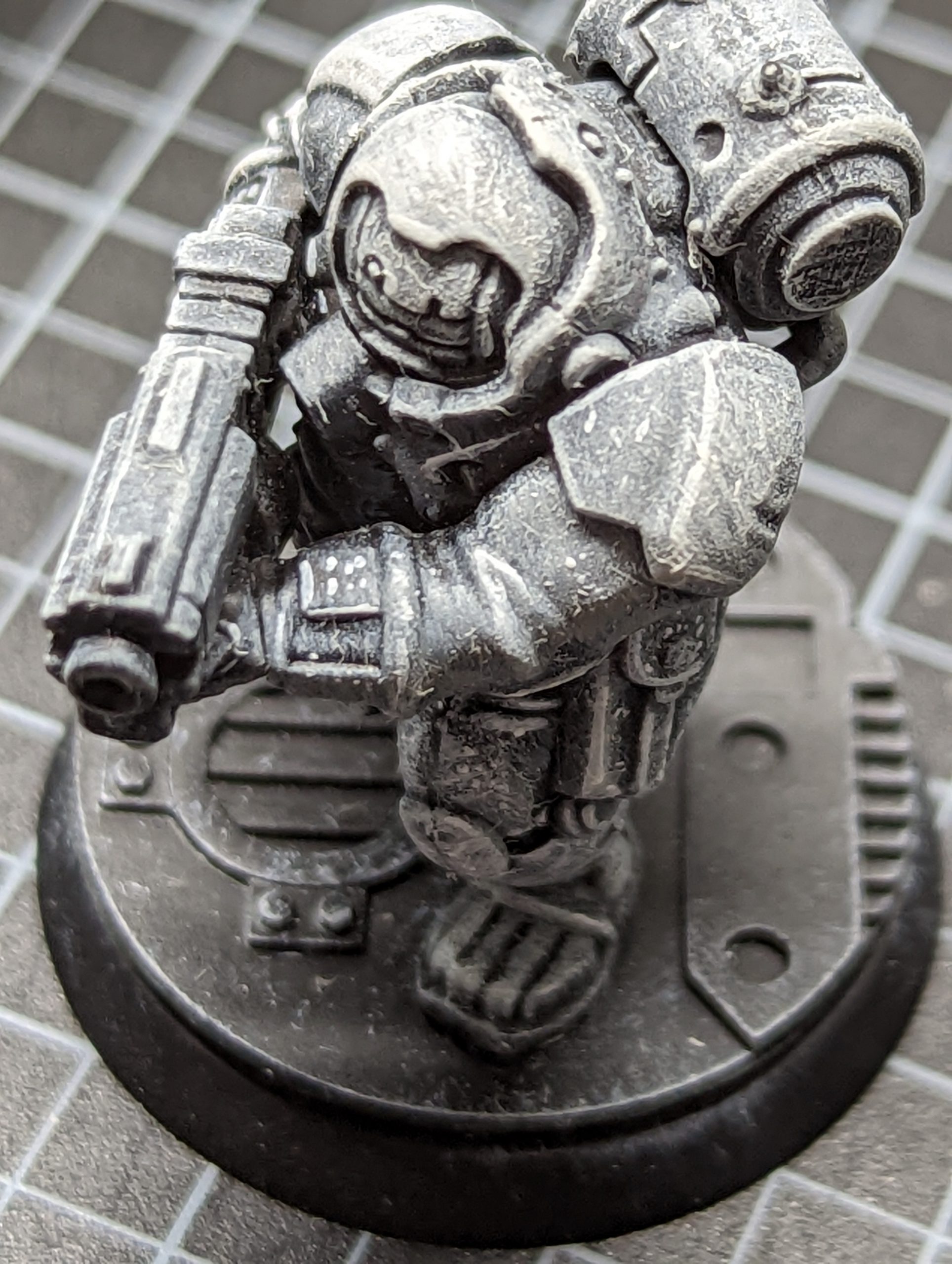
Also remember, and again, this will upset people, that silver is metallic grey, and there is no reason why you can’t do exactly the same with metallics on a model and then shift the colour with a contrast glaze.
And yes, I dusted this model off before painting because boy does drybrushing attract dust and small brush hairs.
Verdaccio
I’ve not done Verdaccio myself, but a friend of one of our contributors has, and they completed the following piece with citadel paints and gave permission for us to include it.
Their instagram is https://www.instagram.com/paint_specs/ and I’m sure they’d appreciate likes or whatever they have on Instagram.
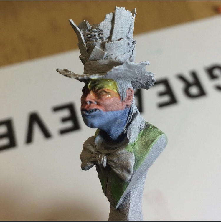
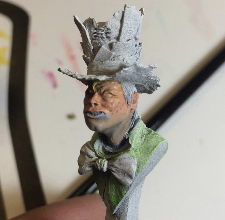
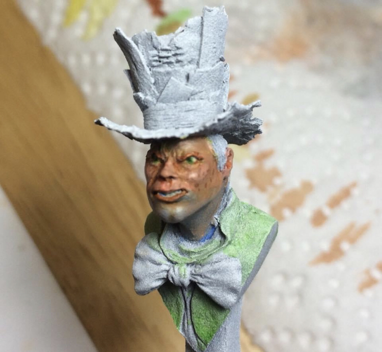
And here is the finished bust:
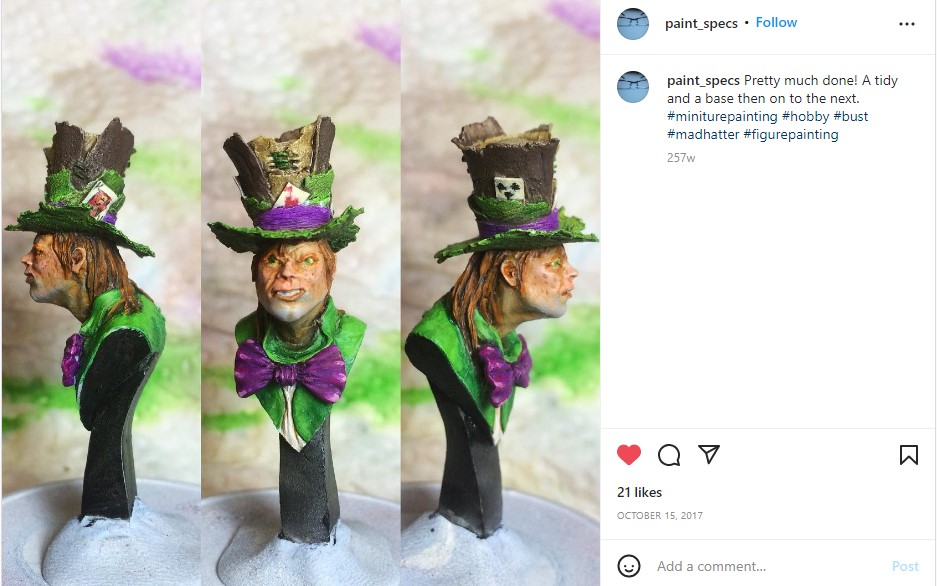
As you can see, this is much more involved than my cheating recommendation to use Plaguebearer flesh contrast (Deathguard green heavily thinned would do the job as well) and involves different underpainting shades to get the effect.
Bust painting is very interesting, and it gives you a canvas to try out techniques that would be hard to try for the first time on a 28mm model. Detailed skin work is an obvious example, but detailed leather or cloth textures would be another. Bust painting is a good teacher, and while you might take a month to paint one, you’ll know a lot more than when you started.
Wrapping Things Up
I hope you’ve learnt something from this article and it’s made you think. If you want to go further, there are some excellent tutorials on grisaille on youtube (I would recommend Marco Frisoni and Richard Gray as youtube painters to watch, even if Marco does youtube face in some of his thumbnails).
Classical painting is full of techniques that have made their way into miniature painting, and is full of theory that is often missing from miniature painters learning. It’s worth taking the time to find out more about colour theory for anyone miniature painting, and remember that everyone can always learn something new about painting (I’ll try out Verdaccio on something sometime soon) and that this is your hobby to enjoy. Find the level you want to paint at, occasionally stretch yourself on a lovely display or centerpiece model, but it’s a hobby, it’s for fun, don’t stress yourself out that your gaming models aren’t worth entering in Golden Demon or Crystal Brush.
So have fun painting, and I hope you enjoyed the article.
Have any questions or feedback? Drop us a note in the comments below or email us at contact@goonhammer.com.

