In our How to Paint Everything series, we look at how to paint well, everything. In this article we’re shifting focus away from the little warriors that populate our battlefields and toward the terrain they fight on. Today we’re looking at how to paint Sector Imperialis/Manufactorum ruins from Games Workshop.
Starting with the release of Kill Team in 2018, Games Workshop completely overhauled their terrain kits, rolling out a series of new building kits that allow players to build cityscapes like never before, assembling buildings with a wall-and-pillar construction that incorporated a large number of cool design tricks, modularity, and compatibility across multiple kits. These are great for representing the war-torn battlefields and Imperial planets of the 41st millennium and are packed with tons of good details. They’re also pretty large, which is great if you need big pieces that can act as Obscuring terrain in 40k. But that size is a double-edged sword: They can also be fairly intimidating, and the perceived time required to paint them can mean a lot of players put off painting them, instead keeping a bunch of bare plastic terrain on their tables. In today’s article, we’ll talk about how to assemble and model them and how to paint them quickly and effectively so you can go from shameful bare plastic to eye-catching terrain that makes your table the envy of your gaming group.
James “One_Wing” Grover’s Method
The 2018 Kill Team big box awakened a terrible thirst in me – the thirst for GW terrain kits. Are they pretty? Yes. Are they expensive and covered with a ridiculous amount of detail, consuming huge amounts of hobby time that could better be spent growing my skeleton legions, and thus a regular source of hobby regret? Also yes.
Ah well, nevertheless.
As one of our resident tournament players, I like playing on symmetrical tables, and for a while I’ve wanted some more GW ruins to mirror the two larger pieces from the aforementioned kill team box. The release of the new wave of Sector Manufactorum kits was enough to break my resolve and I purchased one of the larger kits when they launched, which has been sitting on my shelf staring accusingly at me ever since. With lockdown being in place across the UK over Christmas, however, the time had finally come to slay this daemon, and I invite readers to join me on this journey.
The Plan
The box I had purchased was the Sanctum Administratus, and after some careful counting and planning, I worked out that if I sacrificed the option of building the (admittedly cool) three storey design on the box, it gave me exactly enough panels to match the wall footprint of my two existing larger GW ruin pieces, seen here contributing to a previous attempt at comedy.
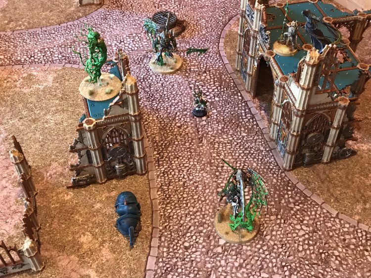
While the larger piece wouldn’t extend so far back, Obscuring means it’s mostly the front that really matters, so the plan was go.
When I last painted ruins like this, contrast didn’t exist, which mean that doing the beige stone wall took a surprisingly huge amount of effort. My hope was that this time I could use a substantially faster process thanks to the advent of the newer paints. I also wanted to shortcut some of the metal detailing if I possibly could, because I was definitely stung by the memory of how long getting these first lot done had taken. Finally, although the structural parts of the ruins are very similar, the details on the panels are different, with a more industrial theme than the Imperialis ruins. I decided to go with the box art for these and paint them metalic red, figuring that when I put these on the table I can have an Imperialis and a Manufactorum half of the board to make them look a bit distinct (which lines up with some of the other stuff I have for Dense and Difficult pieces nicely).
An overall plan thus came together. Now, fair warning – this is me trying to make these look pretty nice, and it takes a while. I cannot fault you if you want to go for easier, drybrushed or airbrushed scheme. If, like me, you view the extreme detail on these kits as a challenge to be faced with paintbrush in hand, read on.
Plan – Walls
- Spray Wraithbone.
- Block in all future metals except the “banding” with thinned Black Templar.
- Block in the banding Wyldwood.
- Block in the exposed structurework on the end pieces with Basilicanum Grey.
- Douse all the stone in highly thinned Skeleton Horde.
- Paint the future red metal doors/windows in Leadbelcher.
- Drybrush all the exposed structurework and random metal bits like fans and vents Leadbelcher straight over the Black Templar/Basilicanum Grey.
- Paint the red metal in thinned Blood Angels Red.
- Paint the banding in Balthazar Gold.
- Apply detailing.
Plan – Floors
- Spray Chaos Black
- Paint the struts on the underside in Balthazar Gold.
- Paint a few detail bits on the underside Leadbelcher, wash Nuln, good enough for stuff people will never see.
- Paint the structural beams on top Balthazar Gold.
- Block in the pillar caps with Wraithbone > Skeleton Horde.
- Paint the floors:
- Caledor Sky
- Drakenhoff
- Sotek Green
- Apply detailing.
Assembly
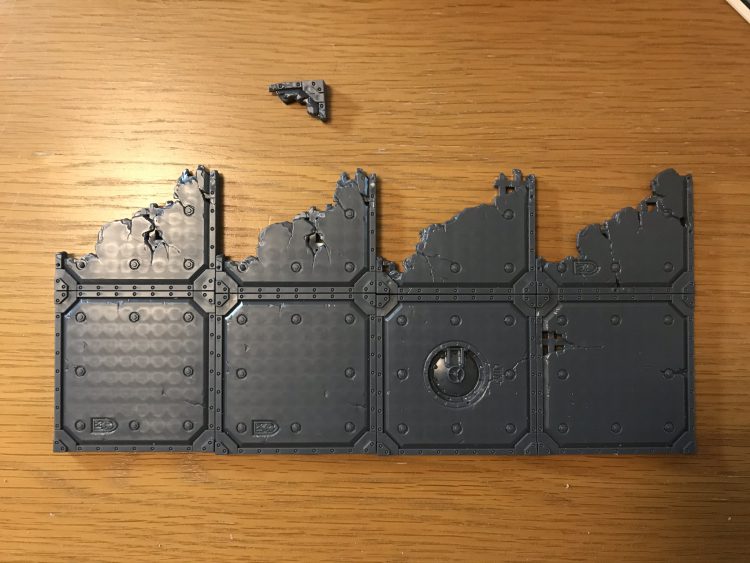
Make sure you plan in a decent amount of time for assembly when working on these kits. They aren’t complicated to put together, but there are a lot of moldlines to remove, and you want to make sure you’re doing that so that the finished product looks its very best. In particular, the ones on the insides of the windows will be extremely obvious unless properly smoothed down.
For subassemblies, the absolutely critical lesson I learnt from last time is that for the main walls, don’t join the corners before painting. You will think “it won’t be too bad to get a brush in to the detail” and you’ll be extremely wrong, and because this method uses a lot of contrast, it’s also helpful to be able to have the panels sitting flat to dry. For the smaller bits that go across the top that’s less of an issue, as even once assembled they’re easier to manage. The floors I assembled into a single piece for each, and having worked out how to tesselate the parts I had for the larger one, used some of the accessories (lights etc.) that can affix to the underside to strengthen the joins between pieces, eventually giving me something that was absolutely rock solid. Fair warning – you can’t really change your mind once you’ve done this, and though not disastrous I later wished I’d used once piece slightly differently, so triple check your plan first!
Painting
Having built my ruins, I bided my time for a lull in the horrific dampness that is British weather, and got my pieces sprayed. Nothing too fancy here – this is another place where being able to lie the pieces flat helped a lot, as I just got both the airbrush stands I use for priming filled up, took turns spraying the parts, waited for them to dry then flipped them.
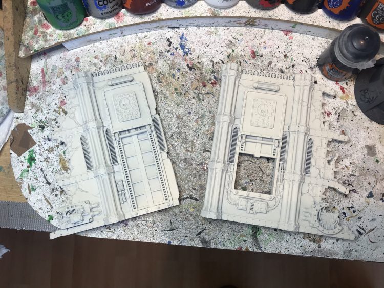
The only place I needed to do some touching up was on the parts that end in a pillar, because spraying while flat meand that the primer hadn’t gotten to the side properly, though if I was doing this again I’d just make sure to spray in there.
Next up, the longest and by far the most boring step – blocking in various sections in contrast. This is, honestly, why if I could go back in time and do my original ruins from scratch I’d choose a dark stone colour, because with beige stone and metal detailing you either have to spray black and re-base the panels (which would be horrific) or do what I’m doing here and spray bone/white and block in the metals. The latter is, at least, merely time consuming rather than actively hateful, so I got to work. For anything that was going to end up silver or red, I applied thinned Black Templar, mixing it up about 50:50 with medium in a big puddle on my pallate pad.
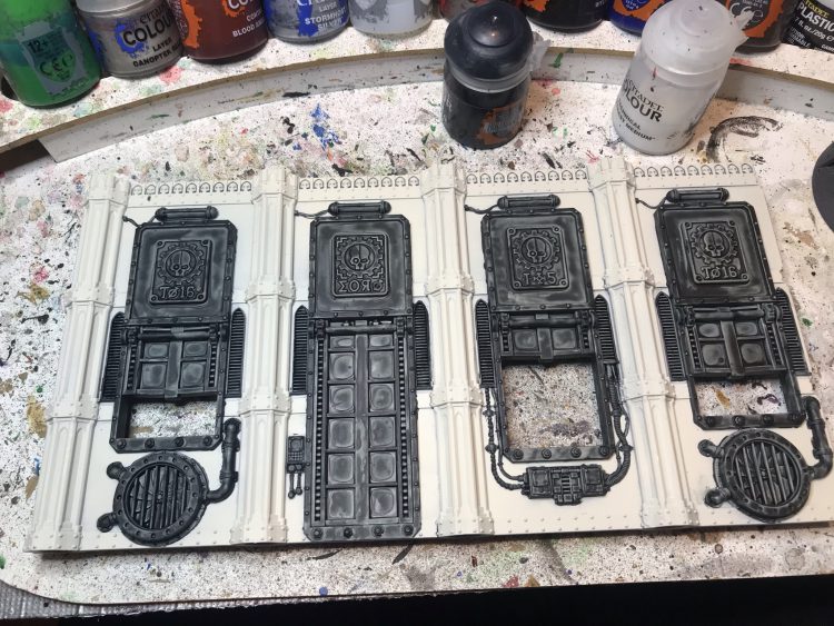
The good news is that this is the first step where Contrast did speed things up, as when I was doing my KT set I was just straight up painting black here, which meant getting it into the recesses on the vents and fans was a complete pain.
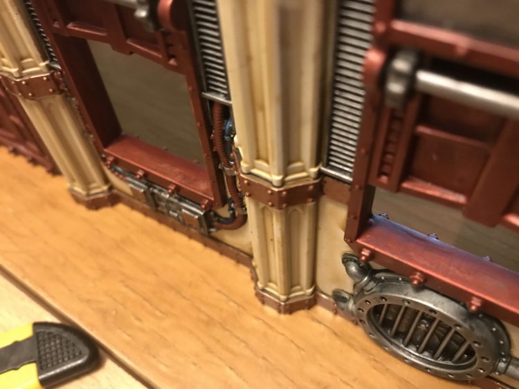
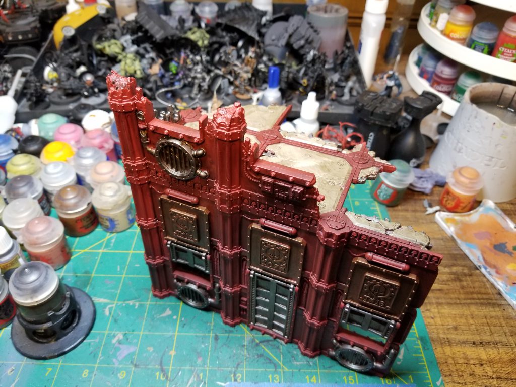
Next up, more blocking, this time using Contrast straight from the pot. For the bands that are going to be Balthazar Gold in the end, I followed Pendulin’s recent advice and went for a brown base rather than black, using Wyldwood to block in. I made sure to stripe along the top and bottom of the bands with this, because while it added a bit of effort now, it’ll blend OK with the contrast being applied to the walls themselves and means you don’t then have to bother applying the metal to this later on, and it’s way easier to do this neatly with the Contrast now. This was another big process improvement and I’ll be adopting it going forward. You can see in the image below (from the finished product) what I mean here.
The next thing to get blocked with Contrast (again, unthinned) is the exposed structure from the end pieces. For this, I use Basilicanum Grey, and I don’t really have anything notable to say beyond that.
Finally, a bit of a moment of truth for whether Contrast was really going to accelerate this. For the KT ruins I’d done the beige stone by washing over the white primer with Agrax then drybrushing with Ushabti Bone, which took forever. The theory this time was that applying very thinned Skeleton Horde (in the order of 2:1 Medium to Paint, possibly even closer to 3:1) direct to the stone I’d get a comparable effect in one fell swoop. Good news – this worked as planned, giving a good effect. I had to do a bit of work removing places where the (extremely thin) paint had pooled, and touch up a few spots with Wraithbone and rewash afterwards, but I got what I wanted. I unfortunately didn’t take a WIP of just that step, but you can see the results in the pic above, as only minor touch-ups were required to get to that.
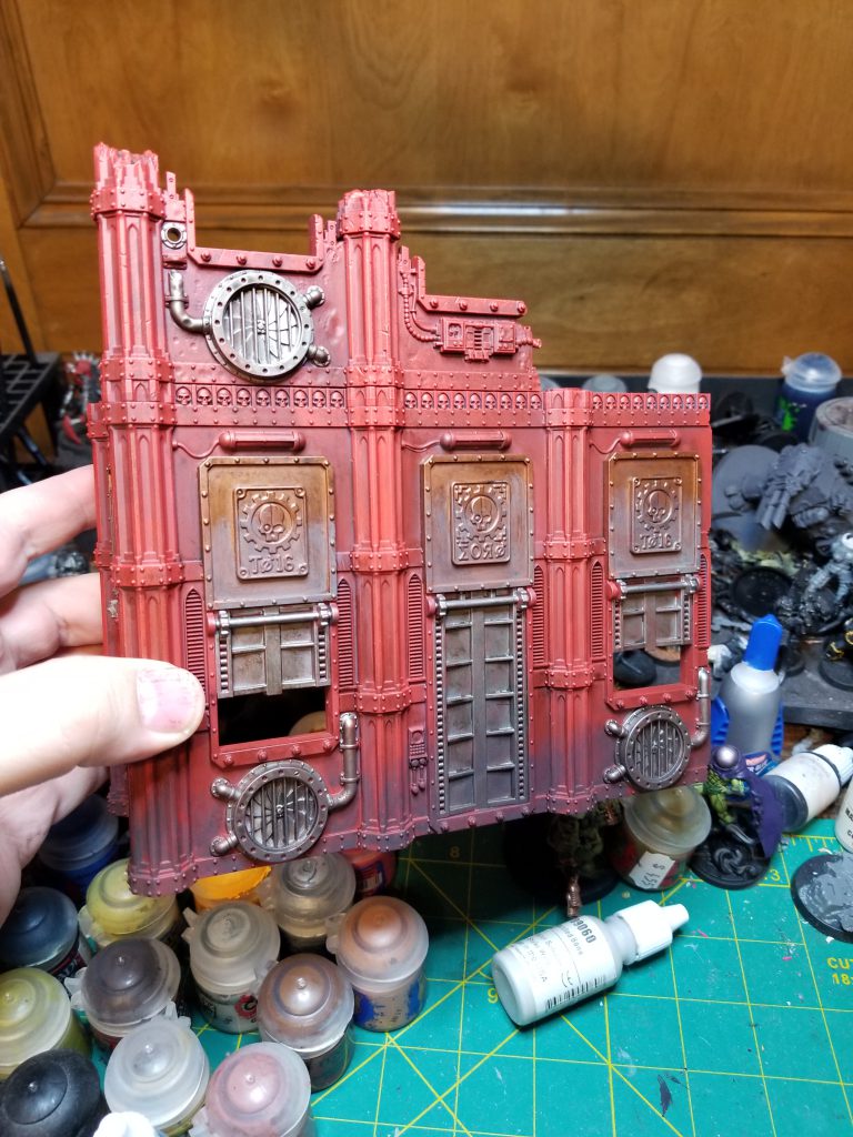
Once that was down, the last “big” step was getting silver into all the places it needed to be. For the windows and doors that would become red, this meant a full coat of thinned Leadbelcher, being careful to paint all round the edges as well. For the fans, vents, control panels and exposed structure, this was where another Contrast shortcut came in – my theory was that I could just drybrush this on, and because it was based in Black Templar it would essentially be “pre-washed”, saving me both from needing to do a full coat of Leadbelcher on these and a later Nuln step. I’m pleased to report that this again worked as planned, and a comparison between the fans on my old ruins and the new ones is below:
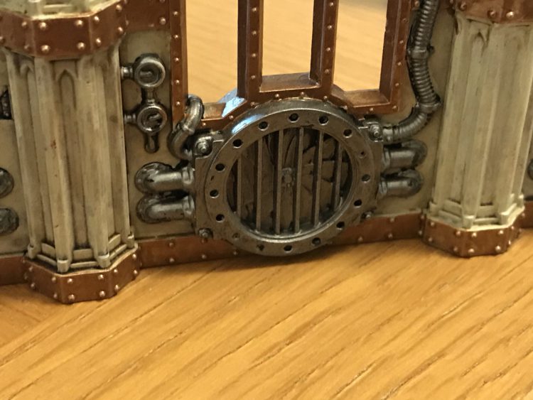
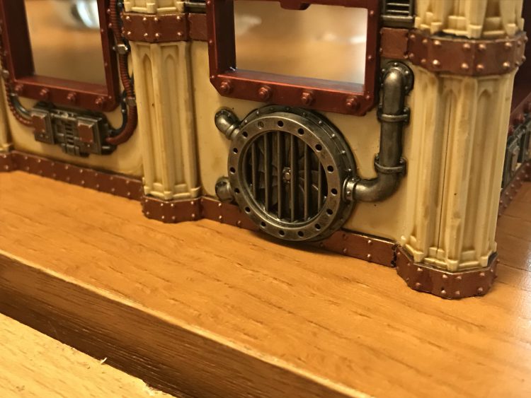
The new version is vastly quicker and (in my opinion) straight up looks better as well. #lifehack, #mindblown etc.
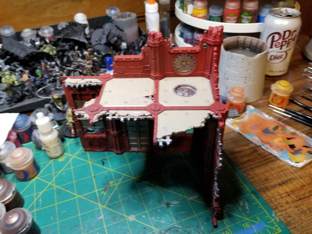
After all that, you end up with something that looks a bit like this:
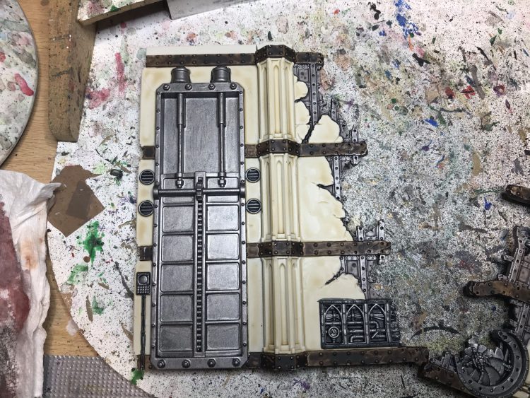
The good news is that at this point, you’re maybe 2/3rds done – there’s only one “long” step left and that’s painting the red on the doors, which we tackle next. For this, it’s once again Contrast time, here Blood Angels Red thinned about 50:50 with Medium and applied generously. The way I tend to do this is apply it to the flat first with a big brush, as you don’t need to worry about being neat, then go back round the edge with a smaller brush to avoid getting red onto the stone or metal panel at the top of the door (which I’m leaving silver). If you do smudge onto the stone while doing this, you can quickly wet a brush and mostly wash the red away/capillary action it up if you’re quick enough. This takes you to the following:
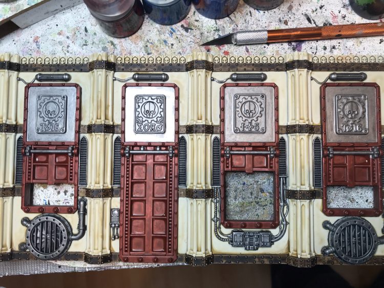
In order to make the red “pop” a bit from the angles people are most likely to view it at (i.e. from above), I added a thin edge highlight of Wild Rider Red to:
- The inner rims of the open windows on the outward facing side of the wall.
- The edge of the top section around the part we’re keeping silver on the outward facing side of the wall.
Two more final bits of “area” metallic to do. First, Balthazar gold on the bands, which thanks to being neat with the Wyldwood earlier is pretty quick, as you’re essentially just doing a flat stripe. Finally, Runelord Brass onto the Adeptus Mechanicus panel in the middle of the upper parts of the doors/windows, which we’ll be adding some more detail to momentarily.
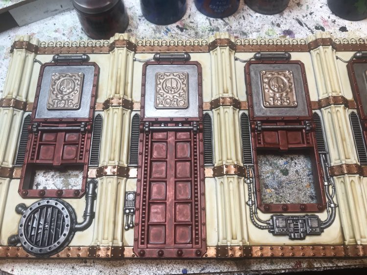
From here, you could basically just wash those panels Agrax and this would be good to go, but by this point you’ve probably already invested way too much time here, so adding some light detail to really make them pop is a good investment. I use Blood Angels Red and Talassar Blue to make various wires, pipes and buttons either metallic red or blue, and use Hexwraith Flame to fill in the cage lights. and display screens.
Finally, I added detail to the AdMech panel. Having washed it in Agrax, I painted the Mechanicus symbol in Stormhost Silver, then applied thinned Black Templar over half of it to give the effect from the box art. I applied Gehenna Gold to the trim and the lettering and, at last, the walls are done!
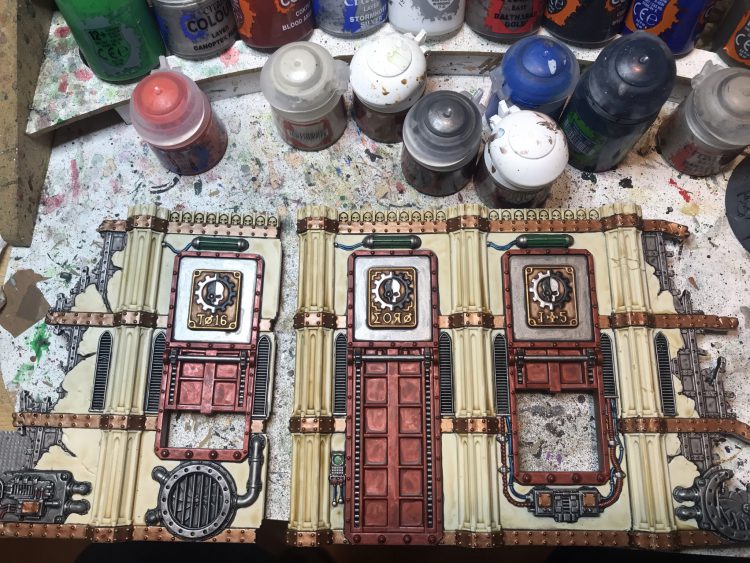
Now for the floors. Unfortunately, I didn’t really take many WIPs for these, but to be honest the process is not super complicated. You do:
- Balthazar Gold on all the strutwork.
- Block in the Wraithbone > Skeleton Horde on the column heads.
- Two thin coats of Caledor Sky on the floors.
- Drakenhoff all over the floors, making sure it goes into the recesses at the edge and the ones with the screws in them.
- Two thin coats Sotek Green, using a smaller brush to avoid filling in the screw recesses, and not worrying about going too deep at the edges now because the wash takes care of it.
- Leadbelcher and Nuln on the hatch.
This takes you to here:
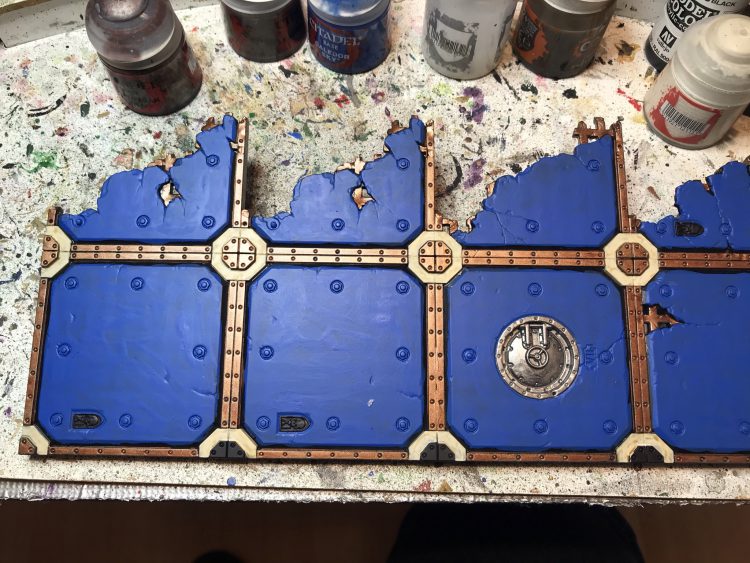
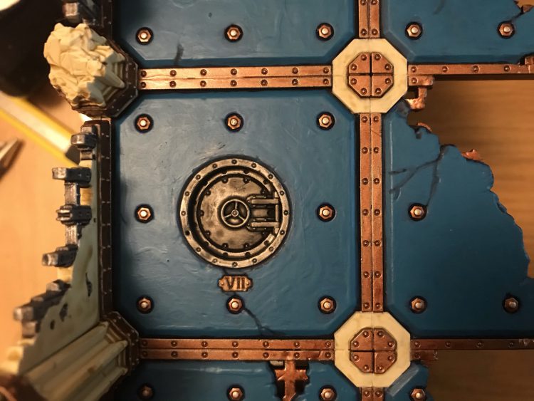
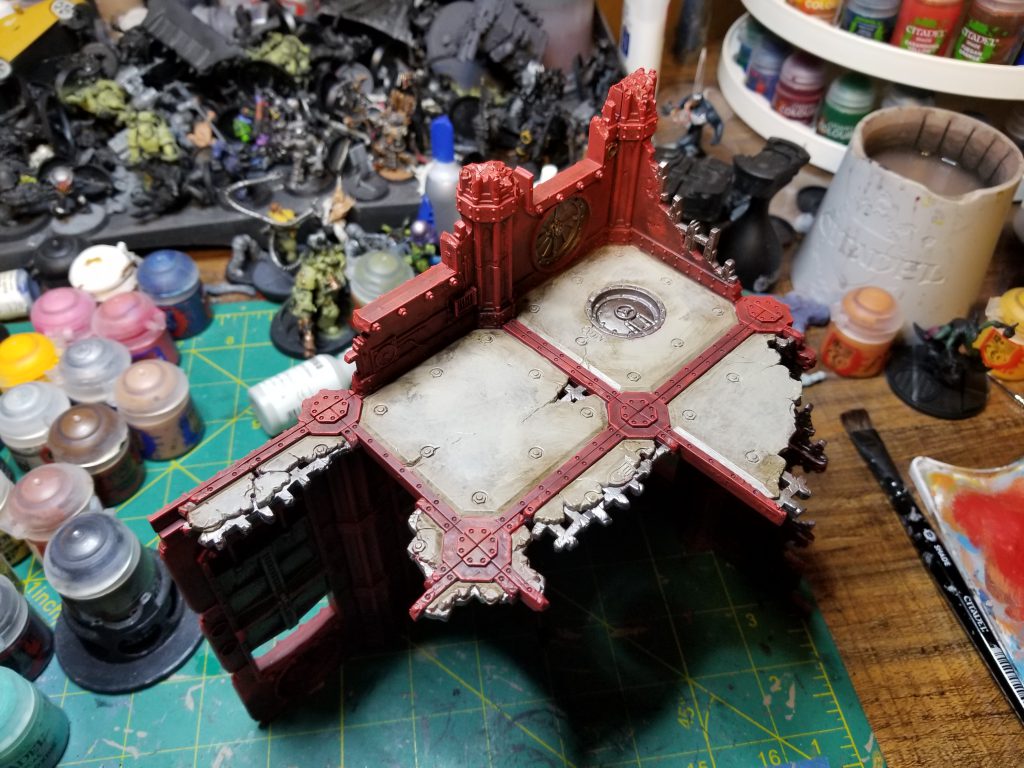
Now it’s just a case of detailing, which took the form of:
- Runelord on the insignias, followed by a wash with Agrax.
- Re-apply Drakenhodff to any screw recess or edge that doesn’t look dark enough, plus around the insignias just painted.
- Re-apply Drakenhoff to the cracks.
- Paint the screws Balthazar Gold.
- Dot the tips of the screws with Canoptek Alloy.
The finished product looks like this:
For the underside I was pretty lazy – people are simply not going to see it in the course of a normal game, so it just needs to be good enough that any glance that is caught of it doesn’t look out of place. Here that comprised:
- Caledor Sky + Drakenhoff for any bits of the stone that are right on the edge.
- Balthazar Gold quickly brushed over the raised struts all round.
- Leadbelcher + Nuln on light mountings and underside of hatch.
- Hexwraith on the cage lights.
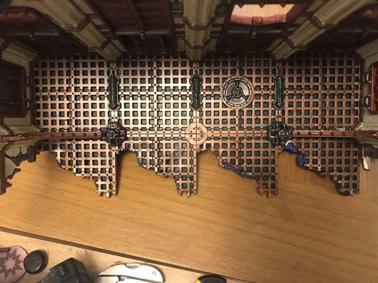
The only remaining task was to blitz through the process for the main walls again for the ruined bits to sit on top. This is, obviously, quite a bit quicker, and all the same techniques apply.
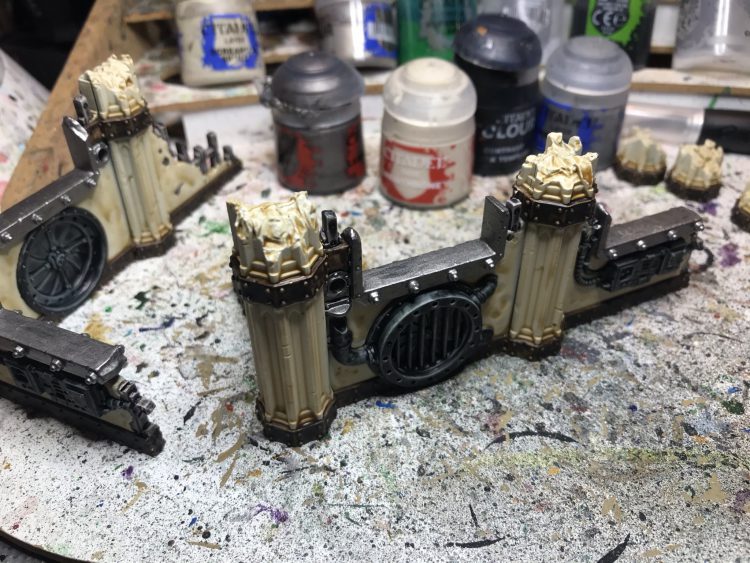
The Finished Product
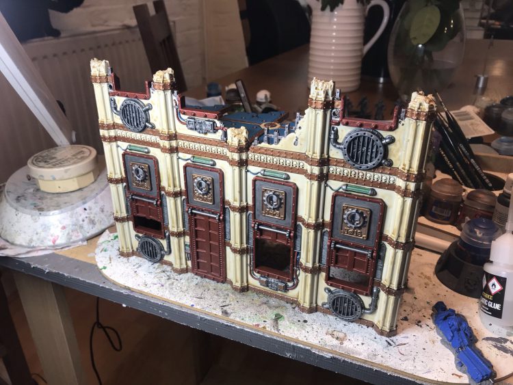
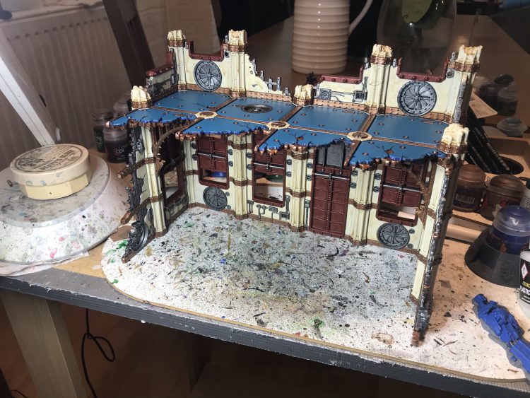
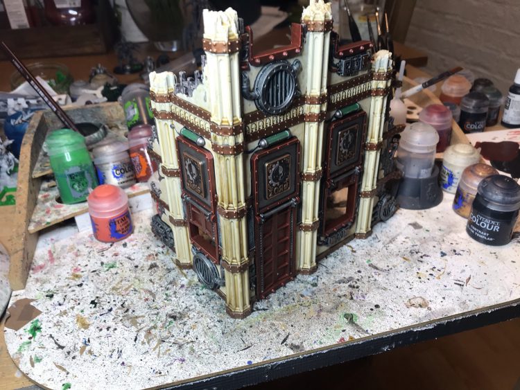
I am thrilled with how these came out, and they will be going on pretty much every table I set up going forward (and are highly likely to show up in any future posed shots for articles, keep an eye out). If you are starting from nothing, I probably would still recommend going with a dark stone scheme so you can work everything up from black primer, but if like me you want to have a go at replicating something in the region of the box art scheme, I hope this article helps!
Robert “TheChirurgeon” Jones’ Method
The Sector Imperialis kits are great. I’ve painted too many of them so far, and I still have more to assemble and paint. Painting terrain can be a real blast – you can get away with a lot of stuff you normally couldn’t on minis, and being sloppy to save time isn’t the end of the world. Generally speaking, I’m of the philosophy that the models are the stars and the terrain is merely a stage for them, so you should purposely put a bit less time and color into your terrain in order to give the models more of an opportunity to pop. And also to make it easier to tell what’s going on with the table from a distance. This means that I generally try to make my terrain pieces a single, more muted color, but when it comes to making them look finished and detailed, what you’ll find is that a little goes a long way – picking out a few small details with additional colors will make a piece of terrain look much more detailed and finished, to the point where you don’t have to do the whole thing if you hit the right details or add the right pop of color.
I’m going to walk through my basic method for painting buildings, then talk about how I do bases for them. Because in 9th edition, terrain really wants to be based. Also I’m going to avoid the building and modeling steps. Wings covered those and if you want more we’ll likely cover it in a future Fabricator General article, In the meantime, I’d strongly suggest checking out Ray Dranfield’s Twitter for some pretty amazing tips on how to use the terrain kits and combine them. My only note is: Don’t worry about the mould lines. The only areas you need to be diligent about scraping and cleaning are the points where walls and floors will make contact with each other. Non one is gonna see the mould lines in your windows.
Painting
I start by priming the wall section black. Ideally this step comes after putting something on a base, but I have a few ruin sections that aren’t based so I can put them on things like Sector Imperialis tiles or use them for specific terrain applications. Once that undercoat is down, I go over the model with a base coat of Mechanicus Standard Grey, which feels like a bit of a waste but note that the goal here is not total coverage, just mostly covering and treating this step more like a more intense form of drybrushing.
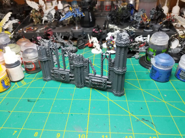
The next step is to hit the metal bits with Leadbelcher. This means the wall-mounted generators plus the exposed bits where the outer layer of wall has been stripped away.
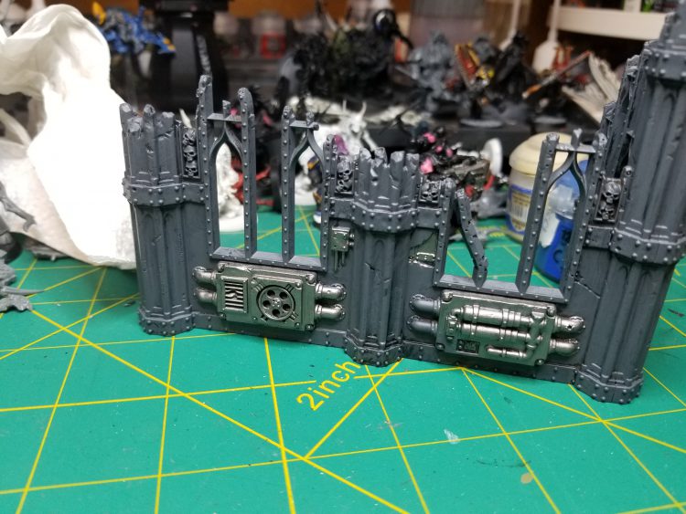
Now it’s time to douse the whole thing in Nuln Oil.
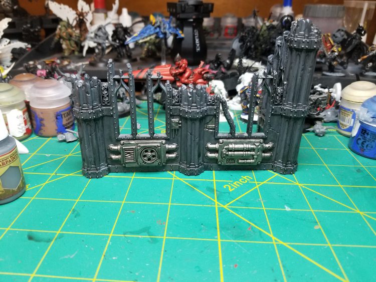
Then drybrush the gray parts with Celestra Gray. Avoid hitting the metal but it’s not the end of the world if you do. The goal is to add a lot of texture to this so be sure to hit the flat surfaces as well, pressing your brush down on them. I use a large drybrush for this.
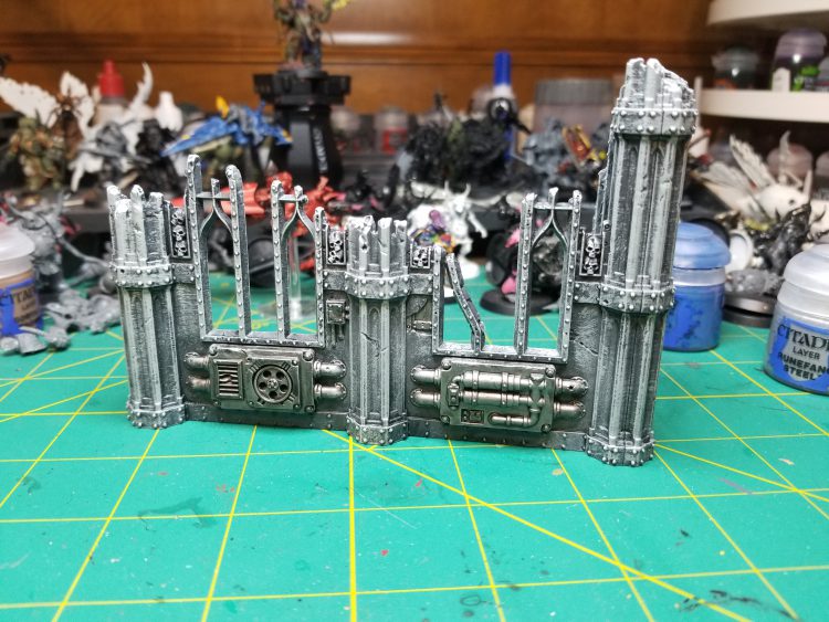
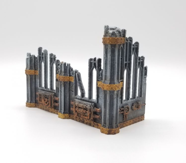
Now it’s time to add details. It doesn’t take a lot to make terrain pop and look inspired; we’re really looking to add 2-3 additional colors and pick out some details. That can be skulls (though those get tedious to paint), though in this case I’ve opted to do gold banding on the walls and pillars and copper piping. Once I’ve painted those, I’ll coat all the gold/copper sections in Agrax Earthshade, and get pretty sloppy/liberal with the shade as I do, hitting parts of the stone and other metals as well – it’s perfectly fine to hit those parts and doing so adds texture.
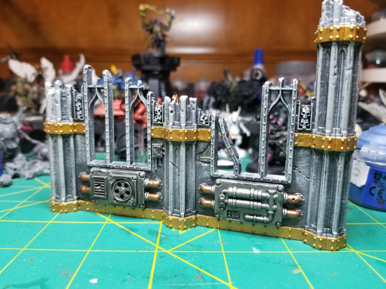
Last but not least I’m adding rust to the metal bits. This is a two-step process: Start by adding a stippled layer of Typhus Corrosion. Typhus Corrosion is a great paint for adding texture to things and dries with a gritty texture that’s great for drybrushing over. It’s wonderful for making metal look aged, and after I’ve applied a layer of it, I’ll drybrush parts of it with Ryza Rust to create a rusted metal look. If I wanted to go even harder on the worn-down look, I’d consider adding Nihilakh Oxide to the copper pipes and potentially the gold banding as well.
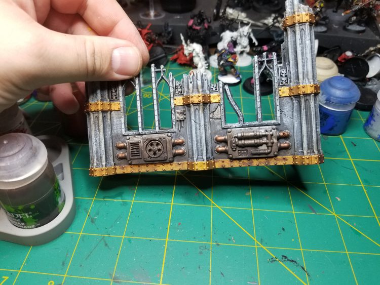
Boom, done. This whole piece probably took an hour to paint once primed, and that was with breaks to paint other minis while I waited for the washes to dry (by far the longest part). I didn’t show any floors here, but when I do them I paint them Karak Stone and drybrush/edge them with Rakarth Flesh and that compliments this cold gray scheme nicely. The end result is a piece that has enough color to stand out but won’t distract from the models around it. The only thing it’s missing is a base. Speaking of which…
TheChirurgeon’s Red Sector Imperialis Terrain
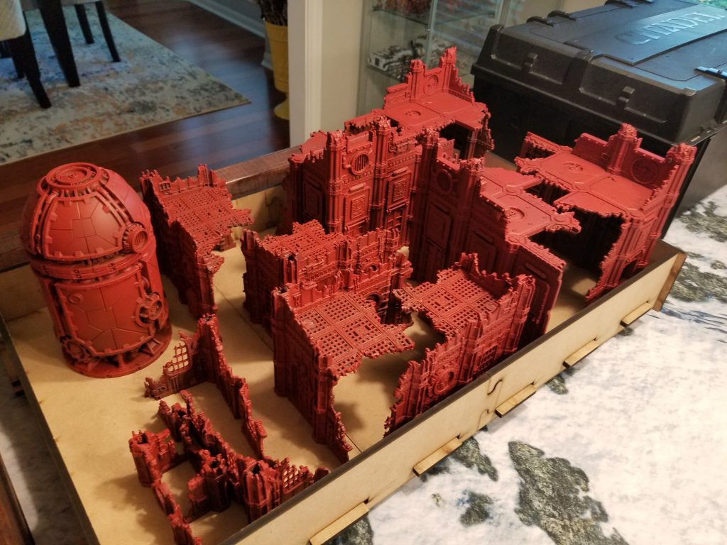
After doing a set of gray ruins I wanted to do something different when painting the terrain for my Games Workshop US Open GT layout, and so I decided to do red buildings. Assembly on these was normal, and once that was done I went ahead and primed them – I started by coating the interior walls and bottom halves with Chaos Black, then I primed the tops of the upper floors of the Storage Fanes with Leadbelcher, making sure to get in the recesses, and finally I primed them with Mephiston Red. This would ensure a decent color fade on the buildings before I even got started, and would mean that the pipes inside the floors would look metal. Most of my existing terrain is gray, so this was a good chance to branch out a bit and do something more colorful.
After that it was time to paint these bastards. I settled on a pretty simple strategy for painting them that would let me breeze through while still giving them ample color:
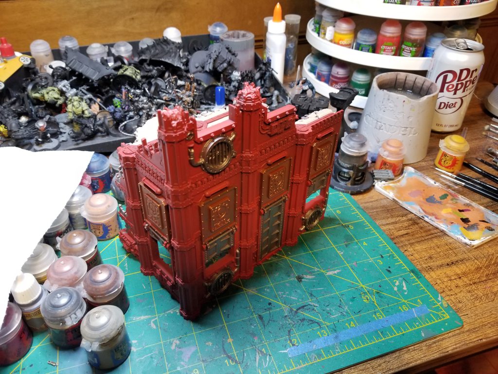
- Paint the most prominent pipes and grates with Leadbelcher. Get some of the wires and exposed pieces of rebar, but I’m not trying to hit everything -just the big bits and something on every face.
- Paint the metal plates and Window grates with Balthasar Gold. Again, I don’t need to get everything here but just enough to add a third color.
- On the Sanctums, paint the floors with Karak Stone.
- Wash the whole thing with Agrax Earthshade. Use more on the lower parts of the model.
- Weathering – I painted the bottom third of the ruins (or so) with Typhus Corrosion, making sure to hit any spots where I messed up and went outside the lines, and also hitting all of the parts painted with leadbelcher. Then I hit the copper plates with Nihilakh Oxide.
- On the Sanctums, I did a quick second pass with Karak Stone to give the floors more of a patina look.
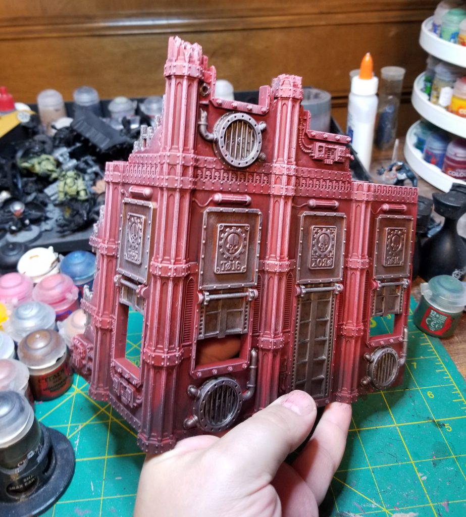
- Drybrushing. I take a large drybrush and put a tiny dot of Mephiston Red into a lot of Reaper Polished Bone (any light bone shade will do) to give it a sliiiiight pink tint, then I drybrush that over the model, using more near the tops. This is the last step, and basically finishes the whole thing. By the end a single building could be done in an hour, maybe less.
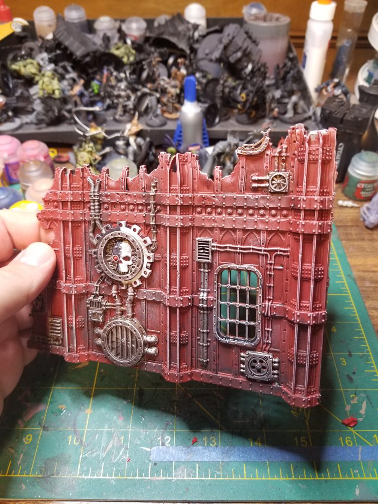
On the other ruins I add an additional detail wrinkle of doing the Mechanicus logos – Paint half of these with Corvus Black and the other half with Reaper Ghost White before doing weathering and drybrushing.
Basing
Let’s talk about basing these things. Even in 9th edition, terrain really wants bases so you can get cover save bonuses and have clearly defined areas for it. We can argue over what the ideal shape and size of those bases are, but I generally make my bases a bit larger than the building since I’m not a coward and am fine with having a lip that models can stand on to get cover instead of having to rule that “touching the wall counts” or whatever. Anyways, similar to our tutorial on building jungle terrain pieces, I use vinyl floor tiles as the bases for my terrain. You start by ordering a bunch of 12″x12″ tiles (I use 1/8″ but up to 3/8″ works just fine, it’ll just change what you need to cut them), then laying out how you want to cut them to fit your terrain. Then you cut them and trim/sand the edges.
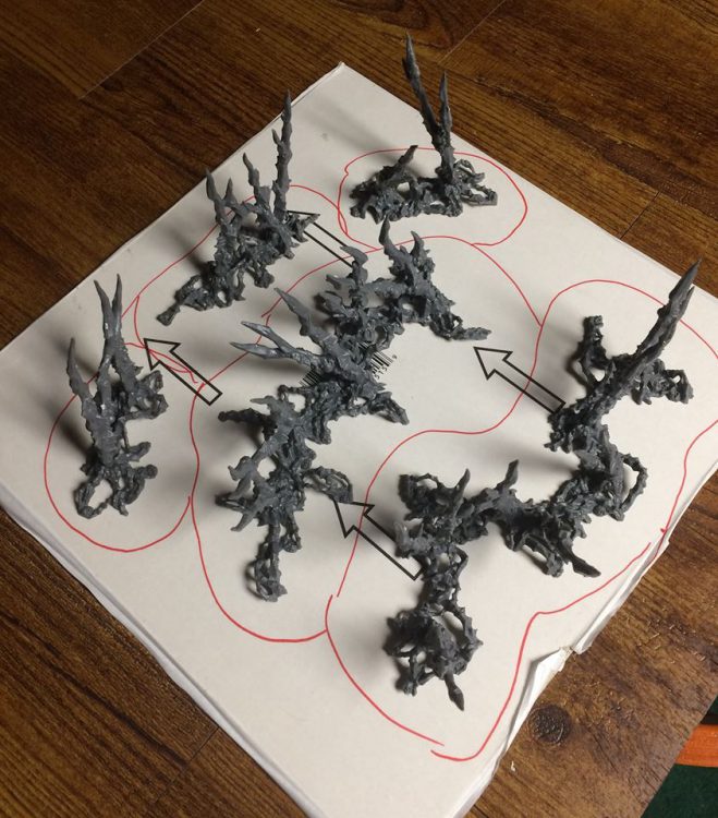
One major upside to doing this is that the tiles already have an adhesive side. It’s not strong enough to hold a building so you’ll want to superglue those down, but it is strong enough to hold a layer of basing grit in place until you seal it. So start by laying that down, gluing down any details like plasticard panels or debris, then throw basing grit/sand on it and tap it off until you’ve got a solid layer. At this point I cover the whole thing with Woodland Scenics spray adhesive, AKA watered down PVA glue in a spray bottle. Coating the whole thing with this seals the model and keeps everything in place so I’m not constantly losing grit over time.
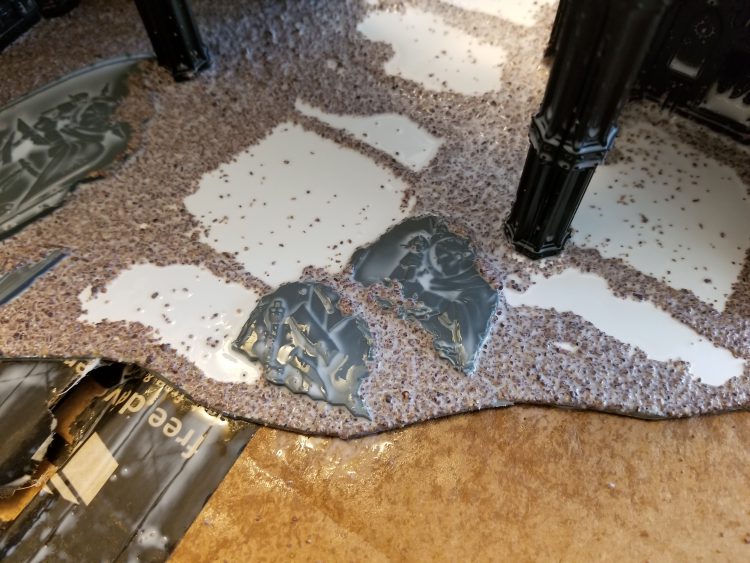
There are a bunch of different ways you can do this; I try to mix in a lot of basing details to break up the monotony and help create the visual reminder that these were buildings with taller walls and ceilings. Plasticard sheets also work well here to create flatter base textures that suggest proper flooring and tiles.
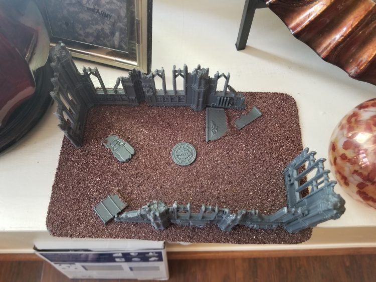
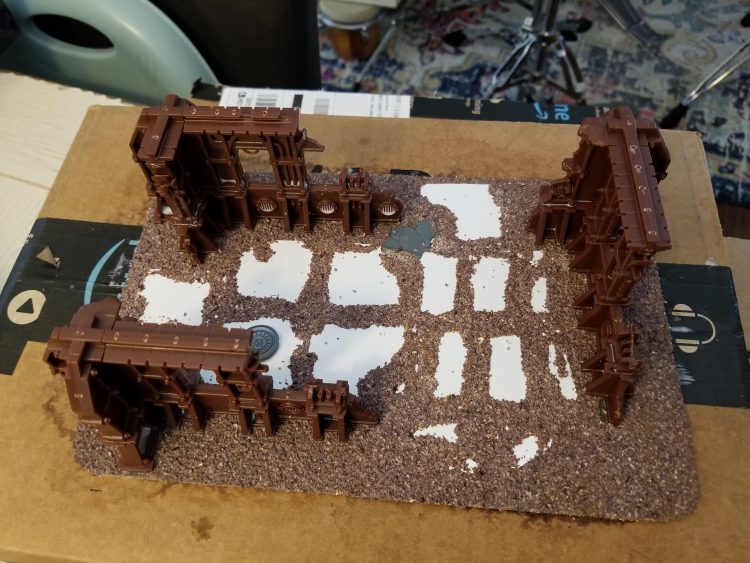
Once the glue dries, prime the thing as normal, then paint it and drybrush it to match your table. I’m currently doing more of an ash wastes theme, so my ground was painted Astrogranite gray (I had a hardware store mix up a can of the color a while back by color matching from the pot) and drybrushed Celestra Gray. Then I add a lot of little details like blood spatters, snow patches, and static grass tufts. These also add a lot of character and help the terrain blend in with the bases I’ve done for my army.
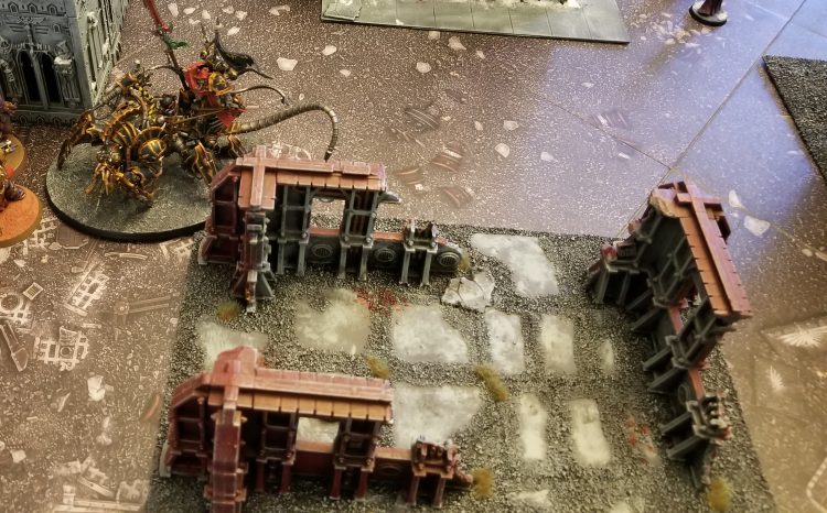
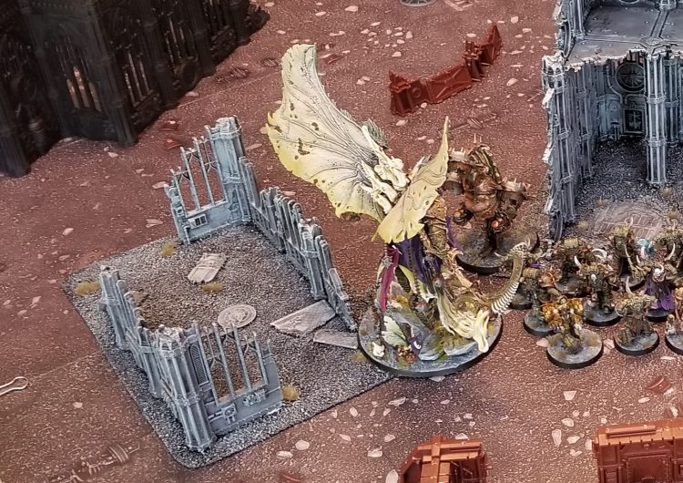
Doing the bases is absolutely worth your time – it makes the terrain into more striking pieces that you can turn into miniature dioramas and it just works better in the game when you have clearly defined boundaries for your terrain pieces.
Wrap Up
That’s it for this article on building and painting ruins. While they’re large models that can seem daunting, once you’ve got a method in place for painting them you’ll likely find they’re pretty fun and quick to paint. As always, if you have any comments, questions or suggestions give us a shout at contact@goonhammer.com.
