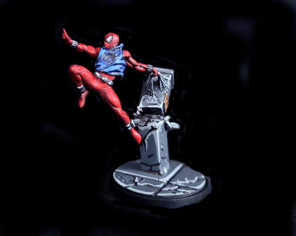
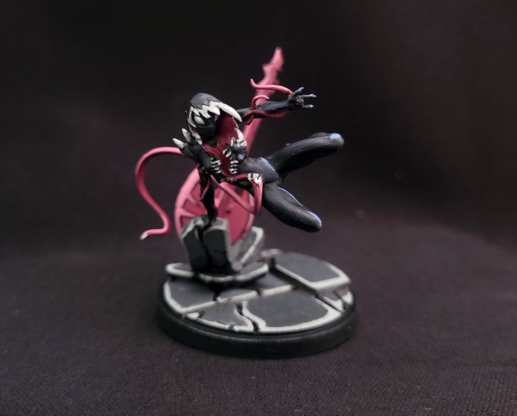
In our How to Paint Everything series, we take a look at how to paint well, everything, with a look at different methods from different artists. In this article we’re looking at Scarlet Spider and Gwenom from Marvel: Crisis Protocol.
As it is set in the Marvel Universe, painting in the comic book style works really well for Marvel: Crisis Protocol minis. Comic Book style can mean different things to different people. I’ve experimented with a few different comic styles and my personal preferred is closer to a cell-shaded look without too many hashed lines. The beauty of painting like this is that if you do it correctly the colours will really pop and stand out on the table.
In basic colour theory terms this is because when you put a colour directly next to black the contrast will make it appear more saturated than it is. When a colored object is placed next to black, our brains tend to slightly enhance the opposite color on the colour wheel to create a stronger contrast. For example, a yellow object next to black might appear a touch more orange due to this effect. Most miniature painting avoids shadows going all the way to black, instead only going to a very dark grey or brown at the darkest points. In a comic book style we embrace the darkness and the darker the black you use the better this effect will become. The only caveat can be that if you do a miniature with OSL (Object Source Lighting) you can end up with one side of the miniature in pure black and it will only look good from certain angles.
The other important aspect of this style is using big blocks of saturated colour with minimal blending and big jumps in colour value. The darkest shadow is always pure black, followed by a shadow, a mid tone, a highlight and finally spotlights of pure white. I plan these out in advance so that I can avoid mixing new colours part way through. When mixing paints it helps to avoid mixing black or white in your colours as if you do your colours will become muted which is not what we want. e.g. To mix a red highlight try mixing in some yellow to push your red more towards orange. Using white will push it more towards pink which isn’t the effect we are going for.
With all the theory out of the way lets start painting!
Scarlet Spider

To begin I primed the mini with black and did a zenithal (from above) prime with grey primer. This helps to determine where my highlights will be later on.
As a caveat, I usually primarily use Golden SoFLAT super matte artist paint to paint my miniatures, as the extremely matte finish works particularly well for this style; but for the purposes of this guide, I have instead tried to use Citadel and Army Painter paints which are more widely accessible. We can instead finish the minis with a matte varnish to achieve that same matte look.
Paints used:
Red areas:
- Dark area: 50/50 mix of Mournfang Brown and Khorne Red
- Mid tone: Khorne Red
- Highlight: Wild Rider Red
Blue Areas:
- Mid tone: Macragge Blue
- Highlight: Calgar Blue
Grey Areas:
- Mid tone: Army Painter Uniform Grey
- Highlight: Army Painter Ash Grey
Stone / Base:
- Dark area: Army Painter Dark Stone
- Mid tone: Army Painter Uniform Grey
- Highlight: Army Painter Ash Grey
Deepest Shadow (everywhere):
Scale 75 Inktense Black mixed with Army Painter matte black. My secret to creating a great black is to use a black paint and, rather than thinning with water, thin with black ink. This creates a paint that will flow better for detail work without losing pigment density.
Highest Highlight:
Needs to be done sparingly but I use AK Titanium White Ink for spot highlights.
Method
I find it easiest to start from the shadow colour and work your way up then do all the Black lining at the end. I begun by painting all the darkest areas with my mix of Mournefang brown and Khorne red. As we have a zenithal highlight we can essentially paint all the areas covered in the black primer in this colour saving the lighter areas for our next value up.
The blue was then painted all over with the Macragge blue. The base and all stone areas were fully painted with dark stone.
The zenithal should guide where to put the next areas, working up the colour values noted in the paint stages above. If you make any mistakes feel free to use the darker tone in each step to fix mistakes. It looks best when you get clear defined lines between the colour values. For the red there are four values to jump through from black up through the reds, as there is more of it on the model. As there was less blue, I only included three values.
For the base and stone areas you may ask why have you highlighted like that, it makes no sense? To you I say, “Don’t care; looks cool.” To get this effect once the entire base is covered in dark stone I block out my highlight shapes in ash grey. I can then use the mid tone of uniform grey to carve these highlights into the crescents all from one side.
Once all the main colours are done its time to go in with black for the shadows and spots of white for the highlights. Use a thin brush to carefully put black lines in the deepest shadow areas. Follow the shape of the fabric to guide where these shadows go, especially on the hoodie. If you make a mistake, don’t fret; you can use a fresh brush and some water to erase things before the paint dries. If you make a mistake and let it dry, you might need several coats of colour to properly get rid of the black. Finally, use white ink sparingly to highlight.
Gwenom

The same Zenithal highlight is used to mark out the initial highlight areas though with this one I didn’t follow quite to the tee.
Paints used
Dark Symbiote areas
- Dark tone: Matt Black
- Mid tone: 70 / 30 Mix Matt Black Mc Cragge blue
- Highlight: McCragge Blue
Pinky Purple areas
- Dark tone: Screamer Pink
- Highlight: Emperor’s Children pink
Grey Areas:
- Mid tone: Army Painter Ash Grey
- Highlight: AK Interactive White ink
Stone / Base:
- Dark area: Army Painter Dark Stone
- Mid tone: Army Painter Uniform Grey
- Highlight: Army Painter Ash Grey
The difficulty with a model that is primarily black and white already is finding ways to keep it from looking too monotone. to add some subtle colour I mixed dark blue into the main Black tone to give it a colder tone. I also added small highlights of a lighter blue to contrast the pink which was the other primary colour on the model.
The guitar and tongue areas were base coated in Screamer pink and highlighted with Emperor’s Children pink.
The method for the base is exactly the same as the Scarlet Spider base above. Once all the base colours are down, use a black ink/blank paint mix to black out the shadows then finally add spots of white ink for the extreme highlights.
Thank you to Atomic Mass Games for providing these models.
Have any questions or feedback? Drop us a note in the comments below or email us at contact@goonhammer.com.


