So you’ve seen the movie and now you know with absolute certainty where Napoleon went wrong. You can, and will, do better. It’s time to get into real wargaming. Welcome to Napoleonics.
This article is part of our Getting Started: Napoleonics guide.
 You might be occasionally described as the “Scum of the Earth” and you might mainly have mostly sat out the land part of the Napoleonic wars except in Spain and the very final moments, but by God and the King, you’re British and it’s time you put the Corsican upstart in his place!
The British are one of the most flamboyant and interesting painting projects of the Napoleonic period. Intense reds, multiple flags, green and black riflemen, tartan, rich blue artillery and a wide range of allied troop colours mean that they’re colourful, recognisable and interesting to paint, with much more uniform variety than some of the other combatants.
British Uniforms are also uniquely fiddly, and, as such, we’ve focused here on giving you a good spread of techniques. Pvt_Snafu shows us a fast and tabletop ready method using Contrast; Lupe spills his hard-won secrets about painting tartan.
British Line Infantry (Pvt_Snafu’s Method)
Painting historical miniatures is one of the ways I take a break from really pushing myself with painting techniques. I realised at the start of the year that having projects I could just kind of coast through would help keep my motivation up, and so I dove in to historical miniatures. I decided I’d make heavy use of Contrast when painting anything for historical systems, and had great success bashing out two entire platoons at 15mm in an evening using this method.
To prepare the models, I fully assembled them and then primed them with Vallejo Mecha Surface Primer Sand. If you spray primer I’d recommend something like the Games Workshop Wraithbone primer, as we’re going to be using a fair bit of Contrast in this guide.
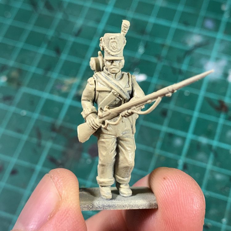
Here’s what I used to get my models done:
- Contrast Blood Angels Red
- Contrast Basilicanum Grey
- Contrast Black Templar
- Contrast Iyladen Yellow
- Contrast Darkoath Flesh
- Contrast Apothecary White
- Contrast Aethermic Blue
- Contrast Wyldwood
- Contrast Snakebite Leather
- Contrast Skeleton Horde
- Vallejo Model Color Neutral Grey
- Vallejo Model Color Ivory
- Vallejo Model Air White
- Vallejo Air Metal Steel
- Vallejo Model Air AMT-7 Greyish Blue
Okay, so I didn’t use Contrast for everything but I’ll get to that. I started by blocking in the largest areas, with a plan to tidy up afterwards. This meant covering the jackets in trousers in their respective Contrast colours (Blood Angels Red and Basilicanum Grey). Once this was done, if the lines were clean enough, I went back and hit the leather areas and hats with Black Templar and any exposed flesh with Darkoath Flesh.
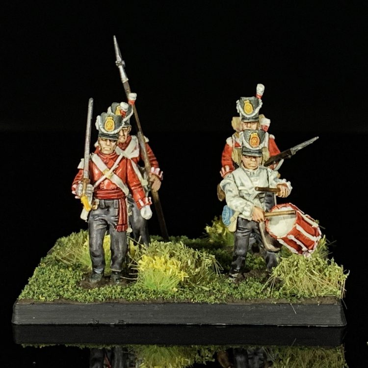
With the initial colours blocked in, I went back and started a clean up pass using Vallejo Model Color Ivory. I brought the straps, cuff details and hat embellishments back up with a couple of coats, along with the wooden water canteen. Cuff details were picked out very carefully with Iyladen Yellow, along with the crest on the hat. The bottom half of the plume was again done with Blood Angels Red. I ended up giving the canteen a layer of Aethermic Blue, and then picking further details out with Greyish Blue but I think a second coat of Aethermic Blue would be fine here. The main part of the backpacks, which I realise now are hard to see, were done with Black Templar and the bed rolls were painted with Skeleton Horde.
The trousers. The bloody trousers. What should’ve been one of the easiest areas drew a total mental blank for me and after one coat of Basilicanum Grey I wasn’t satisfied. So instead of doing what I usually do and just throwing a second coat one (why didn’t I just do this?) I repainted them entirely with Neutral Grey, and then picked out shadows and recesses with Basilicanum Grey. Finally the rifles were done with Wyldwood on the stocks and Steel on the barrels. For the drummer boy, I painted his jacket entirely with a few coats of Ivory to give me a base layer, then a fairly thick layer of Apothecary White. Once this was dry I went back and picked out the raised areas with the Model Air White. I repeated this process for the straps, gloves and braiding.
British Highland Infantry (Lupe’s Method)
I decided to paint the British Napoleonic Highlander Centre Companies box from Victrix for this HTPE, tartan and all. Some might call that foolish, and they would be right.
However, painting complex patterned cloth is a particular skill, and the Highlanders are a truly iconic part of the period, so I wanted to find out the best way of doing them justice. I focused on a good high-tabletop standard paint job, but with the knowledge that a lot of my time would be spent carefully freehanding patterns on cloth. After researching some different regiments, I settled on the iconic Black Watch for a number of reasons – mostly it turns out only a handful of regiments actually wore the traditional kilt and highland getup, and they’re probably the most famous.
I left the heads off the models and then primed them separately both white. People may argue what colour is best for priming, but with these, where vibrancy is key, I urge you to go with white even if you don’t normally.
Let’s tackle the head to start. I began with some basecoats:
- Vallejo Grey Black for the feathers and the cap itself
- Vallejo Silver Grey for the cap band
- Citadel Cadian Fleshtone for the skin
- Scale75 Blood Red for the feather. This will vary depending on the regiment in question. For the 79th (Cameron Highlanders) I would paint all but the uppermost third of the feather the same Grey Black as the other feathers, and then do that part in Silver Grey. For the 92nd (Gordon Highlanders) I’d go for Blood Red on the bottom 2/3 and Silver Grey on that top third
I also basecoated the hair, which varied from man to man. I mostly used Scale75 Mars Orange, Scale75 Brown Leather, Vallejo Brown Leather and Citadel Steel Legion Drab.
That done, it’s time for some washes:
- Nuln oil for any areas of Grey Black, Silver Grey and Blood Red
- Reikland Fleshshade for the skin
- Agrax Earthshade for the hair
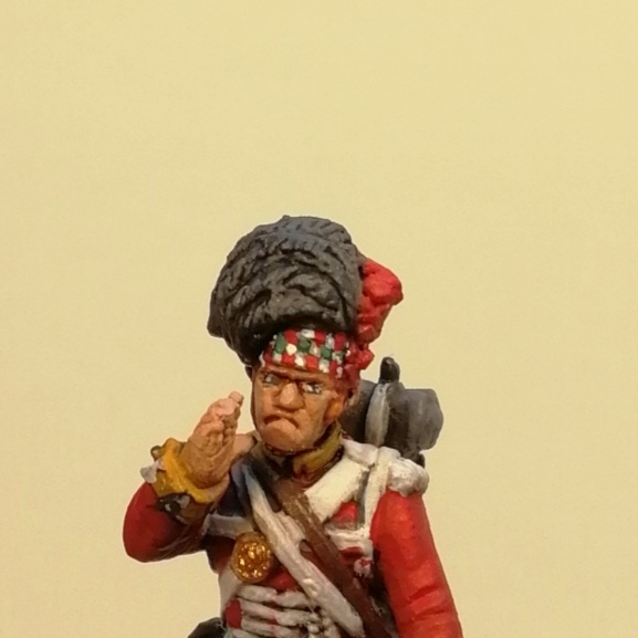
When that’s completely dry, I applied a very careful targeted drybrush of Vallejo Neutral Grey to the Black Grey feathers, and of Vallejo Flat Red to the Blood Red areas. I retouched the Silver Grey on the cap band (and would drybrush it on any feathers that colour), and also retouched the Grey Black on the cap itself. I retouched the basecoat of the skin outside of the recessed areas, then quickly highlighted up adding a little Vallejo Pale Sand as I went to get the brightness where the light would hit. Use a careful amount of your favourite black to paint in the eyes and mouth, before dotting Silver Grey either side of the either with your best brush to create the final effect. I also highlighted up the hair using the base colour and then adding a little Silver Grey into the mix.
Now the pattern on the band. These patterns are all the same across the regiments, so don’t worry about which one you’re painting. Unfortunately, while I can guide you a little in this process, there is no substitute for a practised steady hand and don’t be afraid to retouch your mistakes (I do, all the damn time). First carefully paint in Scale75 Blood Red lines at the bottom and the top of the band, extending about a third of the way up for each. They should both be the same height, and also leave an equal sized white gap between them. When you’re happy with them, draw in a line at 90 degrees to each, extending the same distance across as the first line was tall. Close off the square and then fill it. Leave an equal sized gap then do another, and another, until you have two rows of red squares running the length of the band. You should do this on the rear at the tie too, but honestly it can look a little messier there because the cloth is folded over itself.
Once this is done grab a green (I used Scale75 Boreal Green) and carefully paint in squares in the gaps between the rows, so the corners of these squares touch the corners of four different red squares. Draw the lines in as before then fill. This done, go back and do a second layer over each of the squares to make the colour nice and strong, then tidy up any wobbles or slips with the Silver Grey. You can leave this and it will look great – these are small and the effect will shine through. However, if you’re a lunatic like me, then buckle up and highlight those tiny tiny squares. I used Scale75 Black Forest Green, Vallejo Rotten White and Vallejo Flat Red to do so. To highlight, I simply drew border lines on the top of each square and down the sides, but not on the bottom.
Now it’s time to move onto the body. Basecoats as before:
- Scale75 Blood Red for the red coat and sock tops
- Vallejo Silver Grey for the straps and trim, and the socks
- Vallejo Brown Leather for the leather straps and parts, and the wood on the gun
- Vallejo Grey Black for the backpack, satchels and the boots
- Vallejo Flat Grey for the Bedroll
- Scale75 Canterbaric Blue for the waterbottle
- Cadian Fleshtone for the exposed skin
- Scale75 Caspian Blue for the kilt
- Scale75 Black Metal for the gun barrel and mechanism, bayonet and any other little metal pieces
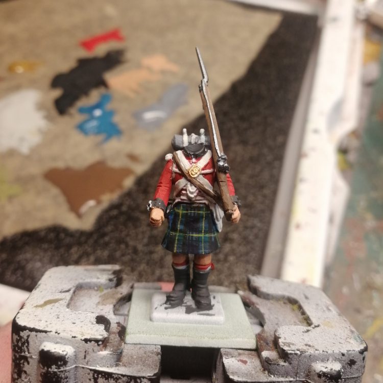
The basetone for the kilt will vary depending on the regiment you choose – we’ll come back to that later. Now it’s time for washes
- Nuln Oil over all of the jack, straps, boots, satchels, waterbottle, socks, metallic areas, backpack and bedroll
- Reikland Fleshshade for the skin
- Agrax Earthshade for the wood of the gun
Don’t bother washing the kilt – you won’t see it anyway after the freehand.
With that dry, retouch all your basecoat over areas that aren’t recessed. That should brighten the model up immediately. I would then highlight the skin up as we did on the face, and highlight the straps and socks with Rotten White. Highlight the metallics with Scale75 Heavy Metal, and we’re very nearly there. Just the tartan to go.
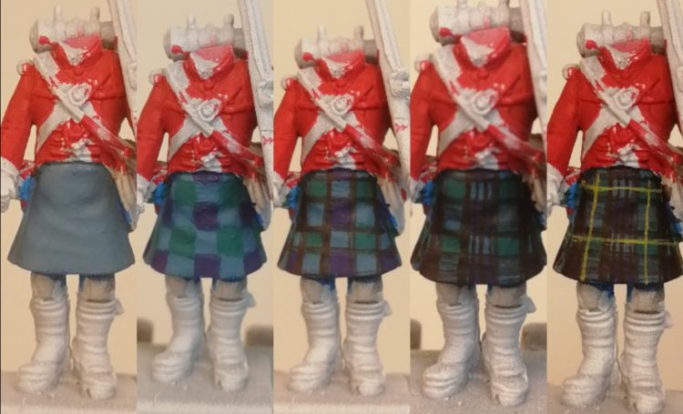
Here are our steps, from left to right:
- Get out basecoat touched up and cleaned up if needed. We’ve gone for the Caspian Blue for a very specific reason. Kilts are made by weaving different coloured cloth together, and when the two colours combine, the effect they produce is like a third combined colour. In this case, our base colours are a rich dark blue and a green, so our midtone colour is a blue-green, and that’s what we start with
- Now draw out a chequerboard of squares of green and blue, making sure that they’re even and clean. You can have some mistakes at this point, because you’ll be outlining them in black in a moment. These are Cantabriac Blue and Boreal Green
- With a fine tipped brush and a steady hand, draw fine black lines at the borders of the squares. This step is tricky, and all I can say is you need to practice (you’ll get the opportunity if you’re doing an army of these chaps). You can clean up with the base colours once the lines are in if needs be. Really thin your black to get it to flow smooth and it’ll be a bit easier
- Now using the same black as before, draw two parallel lines through the columns and rows that contain blue squares. Space them as evenly as possible. You can see the tartan effect begin to take shape at this point
- Finally, using Citadel Averland Sunset, paint in a fine central line down the columns and rows that have green squares in. This done, you’ll find the effect suddenly jumps into focus
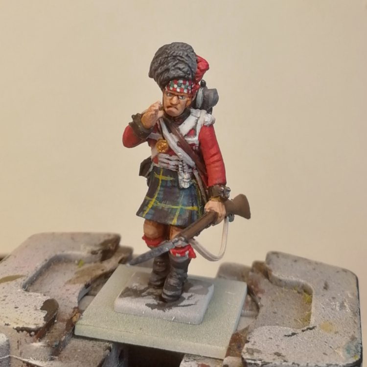
Head on, and that’s it! Our highlander is ready to join the ranks to fight the perfidious French.
Have any questions or feedback? Drop us a note in the comments below or email us at contact@goonhammer.com.

