In our How to Paint Everything series we look at how to paint, well, everything. We look at the different factions of various games, their heraldry, and different techniques for painting them from different artists.
Infinity’s Nomads are one of the most iconic factions in the game – they’re a group of spacefaring anarchists and hackers who got fed up with the corporate and AI-run societies of the Human Sphere and took off for the open stars. They’re housed in three massive motherships that travel between systems, trading with other cultures as they roam the stars. The Nomads are split into three separate factions based on the ship they hail from:
- Corregidor are the fighters of the group, showing the greatest martial aptitude and discipline.
- Bakunin are the covert ops group, focusing on clandestine operations and infiltration. They’re the cyberpunk anarchists.
- Tunguska are the mafia/bank-run ship and the one that wins through overwhelming force. They’re more like sinister corporate overlords and their ship is the leader of the three.
Painting Nomads
Official paint schemes for the Nomads often involve a red, black, and white paint scheme but there are a number of different ways you can go with them to show off their diversity.
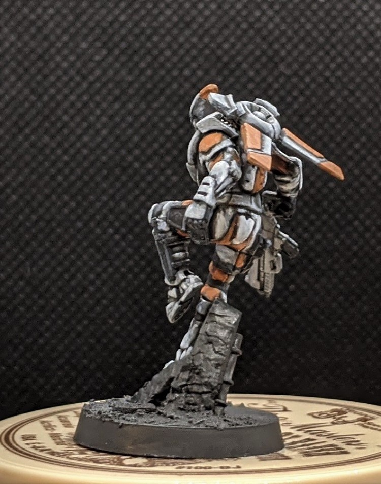
Evan’s White and Orange Nomads
I’d like to preface this by saying I’m an idiot and really love painting Infinity models as bright and obnoxiously cyberpunk as possible, so I’ve painted a lot of my Nomads with white as the dominant color on their armor. This is what is known in the business as a ‘Bad Move’. I really enjoy how it turns out, so I’m going to continue doing so, but going with a more traditional black and red scheme with white accents will go much faster than spending… oh… four or five hours carefully building up white on a Kriza Borac. The upside to the majority white scheme, though is that once the white is done, a few details in various greys and black and some splashes of color finishes a model up quite quickly.
That said, I’ll be presenting all the elements present in a more traditional Nomads scheme, I’ve just included them in different proportions and added orange into the mix.
Blocking Out and Planning
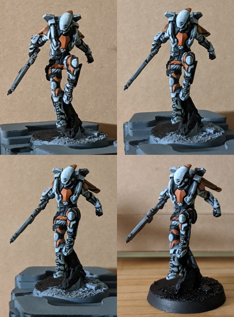
This is a very important first step if you’re painting a model in your own scheme, which I highly recommend for infinity models. It’s quite fun. Put the colors you want to use on your model down, and make sure they work. You could do this in Photoshop, but I just combine it with the basecoat step. This model is a Hellcat from the Nomads Action Pack.
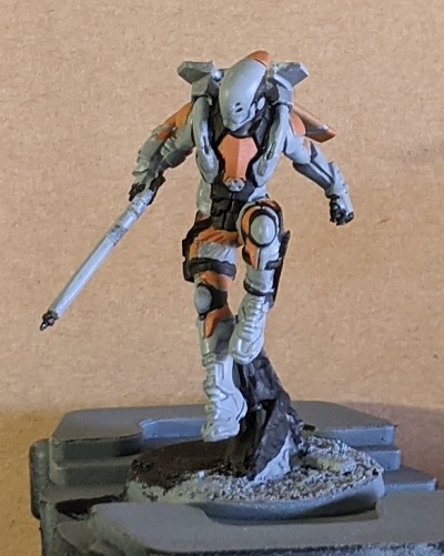
A lot of Infinity models have elements that they share with other models in the range. In this case, a lot of the Nomads Light and Medium Infantry, especially from Corregidor, share essentially the same pants, boots, and basic torso armor. On my Alguacile line infantry, I’ve already established the boots as grey with white armor and the cloth of their pants as this scheme, with the outer panel white and inner panel orange, except for the strip around their thighs where the colors are reversed above a black strip.Their torso armor is Black, with Grey soft armor beneath it and a few select white panels. Keeping these elements the same between models can lend a lot of coherency to a force, and make it look like your elite troopers are using the same equipment as your basic infantry, just with extra kit piled on.
With those basics laid down, I filled in the rest, playing around with the basecoats and changing several things before finally deciding on a color scheme I liked. It’s easy to change colors that don’t work now, before you’ve put in a ton of work on them.
White and Grey
I’ve been enjoying playing around with painting a lot of texture on model surfaces. This has several big advantages. First, it effectively blocks out big volumes and flat areas without getting boring. Second, and most obviously, it adds a lot of wear and visual texture to the model. Third, when painting white, you aren’t fighting the transparent and uneven nature of the paint, but embracing and using it. A textured finish is also much easier to patch up later if you make a mistake, enough so that I can pretty fearlessly freehand black markings onto white without worrying about making a mess of it.
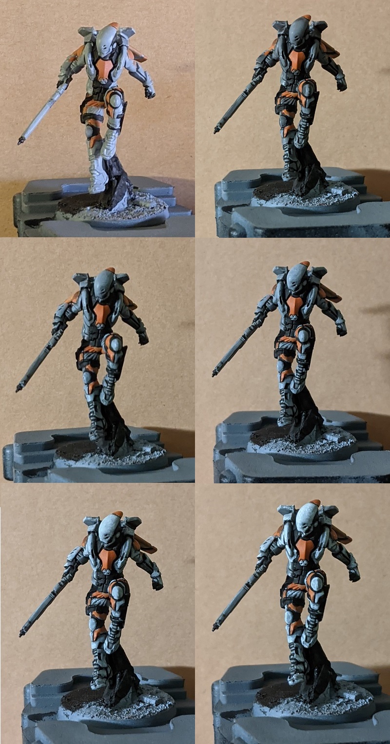
- I start out with the basecoat layer. This is a solid coat of VMA Light Grey. Since we will be doing many layers on top of this, it doesn’t need to be perfect, but you want to make sure all your white and grey areas are definitely grey, and get a very solid coat on areas that will stay grey, as these will have fewer layers to patch up issues.
- Next, I wash all over with Nuln Oil. Again, this doesn’t need to be perfect. Nothing needs to be perfect, unlike normal white paint schemes. Just avoid any large areas of pooling.
- Then, All areas that will be white get gone over again with VMA Light Grey. Almost everything except the recesses gets covered in the white areas, but I don’t apply it perfectly evenly, leaving the coat slightly patchy on the undersides of panels and areas that will be in shadow.The areas that will be grey, such as the soft portions of the torso armor, boots, and gun casing are given an edge highlight in Light Gray during this step.
- I mix VMA Light Grey and Ulthuan Grey in a one to one ratio and go back over the white areas. At this point, I’m still covering most of the panels, but leaving a lot more patchy, dotted areas of texture, especially towards the undersides of panels and recesses.The grey bits get a final highlight in this step, just on corners and bits that need to be picked out.
- I go in with pure Ulthuan Grey and repeat the patchy, uneven, dotted highlighting on the armor, covering less of the surface now, probably about 50% of it at a rough estimate. As this is the step that solidifies the volumes and establishes how bright everything will be, I highlight everything, then go around the model again and make sure everything is as I want it to be.
- Finially, I take VMC White and edge highlight the armor with little dots and scratches. I only hit edges and the very tops of big surfaces with this step, to really bring out the forms of the armor.
I use the same steps and paints on the white cloth, just forgoing the scratchy highlighting and applying the paint more smoothly.
Black and Orange
I approached my Black with a similar approach to the white, albeit with a lot more mixing. I don’t have exact ratios, just what looks ‘right’. When painting black, in order for it to read as ‘black, you have to make sure to keep most of the area in the very dark grey to black range, with lighter colors only on the edge highlights. If too much grey creeps in from the edges it starts to look grey.
- I start with a basecoat of VMC Black. I mix in the very tiniest bit of VMA Light Grey left on my wet palette from the previous step, and cover about half of the panel with it. this should be almost distinguishable from black, but helps make your black a bit less flat.
- I mix in a touch more Light Grey. At this point, you want the paint to just be starting to be grey instead of black. Edge highlight with this color. if you want to use a pre-mixed color you can use Eshin Grey or Skavenblight Dinge here, and omit the previous step if you don’t want to do any mixing.
- A bit more Light Grey again. how bright depends on the model. When there’s a lot of white on the model, I keep it a bit more muted to prevent it from creeping into the white’s territory. If you want to use a pre mixed paint, VMA Sea Grey would be a good choice. If there isn’t much white on the model, I’ll take it a bit brighter. Whatever color you use, hit the corners of the black with this as an extreme highlight, and call it done!
The Orange is simple enough I haven’t included a step by step pictoral guide for it, as the only tricky aspect is covered in the white guide.
- Basecoat of Jokaero Orange.
- Wash with Agrax Earthshade. If you’re only doing a tiny area without any recesses such as a stripe on an armor, you can omit this step.
- Highlight back up with Jokaero Orange, covering everything but the recesses. For the cloth I stop here.
- Mix in a little bit of VMC White into the Jokaero Orange, and dot scratchy, uneven edge highlights onto the armor to tie it in with the white.
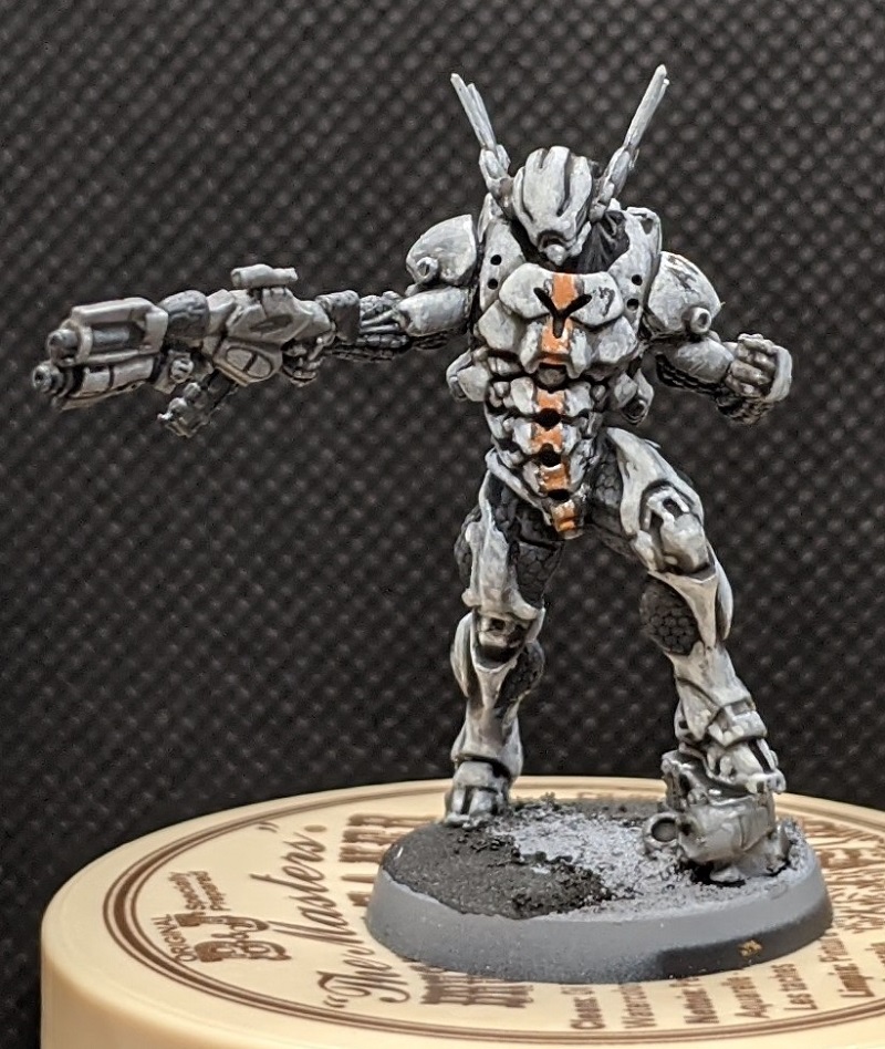
If I’m painting the orange as a stripe onto white armor, I will instead scratch it up with Ulthuan Grey and then hit any edges with a few dots of VMC White to tie it in to the rest of the white armor. This works particularly well if bordered by thin black stripes, as the white and prange blend together slightly without a border. You can see an example of that on the Mobile Brigada below.
Hellcat Conclusion
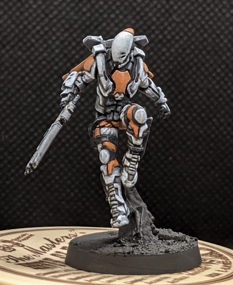
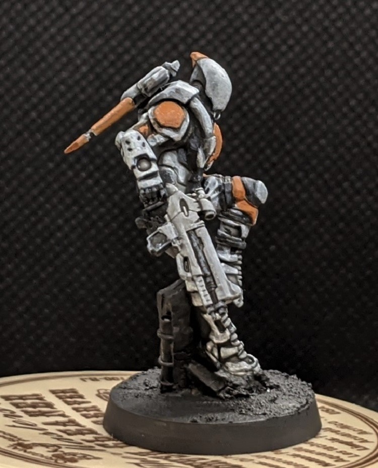
And so, the Hellcat is done. These elements can be mixed and matched easily to create a striking scheme on a variety of models. Just remember to plan it out first, especially if you like obnoxiously bright schemes like I do. Otherwise they can turn out too obnoxious.
Red
So I said I’d be showing you all the elements of the classic nomads paint scheme. But there’s no red on that hellcat. My corregidor is leaning heavily into the orange side of things, but for Tunguska, with their evil banking ways, I feel the traditional red is very fitting, and I’m including a lot more of it into those models. For this Grenzer, I’ve basically swapped red in for orange on his pants, and added red accents to his armor, leaving just little hints of orange to unify the two groups.
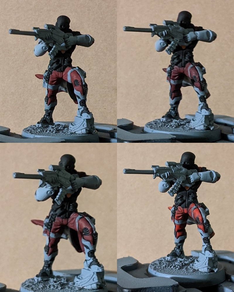
The red is a fairly simple process:
- VMC Burnt Red basecoat
- Wash of Nuln Oil
- Reapply Burnt Red, skipping the recesses.
- Highlight with Evil Suns Scarlet. This can be a fairly transparent paint when thinned down, so I do two thin layers, one more of a general highlight and the other focusing on the tops of folds and the edges of the cloth.
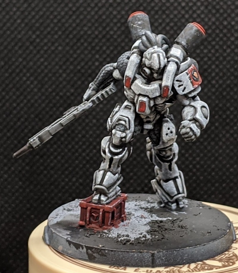
For stripes on white armor, I treat it similarly to the orange from before. I apply VMC Burnt Red, but instead of washing it, I highlight straight with Evil Suns Scarlet, then chip with Ulthuan Grey and White.
If you’re painting red armor, the same steps as the red cloth can yield a good result, especially if you use similar techniques to the white armor from earlier. You can either highlight with a red-orange, or, if you want to do something different, highlighting with a very thin and scratchy edge highlight of light Grey such as VMA Light Grey can give your red armor a very different and battle worn appearance like the box at this Kriza Borac’s feet. This works particularly well if the red armor is the dominant color on the model.
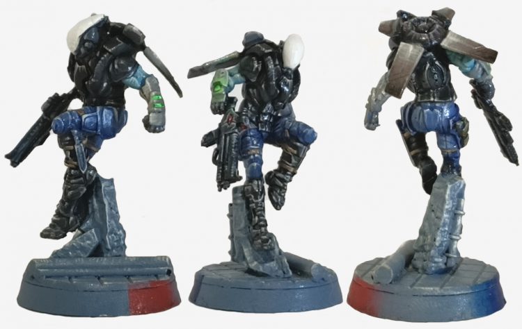
Musterkrux’s ‘Space Cop’ Nomads
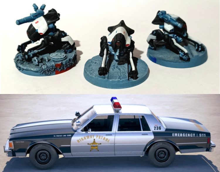
In all fairness, I settled on painting my Nomad army as ‘space cops’ years before O-12 was announced. I was inspired by the classic ‘Blues’ police uniform and the 1960’s police cars you’d see in films (such as the Ford Fairlane and Chevrolet Caprice), as a cute play on the classic Nomad anarchist theme:
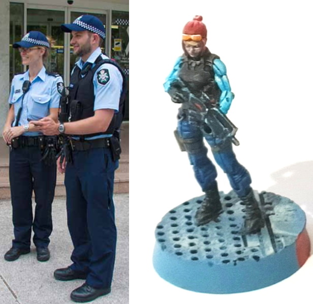
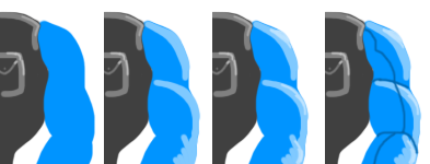
Space-Cop Uniform:
Preparation: Prime black and then zenithal highlight grey (not only to make the primer and bit more colour-friendly but also to help draw out how light plays over the model).
Vest/Body Armour: Basecoat Heavy Charcoal Grey (Game Colour 72.155), followed by a mid-tone grey (Model Colour Dark Bluegrey, 70.867) to the raised areas, then a more restrained light grey (Game Colour Cold Grey 72.050) over that, before a black wash (Army Painter Quickshade Dark Tone).

Pants: Ultramarine Blue (GW Macragge Blue these days) basecoat, then Calgar Blue highlight, then a 50-50 highlight of Calgar Blue and Space Wolf Grey (or equivalent, Glacier Blue 72.095), followed by a blue wash (Army Painter Quickshade Blue Tone).

Shirt: Basecoat a high saturation blue (classic GW Enchanted Blue, Game Colour Electric Blue 72.023), highlight with Citadel Baharroth Blue, then further highlight with a 50-50 mix of Baharroth Blue and any Matt White you fancy. A blue wash (Army Painter Blue Tone again) will bring out the grooves in the shirt.
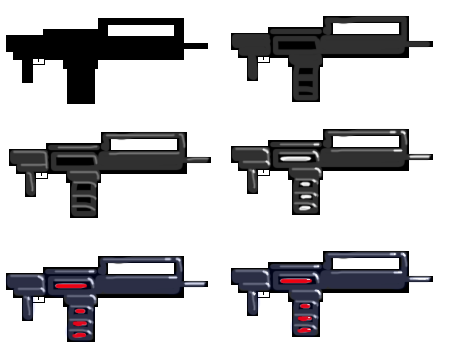
Weapons: Basecoat with a hard/pure black (Chaos Black, Abaddon Black, Army Painter Matt Black, it’s all the same), then block in/overbrush with a Heavy Charcoal. Fine highlight with a mid-tone grey (Dark Bluegrey again, multiple successively lighter highlights if you’re keen). Unlike the vest/body armour above we’re going to add fine-point pure white highlights to the weapon because the material (plastic or metal) is more likely to carry a reflective sheen than a cloth/fibre material one might expect from clothing (any Matt White is fine). We also throw some white into the magazine ‘bumps’ and the ‘button’ that appears to be sitting where an ejection port would nominally be. Next we blue wash (…and Army Painter Blue Tone once again) the weapon to tint it somewhat to differentiate it from the vest/body armour on the model (which, incidentally, is often visually adjacent to the weapon) as well as throw some red (Model Colour Flat Red 70.957) onto those bumps and buttons we previously painted white. Finally, we come back to the fine-point highlight with dots of white (as the previous highlight would have been tinted blue by the wash), and drop some white dots onto the red sections to lend an impression of ‘glow’ to them.
Extra Touches:
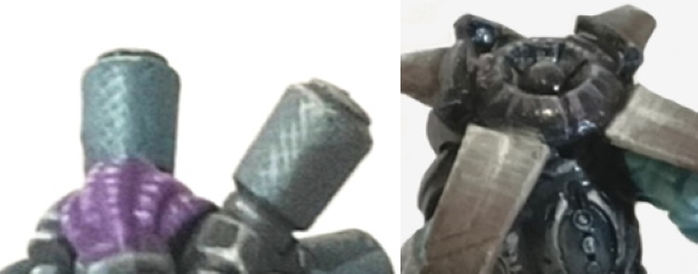
- OSL: I like to use a fluoro green or blue to provide OSL effects to the wrist-band/vambrace comm-links Nomad models have. I do this by dropping pure white onto the lens/button, then a bright, high saturation green (Model Colour Green Fluorescent 70.737 or GW’s Tesseract Glow) on top of that. I do the OSL effect by blending the green with whatever colour the surface is painted, with less being more in these instances, and applying it to the surrounding area.
- Base Markings: The model’s LOF is marked with the red and blue of police lights/sirens, blending back to the original base colour.
- Hatch-highlighting: This is a personal style/technique that I use in place to regular edge highlighting or blending on flat surfaces. Similar to the classic drawing technique of ‘cross-hatching’ I use a very fine brush to apply a series of off-white (blended or not, often Model Colour’s Silver Grey 70.883, AKA The God Paint) parallel lines where light may fall on the model. I find that the visual complexity of the lines to be more interesting than straight edge highlighting (and, for me at least, quicker and easier to apply).

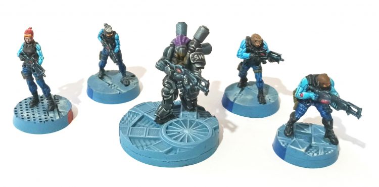
Cross those hatches! At the end of the day you should have some entirely respectable Space Cops that look like this:
If you have any questions (or compliments, back-handed or otherwise), please don’t hesitate to comment below, or email us at contact@goonhammer.com.
