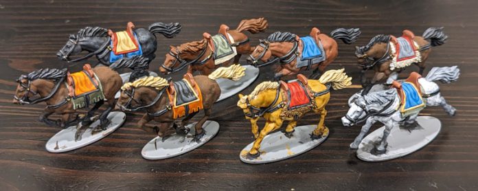
If you play historical wargames of pretty much any period, eventually you will be confronted with the fact that you need to paint some cavalry. From the early Ancients period to even as late as the Second World War there were units taking to the field on horseback. Even in 40K you can field units of Astra Militarum Rough Riders, so cavalry is something that is broadly applicable to tabletop wargames. But painting cavalry inevitably involves that thing that so many wargamers dread: painting horses.
Personally, I don’t get the hate. I think painting horses is fun and relaxing, but apparently that makes me “mad” and “demented” in comparison to the other contributors here on the Goonhammer Historicals team. But whatever, I didn’t even need to draw the short straw, I volunteered for this.
This article is intended to dispel some of the fears and arm you with techniques to paint loads of horses reasonably quickly, as well as introduce you to some common horse colors and patterns so that your cavalry looks realistic – and maybe has a few striking patterns for your important characters! So saddle-up and let’s paint some horses!
Note: There are scads of resources online about horses. If there’s one thing the internet loves nearly as much as cats and memes, it’s horses. Of course Wikipedia can tell you the difference between a “star” and a “blaze.” You could also dig deep into Reddit arguments about what is or is not a true “sorrel,” but let this serve as your warning not to do that. It’s too late for me, but please, for you own sanity, I beg you to refrain. But part of my goal in writing this article is to cover the basics and get you started, and one website I found along the way that was really good for that was HorsesAndUs.com. It’s got a well-organized and informative presentation, great diagrams, and everything is laid out very clearly. If this article piques your interest at all, I highly recommend you go over there and check out their fantastic articles.
Techniques
Before we get into the meat of things, I want to take a moment to talk about some of the painting techniques I’ll be using here, mostly as a short-hand such that I don’t have to repeat myself. The four techniques that I find most useful here are layering, dry-brushing, washing, and glazing, pretty much in that order.
- Layering: This is basic painting, applying a coat of a dark color followed by one or more coats of progressively lighter-colored highlights, concentrating on smaller areas with each successive coat. Aside from the base coat (which you want to cover your primer layer fully), the successive coats should be relatively thin, which allows the darker coat beneath to show through. I don’t usually get too crazy with this, and nowhere do I use more than three colors. Often I only use two, though sometimes I’ll apply the second color twice (to smaller areas) to “reinforce” the color. The goal here is to highlight the raised areas of the mini, as well as the “top” areas like the back, rump, and top of the neck. When using this technique, I’ll note it as “Layer: VMC Green Ochre/GW Ushabti Bone” or “Layer: Bittersweet Chocolate/Espresso/Espresso” with the first color being the base coat.
- Dry-Brushing: Horses are big, muscular animals and most horse miniatures have good textural definition. This relief lends itself very well to dry-brushing, where a lighter color is dragged over a darker base coat using a brush that has had most of the paint wiped off. It’s also a great way to do transitions between colors, which will become important when we start talking about bay coloration later. When using this technique I’ll shorthand it to “Dry-brush: VMC Dark Gray/VMC Neutral Gray” (i.e. medium gray dry-brushed over a dark gray base coat). There is also a sort of medium ground between layering and dry-brushing, where you’re leaving more paint on the brush to produce a more noticeable highlight with a sharper color transition. This is sometimes useful when you’re trying to determine where to place your first layer over your base coat, as it can help identify the areas of strongest relief.
- Washing: Bog-standard washing, with an ink or similar liquid pigment applied over a base coat. This is a good way to subtly tint a base color, and the pooling of the wash into the recesses of the model will darken those areas, which in turn accentuates the visual relief of the model.
- Glazing: This is a sort of cross between layering and washing. The goal is to thin your paint to a more translucent consistency and apply it in very thin layers to very targeted areas (unlike a wash, which you usually apply to a whole color or area at a time). While you can use water to thin paints to the desired consistency, it often helps to use a dilution agent like GW’s Lahmian Medium, Pro-Acryl’s Glaze Medium, or Liquitex Matte Medium. I use the latter because it’s cheap and easy to get at any art supply store.
If any of these techniques are unfamiliar to you, you can learn more from our Hobby 101 series of articles!
I don’t generally use Contrast or “speed-paints” but those are another great way to get the effect of layering multiple colors down to a single step. There are some great pictures on r/Warhammer showing various primer+Contrast combinations that you can use to mimic much of what I’ve done here.
Caveat: I am very much painting for things to look good at tabletop distance. As anyone who paints for wargames eventually discovers, it’s hard to take close-up photos of miniatures, as they reveal every errant brush hair or mistake. Close-up photos can look like some paint-by-numbers bullshit, but I assure you that even at comfortable viewing distance – never mind tabletop distance – the overall effect looks both good and convincingly realistic. Don’t stress if your dry-brushing is a little messy or if your layering isn’t perfectly blended. It doesn’t need to be! The goal here is to paint horses that look great without taking forever to do it.
Finally, for this article I am going to be painting horses from three different manufacturers (Victrix, Firelock Games, and Battle Honors) in two different scales (28mm and 15mm). The techniques I use vary a little bit between the two, with dry-brushing being more common as the scales get smaller.
Just Your Basic Horse
Horse coloration is the result of the reaction of a number of genes, but at the core of everything are the two genes for the base coat color. These are the Extension gene, which dictates whether a horse’s base color will be reddish brown or black, and the Agouti gene, which limits the black pigmentation to the horse’s “points” (its mane, tail, edges of the ears, and lower legs).
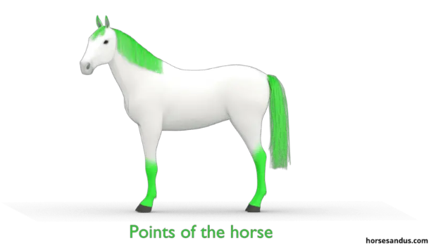
The Agouti gene doesn’t act on a red pigmented horse, so combined this gives us three basic horse colors: A horse with a consistent reddish brown coat and points is called a “chestnut.” A horse with a black coat and black points is (unsurprisingly) called a “black.” And finally, a horse with a reddish brown coat and black points is called a “bay.” Bays are among the oldest of horse breeds (as the product of dominant combinations of both the Extension and Agouti genes), with pure blacks and chestnuts becoming more common shortly after humans started domesticating horses around 5000 BCE.
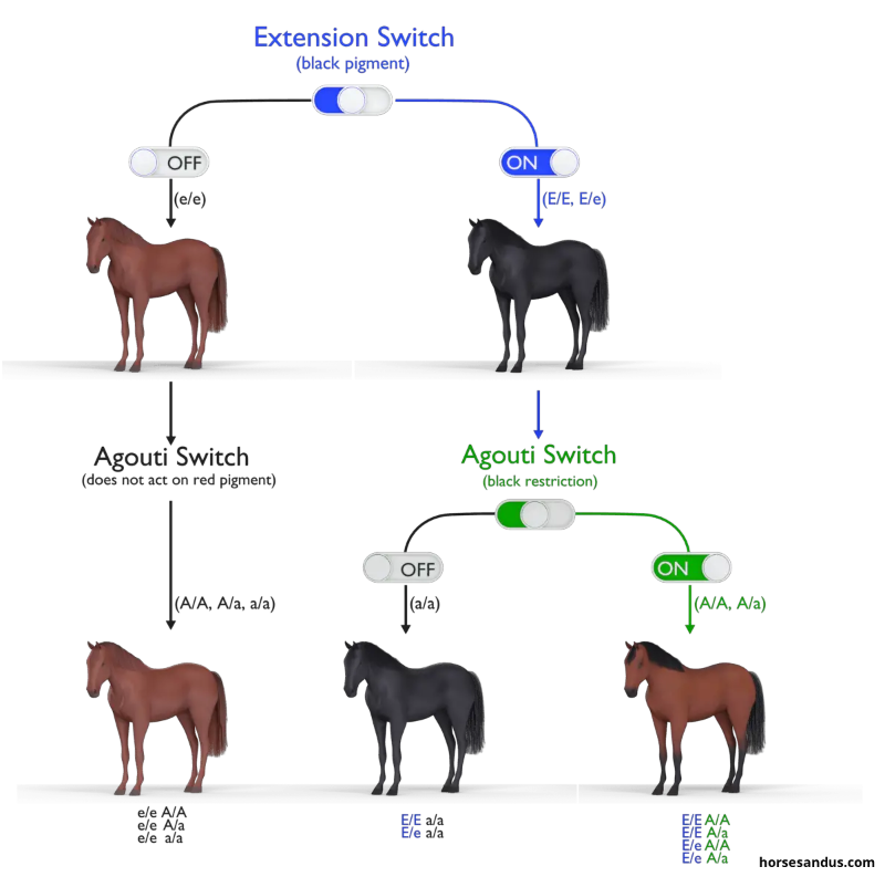
Turns out, basic horses are mostly brown and black, yo.
Right, so armed with this knowledge we can get started by painting our horses in one of these three colors. There is natural variation in the amount of reddish brown pigment of a horse’s coat (generally ranging from “sandy” through the basic reddish to “dark” or “liver”) but absent any color dilution genes (more on these in a bit), you can’t go far wrong just starting with a nice reddish brown color.
So what are some good color combinations here? Black horses are a snap, just dry-brush your favorite dark gray over black base coat. Easy-peasy! Even better, this also picks out the tack and harness (more on this below) at the same time, making black horses a clear winner in terms of time-to-paint.
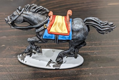
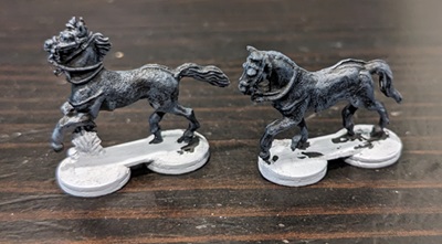
For browns, I have a few combinations I like to use, and here I’ll air one of my dirty secrets: Because horses are a lot of surface area (relative to their riders or miniatures on foot), I often use cheap craft paints for base coats. The two I like best are Americana Bittersweet Chocolate and Craftsmart Espresso. The first is a very dark brown that’s very rich, and the second is a nice, warm brown that is great as both a base color or a highlight layer depending on the color you’re trying to achieve. Going from darkest to lightest, some of my favorite color combinations are:
- Layer: Black/Bittersweet Chocolate – good for a very dark Liver Chestnut coloration
- Layer: Bittersweet Chocolate/Espresso (with an optional second layer of Espresso for slightly a lighter coat) – perfect for a dark brown horse
- Layer: Bittersweet Chocolate/Espresso/VMC Flat Brown – slightly lighter than above
- Layer: Espresso/VMC Flat Brown (with an optional second layer of Flat Brown for a lighter coat) – a nice, medium brown
- Layer: Espresso/VMC Mahogany (with an optional second layer of Mahogany for a redder coat) – a very reddish brown good for Sorrel coloration
For smaller scale miniatures (15mm or tinier), I’ll usually substitute dry-brushing for layering, using the same combinations as above. It’s much faster and produces a very similar effect.
When painting the manes and tails of chestnut horses, I’ll dry-brush using the same color combination as I painted the rest of the horse, or sometimes just one step lighter or darker (so for instance a Liver Chestnut body with a dark brown mane/tail using the first two recipes above).
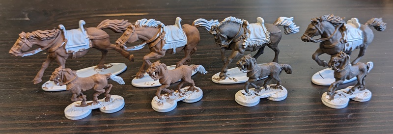
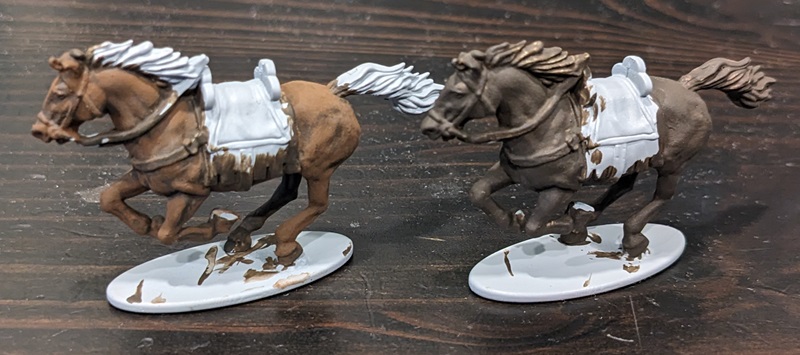
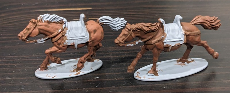
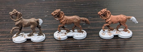
For bay coloration, once the I have finished the brown on the body I dry-brush the lower legs with black, starting just above the hocks/knees. Drybrush this area lightly to get some color transition, getting heavier as you work your way down. By the time you get to the knees/hocks you can just paint the rest of the leg below this in black. Over that black, a very light dry-brush of dark gray will highlight the relief on the legs, especially the fetlocks (the little shaggy bit just above the horse’s hooves). Finally, the manes and tails are base coated black and dry-brushed with a dark gray.
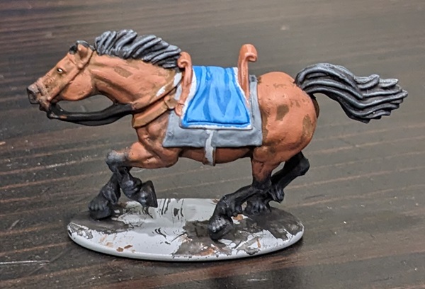
Another area to which you might want to apply this same black or dark gray dry-brushing treatment is the muzzle area around the mouth and nostrils. For horses with black skin (which base-color horses will all have), the hair on these areas is thinner, allowing the skin color to show through. This effect is not always noticeable, but it only takes a few seconds and adding it can make your miniature horses look more realistic.
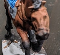
Just remember – if the mane/tail and the coat are the same color, the horse is a chestnut (or a black) and won’t have black points. And if the mane and tail are black, the lower legs should be as well.
If you are painting horses for military units from the Napoleonic Era or later (where “gentlemen” cavalry soldiers were no longer always responsible for providing their own horses, but rather mounts were bred en masse and issued to cavalrymen), the three basic horse colors are probably sufficient for most of what you want to do, and can be used in batches to handle the vast majority of the horses you’ll need to paint. You can probably skip down to the “Socks and Blazes” section below and continue on from there.
But if you want a little more variety or a few special horses (say for your nobles, officers, or special characters), then keep reading!
The Flax Gene
Some chestnut horses exhibit the “flaxen” trait, meaning that the hair of their manes and tails are of a lighter color than the rest of the horse’s coat, often appearing blond. This is a very striking effect, especially on horses with a darker coat. For a little variation, consider adding in a flaxen mane here or there to one of your chestnut horses.
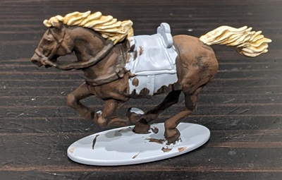
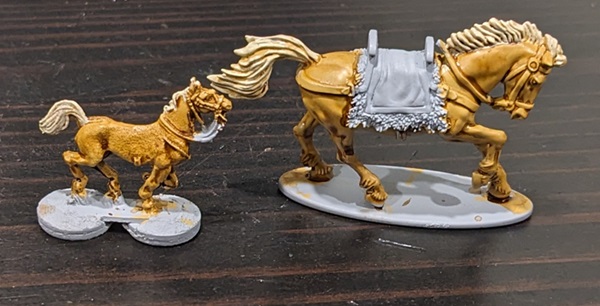
For this example, the mane is a VMC Green Ochre basecoat with a heavy dry-brush of GW Ushabti Bone. You can either leave this as-is for the very blond effect shown above, or apply a light brown wash using something like Agrax Earthshade to give a nice, rich, golden color. Alternatively, a light wash of Seraphim Sepia will give reddish tones.
Cream Dilution
The cream gene is another hereditary factor that can affect a horse’s coloration. The presence of one of these genes (a so-called “single dilute”) does not have much effect on black hairs, but produces a much lighter coloration in brown hairs. Single dilution of the base horse colors produce the Palomino, Smokey Black, and Buckskin patterns. I find Palominos and Buckskins in particular to be really neat colorations, and will usually add one if I’m painting up a bunch of horses.
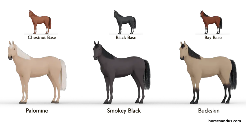
For Smokey Black, at the scale we’re working with these will essentially be identical to a dark Liver Chestnut, so I would use that color combination. For Palomino and Buckskin, I use the following combos:
- Layer: VMC Green Ochre/50-50 mix of VMC Green Ochre and GW Ushabti Bone, followed by a wash of Brown Ink or Agrax Earthshade – good for basic Palominos
- Base VMC Green Ochre followed by a wash of Brown Ink or Agrax Earthshade – perfect for golden Palominos
- Layer: VMC Green Ochre/50-50 mix of VMC Green Ochre and GW Ushabti Bone – great for Duns or Buckskins
Palominos often have a light mane and tail, so I’ll often use Dry-brush: VMC Green Ochre/GW Ushabti Bone for those, similar to the flaxen trait described above. Finally, because Buckskins are a variety of bay coloration, don’t forget to paint the lower legs, mane, and tail black. Duns are not the product of a cream gene, but their coloration is extremely similar so I mention it here to save space.
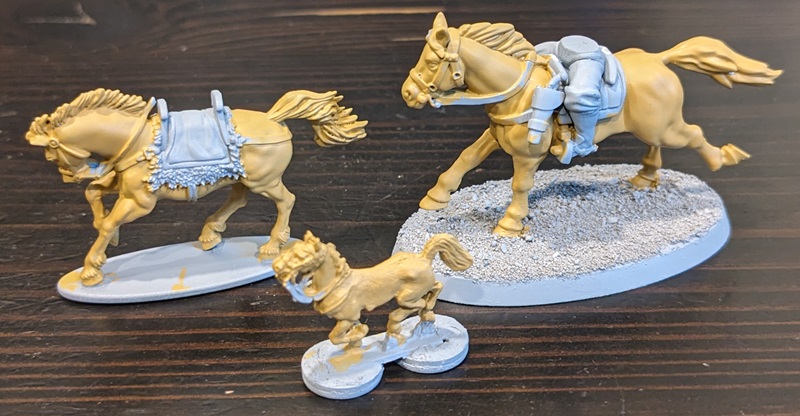
If a horse has two cream genes (referred to as a “double dilute”), then the lightening effect will be more pronounced, even affecting the pigmentation of black hairs.
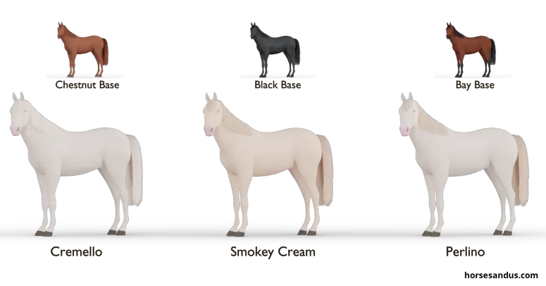
These horses are very light colored, though not actually white. For these types of horses, the following color combos will work nicely:
- Layer: VMC Ivory/VMC Off White – good for Cremello or Perlino colorations
- Base GW Ushabti Bone lightly glazed with a few layers of VMC Ivory – makes for a nice Smokey Cream.
Finally, it’s worth noting that while a single cream gene leaves the horse’s skin black, a double dilute turns the horse’s skin pink. As such, if you’re tinting the muzzles of Palominos or Buckskins you’ll want to use a darker tone, but for all of the double dilute horses you’ll want to use a light pink.
Grey Horses
Fun fact: Grey horses start out black, with the hair losing pigment as the horse ages. Eventually, the horse will become pure white (although some variants will retain dark points or small spots). This process is similar to greying hair in humans, but acts much more quickly. Greys also often exhibit dappling patterns, more on this below.
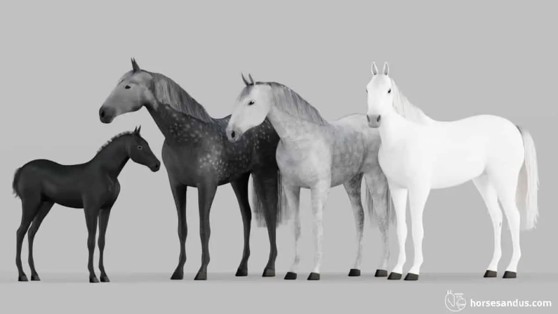
For these kinds of horses, any combination of grays will do the trick. My go-to recipes are:
- Layer: VMC Dark Gray/VMC Neutral Gray – a dark gray representing a relatively young horse
- Layer: VMC Neutral Gray/VMC Light Gray – a medium grey, good for grey horses with light-colored dapples
- Base VMC Light Gray glazed with white – a very light grey, good for horses with dark dapples
- Layer: VMC Light Gray/WMC White/VMC White – good for white horses, with or without dark dapples
- Layer: VMC Gull Gray/WMC White/VMC White – good for white horses, this combination has more subtle color transition and will read as pure white on the tabletop.
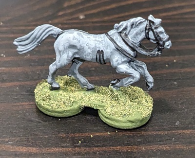
Interestingly, even though the pigmentation is progressively lost from the hair, the underlying skin is still dark. Thus, if you’re going to tint the muzzle of the horse, it should be darker and not pink.
White Horses
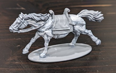
Unlike mature greys, true white horses are born with white hair, the result of a series of genes called “white dominants.” They are also born with pink skin, so if you’re tinting the muzzle, use pink. For white horses, the last two recipes in the section above will both work nicely.
Dapples and Spots
Along with bays, spotted horses exhibiting the “Leopard Complex” genes are among the oldest in the fossil record. They appear in cave paintings estimated to be some 35,000 years old (back before we were clever enough to domesticate horses and instead simply hunted them as food). The manifestations of the Leopard Complex are much as its name implies – complex! There are tons of different options here – little spots, big spots, large patches, spots distributed all over the body, spots limited to just a one area – it’s truly dizzying. If you really want to look at all of the possibilities, I’ll once again direct you to HorsesAndUs.com, where they have an absolutely fantastic guide to horse breeds exhibiting the Leopard Complex genetic markers.
A very common manifestation of this effect – and one that looks really cool on the tabletop – is “dappling.” Dapples are small, irregular spots, and can be either lighter or darker than the base coat. While dappling can be evenly distributed across the horse’s entire body, it is very commonly concentrated along the upper portions and/or rear of the horse.
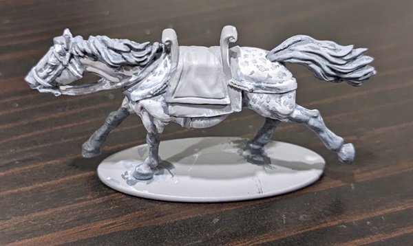
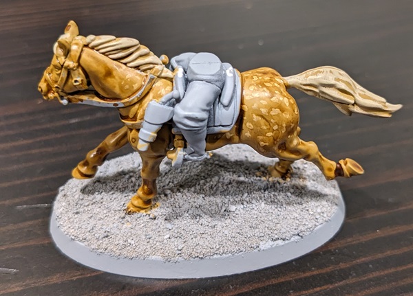
Painting dapples is easy – using a small brush, simply create irregular spots along any of the areas you want the dappling to appear. Make sure your paint has been thinned down to a more watery consistency to avoid making little bumps – especially important at smaller scales! For this article I’ve done two examples; an Andalusian with darker dapples and a Palomino with lighter dapples. In the first case, the horse was white (Layer: VMC Light Gray/VMC White/VMC White) and the dapples were done in the base tone of VMC Light Gray. In the second case, the horse’s base coat is VMC Green Ochre and the dapples are a 50-50 mix of VMC Green Ochre and GW Ushabti Bone. No layering has been done because this horse is going to be getting a wash instead.
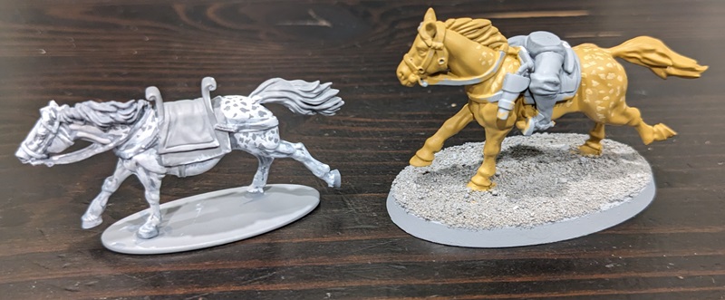
You can get good effects by simply adding spots and being done with it, but to make it look really good it helps to tie the dappling and the base color together with either a wash (as I’ve done here using Agrax Earthshade for the Palomino) or glazing your top highlight color over the horse in certain areas to “tone down” to color transition of the dapples. This lets you change the relative darkness/lightness of the dapples in different areas of the body, as I’ve done here with the Andalusian using very thin layers of almost-translucent white.
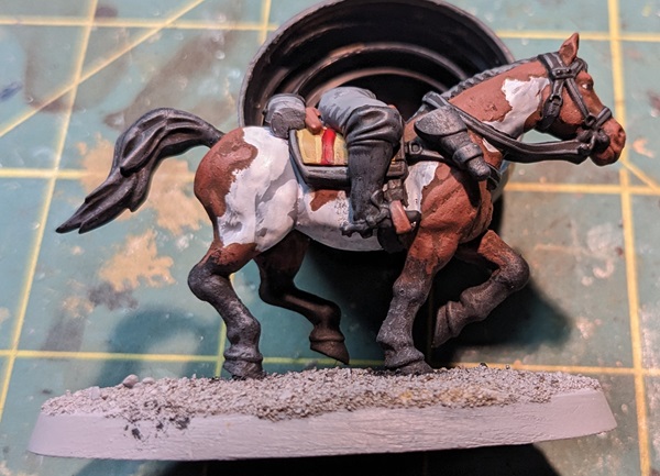
Pintos
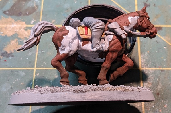
Another common variation on basic horse coloration is the “pinto” pattern. Stemming from the word “pintado” (meaning “painted” in both Spanish and Portuguese), this coloration is characterized by irregular white patches on the horse. The size of these patches can range from relatively small (as in the Frame Overo breed) to covering much of the horse’s body. The white areas can be overlaid over any of the three base coat colors (chestnut, black, or bay), either with or without cream dilution. A bay pinto is one of the ways you can get three distinct colors on a horse.
Because white is often such a tricky color to work with, if I am painting a pinto horse I actually prefer to start with the white areas – it’s easier for dark colors to cover white than it is to paint multiple layers of gray/white over a dark base. You certainly can do it the other way (and I do for socks and blazes, more on this below), but on the whole I think it works better to start with the white. Fortunately, you don’t need to do the whole horse, just the parts you intend to leave white.
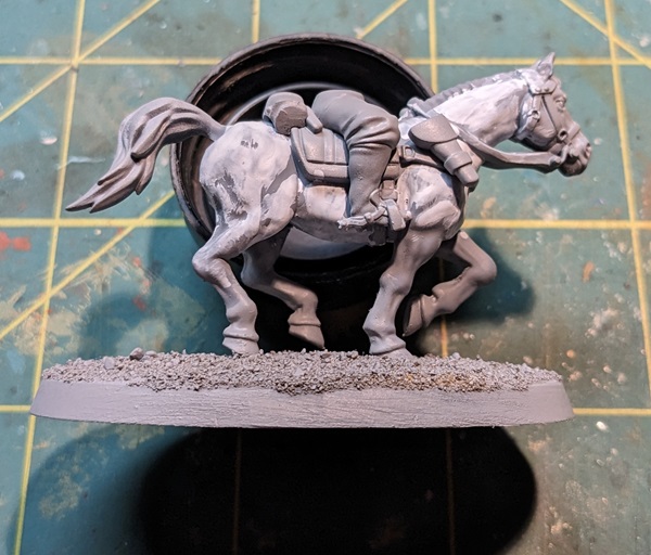
Once you have the areas that you intend to leave white done, you can paint on your preferred base coat shade of brown (known as “piebald”) or black (known as “skewbald”) in irregular patches. Then simply highlight these areas up in layers as described above. You’ll need to be more patient and take the time to use better brush control so as to not get into the white area with your brown highlights, and it is for this reason that I recommend layering rather than dry-brushing for this particular type of horse, even at smaller miniature scales.
OK, story time: My maternal grandparents lived in rural west Michigan, and the property next to and behind their house was a big horse paddock. As kids, we used to spend a lot of time at the fence line feeding the horses on grass clippings and the occasional carrot filched from my grandfather’s garden. In that paddock was an absolutely stunning 3-color bay pinto mare. She looked like something straight out of a Frederic Remington painting, and I admired that horse for years. One day, the horse’s owners happened to be around when we were there and they invited us in to help wash and brush them. Super-excited, curry-comb in hand, 10-year-old me got right up close and personal with my favorite horse – and the very first thing she did was step on my foot, which was apparently one of her less endearing habits.
Turns out, horses can be assholes too, yo.
Roans
Roan coloration is produced by the intermingling of white and pigmented hairs in the horse’s base coat. From a distance it can have an effect that looks similar to greying or cream dilution, and it’s only upon closer examination that the difference becomes apparent. Obviously at miniature scale this isn’t really going to be visible, but there is one simple way to mimic this effect, which is to base coat the horse with a particular color then mix in a little more white with each successive layer.
Using white as a mixer has a desaturating effect that is different than using a lighter (or brighter) highlight layer. The effect is kind of subtle and (because it requires mixing) a little time consuming. It’s also harder to fix any mistakes later down the road, such was when you’re painting the tack and harness (see below). This can be cool for a noble or general’s horse (I find the so-called “Blue Roans” particularly striking), but I’d avoid it for your run-of-the-mill cavalry.
Socks and Blazes
Two very common types of markings on horses are white patches on the face and lower legs. These patches are often asymmetric or irregular – it is not uncommon for a horse to have just one leg end in a white sock, for instance. On the legs, these white patches can range from a thin area just above the hoof to the entire leg (or anything in between). The Wikipedia entry on horse markings has great illustrations along with the technical names for each (because of course each one has a different name), but the important takeaway here is that you can be arbitrary and capricious with how much white you add and you’re still good!
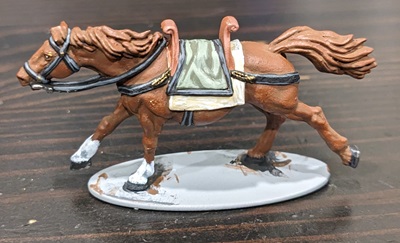
These markings are a great way to add a little bit of visual interest to your cavalry and are really easy to do. Once you’ve finished your horse’s base coat, just take a light gray (I like VMC Light Gray) and pick out the area you want white. Follow this with a heavy highlight of pure white and you’re in business. This two-color approach gives you both a nice color delineation (because grey paints generally cover dark colors better than white) and an eye-catching highlight.
Note that these sorts of white markings can turn even black hairs white, so this kind of treatment is appropriate for blacks and bays as well as chestnuts. This is very convenient, as you can have the rest of the horse more or less finished and just come back and paint a lower leg white whenever it strikes your fancy.
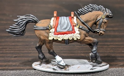
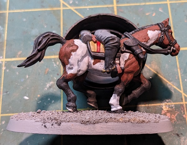
Similarly, white markings on the face are common in many horses. These range from a small spot on the forehead or tip of the nose to most of the face being white. Interestingly, the lack of pigmentation in these features applies to both the hair and the skin underneath. As such, if your facial markings extend across the muzzle, you’ll want to dry-brush that pink just as you would for a double dilute or true white horse.
Eyes and Hooves
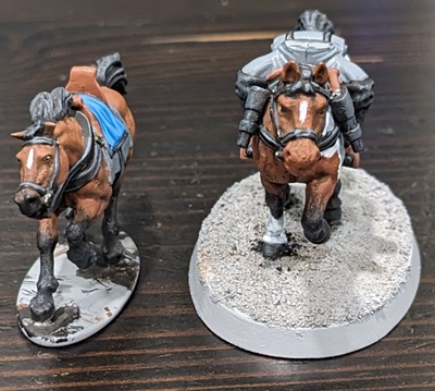
Horses are big animals and have huge eyes! So unlike human-sized infantry figures, it’s going to be noticeable if you don’t at least put a little effort into them. Different horse breeds do have different eye colors (with eye pigmentation often being linked to hair pigmentation or pattern), but at 28mm scale this level of detail will be almost invisible and isn’t at all necessary – a thin white stripe and black spot is more than sufficient.
As herbivores (and therefore prey animals), Horses’ eyes are situated to have an exceedingly wide field of view (up to 350 degrees, though only the 65 or so degrees directly in front of them is binocular vision). Fortunately, when horses are being ridden with the intent of charging headlong into some poor, unfortunate rabble, they are looking where they’re going. That means that in general you’ll always want to orient the dark spot of the eye towards the inner edge, secure in the knowledge that (unlike human miniatures) this won’t make them look cross-eyed. When painting horses’ eyes I cover about half of the white stripe with black, which is quick and easy.
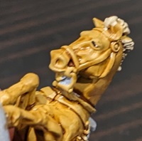
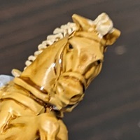
And at 15mm or smaller I don’t paint the horse’s eyes at all. I’m not a monster.
Similarly, hooves can be easy as well. Based in black with a quick layer or edge highlight of dark gray is sufficient at both 15mm and 28mm scales. Technically speaking, lighter skin at the hoof (such as might result from a sock or a true white horse) often produces lighter-colored hooves. These are often a dirty tan color, but at the scales we’re talking I rarely bother with this distinction.
Bonus Points – Horseshoes
For almost as long as people have been using horses in work and war, there has been a recognition that horses’ hooves need to be protected to keep them in peak form. Unless you’re painting miniatures for the Ancient Era (where civilizations like the Romans employed all sorts of weird things like strap-on “hipposandals” to protect a horse’s hooves), that probably means horseshoes. Certainly from about 700 CE on the horseshoe with which we are all familiar became commonplace.
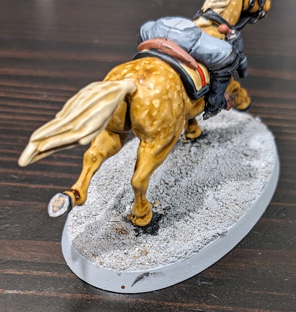
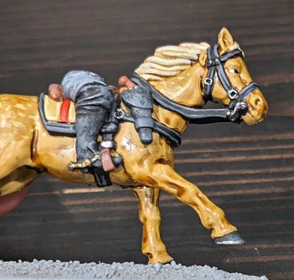
If you really want to add a little extra detail to your horses, you can paint on horseshoes. I would only recommend doing this at larger scales and only on any hoof that is raised (many miniature horses are sculpted in dynamic, mid-gallop poses with one or more hooves off the ground).
To achieve this effect, paint the bottom of the exposed hoof and a very thin bit around the edge black. Put a dot of a dusty brown color (I like VMC Tan Earth) on the bottom of the hoof oriented towards the back – the represents the sort of pad at the bottom. Then, around the bottom rim apply your steely metallic color to represent the horseshoe itself.
This isn’t hard and looks really cool on important leader models, but for large blocks of cavalry omitting this level of detail is a sanity-saving measure. It’s also really hard to see from the front, so unless your cavalry unit has turned its tail to the enemy and is retreating (unthinkable!), you’ll probably be the only one who can see it.
Mud
Charging across the battlefield is a dirty business, and horses’ hooves can kick up a surprising amount of turf – some of which will get stuck to the horse’s legs. And if the battlefield itself is muddy to begin with, this effect will be amplified. Especially if you are painting draft horses (no doubt pulling cannons and limbers along rutted, muddy tracks), you might want to consider adding some mud effects once you’ve otherwise finished painting the horse.
This effect can be as subtle or pronounced as you want to make it. On the extreme end, you might use a technical paint like GW’s Stirland Battlemire that will actually give you little clumps. Otherwise, a nice muddy, blackish brown will do the trick. Use lighter browns or tans to model dried mud (I like VMC Tan Earth in particular for this). If your horse is some variety of chestnut and already has brown legs, have a care to avoid using one of your layer colors for the mud, as it will render the effect difficult to see.
In all cases, apply the mud color to the lower legs by stippling with your brush in an irregular pattern. Dry pigments like MIG Dry Mud are great too – just wet a brush, dip it into the pigment, and stipple like you would with a regular paint.
And if you want to get really crazy, you can do a heavy stipple with a tan color and a lighter stipple with a dark brown. This gives the impression of wet mud that is in the process of drying, which is kind of cool. This is a great effect for draft horses, especially if you apply the same treatment to the wheels of whatever wagon/carriage/limber they are pulling.
Tack & Harness
When people talk about hating the process of painting cavalry, I suspect that this is actually the part most of them are talking about. Tack and harness is the catch-all term for all of the various straps, reins, bridles, blankets, saddles, stirrups, and other bits-and-bobs associated with actually riding a horse (or having it pull a wagon or chariot). This equipment is almost universally made of leather (or wood covered with leather in the case of saddles), so whatever color combination you typically use for leather you can use here. Oftentimes this leather was dyed black, so a base coat of black followed by a dark gray highlight is sufficient, especially for the Napoleonic Era or later.
There’s no getting around it, this part is fiddly because you’re painting a very thin strap lying over a color you’ve already finished. Mistakes are noticeable – which is why avoiding mixed paints for layers and such is key, as it makes touch-ups easier.
My advice for painting these kinds of straps is to use a brush whose body is about the width of the strap you’re trying to paint. But rather than trying to paint just along the top of the strap, run your brush along the upper or lower edge of the strap such that it covers the edge and about half of the top. With a little practice you’ll get to where it’s easy to run the brush along the edge such that you’re getting the edge of the strap (and part of the top) all the way down to the horse’s body without getting any on the horse itself. Two quick passes and voila, the strap is base coated. A quick highlight along the top (or two edge highlights at larger scales if you’re feeling frisky) of dark gray and you’re done. This part is tedious, but once you get the hang of it it’s not difficult. And finally, you can pick out all of the little buckles and metal bits in your favorite metallic bronze, brass, or steel colors.
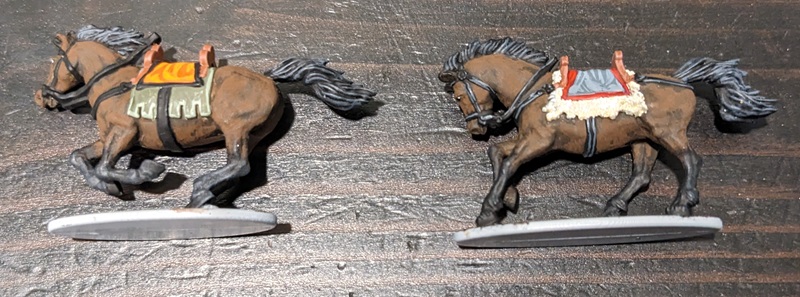

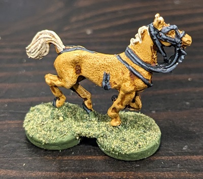
A word on Napoleonics: the standardization of military uniforms was very much a thing by the Napoleonic Era (even if various armies did change uniform designs with dizzying rapidity). As such, if you’re painting cavalry from a specific nation, unit, or in some cases year, you’ll want to do a little research into what colors the saddle blankets and any bedrolls or other carried gear are “supposed” to be. I certainly won’t hold it against you if you just go off “vibes,” but given the amount of detail that companies like Victrix and Perry sculpt into their miniatures, it can be cool to get all the little details right. And it certainly looks great on the tabletop!
But for earlier eras – especially when nobles and officers were expected to provide their own mounts and equipment, then “vibes” is very much the order of the day. If you’re doing something late medieval it might be cool to work the colors associated with a noble’s coat-of-arms into the saddle blanket, but that’s purely an aesthetic decision.
Riding Off Into The Sunset
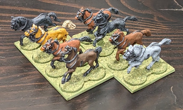
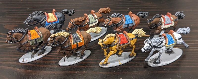
One final piece of advice I can give is to have a plan. Decide before you start how many of your horses are going to be brown or black or bay or whatever. My typical ratio when painting a unit is for 25% of the horses to be dark brown and 25% to be red-brown, with half of these (picked at random) being bays. The next 25% I paint black, and the last quarter is left to “everything else.” This is where I will occasionally put a Grey or Buckskin or a Palomino or whatever, just to give the unit a little variation.
It’s also completely OK to decide that all of your horses will have the same brown base, then just use bay coloration or the occasional sock or forehead star to break things up and add some visual interest. This approach still looks great and can save you a lot of time.
Hopefully I have dispelled some of your fears and given you some ideas for painting cavalry figures. It really can be easy – to be honest, by this point I often enjoy painting horses more than I enjoy painting whoever is riding them! And there’s no denying that cavalry units look great on the tabletop, so I encourage you to give some of the techniques discussed here a try. And if you do go the extra distance and paint a nice Blue Roan or Appaloosa for one of your generals, go ahead and drop us a link!
A big shout-out again to Maria over at HorsesAndUs.com, both for her great articles and for allowing us to use her illustrations in this piece. If you want to know more about horse colorations, patterns, breeding, and all the cool genetic factors that go into making horses look the way they do, I encourage you to head over there!
Questions, comments, suggestions? Insane amount of cavalry to paint and now you’re excited to do them? Contact@goonhammer.com or leave a comment below
