In our How to Paint Everything series, we take a look at how to paint different models, armies, and materials, and different approaches to painting them. In this article, Charlie from the Beard Bunker blog teams up with Rob ‘TheChirurgeon’ Jones to go through the basics of painting freehand designs on your minis.
Freehand like a boss (or at least like middle management)
Hi, I’m Charlie, and every now and then I enjoy throwing freehand details onto my tiny plastic children. My mid-tier efforts are usually met with an abiding thumbs up, but occasionally they’re met with deep confusion. How did I do that? How could anyone do that? Did I sell my soul to a used cake salesman?
This post aims to answer two of those three questions.
Fair disclosure: This article (or at least the first half) lifts heavily from three posts I previously wrote for my own blog, and will be using the same images. In web traffic terms the Beard Bunker is a tiny guppy in comparison to the Goonhammer whale shark, so I figure using the images again is unlikely to ruin anyone’s day.
TheChirurgeon: I am also piggybacking onto this article as well! I frequently get questions about my freehand techniques – usually from Carl asking about my Black Legion – Hi, Carl! I’ll be adding my thoughts and a couple of tutorials here.
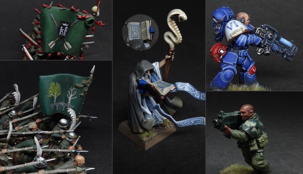
This will be a post of three parts, in order of how advanced the techniques are:
- Flat 2D shapes
- Lettering
- Fully rendered painting
Given that scope, it almost goes without saying: this is a primer, not a bible. One of the joys of freehand is that you’ll never run out of ways to improve. I started off drawing embattled stick-men in my classroom notebooks as a child, and now, several decades later, here I am painting THKULLTH on THPETH MUHREENTH. Such are the fruits of practice and enthusiasm.
Disclaimer: which techniques you should already know.
For 2D shapes and lettering, not much. You need a brush that holds a sharp point, and an understanding of how to use a palette to control the consistency and volume of paint on said brush. For rendered painting, you need to understand layering/blending, and a willingness to be rubbish at something until you’ve practised a bunch.
Bonus disclaimer: bro, do you even airbrush?
There are some freehand elements that are much more easily done with stencils and airbrushing. If it’s easier to cut a stencil of your design than it is to use a brush, don’t be a masochist. Everything in this article, however, is about those times when you’re doing it by hand. Or those times when you don’t own an airbrush.
Painting 2D designs
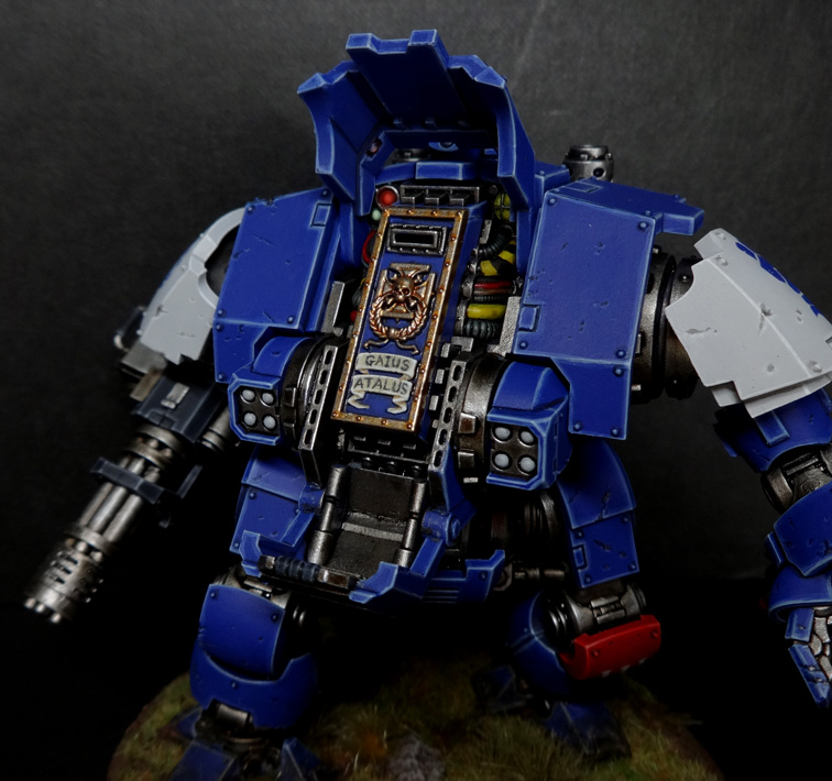
For this first part, I’ll use a Redemptor dreadnought I finished the other week as an example since all the freehand is 2D stuff. Here’s a picture for context:
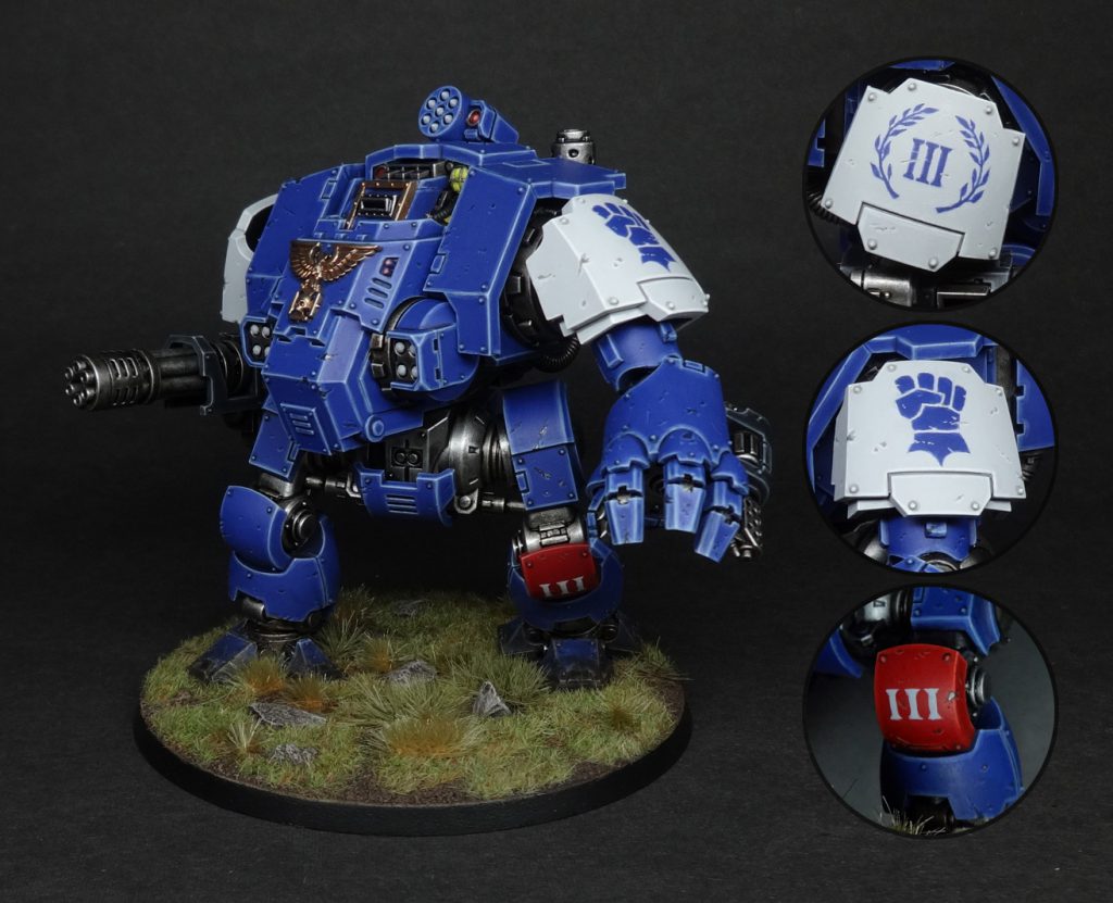
Now, on to the method. Any freehand effort will follow the following steps:
- Apply a solid basecoat of the background colour.
- Find some reference.
- Mark out the design.
- Block in rough shapes/lines.
- Colour it in until it doesn’t look like flying hippo crap.
1: Basecoat
This seems like a foregone conclusion, but there’s a conundrum here. What if you’re applying a design to an area that’s going to get highlights, layering, or whatever else? Should you highlight that area before or after the freehand stuff?
The answer depends on the design and the context, thus giving us more variables than a singing weasel with a rocket up its ass. As such I’ll stick to some general guidelines.
If your design has a self-contained silhouette (e.g. a big opaque triangle), then finish up on the surrounding area first so you don’t have to be careful when layering/wet blending/airbrushing/etc. You can see this scenario in action in Richard Gray’s recent freehand article on Warhammer Community.
If your design reveals a lot of the underlying colour, e.g. a laurel wreath, it’s easiest to keep the basecoat flat unless you have godly levels of brush control.
2: Reference
Unless you’re drawing a simple geometric shape, you need some reference. Even if you think you don’t. Despite having an army of dudes with little fists on their shoulders, I still Googled ‘Imperial Fist Icon’ because I was painting a 2D design, which is different to the 3D moulded shoulder pads. Also I looked up reference pictures of laurel wreath icons to get ideas about different formats (the full circle? The ribbon tie? I wouldn’t have thought to go for the bracket style had I skipped this step).
3: Mark it out
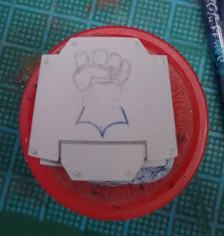
If you’re painting onto a light background, you can use a pencil for this. If you’re painting onto a dark background, use paint. Below you can see where I’ve drawn the outline of the fist icon (in case you’re wondering what’s up with my colour scheme, the Cobalt Scions are an Ultramarines successor chapter and the fist symbolises the Gauntlets of Ultramar, hence looking like off-brand Ultrabois with a glove fetish. If your desire to know more has instensified, here’s the Cobalt Scions’ tag on the Beard Bunker).
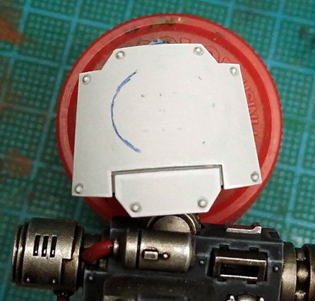
In the image below you can see I wasn’t as detailed in blocking out the laurels, I was just focused on the overall location and proportions of the design. I probably should’ve blocked out the leaves more as it would’ve saved some pratting about later. I didn’t block out the numerals since they’re simple enough – I just tried to make sure they were centrally placed.
4: Block in rough shapes/lines
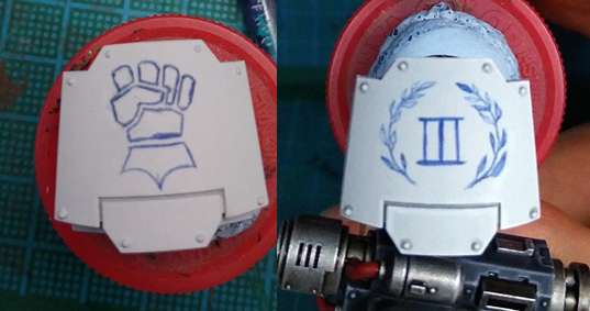
Now get the general shapes in; don’t worry about being tidy. That comes later. As you can see in the image below, I seem to have been filling in the laurel leaves in a completely random order like a prize knob head.
5: Colour it in until it doesn’t look like flying hippo crap.
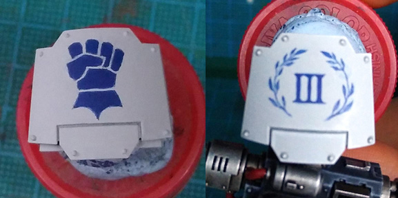
Go back over what you’ve done with #twothincoats so it gets some good solid colour on it. Tidy it up by using the background colour. Expect to keep switching between your design colour and your background colour, since certain angles and shapes are easier to achieve this way. Most of the work got done by putting some blue down and straightening things out with the white when I slipped. Note how right until the end the numerals are joined together, then I painted the thin white lines in to divide them. Much easier than trying to paint an ultra-sharp right angle with the blue.
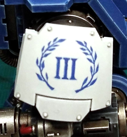
Note also that I re-positioned (i.e. repainted) a couple of leaves at the bottom right before moving on to the final weathering stage, because it’s fine to go back and fix a mistake you didn’t spot at the time.
Since Sir Chunks was getting dings and scrapes applied over the whole model, it would’ve looked pretty weird if the freehand escaped similar harm, so I threw in some extra scrapes over the top, at which point… job done.
![]()
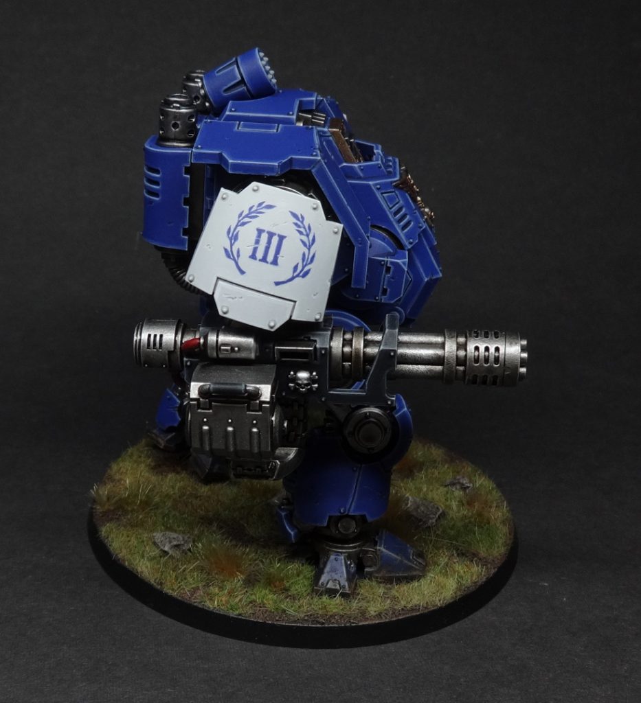
So. That’s the basic idea. Now to take it to the next level and have a crack at lettering.
TheChirurgeon’s Take – Painting Marine Shoulder Pads and Other Details
Pretty much everything Charlie said above applies here – I use a similar take when I paint 2D designs, which is the primary format I take on marine shoulder pads. Something I can’t stand about transfers is that they tend to be over-rendered or have black outlines which to me usually looks off aesthetically. So I take a broke-brained approach to shoulder pads and eschew transfers (which I hate applying) and hand-paint all my shoulder pads.
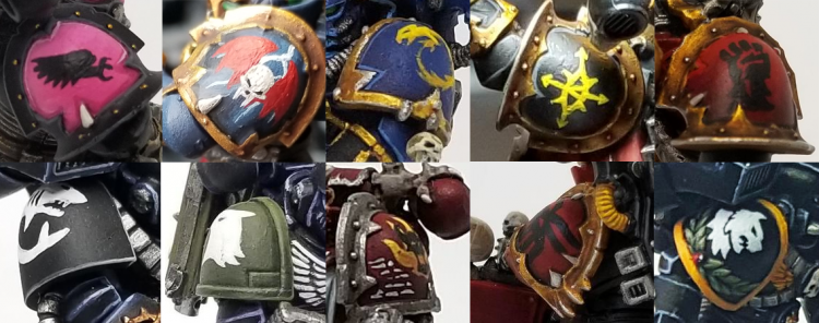
I’ve previously covered the Night Lords shoulder in HTPE: Night Lords, but today I’ll cover the Black Legion markings I tend to do on my marines and tanks.
The Eye of Horus shoulder pads I do are pretty straightforward:
- I draw the basic eye oval in Averland Sunset.
- I draw lines coming off in each of the 8 star directions. The 4 cardinals will be longer.
- I fill in the arrows and add the eye
- I go back over the eye with Flash Gitz Yellow, then I clean up around the edges with the base color, in this case Abaddon Black.
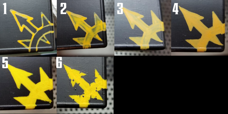
The process on painting the Yellow Chaos Stars on my vehicles and other surfaces is pretty similar:
- Draw out the basic shape in Averland Sunset.
- Block in with multiple thin coats of Averland Sunset.
- More thin coats
- Still more
- Cover that in a few thin coats of Flash Gitz Yellow
- Clean up the edges with your base color – again Abaddon Black here, and add rips, tears, and dots. The goal is to make it look appropriately messed up and chaotic.
Painting Letters
Lettering follows the same pattern of basecoat → markup → sketch → block in → sharpen, but here are some extra notes on painting text. In this example, we’re looking at the base of a Battlefleet Gothic ship.
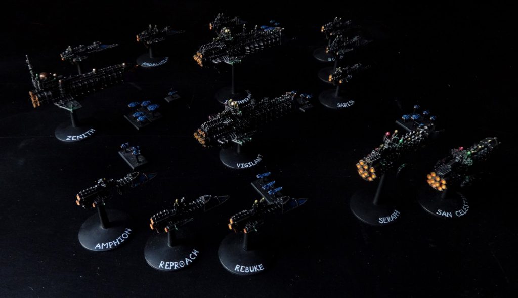
The main thing to note here is picking the midpoint. It might seem reasonable to start painting at the start of the text, but actually, you want to start in the middle and work outwards. This ensures the text is placed where you want it on the miniature. Count how many letters and spaces there are in the text, and paint the middle letter first. In the case of my example below, the middle character was actually a space so I marked it with a small line.

You will also find the background colour particularly useful for creating the right-angles and other sharp features on letters.
Tip: making text look faded
The easiest way to do this is with a glaze of the basecoat colour after you’ve finished everything. Use very thin glazes and do it a few times if needed; you don’t want to nuke all your hard work. See the name plate below for an example of what I mean; those letters were painted in black paint, but appear more faded than that because the whole area got a glaze of bone-coloured paint at the end.
TheChirurgeon’s Secret Tip: Micron Pens
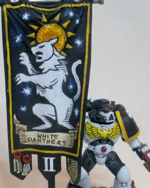
If you’re doing black lettering, which will be common on scrolls and parchment, consider using a .005 black Micron pen instead of using a brush. It’ll give you more control, gives you a fine tip, and works well both for lettering or doing small, thin lines on something you need to have a specific look. You’ll still want to start from the middle of your words and work outward. One the banner below i used a black Micron for the outlines on the banner and parchment, the lettering, and the detail lines, and I used a brown micron to do the fine lines in the halo/sun.
A word of caution: Be mindful that Micron pens are ink and you can, under certain circumstances, reactivate the ink if you’re painting the model with varnish or washing over an area with more inks or very watery paints, which can cause the ink to bleed — no ideal! It’s likely not as big an issue if you are spraying or airbrushing varnish onto the model, but it’s something to keep in mind.
Fully rendered freehand
There is a lifetime of study to be had in traditional 2D painting. I am not about to try and teach that in 500 words since I’m about as qualified for that as Ozzie Osbourne is to host a bat-themed food safety class for children. That being said, there are still useful things to go over as regards applying 2D art to 3D models. Moreover if you’ve learned how to layer colours and have a vague understanding of light and shadow, you’ve already got a bunch of 2D painting skills.
This section, therefore, will provide a variety of useful tips.
Motherfudging REFERENCE
I know we already covered it, but this becomes an even bigger deal when you’re trying to go hog wild on the detail. There is no finer shortcut to visual assery than declaring “I know what X looks like.” This becomes doubly true if you’re trying to paint anything more complex than a basic icon.
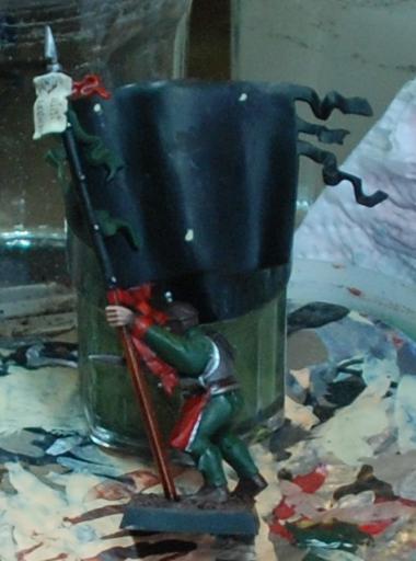
By way of example, let’s go through a step-by-step of an Empire banner I painted way back in 2012. Having chosen a deer skull for this regiment, the Blades of Taal (the Old World god of the wilds, see?) I went looking for reference. I had an idea in my head of what a deer skull would look like, but there were so many details I had no idea about. I can’t find the original source for this image, so apologies to the owner, but have a look:
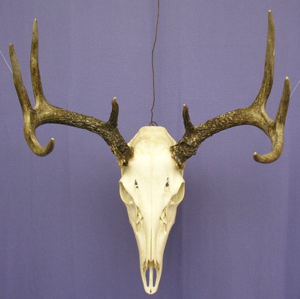
What are those holes on its forehead? And what’s the broken texture just below the eye sockets? I have no idea, but that’s why we use reference photos. Thus armed, I embarked upon the steps outlined earlier, but with more colours, more layering, and more glazes, blending, swearing, inaccuracies, regrets, crying, acceptance, and closure.
Above: Any image can be broken down into triangles and other simple geometric shapes. The overall shape of the design is literally a triangle, so the three dots in the image above serve to locate the design and show me how much space it’ll occupy. Note that I’ve put it off the horizontal centre line. This is to try and keep the skull itself as central as possible while still leaving room for the darker antlers.
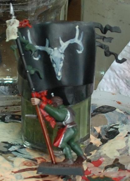
Above: When I say ‘sketch loosely,’ this is just how loose I mean. If you’re trying to make your design look good at this point you’re being needlessly slow and careful.
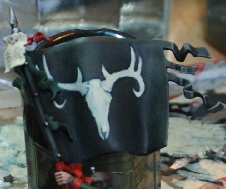
Above: It’s starting to tighten up now, and obviously getting more solid. Even so, note that the top of the skull is too flat compared to the reference, and this mistake has been fixed by the time the image below was taken.
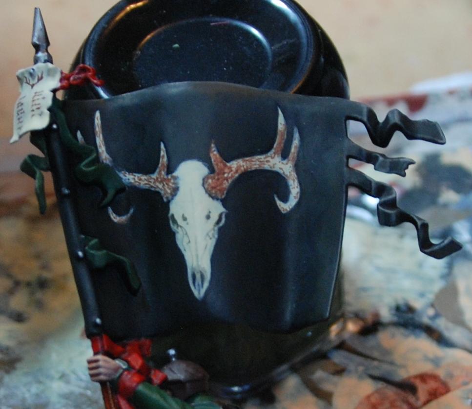
Above: Here I’ve used thinned black paint to sketch the cracks and lines in the skull, and dots of thinned brown paint to start laying some texture onto the horns.
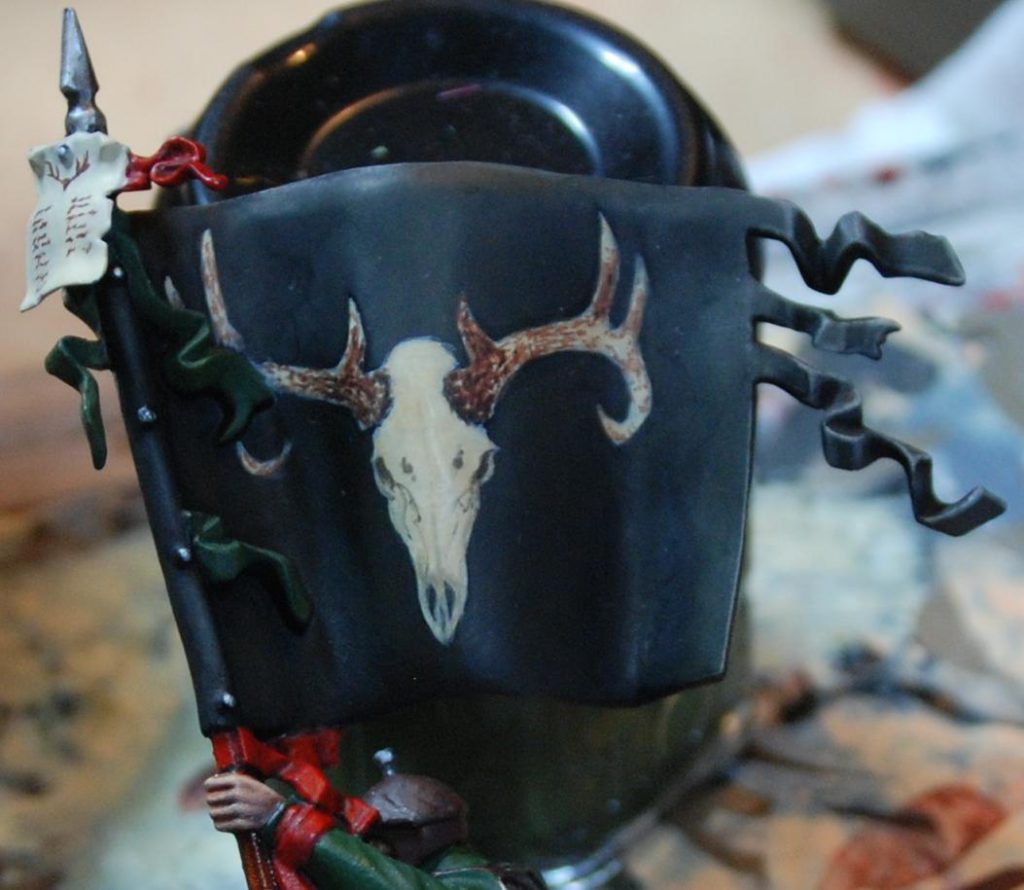
Above: a sepia glaze is used to darken the whole design down but keep it tied together in preparation for highlighting.
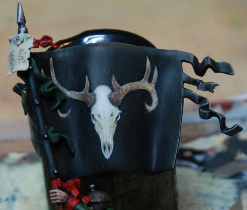
Two changes have occurred in the image above. The first and simplest thing is a bone glaze over the antlers to flatten it a bit and pull the tint closer to the skull. Secondly, white has been used to highlight the skull. I’ve tried to keep the light fairly flat to keep it looking like an icon, albeit a very detailed one. The way I decide where to highlight is, essentially, to imagine where I’d put the highlights if it were a miniature and then… do that. This means broad, thin layers on smoother shapes like the cranium, and sharper accents on the eye sockets and nostrils. If you’re not sure where to put your lighter tones, go back to the reference and look at where the shadows fall.
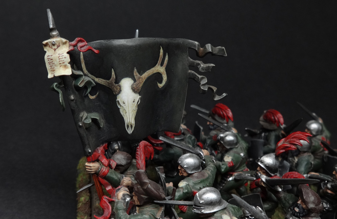
With the design itself done, the banner got a dirt/dust mix sloshed over it. Here it is sitting in its regiment, the Blades of Taal. The ambitiousness of the banner is intended to distract attention from the incredibly lazy paint jobs on the state troops themselves. Clearly, Hochland’s finest aren’t big on laundry day.
Where’s the light coming from?
When painting a miniature, your job is to exaggerate the shape of the thing so that it makes visual sense when it’s about two feet away, sitting on a table and looking pretty. This is often achieved by edge highlighting and by zenithal shading (meaning that you paint the miniature as if lit from above, because most of the time, it will be lit from above). This increases the contrast and makes your miniature pop. Since freehand is, you know, flat, you’re going to have to decide where the light source in the image is. This is particularly true if you are depicting any reflective surfaces. This also helps you figure out where you should shade, and where you should highlight.
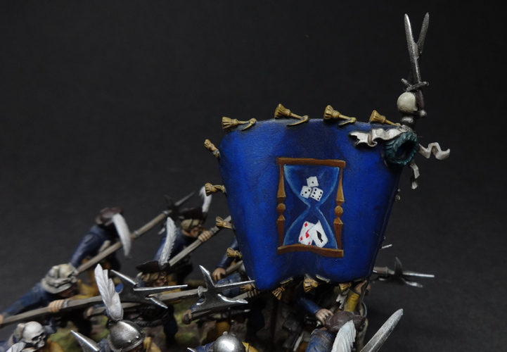
Look at the wood on the hourglass in the banner below. I’ve depicted the light as being above and slightly to the right, and this has determined where the highlights go. It’s not a masterpiece but hopefully it gets the point across.
Advanced technique side-note: why not simultaneously shade both freehand and background with glazes?
One way to deal with a situation where both the background and the freehand need to be shaded (perhaps the freehand disappears into a fold in some fabric or whathaveyou) is to use glazes. Consider painting the whole thing as a flat two-tone design and then use a succession of darker, neutral glazes to put transparent shadows over the whole area. This ensures the freehand design fades according to the light, but obviously it won’t work with every colour combination. Proceed with caution and a willingness to experiment.
It’s NMM time!
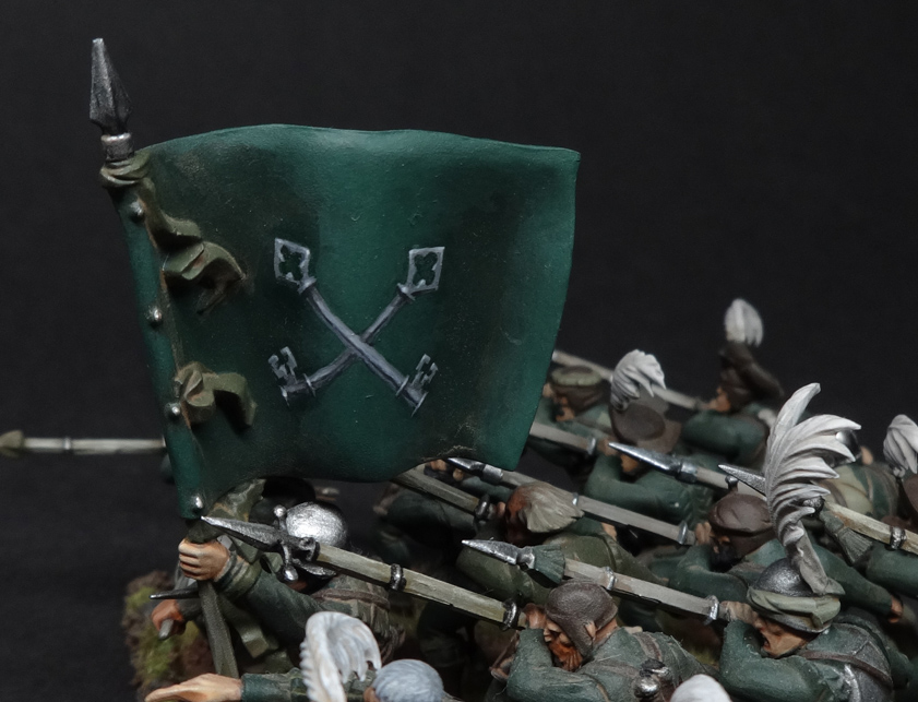
I don’t usually use non-metallic metals as I prefer the look of metal paints for metal, particularly on gaming pieces. When you’re freehanding metallic details, though, it’s basically mandatory since you’re representing an area of paint/cloth/whatever. Assuming you’ve decided on the light source (see the tip above), everything follows on from that. Again, find some reference if you can, since light and shadow works very, very weirdly on metal. There are plenty of NMM tutorials out there which will tell you which colours to use, and the article I linked earlier by Richard Gray is an exquisite example of someone doing this like a boss.
I have a simpler example below, again from my Empire army’s many flags, so that you can see what I mean about having a light source (in this case from above):
That’s the end of my bit, and so I shall pass the mic to TheChirurgeon. Leave a comment below if you have any thoughts or questions, and take care to specify whether you’d prefer me to answer coherently, or in the manner of a mad Scottish prophet halfway into a bottle of whiskey.
TheChirurgeon – Tackling Layered Images
So something I can add here is what to do if you have some layered images or heraldry to do. That is, sometimes you’ll need to do something really complex where you’ll have one element layered over another. While you could plan out painting these elements as one large piece, I have historically found that it’s way easier to just paint each of these elements in full on top of each other. For this example, I’ll be doing the Night Lords winged skull icon over a chaos star. This has three components, really: The Chaos Star, the Wings, and the Skull itself. Again, we could do these as one piece but I think you get better results painting this in layers.

So the first element is the 8-pointed Chaos Star. It’s going to be a steel gray.
- Start by blocking in the basic shape. Generally, I’m drawing lines at the center of where they’ll go when I have to do chaos stars, rather than the outlines. It’s just easier to mark the center lines first. I’m using Mechanicum Standard Grey.
- Next I fill in the star. We can correct later if all of the arrows aren’t the same width.
- Finishing off here, I’ll touch up the edges with black.
- I want to give this some depth, so I use Celestra Grey to add highlight lines to the raised parts – in this case, the light is coming from directly above the star. Once I’m done with this, I’ll use Nuln Oil to darken the insides of the star, and I’ll add a couple dots of lighter grey to make rivets on the arrowheads.

Ok, so now we have the Chaos Star, it’s time to do the wings.
- I start by blocking out the basic shape of the wings, using Mephiston Red. This is easiest if you start with the fingers, which will help you get the shape set right and also ensure that the wings are the same size.
- Next I fill the wings iin completely with Mephiston Red.I’ve got the basic shape filled in now.
- Time to do some shading. The patagium (the fleshy parts of the wings) need to be darker, so I shade them with Carroburg Crimson and Nuln Oil, going darker toward the top so they’ll contrast with the fingers.
- In order to make things stand out more, I hit the top of the wings/fingers with a bit of Mephiston Red mixed with Averland Sunset to give it a lighter shade. Evil Sunz Scarlet could also work here.
Ok, time for the bone elements. This is going right over the middle of the wings.
- I start by blocking out the basic skull shape with Rakarth Flesh, and add bone tips to the tops of the wings.
- Time to add the eye sockets and nose. This is done with Abaddon Black.
- For shading, I use Agrax Earthshade to darken in areas of the skull to suggest more of a rendered shape.
- At this point I re-highlight with Rakarth Flesh and Reaper Polished Bone, which gives me lighter color on the raised areas and helps the skull stand out from the rest of the design.
At this point we’re done. On a larger vehicle note that this might all be painted over a lightning bolt, adding a 4th layer underneath all of it.
Be Free
Hopefully this has given you some ideas and the push you need to start working on some freehand designs of your own. If you’re looking for additional inspiration or other materials, check out the following How to Paint Everything articles, which contain more information about freehanding and complex heraldry:
- The Narrative Forge: Painting Graffiti
- How to Paint Everything: Checks, Hazard Stripes, Flames, Zig-Zags and other Heraldric Details
And as always, if you have any questions or feedback, or you just want to share your own rad freehand designs with us, feel free to drop a note in the comments below or email us at contact@goonhammer.com.
