In our How to Paint Everything series we look at how to paint well, everything, with different techniques and approaches. This week Magos Sockbert is joined by Tom from @twb_paints to talk about how we paint our City States for Conquest: the Last Argument of Kings!
The City States are the most obvious mapping of a real-world civilisation onto a game one that we’ve yet seen, but even that sentence does them a disservice. Almost every model has elements that reminds you of the sheer depth of Eä and the amount of work Para Bellum has put into their universe, game and models. As a faction they provide a ton of opportunities for artistic expression as well as real world research into some of the colors or the historic armies which inspired them.
In this article we’ll look at multiple ways to paint the City States but if you’re looking for even more inspiration, consider checking out some of our Historicals How to Paint articles – most notably our How to Paint Everything: Roman Legions article, or our How to Paint Everything: Stormcast Eternals article. Both have similar motifs going on, with their combination of body-moulded armor and cloth.
Tom
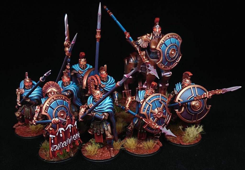
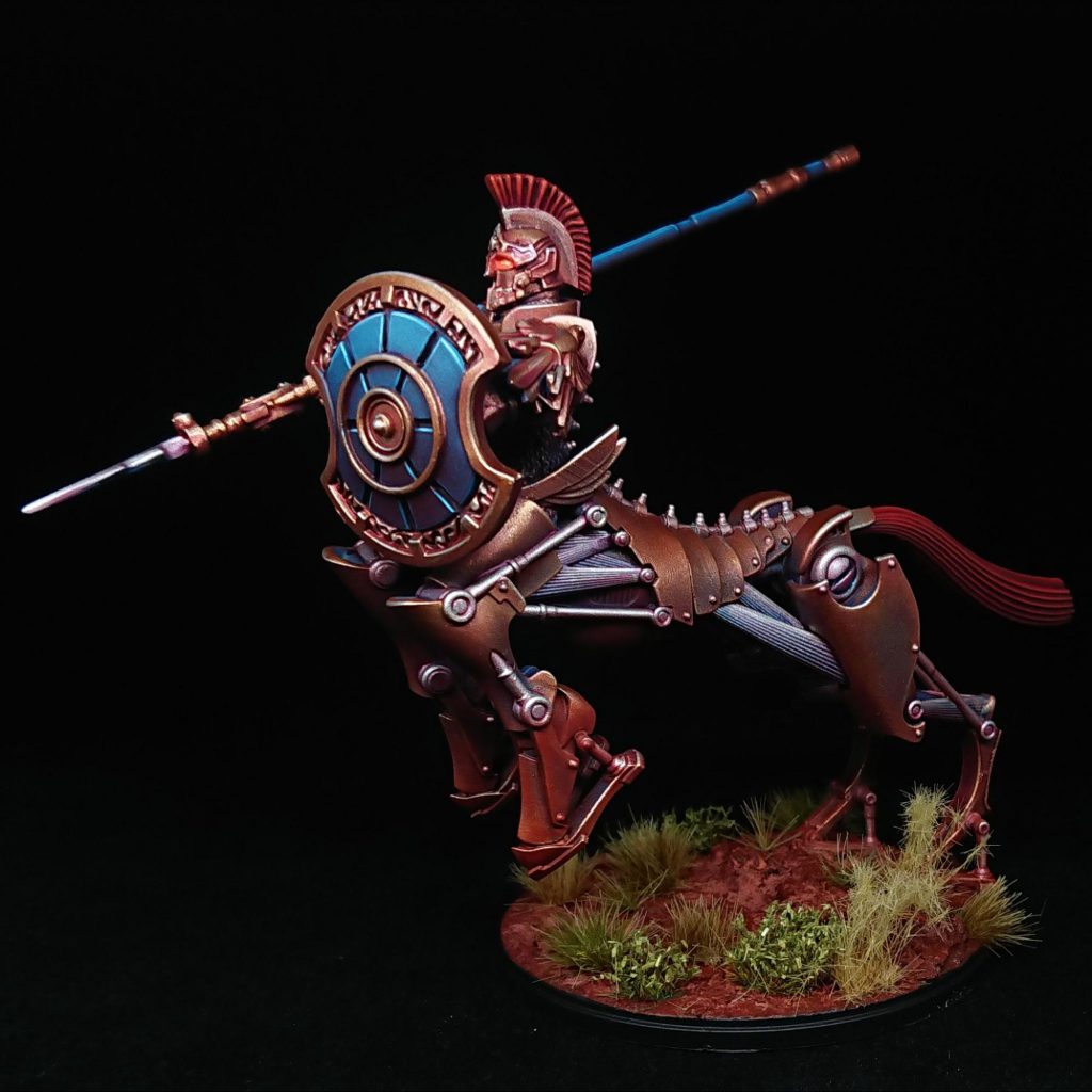
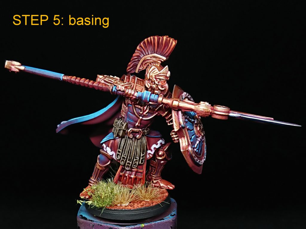
My City States paint scheme tries to lean into the fantasy aspect of the Para Bellum miniatures while being reasonably quick to paint. The broad logic of the scheme is to keep the saturation turned up, even in the metallics, to try and accentuate the techno-mythological elements of the minis. The foundation of the scheme is a red-to-blue airbrush transition and the aim is to allow that to do the bulk of the work for as many areas of the miniature as possible to keep the time it takes to paint each soldier to a minimum. I haven’t totally succeeded in keeping the scheme as fast as I’d like but I’m really enjoying painting it and happy with the results so I reckon that’s more than enough to keep me going.
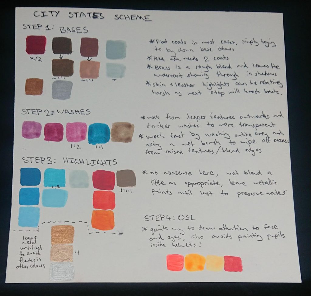
Before I leap into the step-by-step, some notes on paints. I mostly use Vallejo (VMC = model colour, VGC = game colour) with Scale 75 artists acrylics (S75) when I need extra saturation. There is an Army Painter (AP) metallic silver in this scheme for no particular reason and AK fluorescents because I’ve struggled in the past with Vallejo fluoros going lumpy. I use Games Workshop (GW) contrast paints for tinting, usually thinning with extra contrast medium to make the most of the work I’ve done underneath.
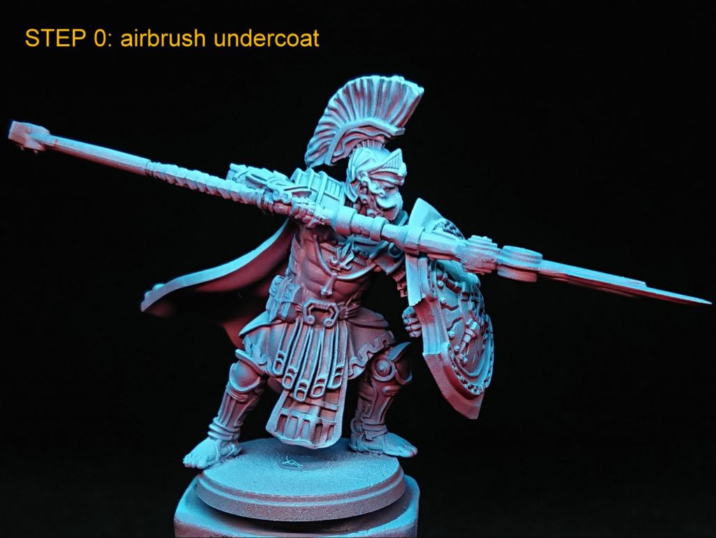
The starting point is a grey primer, over which goes VGC Gory Red followed by layers of VMC Turquoise, VMC Blue Green and final highlight of a 1:2 mix of VMC Blue Green : VMC White. I think the warm red shadows are an effective foundation for the bronze metallics and are intended to work with the iron oxide basing pigments I use later to anchor the miniatures in their environment.
The most boring part is getting down the base colours over the airbrushing. Here I try to allow the airbrush layers to partly show through for the red and metallic areas. There are also some highlights for the leather, skin and white. Highlighting at this stage, before any washes or tints, can allow rougher, faster work to achieve good results, as the next step smoothes out many imperfections. Red is VMC Gory Red, leather is VMC Chocolate Brown with VMC Flat Earth added for highlights, skin (not very obvious on this mini but prevalent elsewhere in the range) is VMC mahogany brown with VMC sunny skin mixed in at 1:1 for the highlight. The white is VMC Pale Blue with White added for the highlight. I leave the metallic base colours until the last stage of this step to avoid contaminating my water jar. The golden metallic is VGC Brassy Brass and the silver is AP Shining Silver.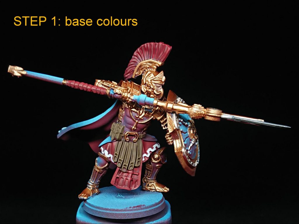
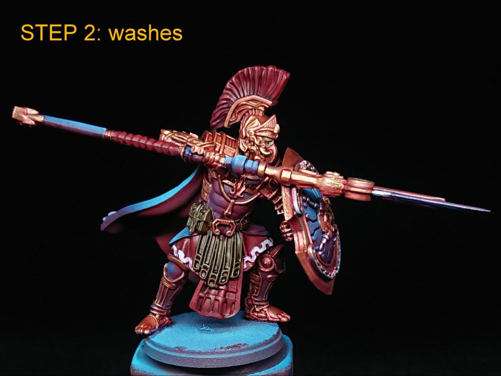
This step is rather fun, but looks a bit ugly so you’ll have to trust me we’re going somewhere worthwhile in the end. I’ve chosen the purple contrasts and I use them to tint areas to make some fantastical hues in the blues and metallics. To give some respite, the leather and skin are relatively desaturated natural tones, but I still wanted them to be tonally different so chose a red-brown for the skin and yellow-brown for the leather. GW Magos Purple tints the blue armour, weapon hafts and shields a darker blue than the cloth, which is shaded selectively with GW Volpus Pink thinned 1:2 with GW Contrast Medium. I use the same mix for the bronze, silver and white parts and neat volpus to shade red areas. The old favourite, GW Agrax Earthshade does double duty for leather and skin. To add a little extra tonal variation on the silver metallics I use GW Akhelian Green, thinned 1:1, selectively in shadowed areas. The general workflow is from deeper features outwards and darker washes/tints to more transparent ones. Where I want to work fast and largely preserve the airbrush transitions I moisten the entire area with a damp brush before applying the contrast paint, and use a clean damp brush to rapidly remove any excess from raised features or to blend edges to avoid pooling and tide marks.
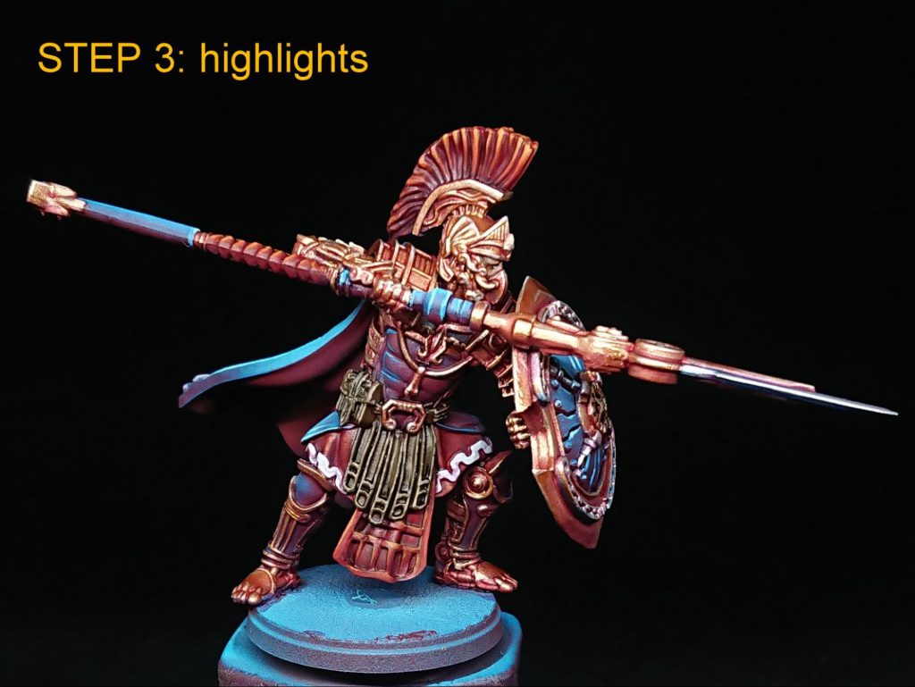
There’s no nonsense here, highlights are just something you need to practice brush control to do quickly and neatly. I do find a little drying retardant very helpful though. I wet blend some of the highlights on areas like the cloak from a glaze-like consistency towards a more pigmented highlight mix. As for the base colour step I leave the metallics until last. Darker blue areas like the armour are highlighted with VMC Turquoise moving towards white, lighter blue areas like cloth are highlighted from VMC Blue Green : White, 1:2, towards white. In both cases I try to only have three highlight mix steps maximum to save time and force myself to be brave. The white areas are highlighted with white, while the leather is highlighted with a 1:1:1 mix of VMC Chocolate Brown, Flat Earth and Dark Sand, trying to add a bit of leathery texture. Red areas are highlighted from VGC Gory Red mixed with S75 Primary Red, to ~1:1 S75 Primary Red : S75 Primary Yellow, with white and extra yellow added for a final highlight step. The metallics are highlighted from VGC Brassy Brass, to 1:1 VGC Brassy Brass : AP Shining Silver, to AP Shining Silver. I don’t highlight the skin areas on any of my city states minis at this stage for this scheme, the logic being that hopefully the highlight at step 1 under the wash from step 2 is sufficient.
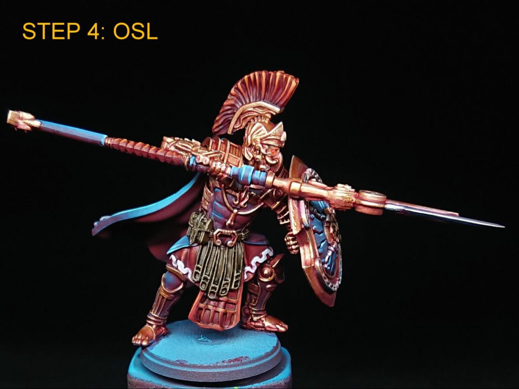
The OSL is a quick way to draw attention to the faces and eyes without having to paint pupils and add an extra steampunk element to the colour scheme. The OSL is a pretty standard workflow from white at the light source, to a glow created by an outer layer of a 1:1 mix of AK Fluorescent Magenta : AK Fluorescent Orange, and inner layer of 1:2, AK Fluorescent Orange : AK Fluorescent Yellow. Highlights add white to the yellow fluorescent mix and S75 Primary Red is used to shade the area and get the definition back, especially around the eyes themselves.
Basing is Vallejo Dark Earth acrylic mud underneath a Vallejo Pigment Rust and New Rust and a selection of tufts. Then I varnish the whole mini with a satin varnish for this scheme. I chose a satin finish because I don’t want to dull the metallics with a matte. A lot of the contrast washes leave a glossy finish that can take a couple of coats of matte varnish to knock back so the satin is also less work, and I personally think the slightly satin effect on the cloth works well with the technologically advanced aesthetic.
Magos Sockbert
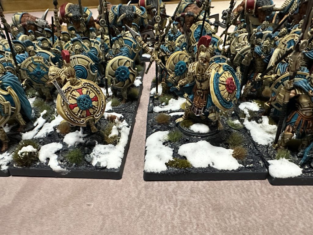
This scheme was designed for one specific reason: speed. I strongly dislike playing with unpainted miniatures (you do you), and Contrast helps solve this problem wonderfully. Of course, me being me, I couldn’t do things too easily, and decided to also experiment with the new Artist Opus round drybrushes. I don’t have a great deal of Lore for my City States (yet!), so colours were picked entirely by what I thought looked cool at the time. I’d test painted some Mechanicum bone and teal years ago, and it seemed just about time to dust that off. One benefit of this scheme is that almost every model in the army uses almost exactly the same paint job across the entire army. The Mechanist in particular had a few different spot colours, but those are pretty easy to work out. I’ll talk mostly about Hoplites, but imagine I’m also talking about painting other dudes as well. I believe in you.
Starting off with priming, I used White Scar. And Grey Seer. And Wraithbone. Really, I used any pale primer I could get my hands on, and I don’t think it made a huge difference across the army. Where possible, I used White Scar for Contrast paints, because I like how much it pops and the new white primers are good enough you can still get nice smooth coat if you don’t… fuck it up. If you do, like that previous awful GW white primer we shall not name, you get a model covered with sand. Don’t do that. Now, I’m a monster, and glued the shields on first; this is fine. I use one of GW’s fancy spray stick things, but a stick of wood and some blu-tak will be more than sufficient. Point is, I didn’t get any coverage issues on any models except the ones I rushed – the scale is so large and wonderful that if it can be seen, it can be easily primed.
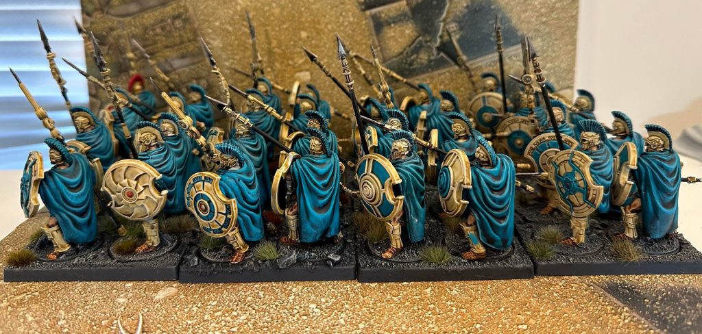
I started painting the model with the cloak, which I painted with Akhelian Green for the cloak, washed with Coelia Greenshade, and then drybrusehd with Adriatic Blue from Scale 75, before a highlight or final light drybrush of Baharroth Blue, whichever felt more appropriate for the importance of the model I was painting. On to the armour! Now, I’m quite good at painting metals; my 40k primary army is Minotaurs, and my 30k army of the moment is Iron Warriors, so I thought I’d do things a little differently and go with a more ceramic vibe. As such, Skeleton Horde was my go to Contrast paint, highlighted by Screaming Skull on the heroes; be careful here, as Skeleton Horde is notorious for pooling badly in ugly gloops. Straps and pteruges (the sort of dangly strap things) were Gore-Grunta Fur and the skin was Guilliman Flesh, and the spear tips were Vallejo Metal Dark Aluminium washed with Nuln Oil Gloss, my standard steel look.
I decided to give every Hoplite a different shield colouring – back during most of the Greek history these guys are supposed to represent, each hoplon (shield) would have had its own cool design painted by its owner or their family, remembering that most Hoplites would not have been professional soldiers, and likely wouldn’t have had much other armour. I’m not a psychopath, however, so they’d have to settle for different variations of teal and bone. I think every one of the 60 odd Hoplites I’ve painted so far have different shields, but I’m not going to lose sleep over it. This was also a paint, because this had the worst example of overspill I complain about below. It’s really not possible to drop a Contrast in these little nooks and crannies without messing up the colour of the walls around where you’re putting it.
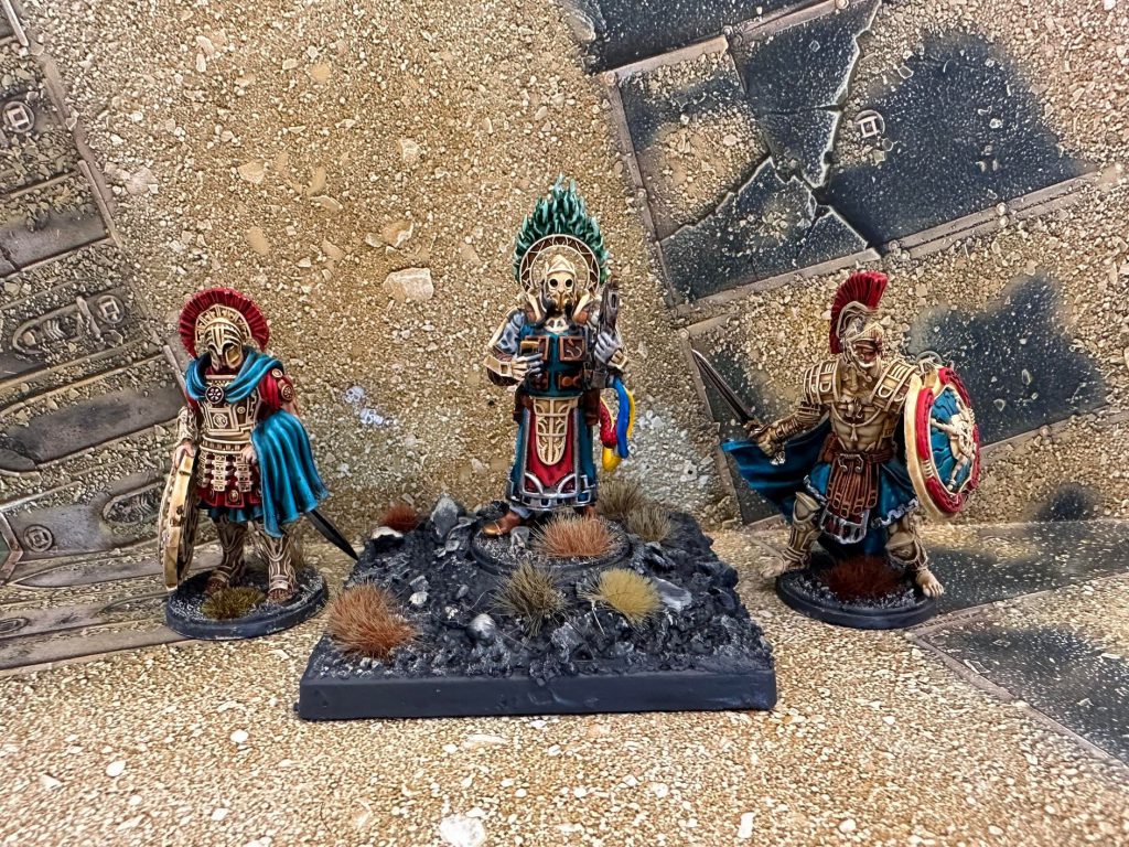
As for details, the leader’s crest was Baal Red with a Carroburg Crimson wash, and nothing else – Baal Red is so strong and well covering that just a wash brings out details. The faceplates of most Hoplites (I know, I missed some…) have a pin paint of Black Legion to just put it into shadow. Black Legion is a very strongly covering Contrast, so it’s not great for painting (it just looks like you painted it black, mostly), but it’s great for shadows or armour ribbing you just need to have a little contrast with. Some models have little accents of gold or gems, but I won’t get into those too much, because they’re largely there because I was bored. A simple Retributor Armour, Agrax Earthshade wash and then spot highlight with whatever shiny metal I had around was all that was needed.
This scheme requires a lot of cleaning up – drybrushing on the cloaks can lead to a lot of overspill, which obviously is a righteous pain when the next colour is cream. Similarly, where I chose to drybrush the armour, overspill onto the teal required patching up as well. Point is, for a scheme specifically designed to go fast, it did not.
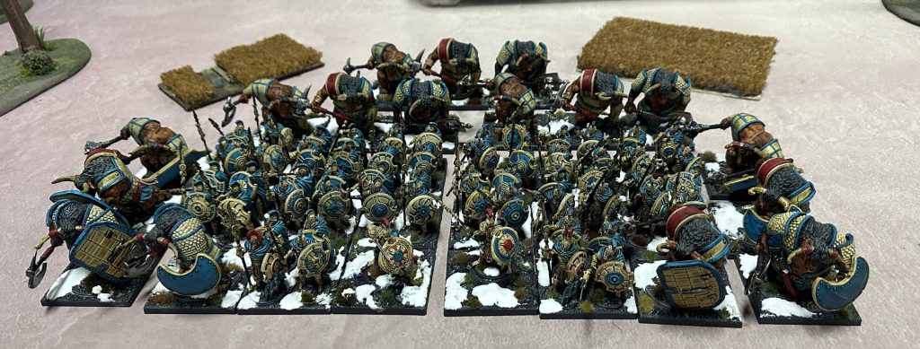
For the Haspists and Thyreans, the skin/fur is Gore-grunta Flesh, and that’s… it. A matte varnish (when the damn thing works) really gets this to look like skin and fur. Just remember to watch it dry, with a pot of Contrast Medium on a brush to quickly wick it away if it starts to pool badly. The horns and hooves were just Skeleton Horde again, washed with Agrax Earthshade. Other than that, it’s just the same paint scheme as my Hoplites. You may notice that the Hoplites skin colour is the same as the minotaurs’ leatherwork, and vice versa. Don’t… think about that too long.
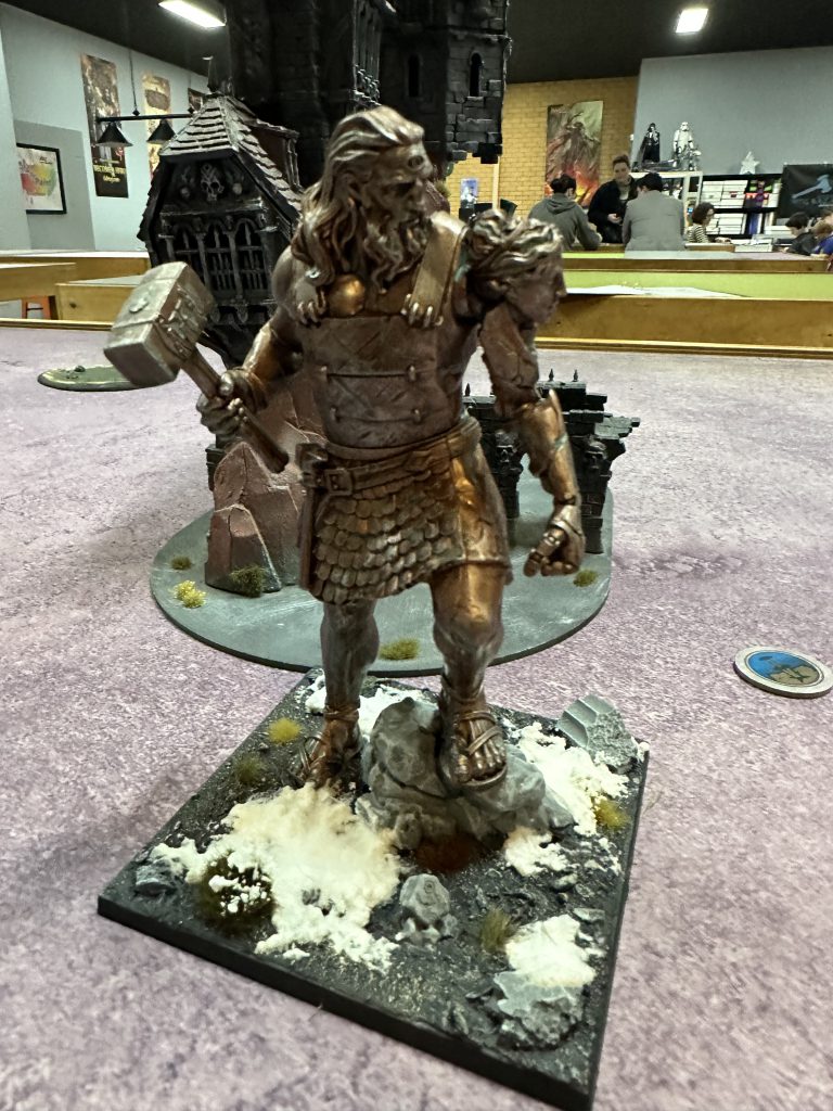
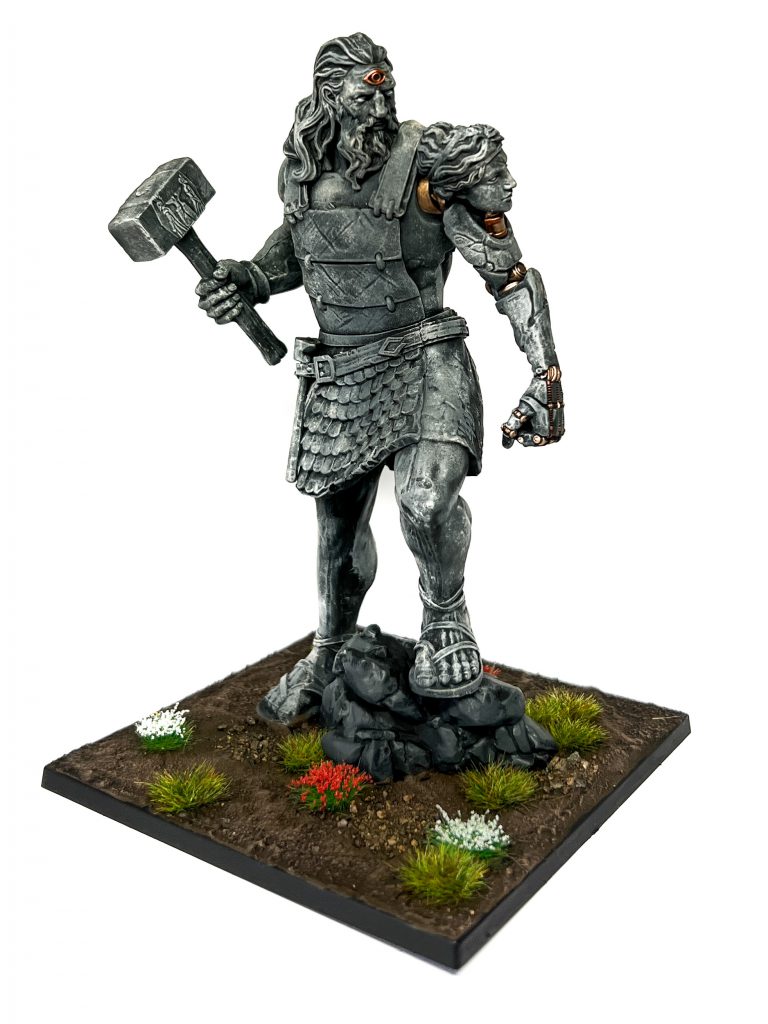
Finally, we have my Prometheans. These were… hard. Bair did a wonderful article about how he painted his here, and I can see why he didn’t go flesh; unless you’re a good painter, this model is damn hard. They’re big enough with enough flat spaces of relatively smooth detail (skin, mostly) that it can look ugly if not done right. Humans know what skin looks like (what a horrific sentence), so doing it not great means it looks far worse than just a badly done metallic. To be clear, this isn’t a knock on the model – it just looks realistic, not stylised like most models. After a few failed test schemes I stripped them, primed them with Chaos Black, and airbrushed them with Vallejo Metal Copper. This gives a very smooth coat, meaning that the Agrax Earthshade wash that goes on over it kind of just doesn’t pool at all. I then used a circular makeup brush to drybrush a few kinds of steel across the whole model – I won’t list them, because I couldn’t remember the first one I did and just fucked around until it worked. I then used Nihilakh Oxide in spots across the model for a verdigris effect, and highlighted some bits with Vallejo Metal Silver and Stormhost Silver, depending on which pot was within reach. This makes them all turn out… fine, but I there isn’t a lot of contrast or definition across the model at a distance. I’m looking at perhaps picking out some bits in gold maybe, but nothing really worked out yet. Stay tuned!
All the bases are covered with my patented mix of sands that I’ve acquired from various access restricted national parks, painted with Eshin Grey and washed with Drakenhof Nightshade, giving a really dark blue-grey. It’s then drybrushed with Tyrant Skull and Terminatus Stone to give it a bit more of a pop against the darkness, before a range of grass tufts were attached (with a dab of superglue – sand is rough enough that tuft glue often isn’t enough). All the Contrast paints have a pretty similar value, so it helps to do something fancy to spicy up the base, give it some contrast to the Contrast. In this case, snow! This is ye-olde traditional modelling snow, just bicarb (baking) soda, a bit of water, and PVA glue to help it set. It goes on real gloopy, and looks ugly as sin until it dries, but you can get a great snow effect with minimal effort. If you want to be fancy, a few drops of white ink can really make it pop (I use Liquitex Titanium White). Now, key bit here: put your grass tufts down before you do the snow. I’ve lost track of how many models over the years have weird tufts growing on top of snow because I just forgot… You’ll also notice that this goes on around the base rims, over the whole stand. This kind of gently glues the model to the base, but still allows me to remove it if I really need to play First Blood, which can then be fixed by some light snow effect when I reattach them. Given I’ve now started gluing my W’adrhun to the stand directly, not sure how much use I’ll get out of this, but an option is still an option!
Have any questions or feedback? Drop us a note in the comments below or email us at contact@goonhammer.com. And if you want to get 10% off and support Goonhammer, make your Conquest purchase by clicking here for US/Canada or here for EU/rest of world and enter code “goonhammer” at checkout.
Don’t forget to check out Tom at @twb_paints on Instagram to find more of his wonderful work on Conquest and Infinity!

![[40k] Competitive Innovations in 10th: Death Beckons pt.2](https://d1w82usnq70pt2.cloudfront.net/wp-content/uploads/2020/01/Analysis_Banner.png)
