“Glaze: A thin coat of transparent or translucent paint used to modify the tone of an underlying color. Glazes can alter the chroma, value, texture, and hue of a surface. They are composed of a large amount of binder or solvent mixed with a very small amount of pigment.” – MoMA Art Glossary
Let Me Be Clear…
So a glaze is a very thin layer of transparent paint, but what does that mean? Well, this is a great opportunity for me to have a little gab about paint opacity. If you ever shop in a proper art shop for paints, you will almost certainly see one of these little fellows on the label of whatever paint it is you’re interested in purchasing, sometimes with a key as to what it means, but more often not, just a little square either filled in, empty, or half filled. This symbol indicates the Opacity of the paint, that is to say, how much light it lets through to the layers underneath (how opaque it is).
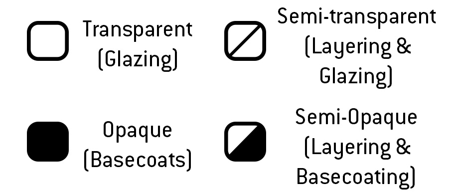
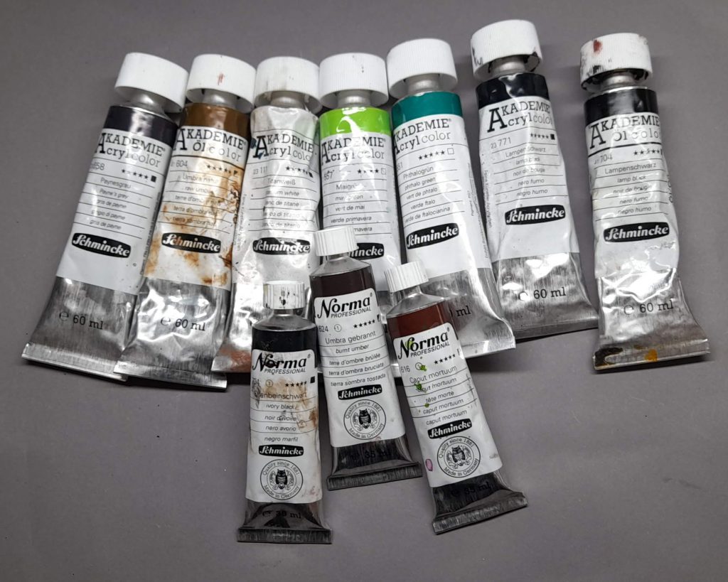
Now, miniature paints almost never have these symbols on them (and honestly, I wish they would), instead often using descriptive language in their marketing to attempt to explain how opaque their paints are. An example: Citadel separates paints into several categories at the point of sale, so if you buy, say, a pot of Bugman’s Glow base paint, you can be fairly confident that it’ll cover reasonably well.
On the other end of the scale are watercolours (not relevant for us, but they are) artists inks, certain colours of normal acrylic (magenta and yellow are often pretty transparent, for example) or the more recent deluge of transparent paints designed to go over a white or off-white basecoat (AP Speedpaint, Citadel Contrast, Vallejo Xpress Colour et cetera), these paints do vary somewhat, but almost all of them allow most of the light through to the layer underneath. Citadel used to sell some very highly-regarded Glaze-specific paints, but they stopped, presumably in order to eliminate confusion with the Contrast line. A thin layer of these paints on a flat surface will (sometimes drastically) alter the hue and chroma, while leaving the value largely unchanged.
It wouldn’t be a keewa Hobby 102 article without some handy-dandy homemade diagrams, so let’s have a look at some diagrams.
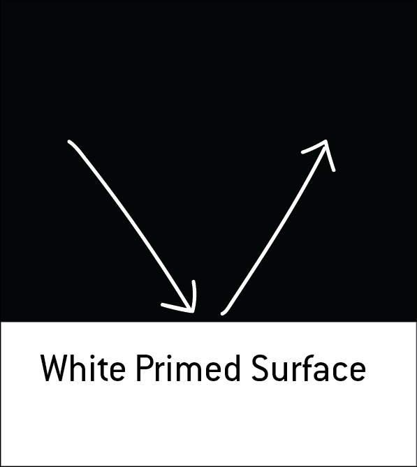
In Figure 1 we can see that when white light meets a white surface, it bounces off (reflects) unchanged.
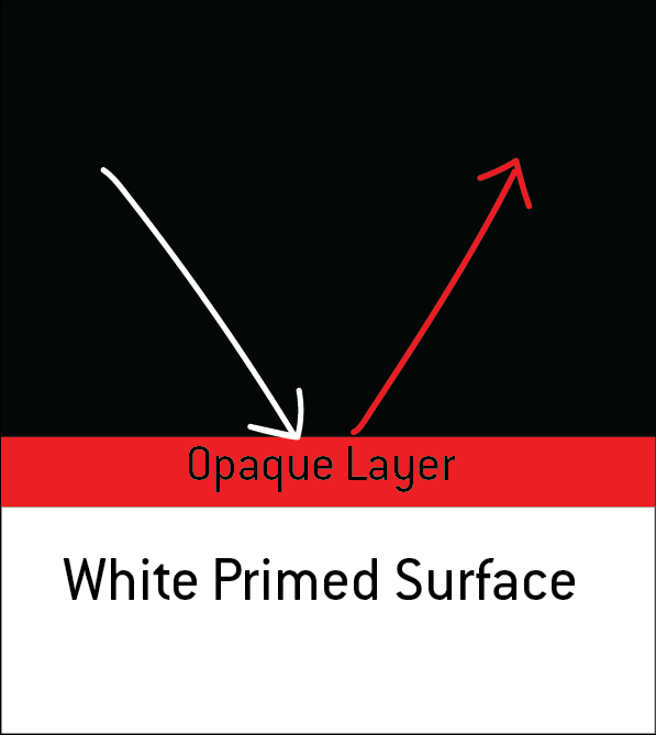
In Figure 2 we can see that by adding an opaque layer, we’re blocking all the light from reaching the white surface, all of the non-red wavelengths are absorbed and so only red light is reflected back from the surface (to which our eyes and brains go “hmm.. it’s red.”)
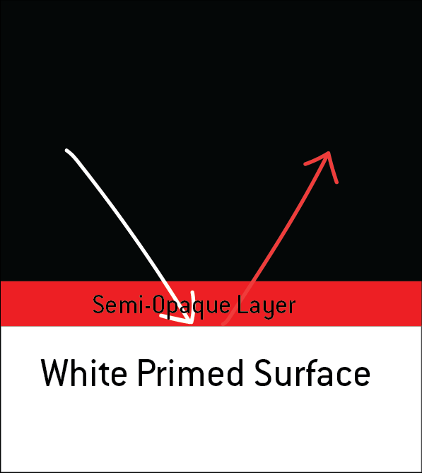
In Figure 3 we can see that a semi-opaque layer still lets some of the light reach the white surface, because the red layer is sort-of see-through, so the light that comes back as a reflection is a mix of red *and* white, the semi-opaque nature of the layer means that the ratio is more red to white, so the colour is a kind of light-red/pink.
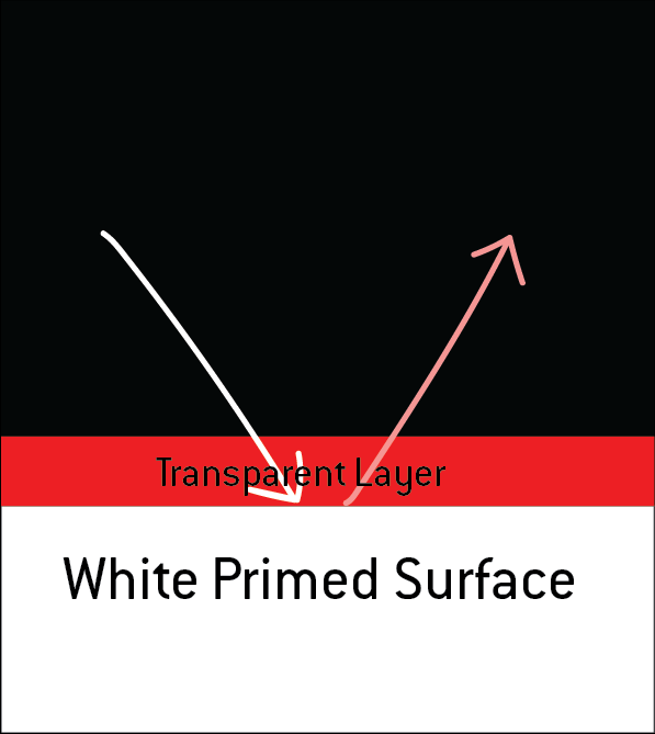
In Figure 4 we can see that more of the light reaches down to the white layer and bounces back, let’s say that half of the light, then we can say the light reflected will be pink.
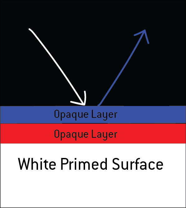
In Figure 5 we can see that by sticking an opaque layer of blue paint on top of the red, none of the light reaches through to the red layer and is bounced back blue. Simple, isn’t it?
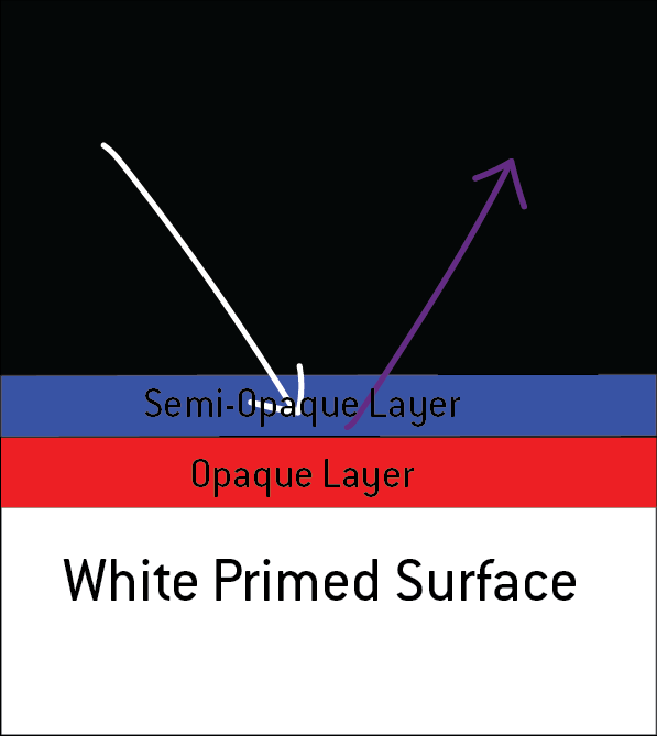
Figure 6 shows the effects of a semi-opaque layer of blue paint in very much the same way as before, only instead of mixing with the white, this time it’s blue mixing with red. Since the blue is semi-opaque, we can say that more light bounces off the blue than the red, and therefore we get a bluish purple.
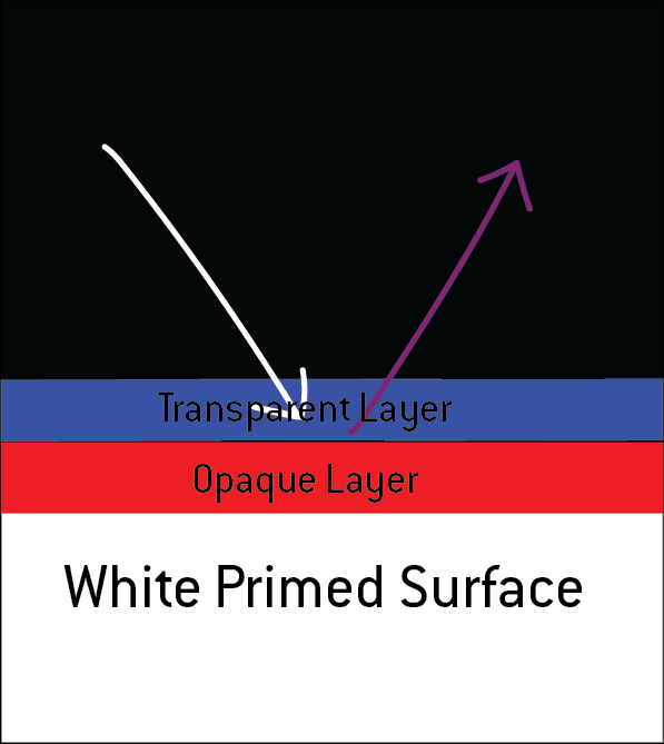
…and finally, Figure 7 shows a transparent layer off blue over red, since the layer’s transparent, let’s say that it’s 50:50, resulting in a more reddish or neutral purple.
Does that make sense? I sure hope so.
Why Glaze?
Glazing is simply applying this theory into practise. In a miniature-painting application, glazing is great for several things:
- Adding interesting shadows and depth to models, since most glazes tend to be on the darker side, you can use them to softly shade the undersides of volumes and achieve nice smooth results.
- Smoothly blending from one colour to another, since the undercoat largely stays visible, and the layers are so transparent, you can build up a very fine gradient
- Changing the hue of paint you’ve already put down, say you’ve painted a cloak in a bright blue colour, but you’ve changed your mind and would rather it was turquoise, you can glaze carefully with a green or turquoise ink to shift the hue towards your desired result.
- Painting over a monochrome underpainting (En Grisaille/Slapchop), since the paints are transparent, all the highlights and shadows will show through, you’re effectively adjusting the hue and chroma, after all.
Glazing is no good whatsoever for:
- Painting over black, no matter how much you glaze either the black is going to show through, or you’ll put down so many layers of paint that by the time you get it where you want it, you’ll have applied so many layers that the detail is filled in and smushed.
How to Glaze?
Glazing involves thinning your paint until it’s transparent, loading up your brush, and wicking off the excess onto a cloth or paper towel or whatever. It’s important to do this because otherwise you might flood your model and make some ugly tide-marks and dark spots. Then paint the glaze smoothly onto the surface, moving from the place where you want the least paint to settle to the area where you want the most. Then all you do is let it dry and go again, in a smaller area this time, it’s like… layering, but with transparent paint.
Have any questions or feedback? Drop us a note in the comments below or email us at contact@goonhammer.com. Want articles like this linked in your inbox every Monday morning? Sign up for our newsletter. And don’t forget that you can support us on Patreon for backer rewards like early video content, Administratum access, an ad-free experience on our website and more.
