Over the years the Goonhammer crew have put together a vast and expansive library of painting guides. Appropriately titled “How to Paint Everything” we’ve got schemes and recipes for hundreds of models. They all, however, assume you know the difference between wet blending and glazing or what the hell “zenithal” means. Welcome to Hobby 102. This series will lay the groundwork to teach you the fundamentals and best practices to make your models shine.
The Hobby 102 series is sponsored by The Army Painter.
Welcome back to our series of articles wherein we elucidate concepts that you can apply to take your hobbying to the next level. Today we have a “primer” (haha, geddit?) on the very complicated subject of colour theory (nerr nerr to any Americans reading this, colour has a U in it). Since, at its very heart, miniature painting is essentially an exercise in colouring in, an understanding of this topic will improve your painting, and how you create and implement colour schemes for your miniatures.
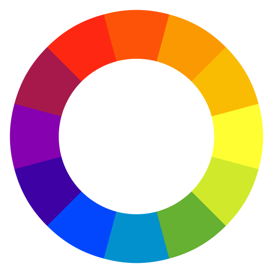
You’ve probably seen this fella floating around on the internet before, the venerable Colour Wheel, your friend and mine in all artistic endeavour. But what does it mean? How can we use the colour wheel to strengthen our understanding of what colour is? How do colours relate to one another, and how does their combinations affect our very psychology? Well, all very important topics, but let’s start with a quick rundown on what “colour” means when it comes to painting.
Colour is all about which wavelengths of light are absorbed and which are reflected by various objects, they interact with the sensor in your eye and you can see them, yada yada, we all know that from science class in school. But paint is a little different to light itself. If you mix equal parts of every colour of light, you get white (this is called Additive Mixing), if you mix equal parts of every colour of paint, however, you’ll get a dark brown (this is called Subtractive mixing). The reason this happens is that when you mix pigments together, you increase the number of absorbing pigments, and thus the only wavelengths that get reflected are ones that the pigments in both paints reflect.
Attributes Of Colour
Each colour has three important attributes that determine exactly how our eyes perceive it. These are:
- Hue – The Hue value tells us where a colour sits on the spectrum, essentially which pigments are in the paint we’re using.
- Saturation – This tells us how.. well, colourful each colour is. Saturation is all about how much of each pigment is in the paint we’re using.
- Value – Tells us how light or dark a colour is. From the palest yellow to the darkest navy blue, each colour has a relative value.
There are a few different kinds of colours when it comes to paint. Primary, Secondary, and Tertiary.
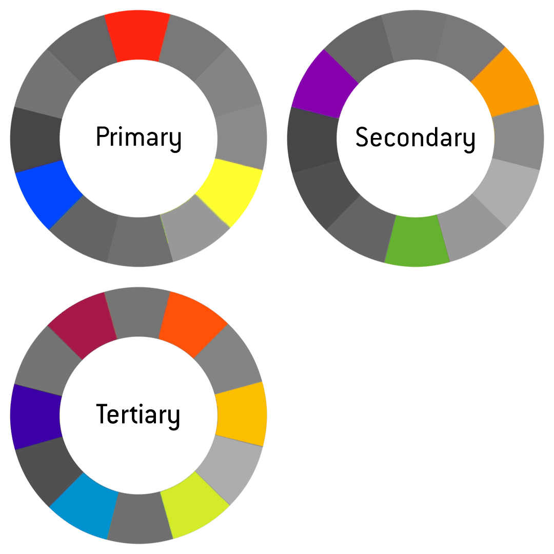
- Primary – Primary colours are the most basic colours available: Red, Blue, and Yellow. What makes primary colours… well, primary, is because they are the only colours that cannot be made by mixing other colours. No matter how much red and yellow you mix together, you will never be able to create blue.
- Secondary – Secondary colours are the colours produced by mixing an equal amount of two primary colours. On the colour wheel, this means that each tone is exactly equidistant from its parent tones. The secondaries are Orange, Purple, and Green.
- Tertiary – Tertiary colours are created by mixing an equal part of one primary colour with an equal part of a secondary colour. These are the other tones not covered by either primary or secondary. The tertiary colours are Vermillion, Amber, Chartreuse, Teal, Violet, and Magenta, or Red-Orange, Orange-Yellow, Yellow-Green, Green-Blue, Blue-Purple, and Purple-Red, if you’re boring and unimaginative.
Paint is essentially infinitely mixable down to the molecular level, so of course there are Quaternary and Quinary colours (and many many more) but for the purposes of this explanation, we’re going to ignore them.
What About Black and White? Brown? Pink?
Black and White, our old friends, paints that every painter should have in abundance because we use them a lot. “Why aren’t they on the colour wheel?” I hear you cry! There’s a good reason for that, because they are Achromatic. Black, White, and their lovechild Grey completely lack one attribute of colour, (the only attribute the colour wheel shows, incidentally) – Hue.
One major benefit of being achromatic is that Black, White, and Grey, are able to sit comfortably beside every other colour without clashing. Yep, that’s right, black really does go with everything. A cousin of these neutral colours is brown, which also doesn’t appear on the colour wheel, not because it’s achromatic, but because it’s created from a mixture of complimentary colours (red + green being a common recipe for brown), meaning that it is hue neutral.
Black and white are also really useful as paints to mix with other paints, allowing the painter to adjust the value (light and dark) of the colour. However, if you mix a paint with black or white, you not only alter the value but also the saturation, because you’re essentially adding achromatic pigments to the paint, which will reduce the overall number of coloured pigments in the mixture, thus the result is less saturated. Thus, colours like pink and sky blue, which are desaturated and brightened versions of magenta and primary blue, created by mixing in a good amount of white.
Colour Relationships
Okay, so far so good, we know more about why colours and paints are the way they are on a mechanical level, but what about psychologically? What about how they make us feel? There we need to discuss colour relationships and how different colours combine and contrast to produce interest.
Complimentary
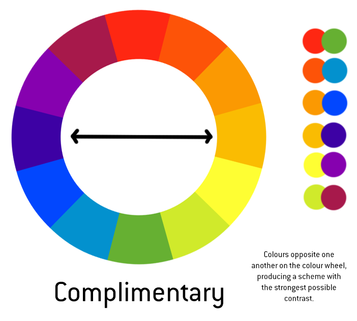
The most used colour scheme of them all, employing complimentary colours is a quick shortcut to bold, striking colours that attract our attention, providing a visual richness that pleases the eye. The colours being so far apart adds an element of tension that draws you in.
Analogous
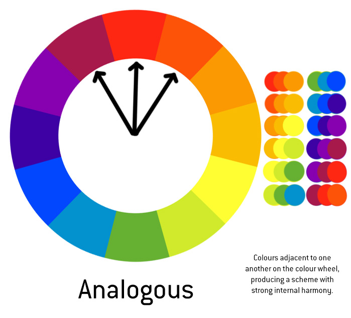
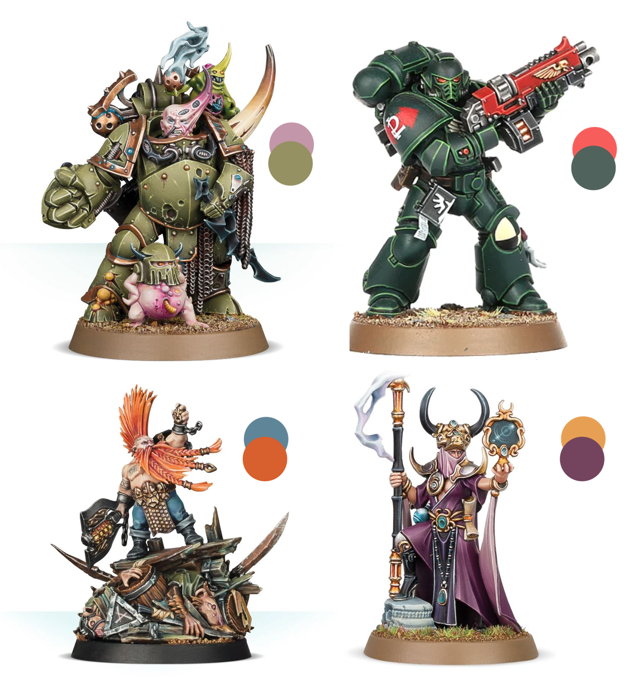
Analogous colours are adjacent to one another on the colour wheel. This adjacency means that the hues are very close to one another, which limits the colour contrast. Analogous schemes are more harmonious while being less intense and more pleasing than Complimentary schemes.
Split Complimentary
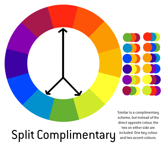
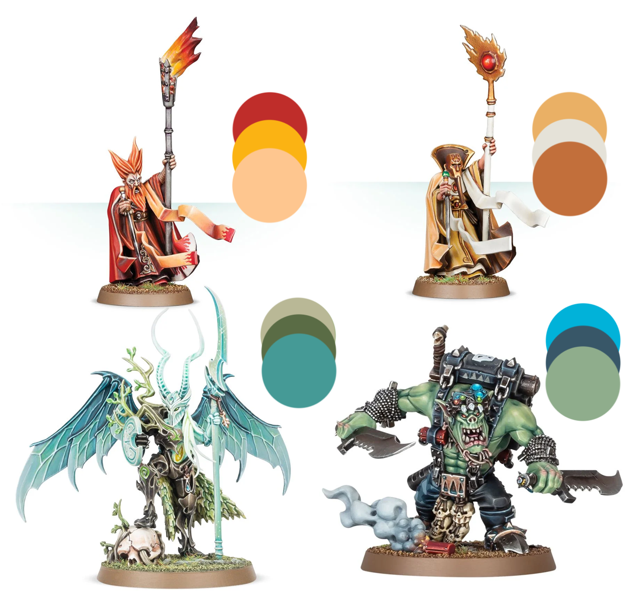
Split Complimentary is similar to complimentary, but instead of choosing the direct opposite and leaving it at that, it uses three tones instead, a main tone, and then a colour on each side of the direct opposite. The two contrasting colours can be directly adjacent or a little further away from the oposite, but they must be equidistant from the direct opposite in order to produce a balanced scheme.
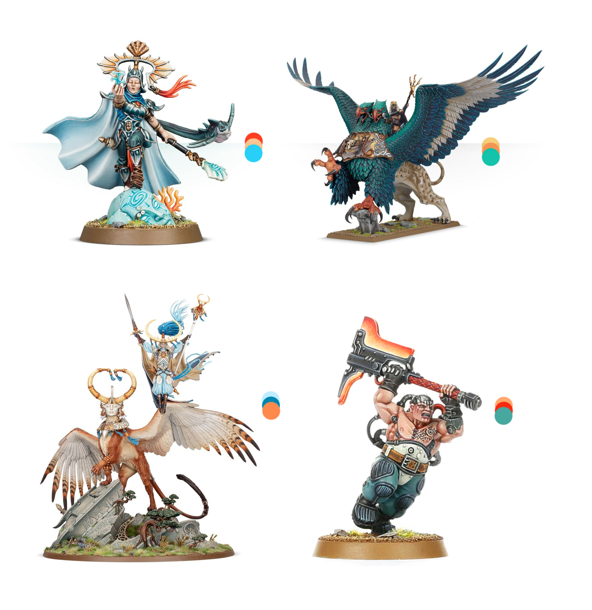
Triadic
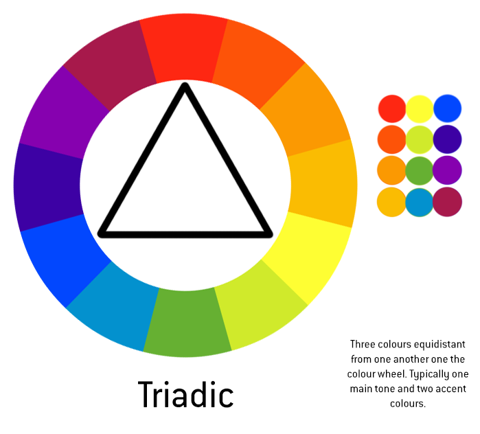
Triadic colour schemes are essentially split complimentary schemes that have been taken to their logical conclusion. Each colour is an equal distance from the others, meaning that the overall balance is… I dunno, quite sturdy? There are “only four triadic schemes available,” so they’re much more limited than all the others, but they can be as striking as a split complimentary scheme. The Primary and Secondary colour groups are each examples of triadic colour schemes.
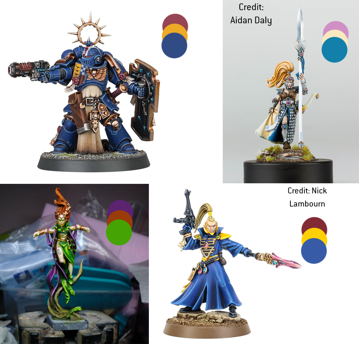
Tetradic
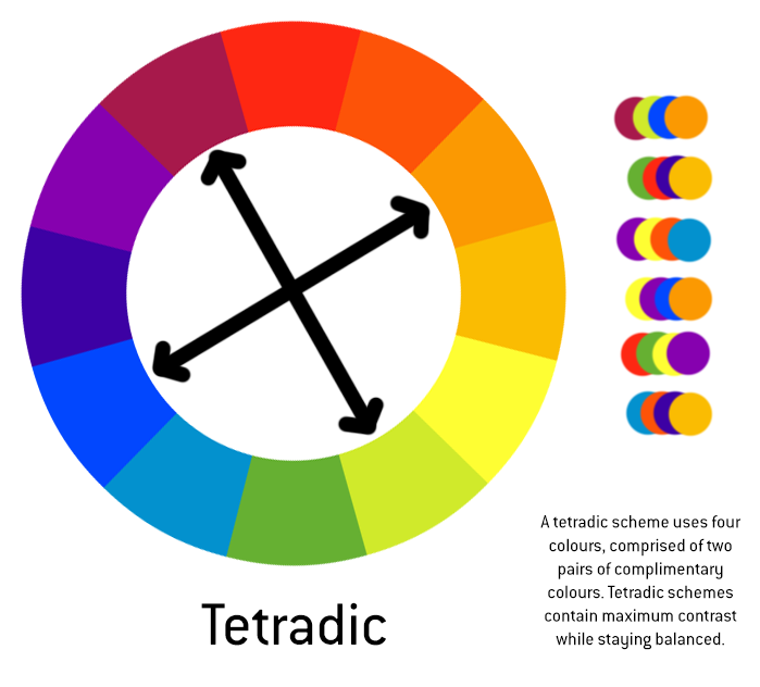
We’re really getting into the weeds now! Tetradic (from the Greek tetra, meaning four) is a scheme that consists of four colours, comprising two pairs of complimentary colours. These schemes are about as vibrant and punchy as you can get, delivering maximum colour contrast without being lopsided.
If we go back and look again at our Plague Marine from earlier, we’ll find that there’s a second complimentary pair hiding in plain sight. The gold and verdigris together create a subtle complimentary pair, making this scheme tetradic instead of simply complimentary. You see how ridiculous this can get? 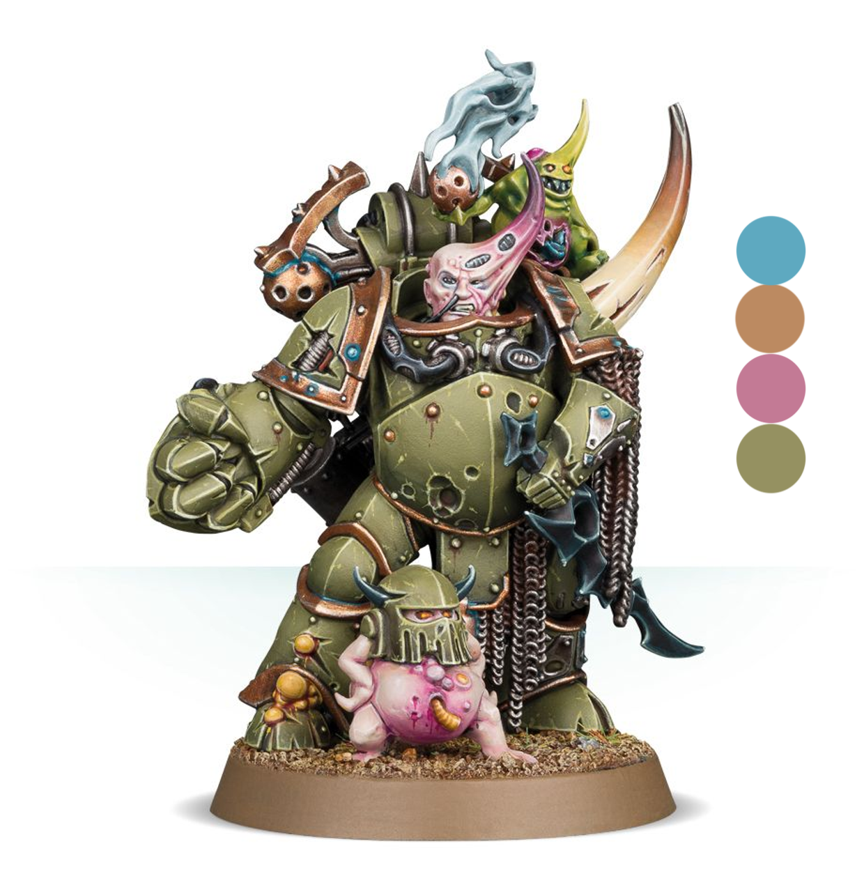
Now you know about these schemes, you’re going to see them everywhere you look, like you’ve just put on the sunglasses from They Live. If you look at the official box art pictures from GW you’ll notice that most of them follow these templates to some degree or other, so when you create your own schemes you can be confident that they’ll look good. I do hope I haven’t ruined the mystery of visual media for you, but those are the risks we take, aren’t they?
