If you haven’t already read the Hobby 102 Colour Theory article, I recommend you give that one a look first; I’ll be referring to plenty of Colour Theory concepts here and I’m not going to restate that article again. You have been warned!
Say you’re in the middle of painting something and you need a certain colour, you reach into your paint rack and realise – gasp! You don’t have it! Among all the pots and bottles in your alchemist’s desk, that colour is just not there! What can you do? Or perhaps you’re painting something and decide you want to up your game and take complete control over the colour you’re using, rather than having hundreds of different bottles of slightly different colour. My friend, it is time to enter the world of mixing paint.
Presumably you’ve been to primary school and therefore know at least a little bit about mixing paints, but just in case you were raised in the woods by a family of bears (and yet are perfectly capable of reading English) I’ll briefly go over the very basic bits of mixing.
When it comes to paint, there are three primary colours (red, yellow, and blue) and, in simple terms, this means a colour or tone that cannot be produced by mixing other colours together. No matter how much you mix, you’ll never be able to produce primary red, blue, or yellow (or black and white). The purest forms of these colours can only be created with unmixed pigments. Now, that isn’t to say there aren’t pigments that are not represented by these primary colours – there definitely are – but pretty much every other colour can be made from the basic building blocks of these five ingredients.
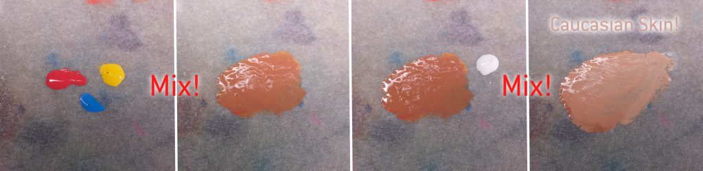
These formulas, or recipes, can be dead simple (equal parts yellow + blue = green) or more complex (yellow + red + a tiny amount of blue + white = Caucasian skin tone).
What is Paint, Anyway?
Paint is essentially a mixture of three things:
- A pigment, which is just something that is coloured; often it’s an oxide of some metal, but many things can be used as a pigment – the colour ultramarine was traditionally created by grinding lapis lazuli gemstones into a very fine powder, and in a more grisly affair, “mummy brown” was a highly prized pigment made from actual ground up mummies looted from tombs in Egypt (…yeah),
- A medium, which is something that will help the paint move around and spread, and will evaporate when it dries,
- and a binder, which is something that binds the pigment together to form a coat on the surface.
For miniature painting applications, the medium is mostly water or water-based, and the binder is mostly acrylic (unless you’re one of those cool daredevils that use oil paint and enamels), but in the past artists have used all sorts of things as binders, from egg whites to beeswax and linseed oil. Prior to the industrial revolution, artists would typically make their own paints by grinding their pigments (which were often toxic, gross, or both) and mixing them with their binder of choice, but nowadays we can skip that part and buy lovely ready-made paint in tubes or bottles. When paints are mixed, the pigment particles come together in the binder and change which wavelengths of light the paint absorbs and which it reflects.
Tones, Tints, and Shades
So we understand that mixing red and yellow makes orange, yellow and blue makes green, blue and red makes purple and so on (the secondary colours), but why does mixing red and white make pink, rather than a brighter red? Well, that’s because when you add white to a colour, you introduce white pigment particles to the mix, and while that does lighten the colour in terms of value, it also changes the chroma of the mix as the presence of these uncoloured pigments effectively reduces the ratio of coloured pigment in the overall colour. This is called a tint. So what we called pink is essentially a tint of red. This diagram displays what pink paint looks like on a particle level, you can see that the red is both lightened and desaturated by the addition of white.
If we keep the red, but swap the white in the mixture for a grey that’s 1:1 black and white, we’ll get something called a tone. The value is pretty much the same as the original colour, but the chroma is reduced, the tone is much more muted. This tone is called rose vale, by the way.
Now if we use the same red, but swap the white for black, we’ll get what’s called a shade, for obvious reasons. The value and chroma are both very different to the original colour, sort of in the opposite direction of the pink. This colour (blood red) looks almost brown.
In each of these cases, the value and chroma have changed, but the hue has not. When it comes to painting miniatures, these concepts are useful to know, because they inform how we form our decisions when it comes to mixing paints. You could shade your red by mixing black into the original, and you could highlight your red by mixing in white to the original tone (although your Blood Angels might look a little strange with pink highlights.)
What About Brown?
If you’ve ever seen a rainbow you’ll notice that one of our most common colours is missing. Brown doesn’t feature on the rainbow, because by and large brown is a compound colour formed by the interaction of two complimentary colours. I have to caveat basically everything I say here because there are about a billion exceptions to every declarative statement; although this topic is very widely researched and written about, it’s still not completely set-in-stone.
So if we take a look at our mix some red with green we get a brown. I say “a” brown because there are lots and lots of different types of brown depending on exactly what gets mixed with what, ranging from beige and ivory at the lighter end of the scale to bistre and van dyck at the darkest.
As you can see from the diagrams I’ve made, (which are grossly oversimplified) the amount of each colour in the final mix is absolutely not even, some browns have much more of one primary colour in them than the other two.
Beige, for example, has only a trace amount of blue, while yellow and white dominate the mix, making it a very light, warm, brown; bistre, on the other hand, has a lot of blue and black, with less yellow, making it a very dark, cold brown. By adjusting the ratio of these core elements, the primary colours, black, and white, we can make just about any colour you can think of through mixing.
Some great artists have painted their masterpieces using nothing but shades of brown, like this self-portrait from Rembrandt. 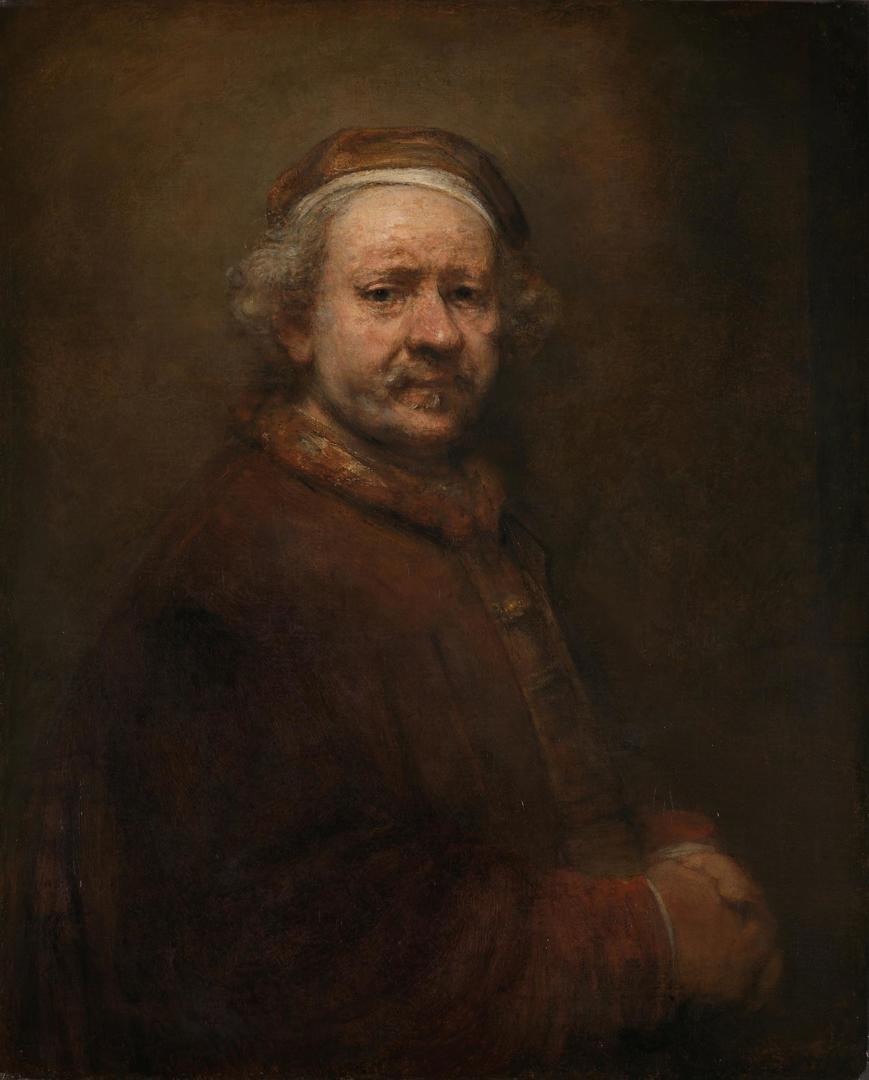
Kneel Before Zorn!
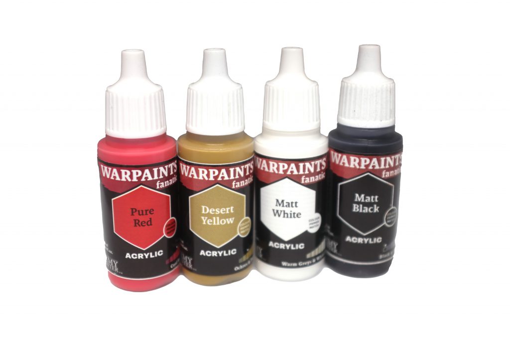
 Let’s take a minute for a little diversion into art history and talk about an artist named Anders Zorn, a well-respected portraitist from 19th century Sweden, Zorn is known among artists for the brutal simplicity of his preferred palette of flake (lead) white, yellow ochre, vermillion, and ivory black. You might think that such a limited palette must put serious restraints on the kind of painting you can do, but you’d be surprised just how much tonal variation can be achieved simply by mixing those four colours, especially when it comes to his classic evocative portraiture.
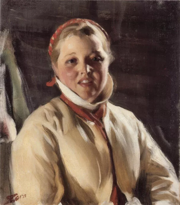

Wait, where does that delicate green come from? There’s no blue in the palette! My friend, that is where you are wrong! You see, ivory black is ever so slightly blueish, a teeny tiny amount, but when you mix it with other paints that extremely subtle tint comes out and therefore Zorn used it alongside the yellow ochre to mix very subtle olive greens for his work.
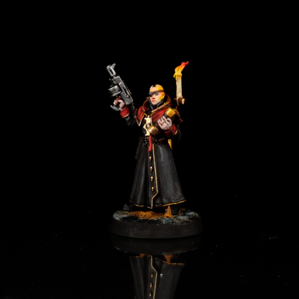
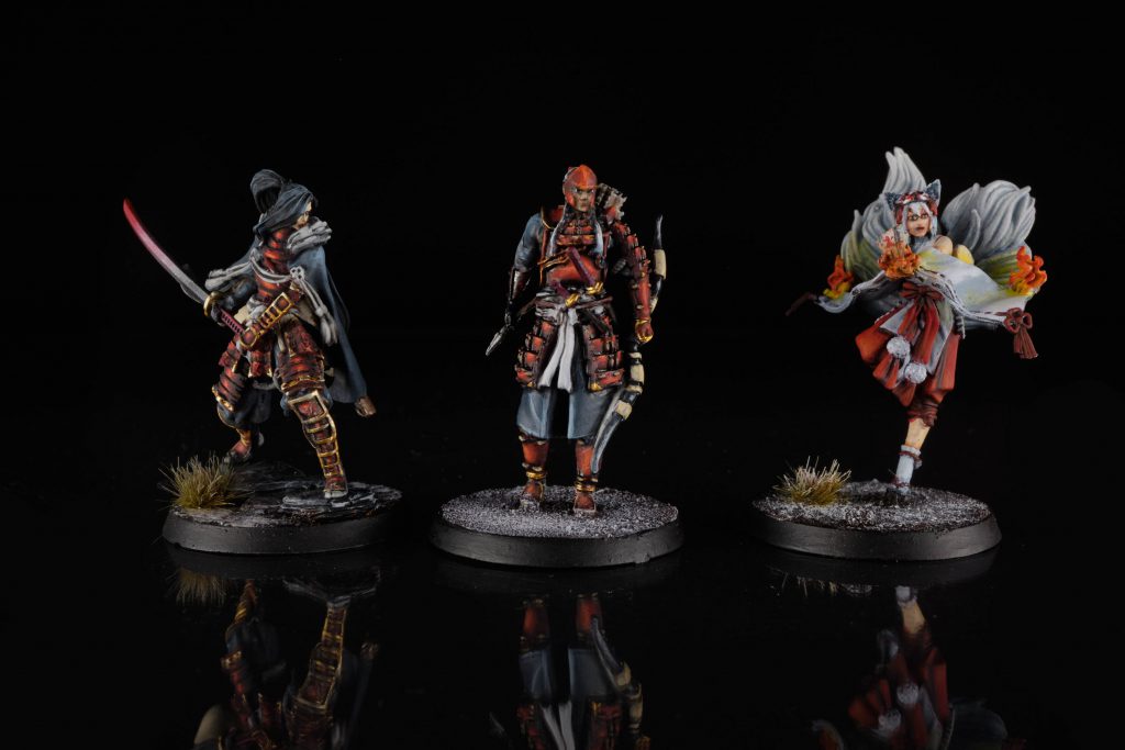
Okay, but what does that have to do with miniature painting? We’re not painting with oils on canvas here! Well, that’s true, but we can still take lessons from the Zorn palette and use it in our own work as miniature painters. Here’s a bunch of stuff I’ve painted either mainly or only using the Zorn palette (plus a bit of silver for mixing metallics).
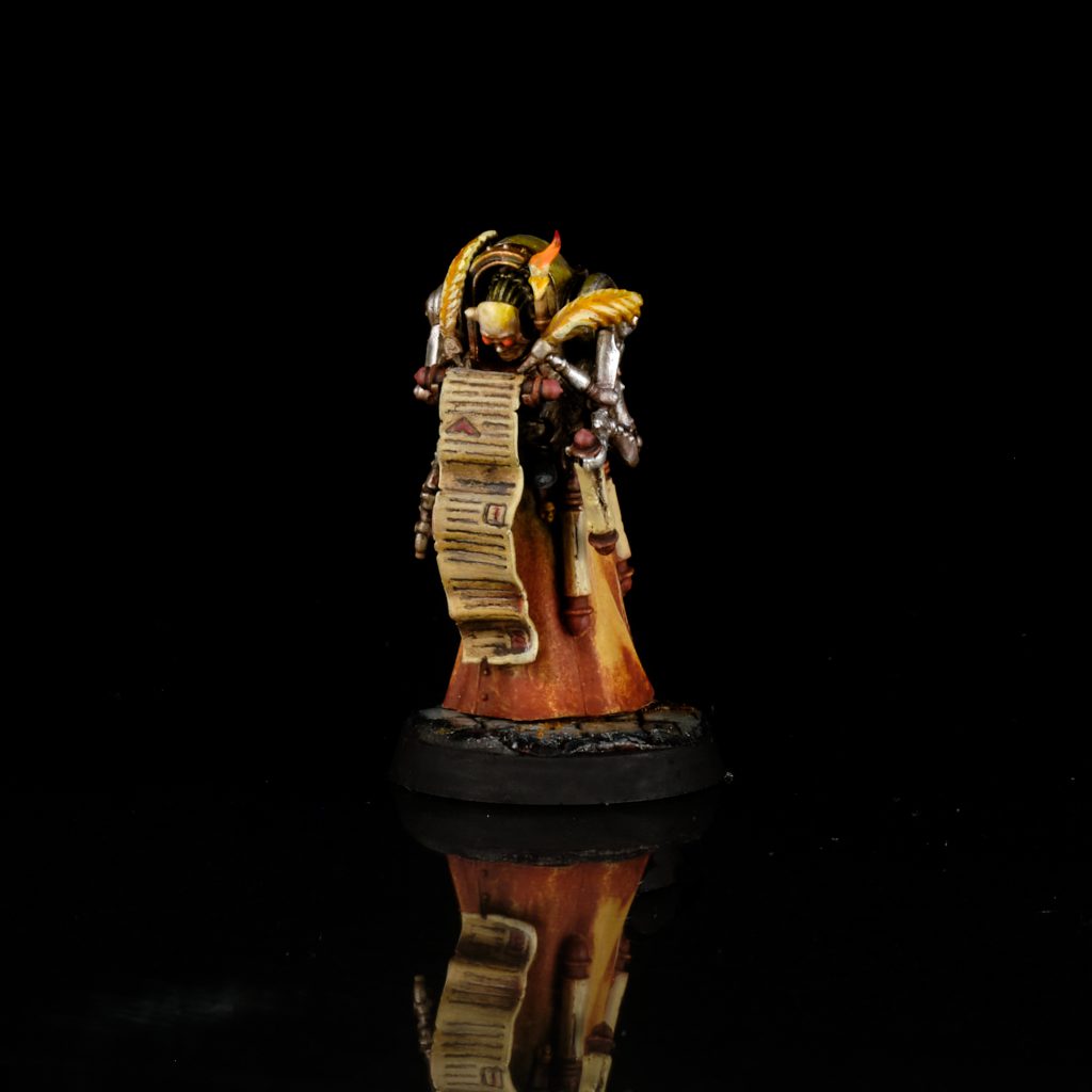
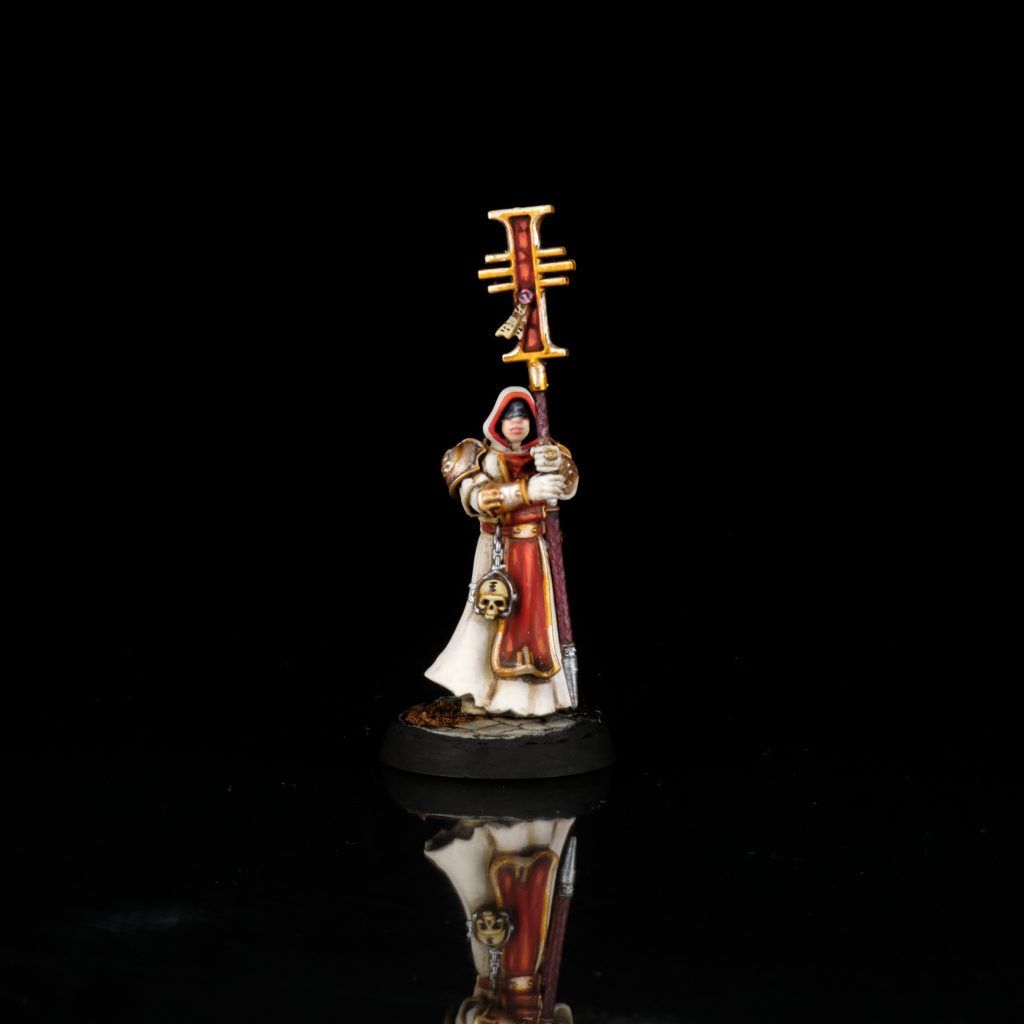
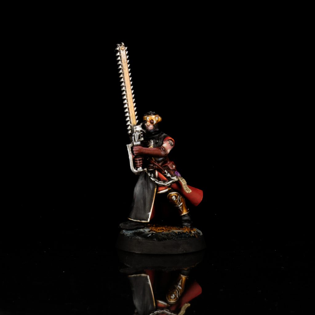
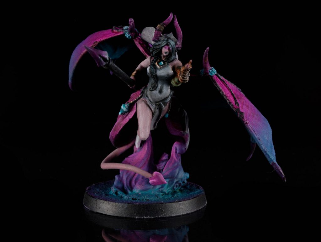
Learning to produce these different colours by mixing from only four paints is a great way to expand your ability and confidence with colour mixing. Give it a try! All you need is a wet palette and those four paints. Setting arbitrary limits and restraints upon yourself gives you an opportunity to experiment and grow as an artist. It doesn’t even have to be the four colours Zorn came up with, find a colour scheme you like and challenge yourself to paint a whole model using only a small handful of paints, for example: I painted this succubus lady from Eldfall Chronicles using only magenta, turquoise, orange, black, and white.
M-m-m-my Magenta
Let’s talk for a moment about the colour I just mentioned there, magenta. Magenta is a weird colour that, in pigment terms, has only really existed for fewer than two hundred years when a French boffin named François-Emmanuel Verguin synthesized it chemically. He called it fuchsine after the similarly-coloured fucshia flower, but it was renamed after a place called Magenta in Italy. Magenta is an interesting colour in several ways: It is extra-spectral, which is to say that it doesn’t appear in the spectrum of visible light – try and find magenta in a rainbow! You can’t do it; it isn’t there. Another quirk of magenta is that it cannot be mixed from other colours. No matter how much you fiddle around with red and blue, you will not be able to get a pure, bright magenta. Dirty violet perhaps, but not magenta. I really have said that word too many times in this one paragraph; it’s become a bit too saturated (just like magenta!)
It’s CMY, k?
But, how can that be? Surely that makes magenta a primary colour? That’s right! Magenta is a primary colour, and so is cyan. You see, that whole “red, blue, and yellow are the primary colours” thing is totally old hat, only true if you’re doing some primary school art class, ya big baby. Now that magenta’s in the mix, we’re in a whole new world. Welcome to the future, the big leagues, the adult division. The real pigment primaries are magenta, cyan, and yellow (yellow gets to stay in Primary Club because it really truly can’t be mixed by anything else.)
Go and have a look at your printer, if you’re cursed enough to still have to use one of those demonic things; the ink cartridges you put in aren’t red, blue and yellow, but cyan, magenta, and yellow. You remember when I said you can’t mix red? That’s wrong! I totally lied to you back there; you can actually mix red from magenta and a bit of yellow. “Blue?” That’s “cyan with a bit of magenta” to you, buddy. Better yet, these new primaries are capable of producing much brighter, more vivid colours than the old primaries of yesteryear. Mixing red and blue will give you purple, sure; if you like kind of dirty, desaturated purples, be my guest. But mixing cyan and magenta will give you a brighter, bolder, more saturated purple that you can modify with black and white as you like. Remember, you can’t add saturation through subtractive mixing, so to get the most saturated colours possible you need to start out with the most saturated pigments you can. Our friend magenta changed the entire game when it comes to mixing bright and vivid colours. So here’s to you, magenta, the greatest colour invention of the last several hundred years.
Mix It Up
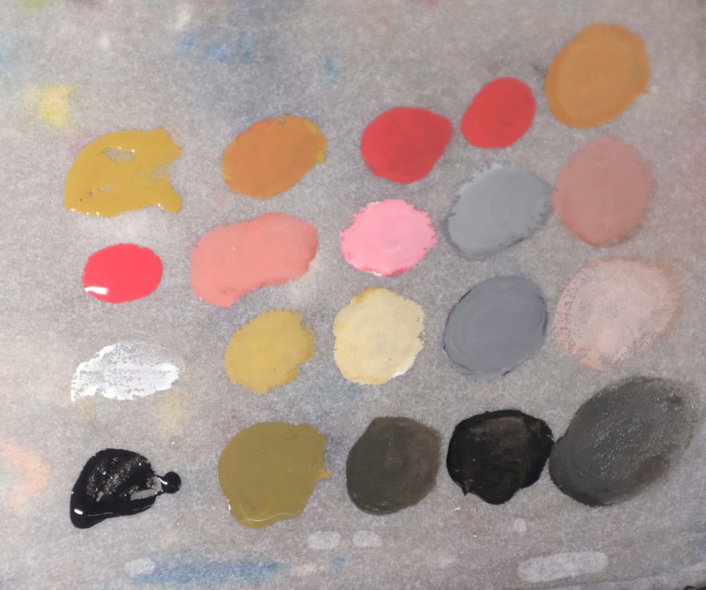
So that’s the theory, let’s try putting it into practise. You’re going to need a wet palette for this, you probably should be using one anyway but it’s essential for mixing paints for miniature painting.
Got your wet palette? Good. Here’s a little demo of how I used only a few paints to spin out a whole bunch of different colours.
From just these three primary colours we can mix a ton of different colours, I’ve given their traditional names below, but people call them all sorts of things.
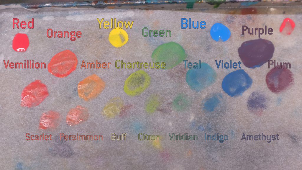
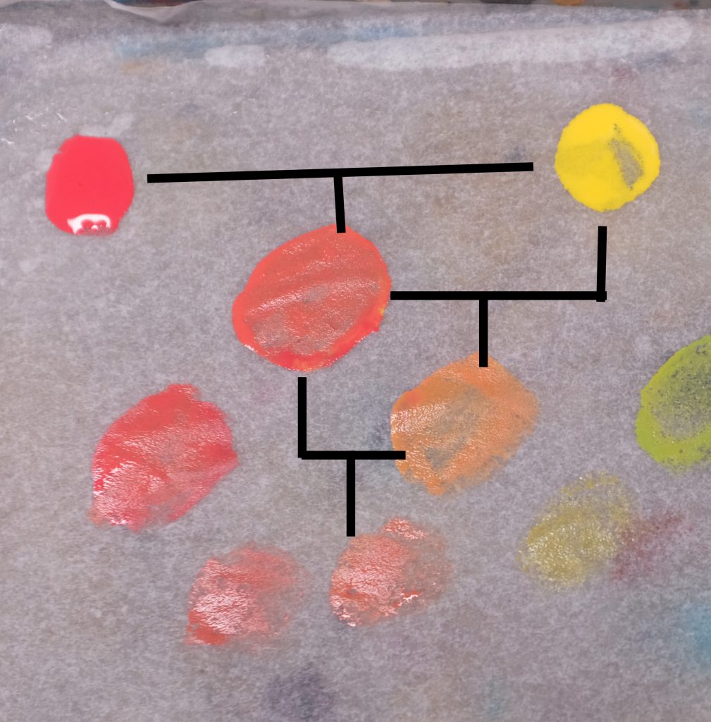
So we start from the primaries, mixing them in a 1:1 ratio to make the secondaries in the second row. Then in order to make the tertiaries, we mix the secondary 1:1 with a primary colour, and so on for the quarternaries, mixing 1:1 a tertiary with secondary. I’ve tried to illustrate the relationships with this family-tree diagram:
As you can see, the saturation of each new mix is decreased as we move down the row, with the Quarternary colours being quite muted compared to the bright primaries. That’s a problem if we want a really bright colour from the ones on the lower rows, so what can we do? Well, the only way to do that is to have the maximum possible saturation at the top of the chain, so the strongest, most macho, most saturated primaries we can get. Typically these paints use only a single pigment rather than a mix in order to get the absolute strongest colours possible.
So that’s mixing paint, pretty cool huh? Now get out there and expand your horizons, artists!