In this article we’re looking at how to select an appropriate colour scheme for your Bretonnian army, considerations and other fun discussions on heraldry from a real-world, lore, or just “I want something pretty” perspective.
Let’s be straight up. Bretonnia is probably one of the most daunting factions to paint, mostly because of the inheritance from Warhammer Fantasy of the concept that every knight must have their own heraldry and colours. My first wargame in earnest was the Old World and my paint collection blew out in a very short time trying to get a colourful army on the field. So let’s share some key learnings and how you could get a nice colour scheme that brings you joy to paint and have it look amazing on the table.
Basic Principles of Knightly Colour Schemes aka Heraldry
Our lovely colleagues have already written a How to Paint Everything article talking about the basics of, and the point of Heraldry. But let’s get more specific into Bretonnian knights here. Your knight just got made a Knight Errant and they have to choose their own shield design – what do we do now? Well, here are some basic principles.
Tincture
What normal people call “colours”, fancy medieval people call “tincture”. The so-called “Rule of Tincture” essentially puts down the general rules of colour matching so your shield could be easily identified with decent contrast.
You would probably have heard some variation of “metal should not be put on metal, nor colour on colour”. So let’s just quickly break all that down – you’d be surprised that even the term “put on” can get confusing!
Metals: Very simply put, yellow and white to represent gold and silver. If you want to get fancy, they’re also known as or and argent which is conveniently gold and silver in French.
Colours: This is everything else. The traditional heraldic colours are green, blue, red, purple, and black but you can see many modern coat of arms today with shades of the traditional colours or even completely different colours such as pink and orange.

They say a picture is worth a thousand words, but the thousand-word table above hopefully illustrates why the Rule of Tincture is there in the first place. As you can probably see, putting colours on colours, or metals on metals generally results in a non-contrasting meld of sadness.
So it seems simple right? Just don’t put metals next to metals and colours next colours. Well, kind of…
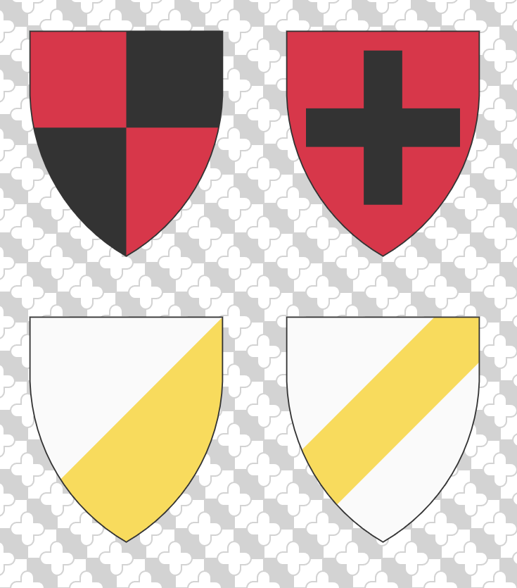
One of the main misunderstandings of this rule is that some folks go “it breaks the Rule of Tincture!!!” when a shield actually doesn’t. Looking at the example above, the shields on the left follow the Rule, while the ones on the right don’t**. One may wonder what the bloody difference is. For that, we’ll need to talk a little bit about Fields and Charges in heraldry.
Fields
The field is just the fancy term for background of your shield. It can be a single tincture***, divided into several areas of multiple tinctures, or varied with patterns.
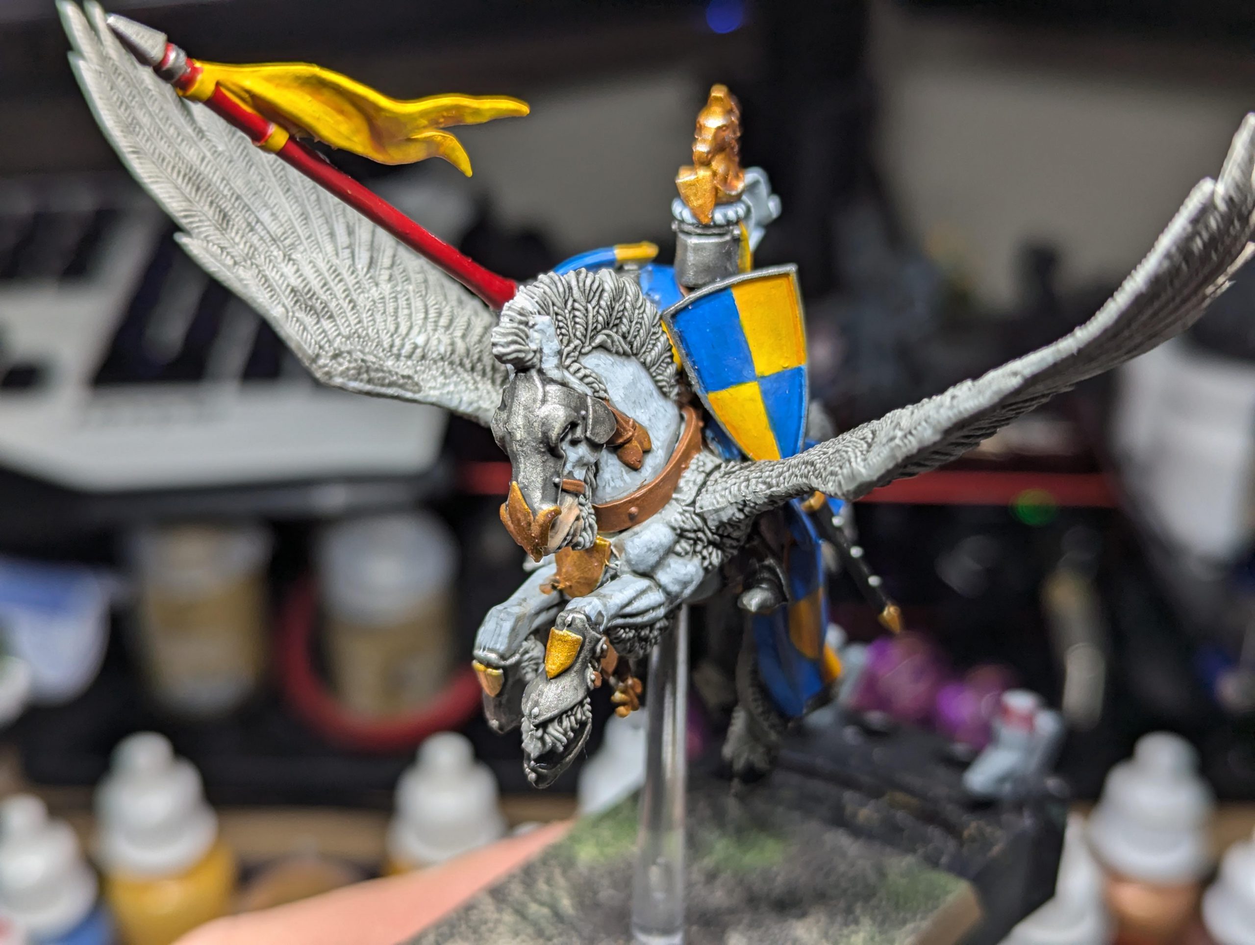
As might be getting clear, tinctures on the field are next to each other rather than one on the other. So any combination of tincture here would generally be fine. This is why the flag of Haiti (red and blue field) and the coat of arms of the Duke Gastille of Brionne himself (red and black field) do not break with the Rule of Tincture.
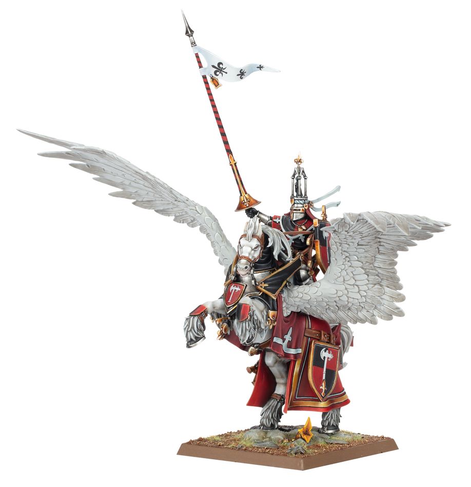
A field that contains both a metal and a colour in equal proportion (such as a field of yellow and green) is considered ‘neutral’, which is important to keep in mind for the next bit.
Charges
These are the items that get placed on the field and is basically what the Rule of Tincture is referring to. Metal charges shouldn’t go on colour fields and vice versa. Now, remember the neutral fields I was talking about in the last section? Basically, you can place a colour, metal, or another neutral charge on top of it.
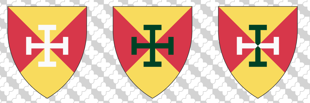
So first up, what is a charge? First up, there are the easy and clear examples which are known as mobile charges or common charges. These are your axes (like the Duke of Brionne), crosses (like the one above), stars, fancy shapes, animals, castles, capybaras, and basically anything you can think of that clearly gets slapped on top of a shield.
Then, you have the slightly confusing charges called ordinaries. These are geometric bands or shapes which go on top of a field rather than simply dividing it. These bad boys are traditionally subject to the Rule of Tincture.
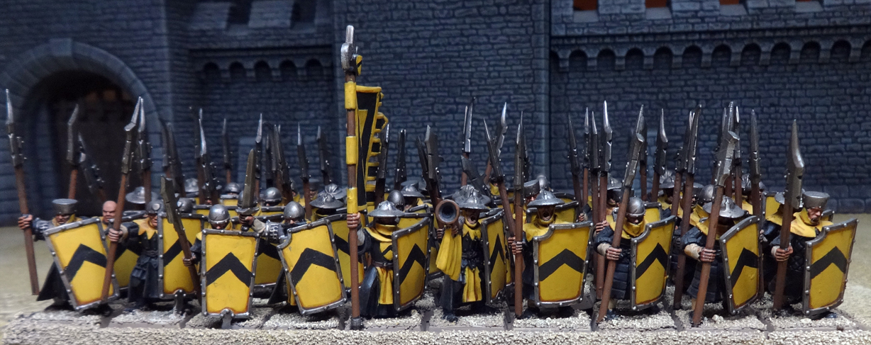
However, if you take an ordinary and pattern it all over, then suddenly, you’re back to merely making a variation of the field, which turns it back to part of the field, which is then not subject to the Rule of Tincture.
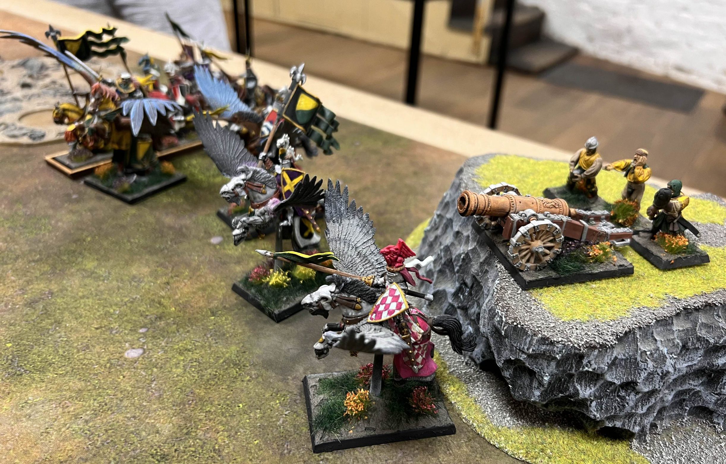
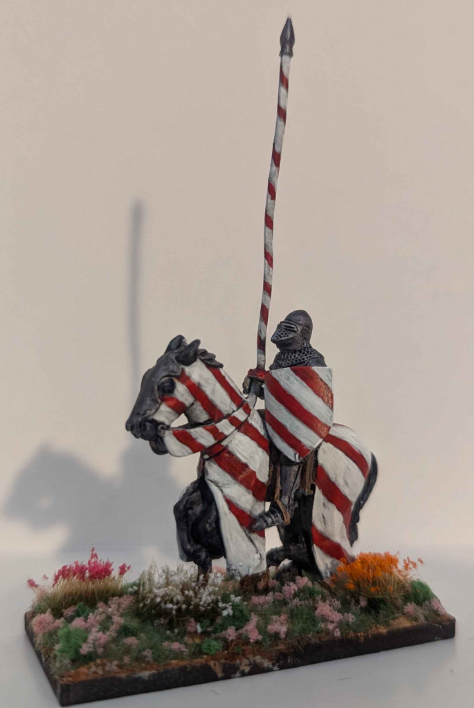
There’s a lot more that can be discussed about the topic of heraldry, and maybe it’s something that can be discussed in a future entry here; but this should provide a basic of the basics so to speak. Now that I’ve confused you sufficiently with basic heraldic theory, let’s figure out what kind of style we are looking for.
A Slight Digression: Complementary Colours
Noting that the whole point of the Rule of Tincture is to ensure contrast and easy distinction of heraldry on the field of battle, one can take a quick look at our Goonhammer Hobby 102 article on colour theory and break away from the restrictions of the Rule of Tincture and create schemes of complementary (most contrasting) or triadic (the three colours which contrast the most with each other) colours. This is especially useful later when trying to paint other parts like the barding of the horse.
Canva also provides a nice convenient colour wheel app to figure the right shade of colour.
What Style am I Going For?
This is Warhammer, and this is your army. So the Prime Directive and rule here is DO WHAT BRINGS YOU JOY*. I cannot stress this enough, as bringing joy is the whole paint of doing this hobby. Having said that, a style provides certain constraints to what choices we have which can make a style selection for your units much easier to make. The right amount of constraints spark creativity, after all!
Lore Accurate
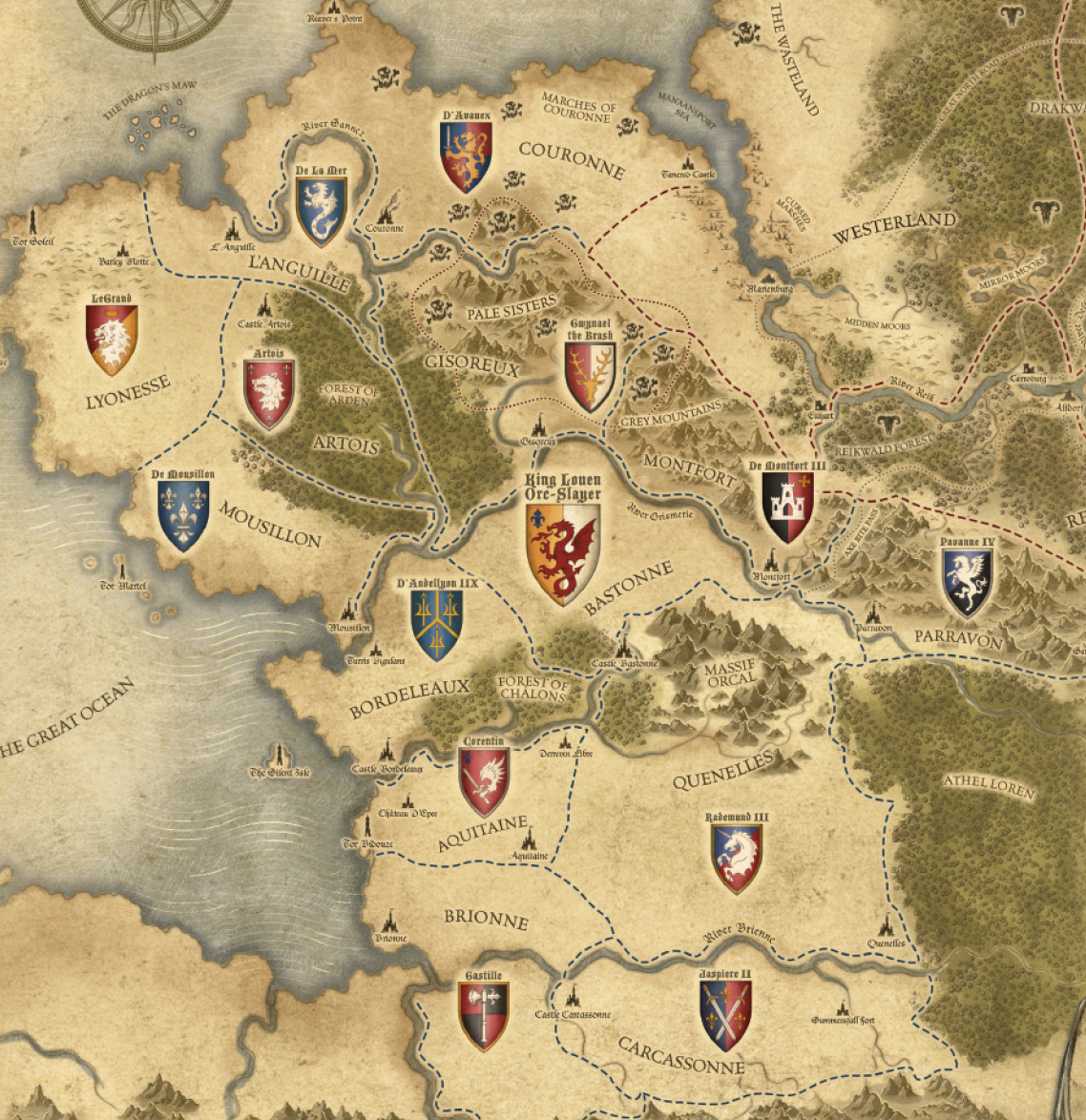
As a newbie to the hobby and tabletop in general, I’d expect (and encourage) corrections to my flaws in lore here, but here’s my best attempt at a TL:DR for being lore-accurate. There are basically two styles:
pre-Old World: every Knight has their own heraldry, usually only having the charges of their relevant Duke/Baron to reflect their masters (e.g. all Brionne knights will have an axe somewhere in their heraldry). In addition, knights slap on extra bits of heraldry to represent kills and other actions (much like pilot victory markings during WW2) such as a lion for fighting in an Errantry War, or scales to represent a win in Trial by Combat. As this is an Old World focused article, we shall leave it at that though you are welcome to dig up old Warhammer sources to find all kinds of lore-related stuff (albeit inconsistent between editions).
Old World: Basic knights follow the heraldry of their Barons who are the lowest level allowed to have their own heraldry. This heraldry is similar in style to pre-Old World, that is, any variety of fields and charges, but containing the primary charge of their duke. The little miniature shields on your knights contain personal family crests.
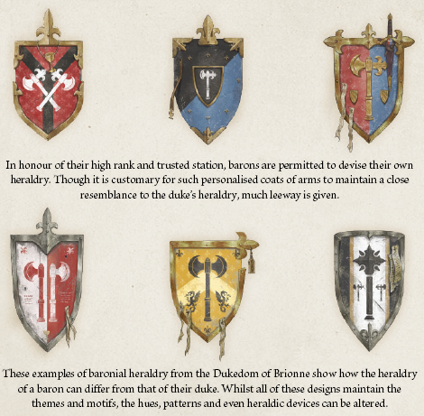
In addition, the colour pallete is generally limited to only black, red, blue, white, and yellow. This is because purple dye presumably doesn’t exist or is too expensive in Bretonnia (the dye in the real world comes from smashing a poor rare snail), and green is reserved for the one and only Green Knight.
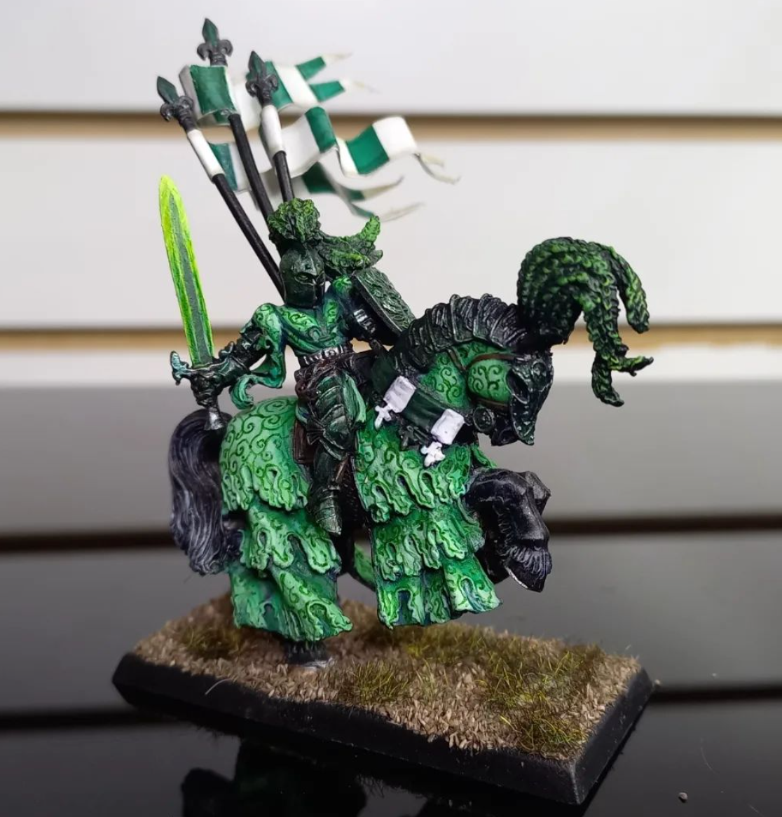
While your palette appears relatively limited, the variations of the field, and charges you can add via decals or painting actually gives you a large number of variations to play with, whichever you choose! And remember, in Old World lore-accurate setups, the vast majority of your army will have the same heraldry – with their personal coats of arms only staying on the small shields on their harness.
Historically Accurate
Let’s get this quickly out of the way, ‘historical accuracy’ isn’t going to happen with a faction that’s basically a melding of stereotypes (already by nature historically-inaccurate) from sources as varied as Thomas Mallory and Monty Python. However, here are a few ideas taken from historical reality that can help give some ideas.
The lovely crew at Goonhammer Historicals provided a nice summary of what real historical units would have had, including a quick discussion on medieval style colours, and what colours are realistic (hint: heraldry tinctures generally reflect reality – though purple has a massive caveats due to rarity of the pigment). But if you want to go sort-of historically limited, then stick to the heraldry tincture set I provided above.
If you are looking for specific inspirations, there are heraldry rolls from all over Europe in the medieval period such as Wappenwiki.

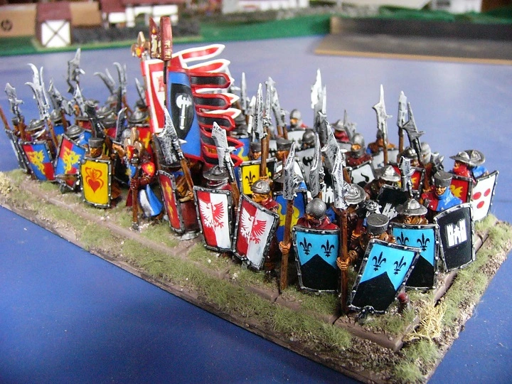
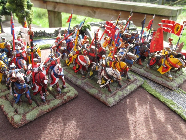
One great idea I have also seen is playing on the concept of knight-service (in certain medieval European systems, knights got given land and they were obliged to provide some troops for their lord consisting of the horseman himself and some armed dudes). These armies would consist of knights with individual heraldry, but also a group of some men-at-arms and archers in those colours.
I Just Think They’re Neat
Anything goes here! Do what you like, and do what brings you joy. The heraldry and colour scheme guides above should give you a general feel of what feels good and what doesn’t.
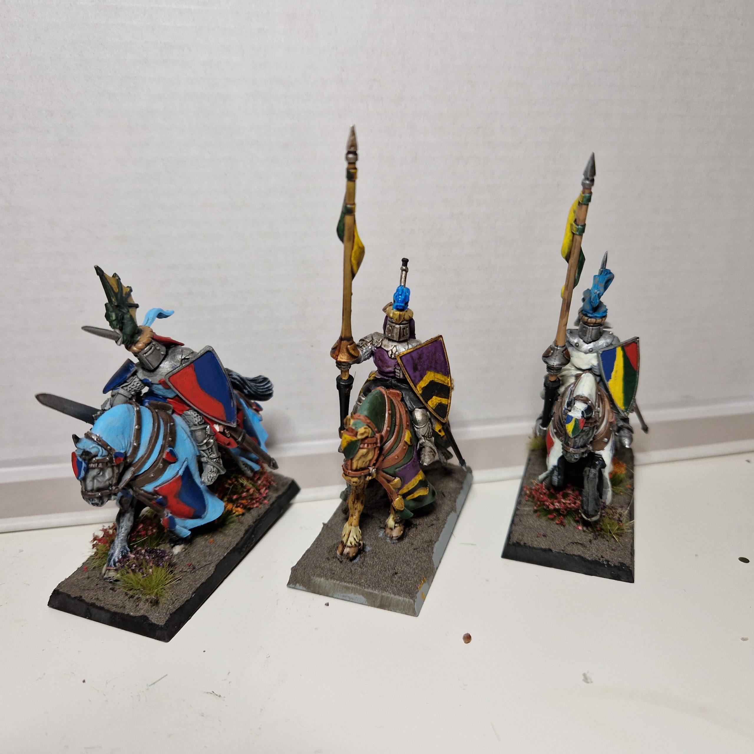
This is pretty much the direction that I took.
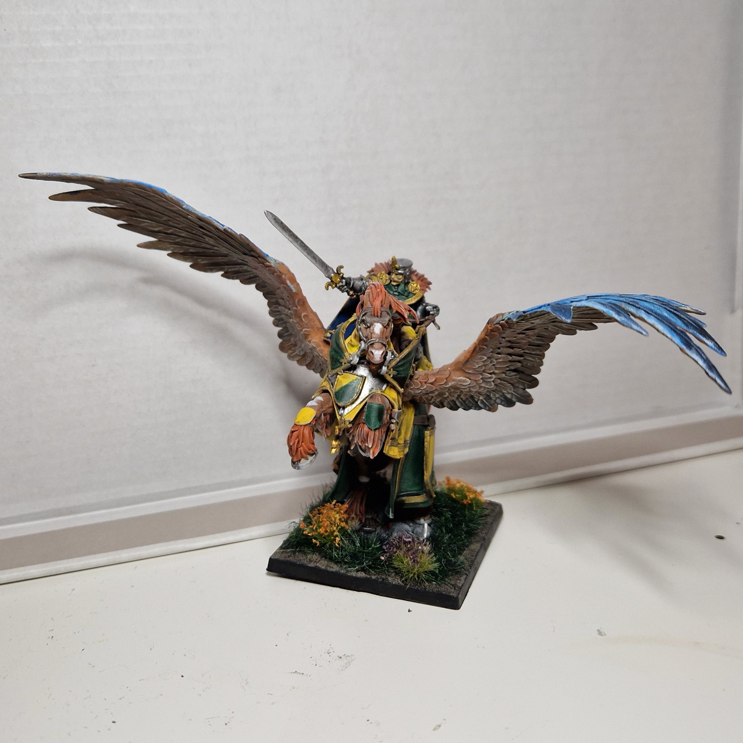
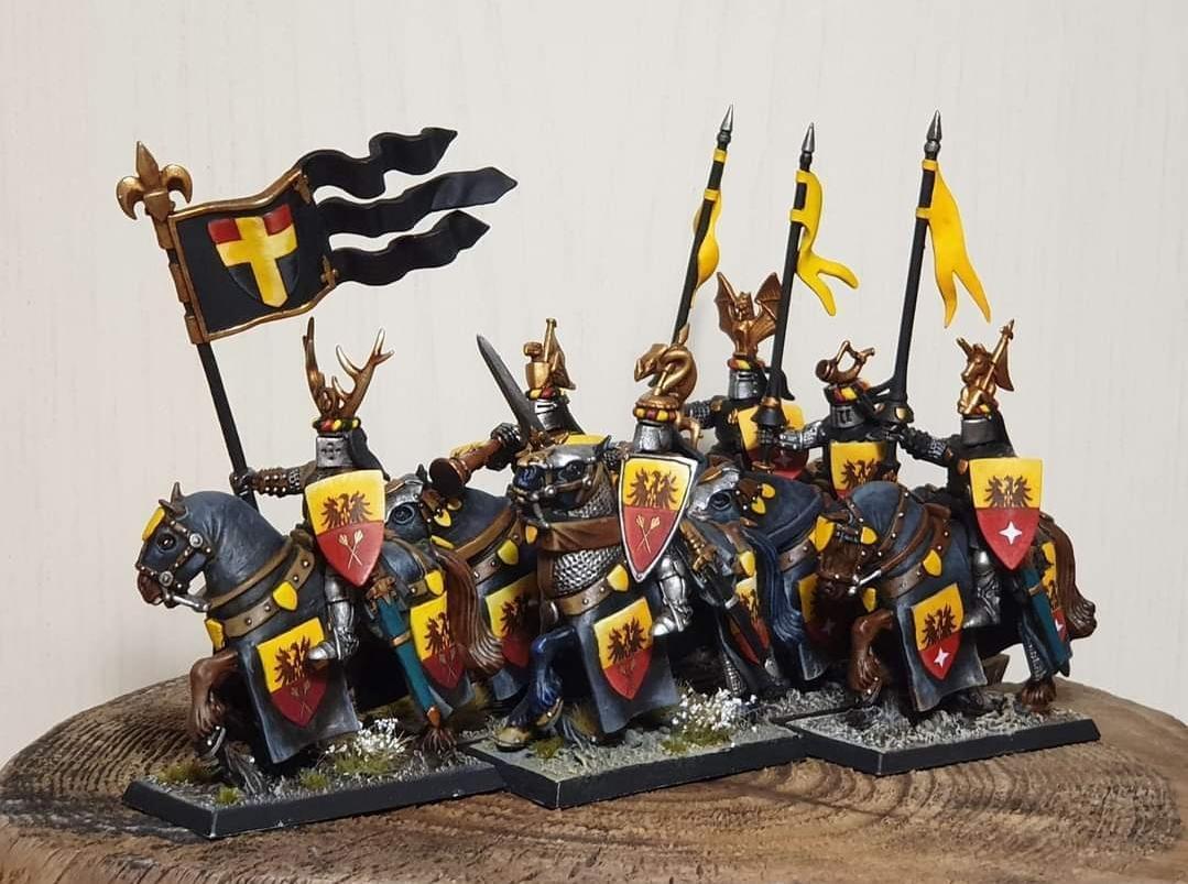
For myself, I went for the pre-Old World “every Knight has their own colours” look, but to show they’re part of a team, I’ve chosen to keep my standards, as well as the penants on my knights’ lances with my Baron’s colours of a yellow and green field.
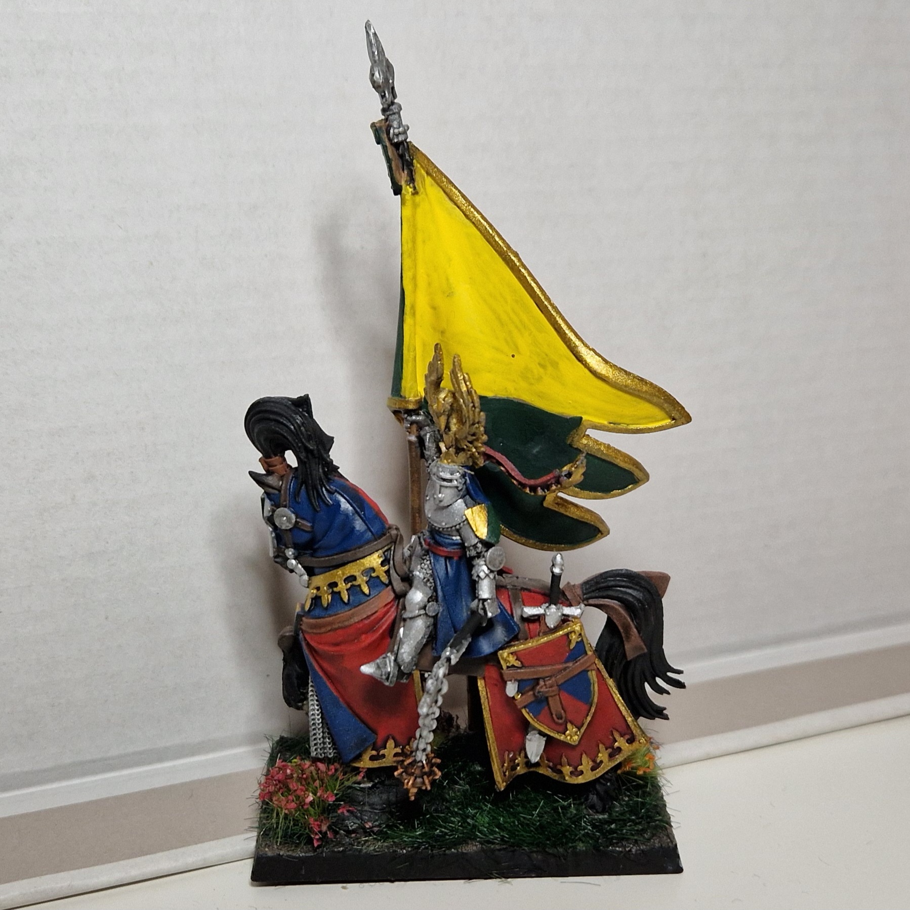
In addition, I have chosen to indulge in traditional as well as some not-so-traditional colours depending on whatever took my fancy while I was painting my knights.
In Conclusion
So, this seems like 2000 words to say ‘do what you want’, and frankly, it is.
There is a huge variety of styles used by all painters, inspired by history and also the reasonably inconsistent lore between Warhammer Fantasy and the Old World. At the end of the day, choose something that brings you joy because that’s the whole point of this hobby.
As usual, like, comment, subscribe, and share some of your tips to selecting a nice colour scheme for your Bretonnians!
Have any questions or feedback? Drop us a note in the comments below or email us at contact@goonhammer.com. Want articles like this linked in your inbox every Monday morning? Sign up for our newsletter. And don’t forget that you can support us on Patreon for backer rewards like early video content, Administratum access, an ad-free experience on our website and more.
* Disclaimer: If what brings you joy causes harm to others, then please seek help.
** In German and Central European traditions, black counts as both which is why charges on red backgrounds do not technically break the Rule of Tincture; hence coats of arms like Albania’s.
*** While I personally feel a bit pretentious using the term “tincture” as opposed to “colour”, it is more useful so there is no confusion between the heraldric meaning and common meaning of “colour”. So I will use “tincture” to refer to colours, and “colour” to refer to the heraldric meaning of “all colours that aren’t white or yellow.”
