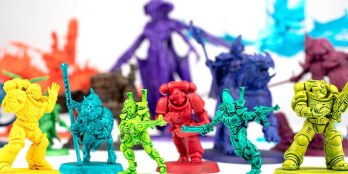
As happens from time to time, Goonhammer’s early shipment of the new range of Contrast paints and Shades were lost in the warp. By the time we convinced US Customs that they were neither toxic nor EPA regulated substances we had lost quite a bit of time to test them out. Luckily Darcy Bono is here to help! She’s hopped on to talk about the new Contrast paints while Raf will pick up with his thoughts on the new Shades.
Contrast Paints
At the moment, GW’s new range of Shades and Contrast Paints are quite a hot topic amongst hobbyists. They claim to provide exceptional vibrancy and coverage, ultimately allowing painters to produce stunning results in a short amount of time. GW marketing pieces have shown off the intensity of these new colors, but mainly on a monochromatic “this is what this color looks like” basis. In this article we’ll look at a compilation of practical applications of the new Contrast Paints and various looks you can achieve with them.
For the Grimdark…
You’ve likely already seen just how saturated and bright the new colors are. At a glance such a stunning palette would seem to lend more to the fantasy-scape of Age of Sigmar rather than the Grimdark of 30k or 40k. But fear not grunge fans, there are at least three must haves in the new range.
- Black Legion: This is one of the highly saturated “contrast paints” that are more suited for smooth base coating than creating actual contrast (more on that in a bit). Think of Black Legion as Abaddon Black but with a smoother and more fluid consistency. Unlike its predecessor, Black Templar, this a warm black that shows its brown undertones when thinned down.
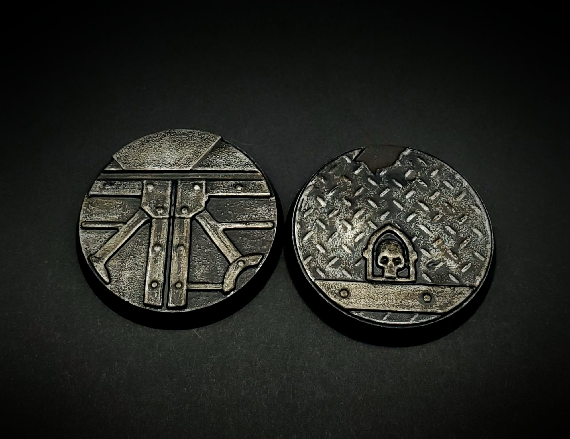
- Ratling Grime: This is such a perfect industrial sooty brown charcoal color. It did most of the heavy lifting on the bases in the picture. Heavily drybrush a black base with silver, then apply this paint for the perfect Grimdark metal. I’ll definitely be using this on any gun barrels.
- Grashrak’s Sewers: Straight out of the pot and over white, it makes a gorgeous walnut brown. Yet applied in metallic recesses it makes for a nice grimey oil streaked look as well. I could also see it being sponged on Nurgle forces for a disgusting sludge splatter (two words that should never be used together).
Note: From here on out, all of the pictured miniatures were primed white using White Scar Spray Primer. All of the Contrast paints were applied in one coat straight from the pot and not given any additional detail, unless stated otherwise.
For the Perfect Base Coat…
Black Legion isn’t the only paint that works a bit differently than the previous Contrast range. Black Legion, Baal Red, Bad Moon Yellow, Imperial Fist Yellow, Magmadroth Orange, Sigvald Burgundy, Doomfire Magenta, and Leviathan Purple are an exceptionally opaque family of paints. In all honesty I’m a little surprised they weren’t marketed as their own series since they don’t really provide much contrast. However, they are amazing for quickly achieving smooth base coats when applied over a light primer (and that’s including yellow)! They also don’t pool or show brushstrokes on large flat surfaces as much as other paints. This essentially allows you to complete what is perhaps the most tedious step of the painting process in a much shorter amount of time, so you can get to painting additional details—like edge highlights and weathering—more quickly.
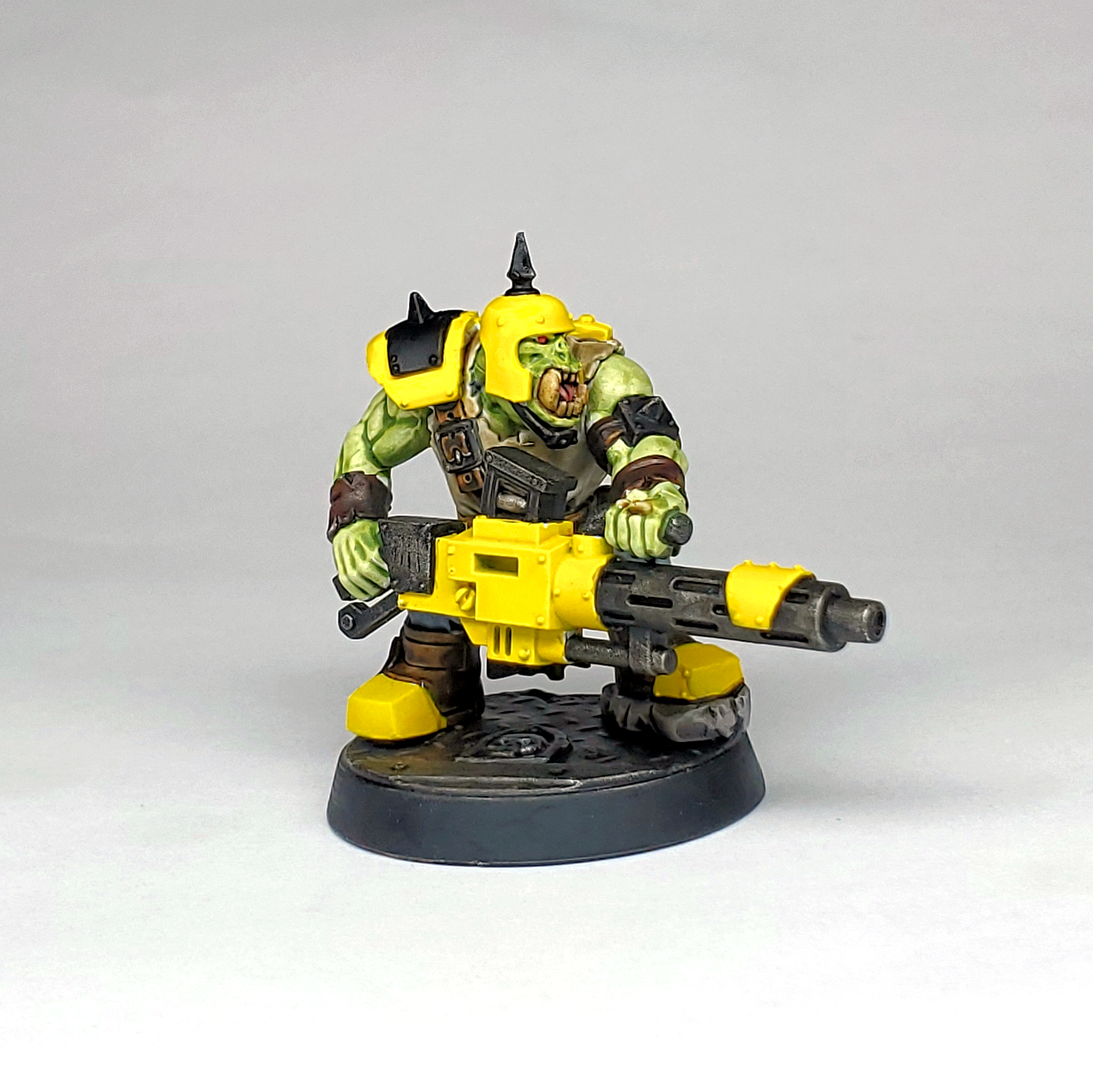
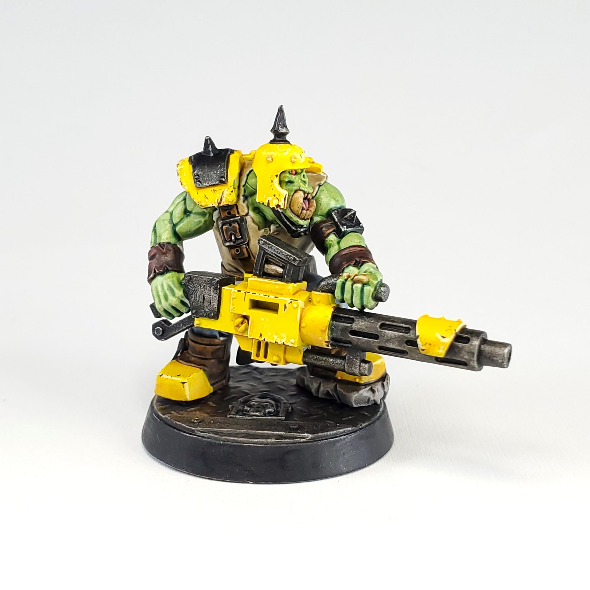
The big shoota and armor on this ork was just a single coat of Bad Moon Yellow. I then added a recess shade using Nazdreg Yellow and then chipping using Dorn Yellow and Cygor Brown for greater detail. The black was Black Legion edge highlighted in Iron Hands Steel.
For da Greenskins…
As an avid Ork/Orruk fan, Gutrippa Green instantly got a hearty WAAAGH out of me. It’s a nice mid-tone green that is saturated enough to be applied in one coat straight from the pot, but still provides the depth of the original “contrast look.” It can be cooled down to a more blue green, using the new Poxwalker Green Shade (as seen on the Bad Moon above) or warmed up using something like Kroak Green, or even Athonian Camoshade, for a more earthy green.
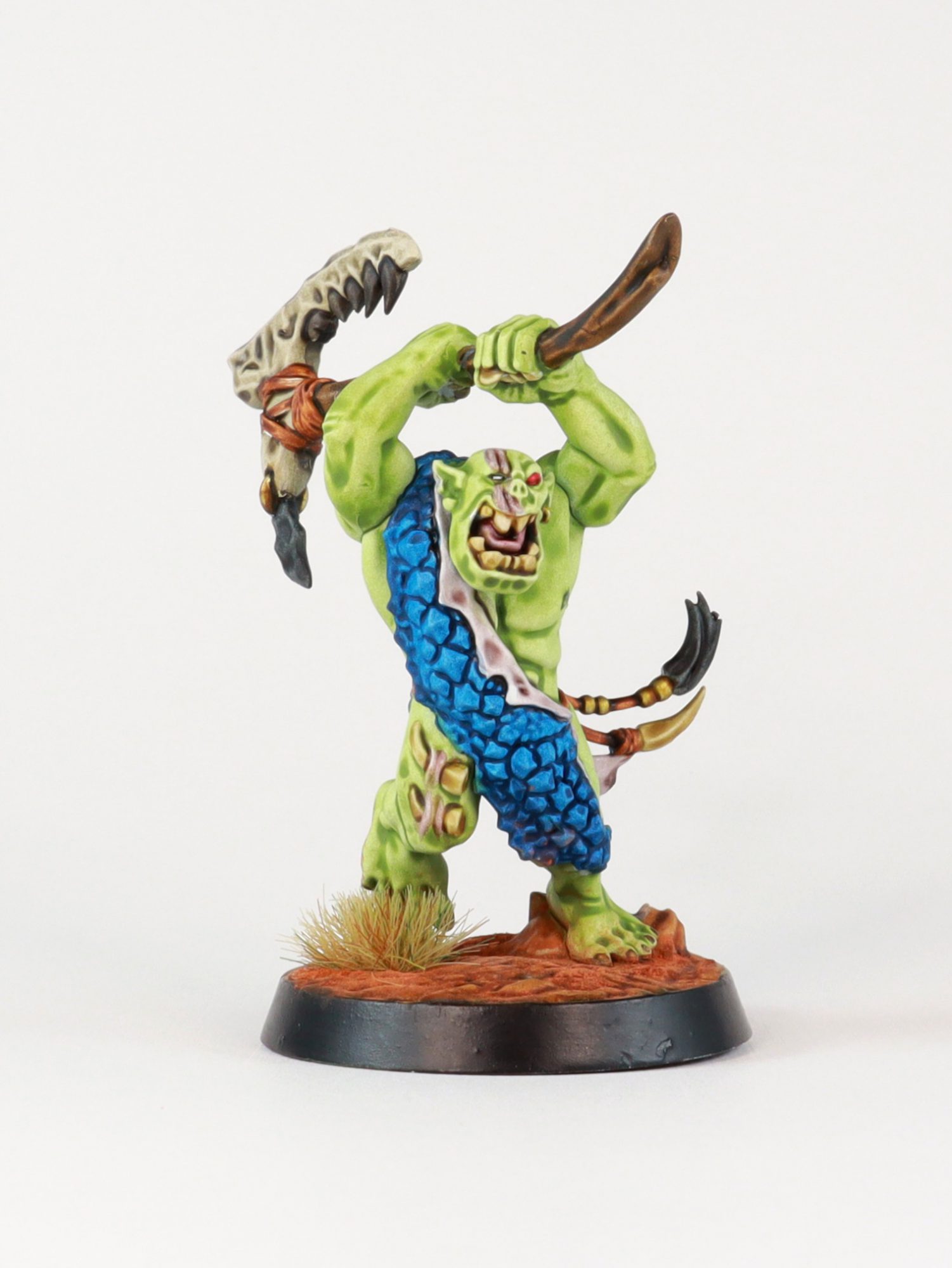
● Additional colors on this mini include Stormfiend for the scales, Garaghak’s Sewers for the wood, Targor Rageshade for the skin of the reptilian beast and Berseker Bloodshade for the scarring.
For the Xenos…
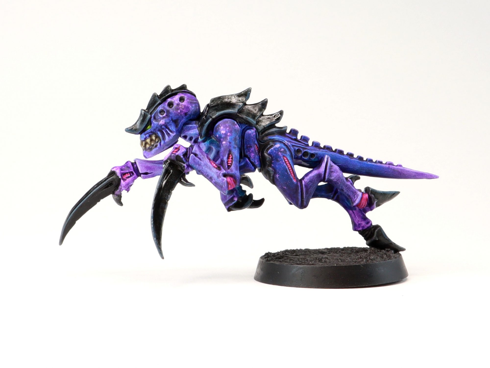
Unlike their grittier adversaries, Xenos factions tend to flaunt a bit wider and more vibrant color palette. Tyranids, Eldar, Harlequins and even Necrons are frequently depicted in colors that really pop, and the new paints are ideal for this. Tyranid Hive Fleet Hydra is one such example. I painted this Hormagaunt in about 30 minutes (including dry time) using three of the new Contrasts. I started with a thin layer of Stormfiend for that nice saturated blue seen on the previous orc. I then immediately wiped away areas I wanted to be the most purple using Contrast Medium so the blue faded back to white. Once it was dry, I applied a coat of the new bright Luxion Purple, again using the medium to wipe away any areas I wanted to be lighter or more blue than purple. For a slightly speckled pattern I sponged on some white paint once the foundation of the skin was dry. I then blotted on a little more Luxion Purple over that white so it appeared brighter than the previous layers of purple.
For the Psychedelic…
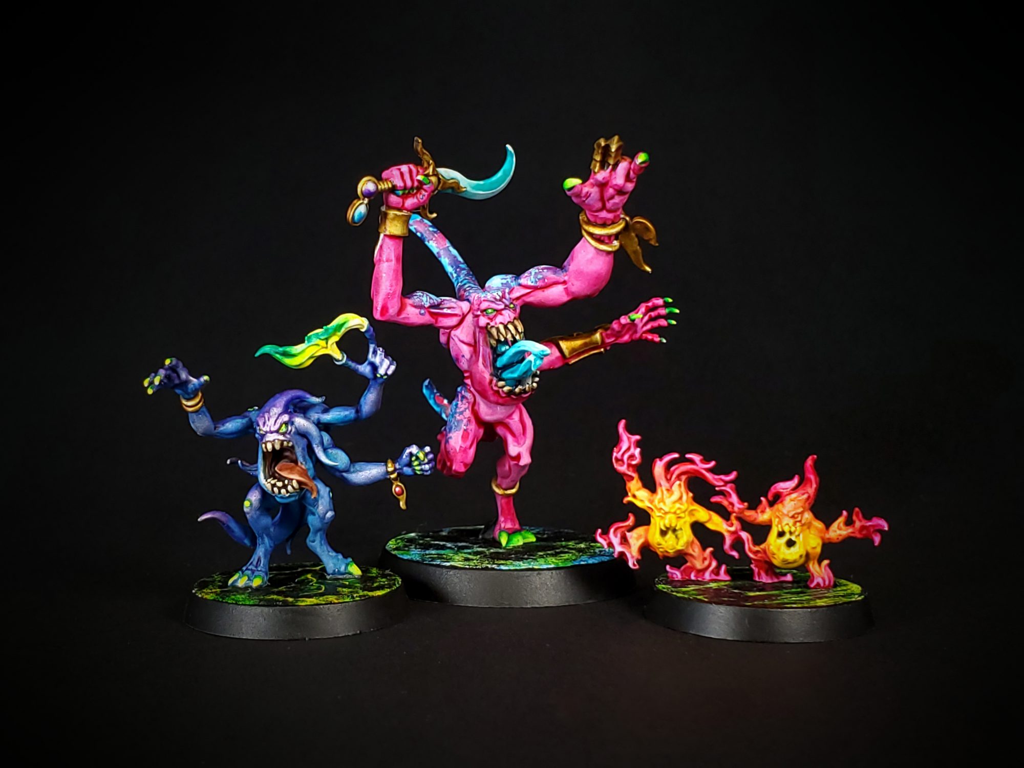
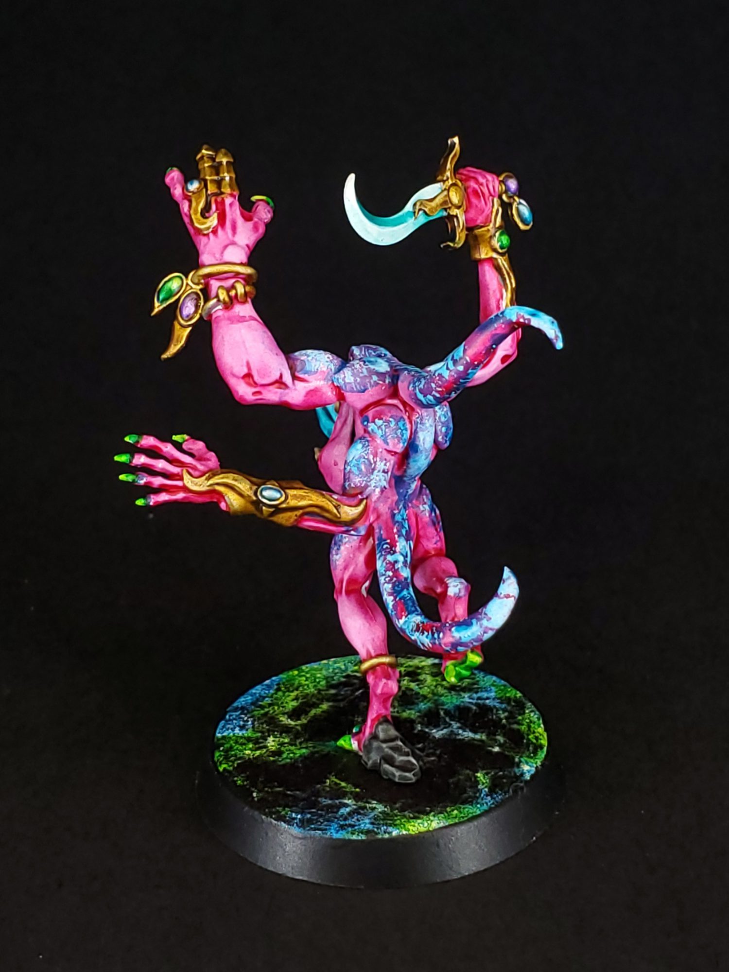
Your imagination (or maybe sanity) is the limit when it comes to how intense you want to be with these new paints. The new White Scar Primer makes colors like Doomfire Magenta, Frostheart, Magmadroth Orange, and Striking Scorpion Green especially eye searing. You can also use a bright silver base to create a metallic or slightly iridescent surface, as is the case with the Blue Horror on the left. It was painted using the same colors as the Hydra Tyrannid but a bright silver drybrush was applied in between the application of Stormfiend blue and the Luxion purple.
For the Nostalgic…
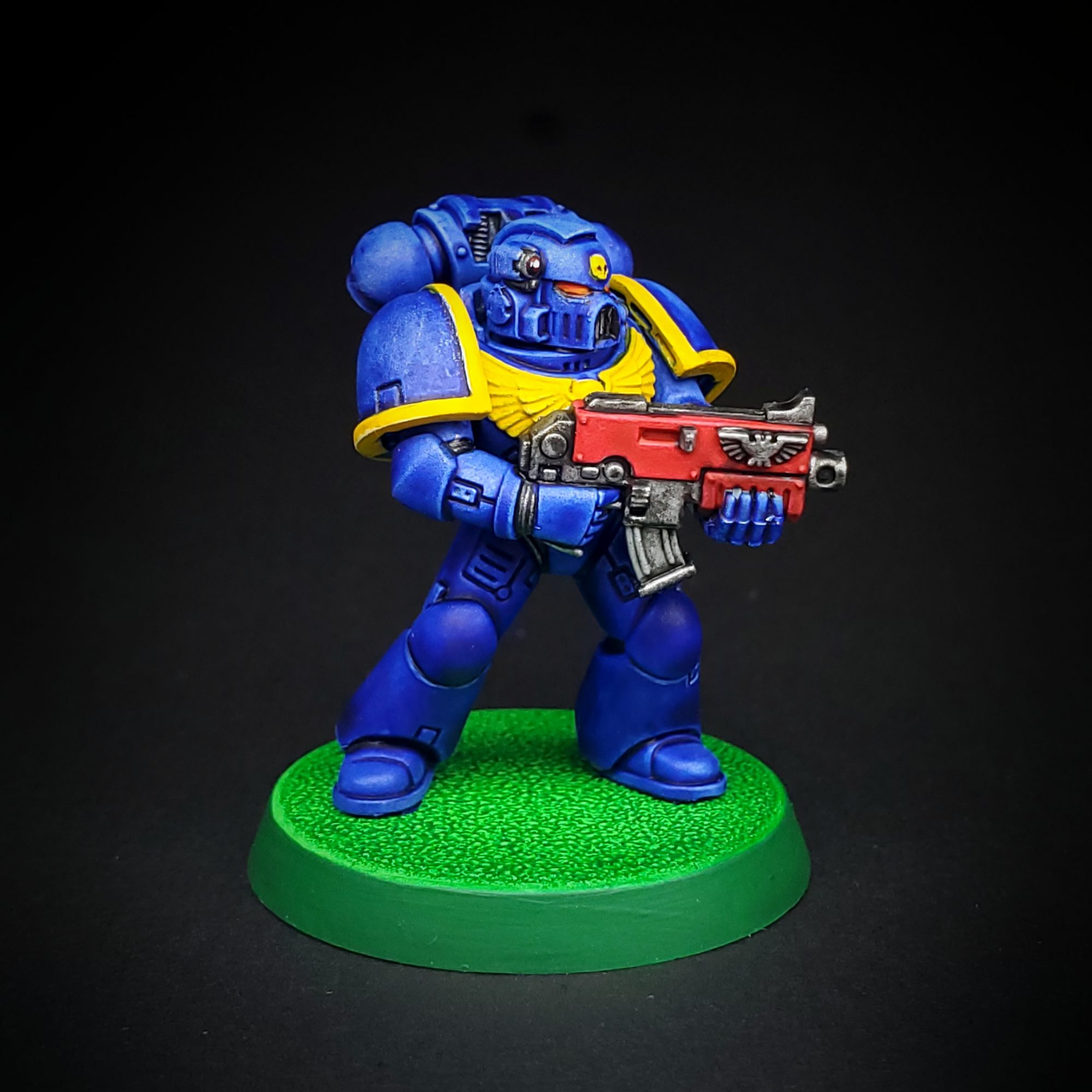
Good news for those who remember Goblin Green bases and when Ultramarines looked…a bit different. The iconic simplicity of the 90s bases can now be reasonably replicated by applying Karandras Green over white. This classic scheme for the Ultramarines was painted using Celestium Blue, Baal Red, and Imperial Fist Yellow. The red and the yellow are two of the dense paints I mentioned earlier. Again, I recommend treating them like a traditional base coat and applying a shade or an edge highlight if you’d like more detail. In this case I wanted to demonstrate what they look like straight out of the pot, so I left them alone. The inlay of the armor was Black Legion over a bright silver and the bolter metal was Rattling Grime over the same.
For Magic & Ice…
I’ll be honest, I wasn’t really a fan of Pylar Glacier when I first tried it. Unlike all of the other paints in the new range, it is extremely runny to the point where it only flows into the recesses and doesn’t tint the raised portions at all (Brimstone Horrors for example).
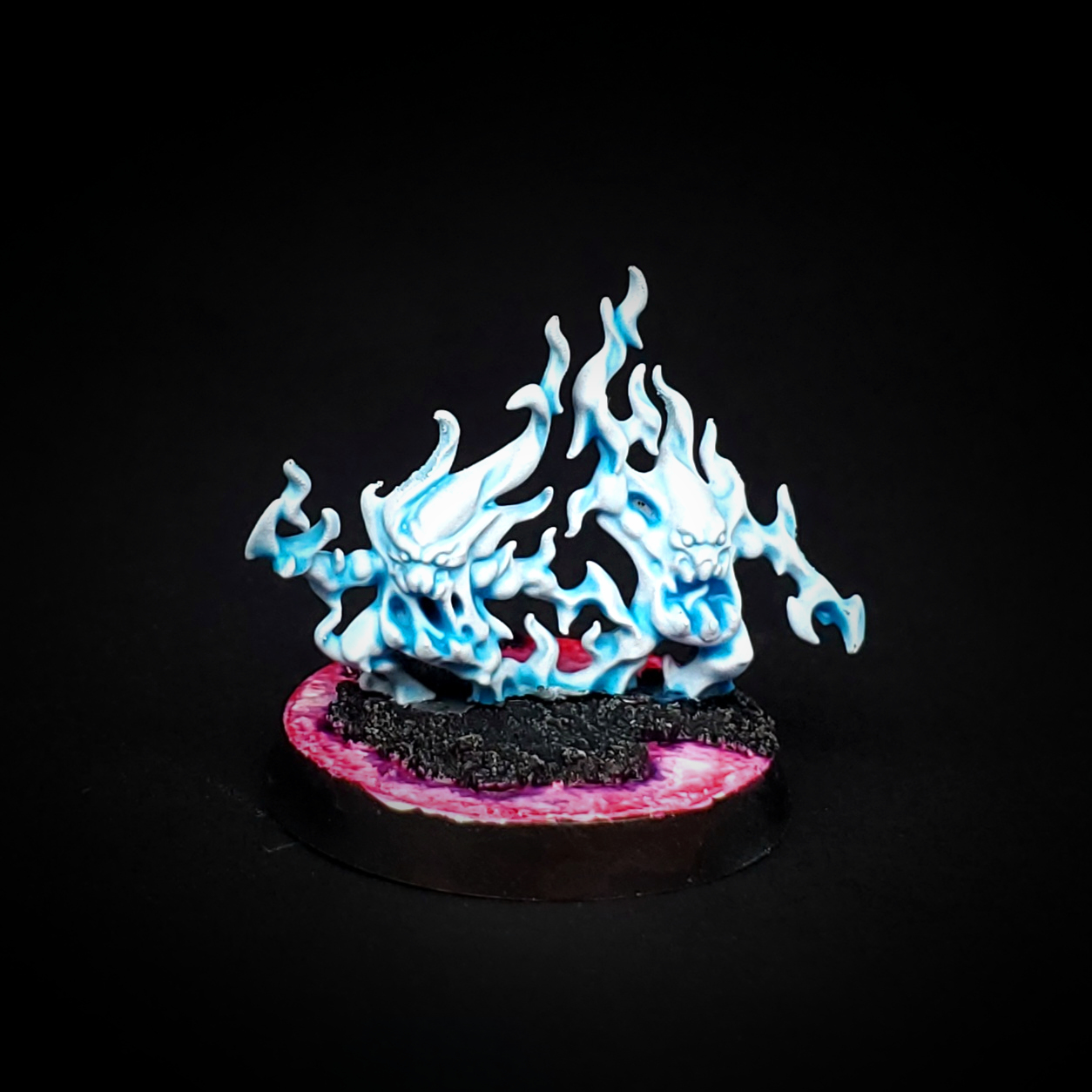
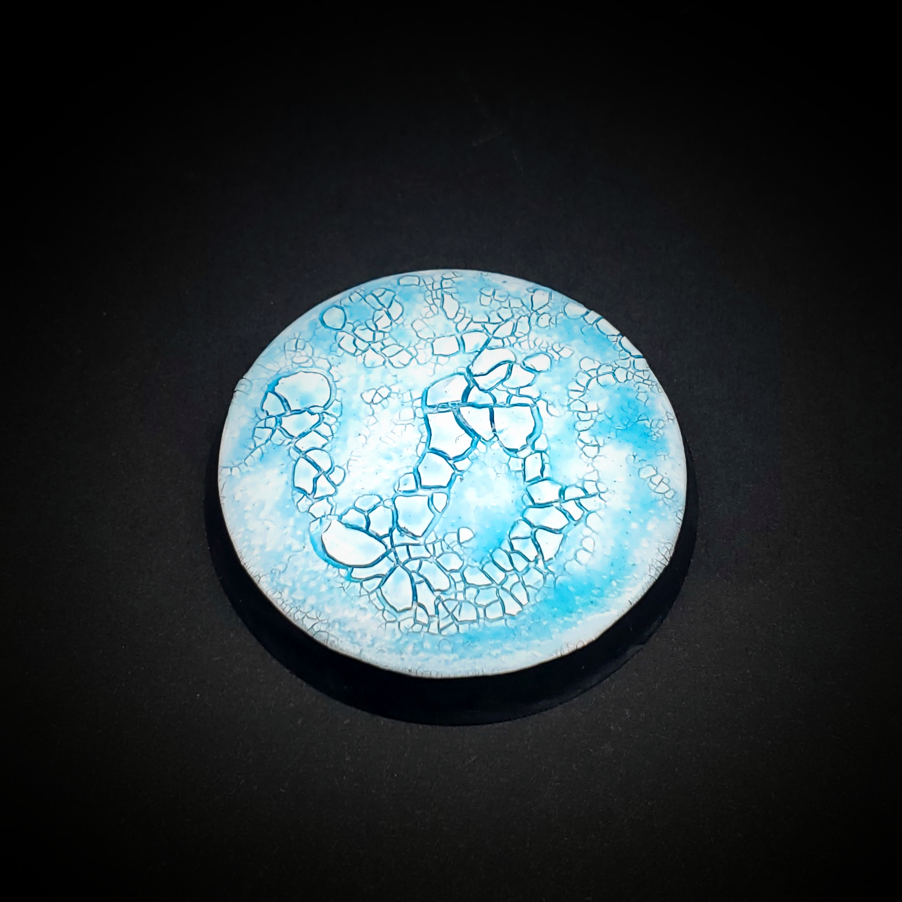
However, I could see it being useful for if you’re painting spells or perhaps even glowing blue eyes if they were detailed enough to have distinct recesses. It is, as the name suggests, highly useful for painting ice bases. The following is an update from a simple ice base recipe I made years ago.
– Apply cracking basing texture, Agrellan Earth, allow to fully dry.
– Prime with White Scar Spray
– Coat thoroughly in Pylar Glacier
– Apply gloss varnish like ‘Ardcoat
For Plasma Weapons…
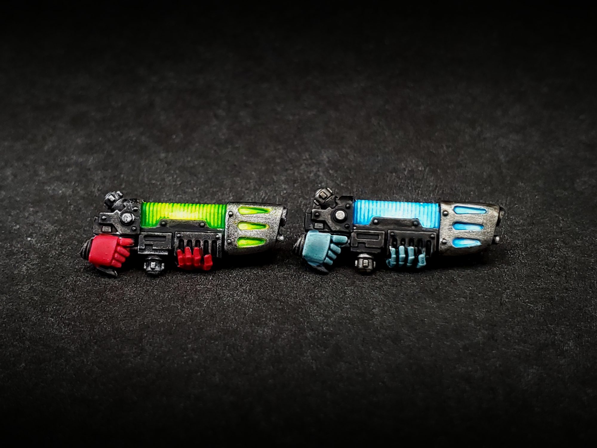
Most of the new Contrasts are both vibrant and a little transparent. This makes them absolutely perfect for near instant plasma weapons. Just be sure to prime white and paint everything except the plasma coils first. This way you don’t risk tainting the pure white base coat on the coils which is the key to this technique. For the blue one, it was just a coat of Frostheart Blue (which is also perfect for ice weapons). I then immediately took a bit of Contrast Medium and wiped away the center where I wanted the white glow to be. That’s it! The green was very similar except I applied Ironjawz Yellow to the white first. Ironjawz Yellow, unlike Bad Moon or Imperial Fist, is much more transparent and behaves like the usual Contrast paints. Once that was dry I applied Striking Scorpion Green and again used Contrast Medium to wipe away the center and push the green towards the recesses. You can do the same thing with Ironjawz Yellow and Magmadroth Orange for a much more chaos-y plasma as well. [Editor’s Note: Holy shit Darcy, this is incredible]
There are still tons of applications I want to explore, but I hope something out of these seven proves useful to you. If you have any questions or have any suggestions, feel free to leave a comment or contact me directly on any of my social media pages.
Shade Washes
Dropping alongside the Contrast expansion are some new Citadel Shade paints. Whether you use them for all-over washes or more deliberate recess shading, Citadel’s Shades have been staples for painters for years at this point. An expansion of colors, therefore, is welcome news. The bigger news, however, was the announcement of a reformulation of the Shades and that this new formula would apply to the existing Shades as well.
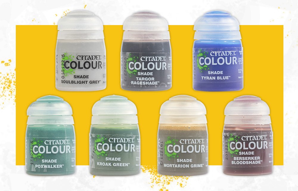
My immediate reaction was to run out and stock up on staples. Like many painters I use Agrax Earthshade and Nuln Oil extensively, and have also worked my way through a few pots of Druchii Violet, Athonian Camoshade, and Reikland Fleshshade. As I’m eternally in the middle of multiple projects I was worried that the new formula would mess with my recipes. Fear not, I’m happy to report that the new formulation feels like a strict improvement in nearly every application. Rather than stock up on old paints it’s more likely I consign them to the terrain bin and switch exclusively to the new ones.
The first thing I noticed was that the new formula feels more viscous. It is a step away from the watery runny shades we’re used to and a step towards the Contrast line. Despite being more viscous, however, it is more transparent and the pigment tends to pool better in the recesses of your model. This means that the Shades do their job of shadowing better than before while also providing less of an overall tint.
Here are some examples:
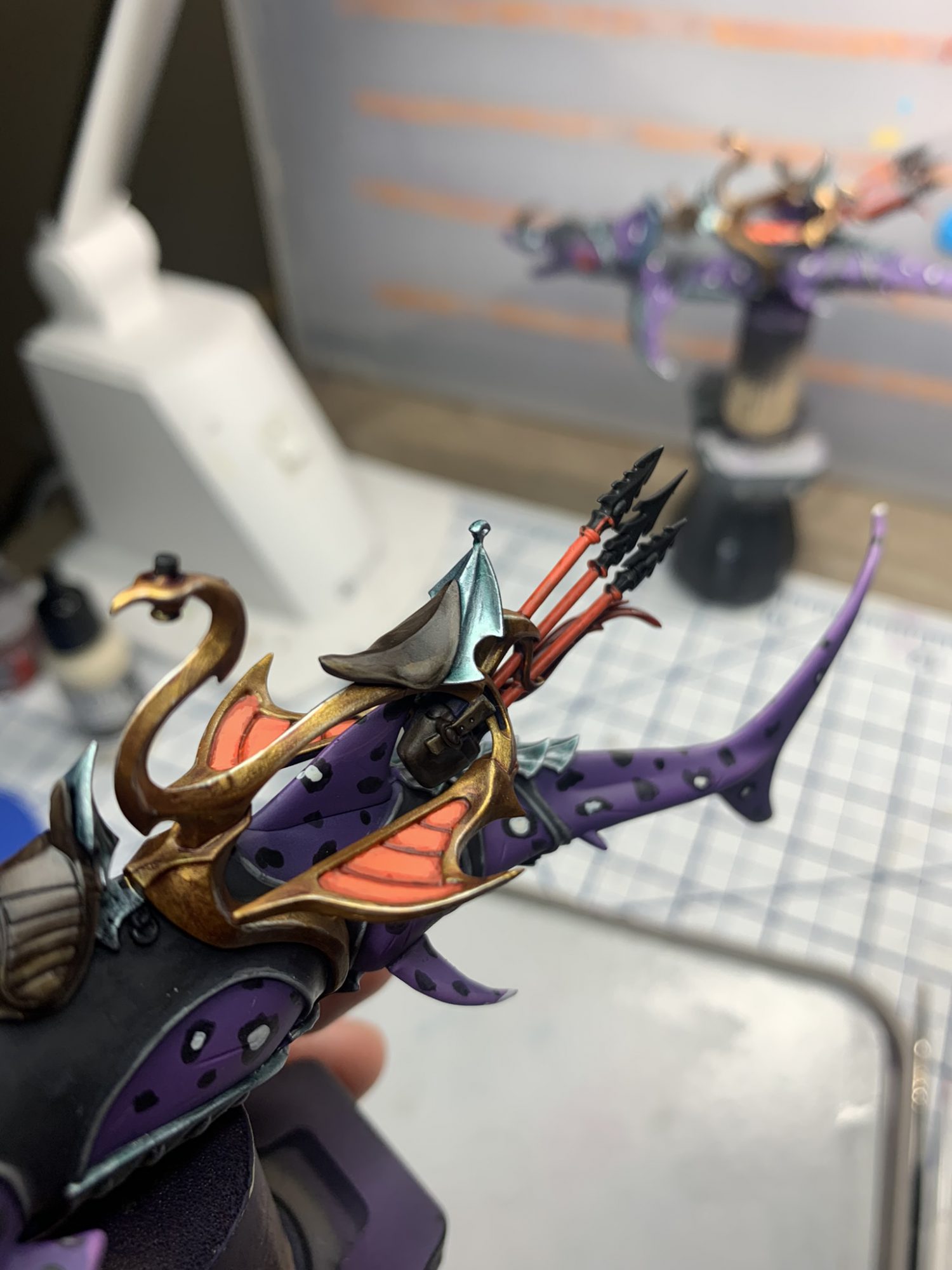
In this first set of pictures I have applied new and old Druchii Violet directly from the pot, in identical volume/method to the gold saddle on an Akhelian Allopex. It was applied as an all-over wash. The golds are Scale75 Viking Gold highlighted with Scale75 Dwarven Gold.
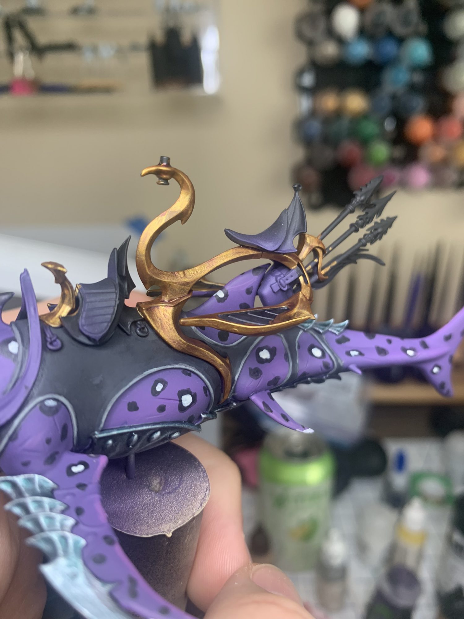
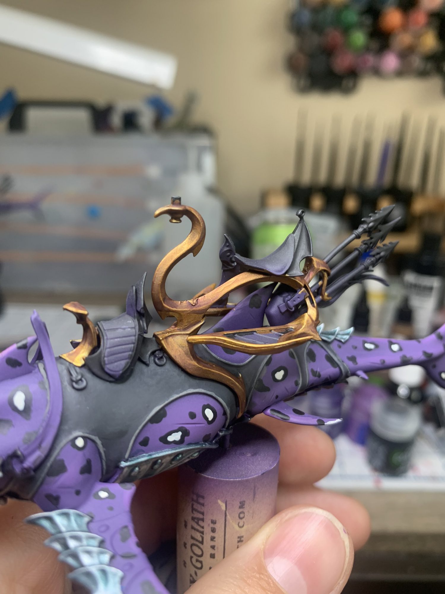
As you can see, the old formula dulls the gold and applies a rather heavy purple tint over the flat surfaces. On this Allopex I’ve had to go back in with my Dwarven gold to bring the shine and color back up, leaving purple in the recesses. On the model with the new formula I was able to go straight to my edge highlights!
In this example, also on the Allopex, I have applied Coelia Greenshade over silver armor. The silver is Scale75 Black Metal highlighted with Scale75 Heavy Metal. Again the Greenshade has been applied as an all-over wash direct from the pot. (Note, there is new Fuegan Orange in the foot rests as well!)
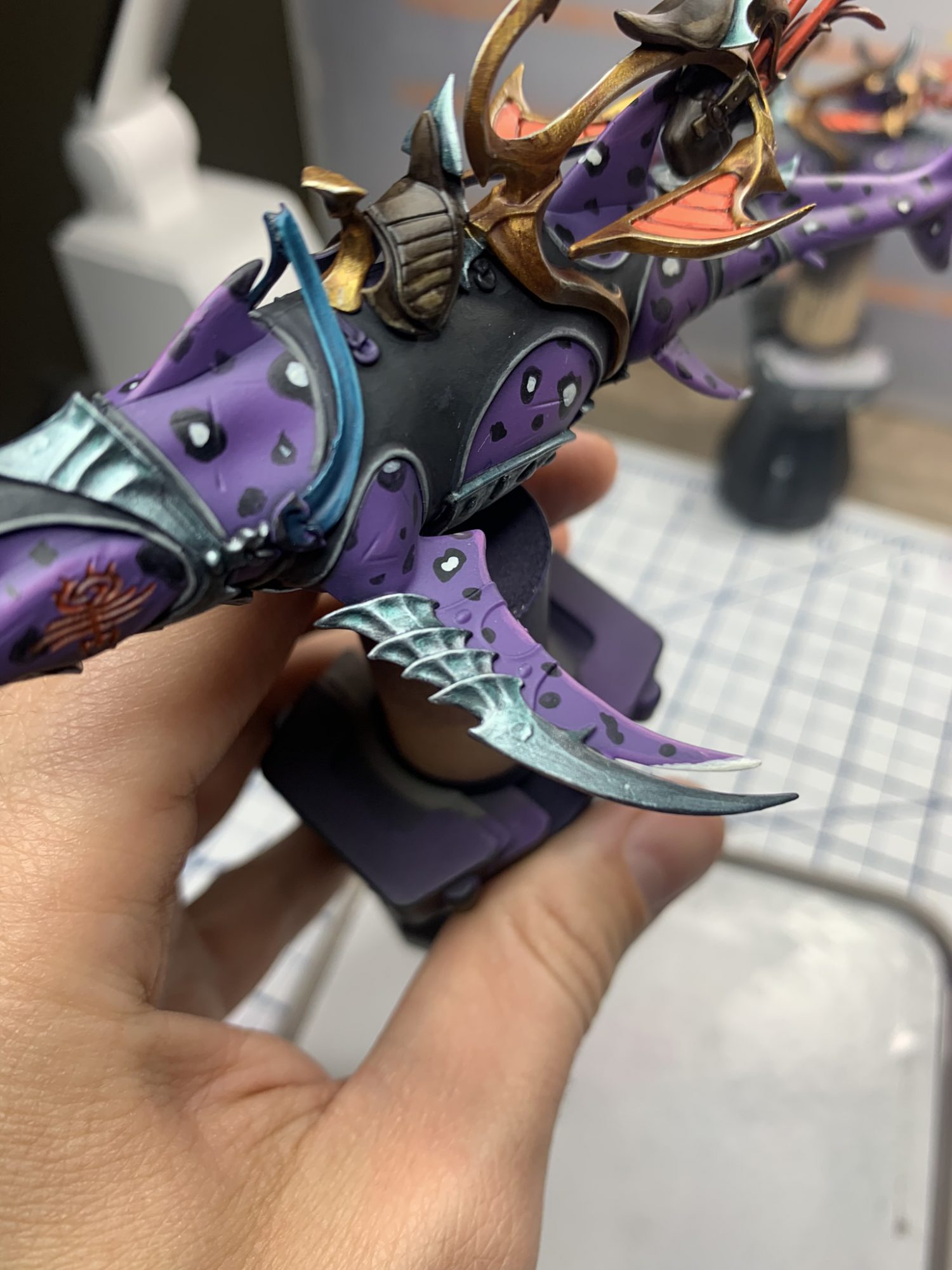
Again I was able to achieve an identical look but the new formula made it much easier. In the first image I’ve had to drybrush heavily with Heavy Metal and apply edge highlights in some places to get the look I wanted. With the new formula I did…nothing.
Because the surface tension (I think) is higher, the shade pulls away from the edges and vertical surface and does a better job of concentrating in the recesses. This left my edges alone and I was able to move on without any touchups!
This has had a quick and dramatic effect on my workflow. Shark gums were highlighted and washed with the new Berserker Bloodshade—my pic for Agrax/Nuln levels of gotta have it—and I moved straight on without retouching highlights, Fuegan hits my oranges, and Reikland Fleshlade does what it has always done on skin, only better.
The first and biggest issue with the new shades is that the new formula does not mix with base paints as well. I’ve often mixed shades with layer paints to create gradual blends and the new formula is far enough away from the basic recipe that it doesn’t glaze back on in the same way. It’s possible that I can recreate this with a little more work and testing, and if I do I’ll be sure to report back.
Additionally, because they don’t provide an all-over tint in the same way I expect some of my terrain recipes will need to change. This isn’t that big of a deal as there are millions of products out there for quick terrain and, frankly, I care a lot less about my terrain than I do my models but it’s worth noting that if you were depending on the all-over tint for some of your recipes you’ll have to make some adjustments.
The other negative is, of course, the new pots. While the price has stayed the same, both new and old shades have been moved over to the 18ml Contrast-sized paints. Nothing avoids inflation (or shrinkflation, as it were).
With that said, I consider the new formula a strict improvement over the old one. It does what it’s supposed to do—shade your shadows—better, quicker, and more easily. The new colors are welcome, in particular the warm purpley red of Berserker Bloodshade and smooth Soulblight Grey. As with any new paint I’m sure we’ll see some new techniques start trickling out soon and if we find any we’ll be sure to let you know!
Both authors were provided sample kits of the new paints for this review. Goonhammer would like to extend a huge thank you to Darcy Bono for contributing to this article. Check out all her socials and links here.
