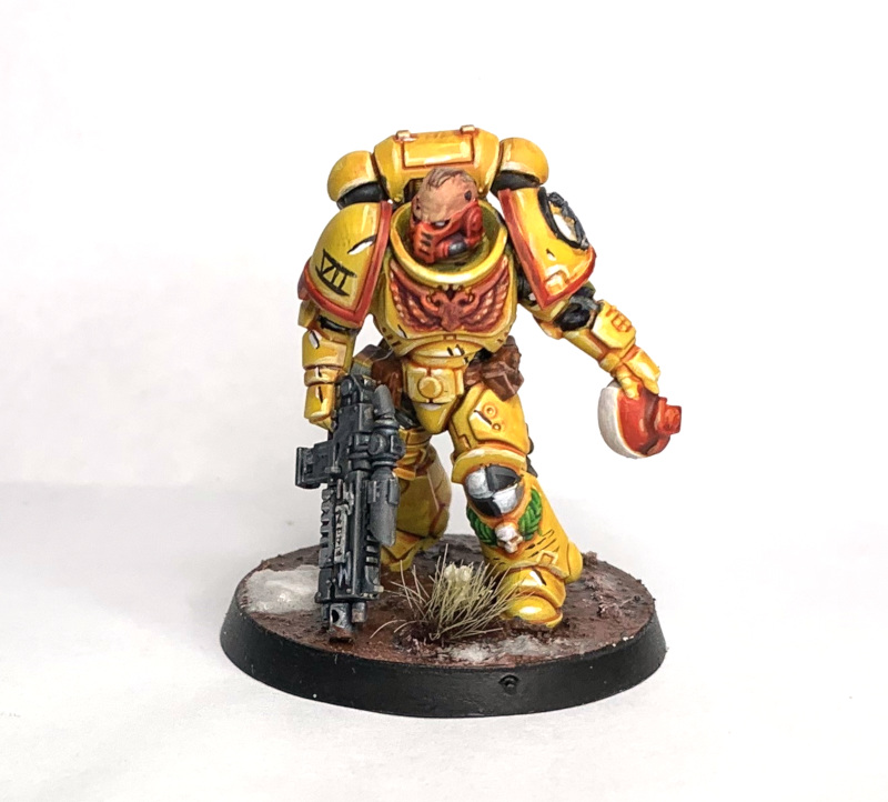
With the release of Citadel’s Contrast paints I thought I’d give a few of them a test spin to compare and … see what they’re like and if they’re the second coming of acrylic, evil glaze-magic or something else on the gradient (last pun).
I’m generally a pretty quick painter and often paint things in a single sitting due to zero attention span and the desire to get to the detailing phase ASAP aka the fun bit, so my experiments are going to be to find out what I can do with them and whether they’re something I can add to my collection or whether they’ll never darken my doorstep again (sorry).
Spoiler: I already have been using them more since starting this, so yes, they’re definitely in my collection.
Items Required
The collection of Piston Head beers (there’s a box with 2 each of the above in, which is great as that works out as 1 for each step)
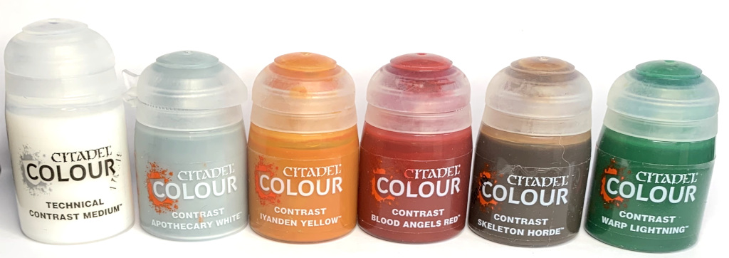
These are the contrast paints I used in the 2 experiments.
Optional

These are the Layer and Edge(RIP) paints used on the Imperial Fist experiment.
Experiment 1 – Easy Mode Imperial Fists
The very first thing that’s different in this painting experiment is the primer being used. In order for contrast to work optimally Games Workshop have released two new spray can primers: Wraithbone and Grey Seer, both of these have a corresponding colour in the Base paint line with the same name. The pots of paint are ideal for touching up any areas, or painting small areas that you want to cover in contrast paint as they provide the same base line colour the spray does. For painting large areas of Contrast paint I recommend using the rattle can versions as it’ll save you having to prime separately first and I’m not 100% convinced that the paints are the same formula.
Step 0: Primer
I was too excited to try the paints out to get a shot of an Intercessor primed in Wraithbone so have an Eldar character from Blackstone Fortress instead.

As you can see, Wraithbone is an off white/cream coloured primer, so if you’re not used to white or light grey primers (for shame), then the experience might be a little different than what you’re used to. If you’ve ever painted with glazes or washes then you’ll understand why a light base is perfect to work with.
Don’t forget to prime yourself for the next steps too:

It’s the strongest flavour of the bunch so it’s perfect for the strongest Chapter (I kid, but Blood Raven Yellow isn’t a thing).
Step 1 – Base and Wash all in one, just like a glaze only better
Cover everything in neat Iyanden Yellow straight from the pot. A trick when using Contrast seems to be to keep the brush strokes vertical going from top to bottom, then collecting any excess at the bottom and reusing it. Doing this will stop excessive pooling and staining on larger surfaces such as Space Marine armour (I do think it’ll be tricky to avoid on larger flat surfaces such as vehicles and walkers though). It should look something like this while it’s drying:
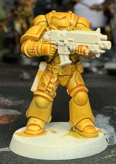
(Notice there’s some staining on the legs, this is because it was my first attempt at trying it out, and I hadn’t worked out the vertical strokes trick)
Step 2 – Tidying and Edge Highlight 1
Optional Step: Once it’s dry you might want to drybrush or layer (very, VERY thin pools) of Flash Gitz Yellow over the top of any larger flat areas to hide the stained bits. It turns out Flash Gitz yellow when thinned is a pretty good approximation of dried Iyanden yellow over Wraithbone.
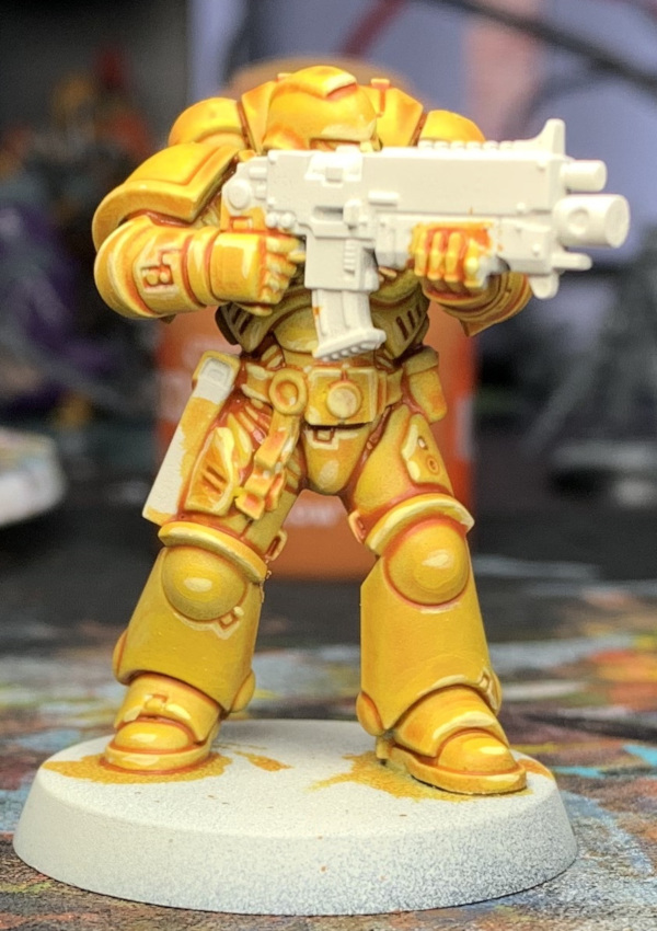
Now take some thinned Dorn yellow aka the paint formerly known as Edge and apply it on the sharper edges of the model and anywhere you want to simulate light hitting. Like this:
Step 3 – Paint the Owl
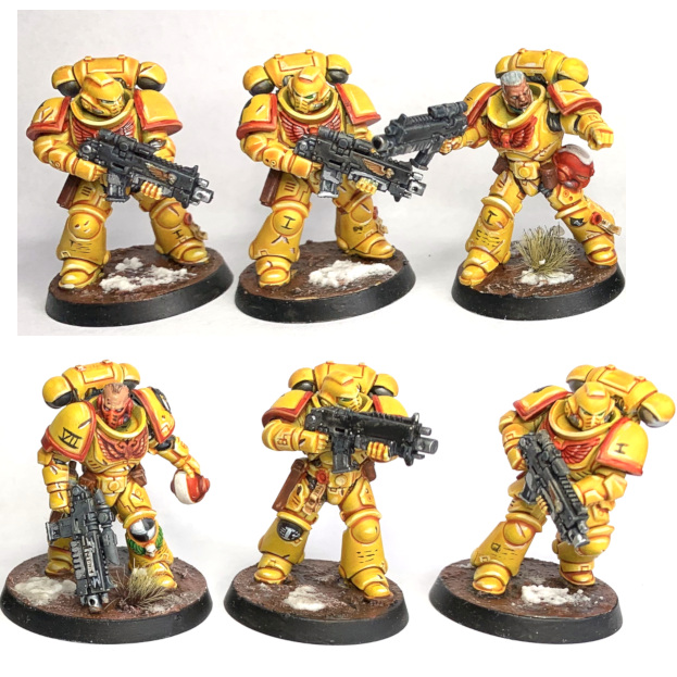
The rest of the steps will depend on how you want to paint the details on the Imperial Fist. I went with the 3rd Company (red accents) so it was Blood Angels Red (Contrast) with Troll Slayer Orange and Lugganath Orange highlights. For the black areas I used Abbadon Black thinned and washed over and the same for the metals only with a highlight of VMA Gunmetal and Steel.
Eye lenses are Warp Lightning Green (Contrast) with a dot of white at the back, and finally the same white was used as a couple of spot highlights over the Dorn Yellow from the previous step. Do this 6 times and you’ll magically get a unit and a HQ just like this:
Experiment 2 – Quick Ork/Orc/Orruk/Goblin Skin
This was just a quick experiment to get a nice looking but really quick Ork skin using just the contrast paints. With an optional highlight if you want it too look even Orkier. For reference here’s one of my hand painted Orks:
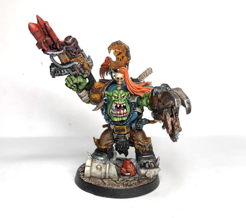
Spoiler 2: It won’t look like that, but it wont look out of place on some horde of Orks that this guy could theoretically Boss araaand’
Let’s get contrastin’
Step 0: Priming
Wraithbone Spray primer as per the Imperial Fist, and as per the Imperial Fist, here’s an Eldar, because once again I was too excited to take a shot of the primed Ork.
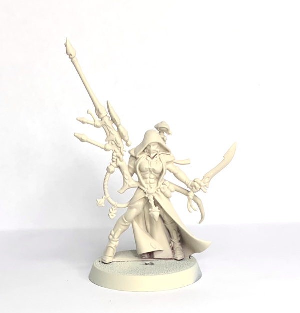
Hello Eldar my old friend…
… crack open the Amber one for this round:

It’s my favourite of the bunch, and the Ork’s are my favourite bunch.
Step 1: Green
All these steps will use the as yet unused Contrast Medium, which is like Lahmian Medium but has Contrast in its name, and not Lahmian. It also makes paint behave even more Contrast, and in the case of Contrast paints it has the same effect Lahmian does to regular paints (makes them more translucent without ruining the viscosity).
Mix up some Warp Lightning Green and Contrast Medium, approximately the same amount of each and cover the skin with it. Like so:
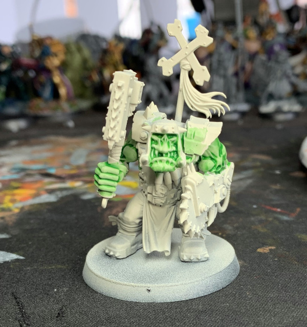
See how much of the Wraithbone shows through because of the medium. this will help the next layers too.
Step 2: Greener
Now mix up some Skeleton Horde and Contrast Medium, again in equal parts and paint it all over the green from before. It should look like this:
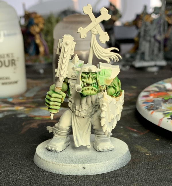
To be honest, you could stop there if that’s your thing, or you could…
Step 3: Greenest (Yellow)
Now mix up Iyanden Yellow Contrast (of Imperial Fist fame) also with the Medium, and also in the same amounts and cover the skin again:
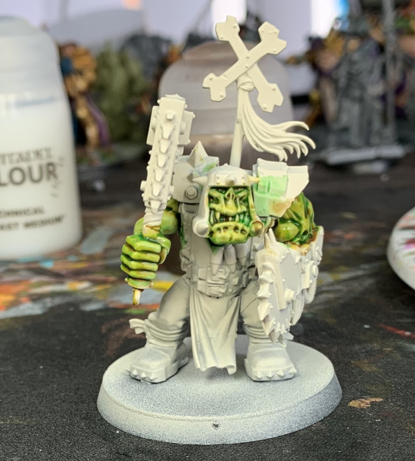
You could also call this done now, but I like to hit the most raised areas with Krieg Khaki (Edge/Layer) in very sparse amounts. I also did the teeth and eyes in this section with Kreig Khaki, and the eyes followed with Blood Angels Red. The lower lip was Genestealer Purple mixed with Contrast Medium about 1 part paint to 5 parts medium.
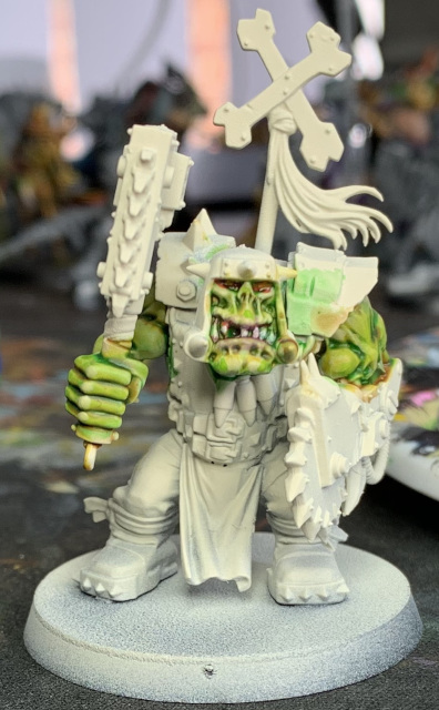
He’s not going to win you any contests, except maybe all the extra ones you can paint now you’re not painting Ork after Ork in laborious detail.
Now crack open the final drink, the Flat Tire (sic :uk: ) one and admire your new found love of the glaziest of glaze range. Then compare and contrast to other glazes. (Sorry, not sorry).

Beer Rating: 2 out of 5 glazes.
Imperial Fist Rating: 6 out of 5 on the speed scale (one dude will take about an hour)
Ork Rating: Red.
Come back in another 5 months for the next installment.
